EasyList


Problem Design and Overview
For our design, we chose to focus on a target demographic of college students and young adults. A large percentage of this population lives with others, whether that be roommates or family. This makes the already difficult task of keeping track of food and ingredients at home even harder, as multiple people are buying or using up items. This compounds with other issues, such as indecision while grocery shopping, to make the entire experience of shopping and cooking somewhat challenging and inconvenient.
Our design seeks to remedy this by putting more easily accessible information in the hands of the grocery shopper and home cook. Our design ultimately took the form of a mobile app, in which there are features such as a manageable inventory, shopping list, and a dynamic recipe recommendation system. These functions aim to lower the uncertainty in what is already in stock at home, and also in what you want to eat for dinner, thus encouraging people to cook more, with less waste and deliberation.
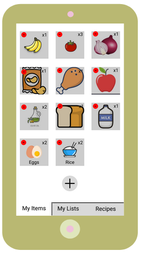
A screen of our app, showing the inventory function!
Design Research Process and Key Insights
Within our design research process, our primary goal was to get a better grasp of the dynamics people that live with each other have in regards to grocery shopping. We were particularly interested in the differences in dynamic between different relationships, e.g. between roommates (friends or not), family, or romantic partners. Using this information, we wanted to see which issues or problems were shared between multiple groups, and how we could potentially address them. We chose three participants that all shared a living space with others, with varying relationships with their roommates (couple, roommates, etc.), for the previously mentioned reasons. We chose to conduct interviews because we felt it was the easiest, most effective way to get the information we needed from our participants. It was also the most malleable method, as due to the various living conditions of our participants, we needed to be able to shift our questions accordingly.
From our design research, we came away with 3 key insights:
Increasing awareness was perhaps one of the first things that came to mind when first thinking about this design. Allowing people to be more aware of what they have or do not have in their fridges or pantries lets them make decisions in the kitchen more confidently and strategically. The form in which this information manifested was something that was developed and changed many times, especially after the interviews we conducted. For instance, we first developed a device that would scan barcodes in order to record items as they were bought. But we got feedback that such a design would be a pain to remember to bring and use every time one goes grocery shopping. In response to feedback such as this, we eventually settled on a mobile app, which resides in smartphones that nearly everyone carries with them everyday.
Minimizing indecision was another key issue that came to mind. When one does not know what they want to make or eat, they will naturally not know what to buy as well. This can create a sort of wall for the shopper, deterring them from shopping and cooking themselves. Our main idea to tackle this problem was actually given to us by one of our participants during the interview: a recipe recommendation feature. In regards to this insight, we felt that this was an elegant solution that also tied in nicely with our grocery shopping focus. It was the idea that started our idea of the flow of deciding what to eat, making a list, shopping, then cooking, which is now a key action sequence in our finalized design.
Promoting exploration was the last insight we settled on. Our participants sometimes cited that they felt that, when they did cook, they always ate the same thing (chicken breast being a primary offender). Promoting diversity in diet is a brilliant way to increase excitement and passion in cooking, and we felt that it had a key place within our design and target audience. We eventually used this insight to expand the aforementioned recipe recommendation function, adding more categories and suggestions in order to accommodate and expand the tastes of those that use our design.
Iterative Design Process and Key Insights
After the design research process, we narrowed down to two major tasks–recipe recommendation and grocery items tracking–and continued to the iterative design process. We started by creating our initial paper prototype, it has most of the features in our current design but has poor usability, such as having few hints for state transition and lacking clarity in possible actions. Through several rounds of heuristic evaluation and usability testing, we received advice from peers and participants of the usability tests and refined our paper prototype iteratively. The following are some key insights we gained from the feedback.
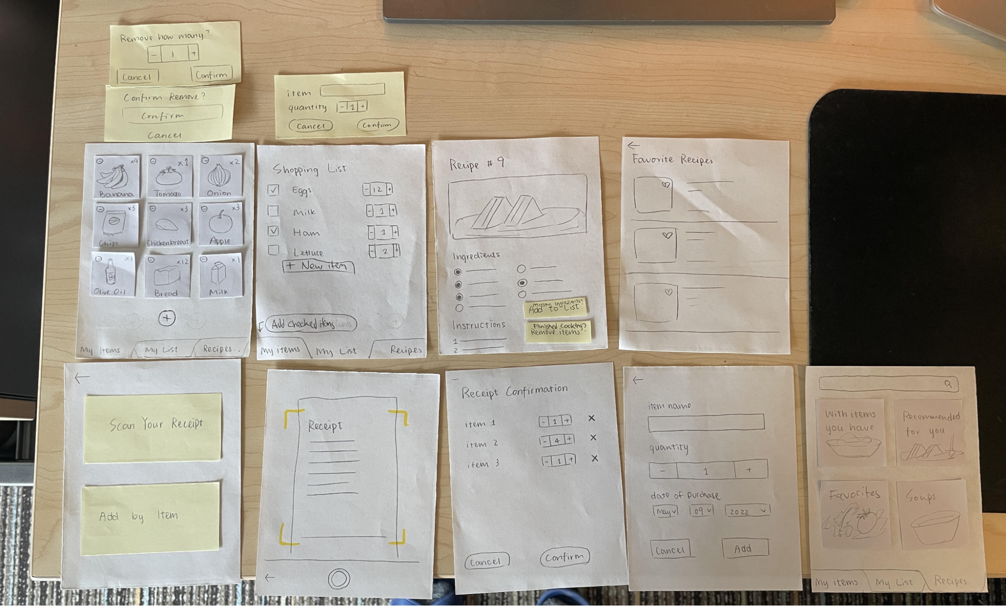
Error prevention and recovery are key concerns by both the evaluators and the participants of the usability tests. In our heuristic evaluation, most of the issues were about the mistakes and errors that one can trigger or encounter in completing the tasks. One example is in our first paper prototype, where the receipt scan might add items the user does not want to track to the items page. The feature is included because of its convenience in completing the intended tasks, but error prevention and recovery should also be thoroughly considered in the design.
Clarity in action-result boosts accessibility for all. During our usability test, all of the participants encountered different levels of confusion while completing the tasks. Although native English speakers tend to adapt to our design more quickly, they also pointed out that rewording the buttons would help them better understand the outcome of the action. Additionally, some functionalities needed to be clearer. For instance, it wasn’t originally obvious that tapping on items in your inventory would allow you to subtract them, so we added minus buttons to indicate that.
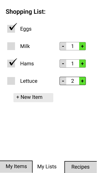
Avoiding repeated manual input often comes up as a new feature suggestion and concern, according to the usability tests. For example, we were asked if there could be a button that removes all used items in the recipe from the items page. Additionally, having quantity boxes that allowed you to either click a plus/minus button or type a number was important, depending on what is faster. From feedback like this, our insight is that people are aware of the time they need to spend on the app.
Resulting Design
Here is our resulting design after we finished iterating on our prototype and transformed our final paper prototype into a digital mockup. These are the three main pages you are brought to when they enter the app.
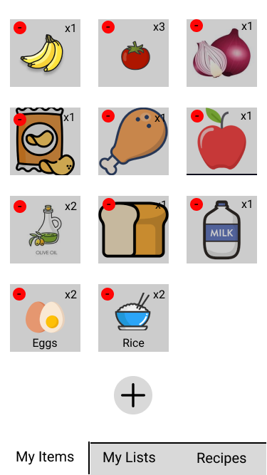
Tracking grocery items in your fridge and pantry
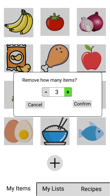
You can view what items they currently have in their shared fridge and pantry in the “My items” tab of the app.
On the “My Items” tab you can edit the items by either removing a current item from the list once it is over or add new items. To remove items that are no longer in the fridge or pantry, you can simply tap on the icon of the image and a popup will appear. You can then specify how much of the item they want to remove and then press confirm and that set amount of the specified item will be removed from the list. In this scenario, 3 amounts of a specified item will be removed from the list once the confirm button on the popup is clicked.
To add items to the list, click on the plus sign towards the bottom of the list and you will be presented with two options. You can either add items to the list by scanning a receipt that contains the groceries or manually add the groceries.
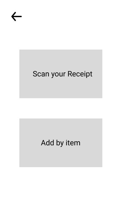
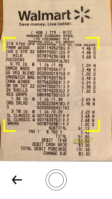
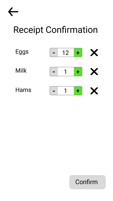
When adding by scanning a receipt, a confirmation page will popup of what items were picked up from the receipt and you can edit any of the quantities if needed or remove an item you do not want to add to the list.
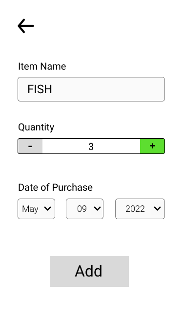
To manually add an item to a list, a form will be presented to you to fill out information and quantity of the item you wish to add and once you click add that item will be added to the list. In this scenario a user is adding 3 fish to the list that were purchased on May 9, 2022.
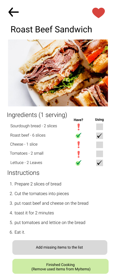
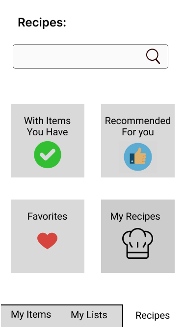
Recipe Recommendation
You can click on Recipes to go to the recipe page. There are four options, recipes with items you have, recipes recommended for you, your favorite recipes, and my recipes, the recipes which you can create yourself. There is a search bar at top, where you can search for recipes.
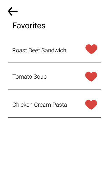
When you click Favorites, you see the recipes you liked with the heart icon next to it.
When you tap on one of the recipes, you are brought to view it.
This is the recipe page, and it shows the ingredients you need and instructions of how to cook it. The ‘Have?’ column in the ingredients tells you if you have that ingredient in myItems and the fridge. The Using column is used to remove the items from myItems when the cooking is finished. There are two buttons, one is ‘add missing items to the list,’ and it adds the missing items to the myList, the shopping list. Another is the ‘Finished cooking’ button, and it removes the used items from myItems.