Cup-anion
Your Drink Tracking Companion
Team Members




Problem and Design Overview
The average American adult consumes roughly three times the recommended amount of sugar in a day, with the leading source of added sugar being beverages. Many people struggle to drink a sufficient amount of water each day. Unfortunately, it is difficult to be mindful of what and how much you drink, as drinking is almost a subconscious act occuring throughout the day. It is far too much work to self-track every single sip of each drink every day.
Our design consists of a cup paired with a smartphone app that helps people meet their drinking goals. The cup component automatically detects and logs the quantity of different substances in drinks, requiring no additional work to track. People can set specific goals and view their drinking data through the app.
Design Research Process and Key Insights
The Process
At the beginning of the research process, we thought we would want to conduct observations and drinking diaries in order to discover what kinds of things people tend to drink and in what container. However, we realized that it would be much more insightful to conduct structured interviews to hear stories about people’s drinking habits that one wouldn’t observe from the outside, such as weekday vs. weekend habits, patterns throughout the day, and any previous attempts to track drinking. We chose to conduct structured interviews with people who were actively looking to track their drinking for various health-related reasons including IBS or sensitivity to caffeine. We acknowledged that there are several motivations to track drinking, but we chose to interview those with health related motivations because those people would have more to gain from our potential designs than the average person. To avoid placing our own bias, we wrote a specific interview script with open ended questions about our interviewees' drinking habits and desires to track them. After conducting one interview, we included an additional question on how they would like reminders, as we learned that was a key feature that we initially missed in our first set of questions.
The Results
People have different motivations for tracking their drinking habits.
A common theme that emerged from our design research was that participants had different reasons for wanting to track their beverage consumption. Some wanted to drink more water. Others wanted to be more aware of their caffeine and added sugar consumption. One participant pointed out that the labels on store bought drinks were hard to read, making it hard to find artificial ingredients that they were staying away from. Based on this, versatility became an important part of our design. We wanted the container to be able to detect not just water, but various types of drinks and substances.
People want to meet goals to improve health.
All participants expressed a common struggle of not being able to remember to reach their goals. Drinking wasn’t something they thought consciously about doing and so they would forget. Hence, goal-setting became another key part of our design. More specifically, we wanted to be able to encourage people to meet goals in a way that was not overly disruptive to their routine. For instance, in the sketch below, the cup begins to glow a different color to remind the participant to drink.

The cup starts to glow a different color, which subtly reminds the participant to drink more water.
People want a design that is easy to use without messing with their routine.
Our participants all wanted something that is easy to use because they are too busy to self-track. To help avoid the extra work, we wanted a design that can be used easily, without too many extra tools, and that works for all types of drinks. While not explicitly mentioned by our interviewees, we noticed that many of them drank the same things every day: water, coffee, energy drinks. Taking this into account, we realized that it wasn’t necessary to fit every situation, but rather the typical ones and allow for “edge cases” where they could manually tell us what they drank.
Iterative Design Process and Key Insights
The Process
We started out by paper prototyping a cup and an app with the design and insights that came out of the above research. We focused on the goal of passively encouraging people to meet their drinking goals through elements of design on the cup, and the goal of measuring any beverage’s volume and contents through interface with the cup and app. We employed a process of a heuristic evaluation and three independent usability tests.
The Results
The cup was unintuitive to use without a tutorial
Our initial heuristic evaluation revealed that the cup and app inherently did not have affordances for the functionality we were promoting. In our heuristic evaluation, it was brought up that there were a lot of buttons/lights and correlations with the app that were unexplained. In our initial design, we had just the main home screen.
But this confused participants since they thought that our design was just a simple tracking up and didn’t understand the correlation and interface with the cup.
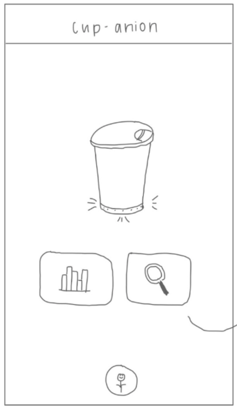
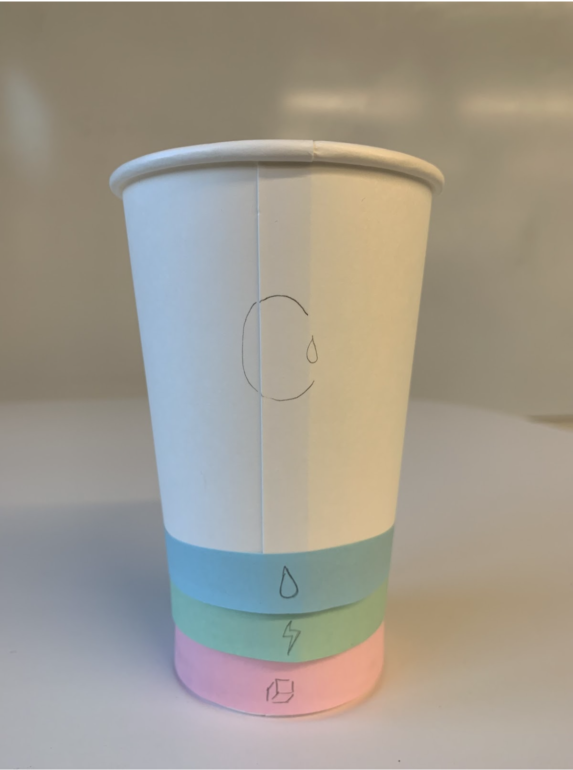
The relation between the rings and lights on the cup and the buttons with the app is unclear.
This issue persisted throughout the usability tests which gave us a lot of potential explanations to include in the tutorial. The iterative design of the tutorial was fickle but important to us because we had the desire to keep time on the app minimal, but at the same time, to do so meant that the person needed to have a better understanding of the cup. We ended up adding a short and simple tutorial of the cup that launches when the app is opened for the first time which is shown below.

A brief walkthrough of of the cup and app functionality.
Participants want a non-intrusive alert system to nudge them towards goals.
Our initial prototype utilized three rings of light around the bottom of the cup, where the color of the light indicates how far from the goal the participant is. In the image below, the third goal is not being met, so the light is glowing red.
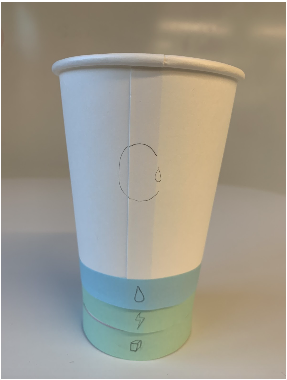


As the participant drinks too much sugar, the sugar ring (bottommost) starts to glow red.
Participants found the consistent lighting to show goal status distracting and told us that they would prefer the default light for the goal status to be off, and only come on as a nudge when the participant was straying from their goals. They also revealed that they would want some customization towards what colors that nudge could be so as to avoid difficulties with seeing colors, or finding some colors more or less distracting that what they would like. To address this we implemented their advice, giving default off lights on the base of the cup with an option to select color of the light when setting the goals.


The ring associated with a specific goal starts to glow in accordance to the reminders set by the participant in the app.
Participants want a way on the cup to see daily progress
Some participants wanted to be able to view their daily progress on the cup itself, feeling that it would be less distracting than having to pick up their phone and look at their data through the app. Again, the iteration of this design element was trying to strike a balance between the simplicity of the design, and the control granted to participants. In the end we added a second set of lights that would indicate participants daily progress (seen around the logo).


The progress ring starts to fill as the participant gets closer to their goal.
Resulting Design
The final design of the Cup-anion Cup contains three rings around the base, and three rings around the logo. The bottom rings light up to nudge a user about their goal, and the top rings start empty, then fill in as the user gets closer to their daily goal to indicate progress.

The final mockup of Cup-anion.
Say we have a hypothetical new user of our design. They have already gone through the tutorial and are ready to set a goal in our app. They can go to the settings tab as stated in the tutorial and easily set a water drinking goal. When setting the goal, the user has the power to change the frequency of reminders, the amount to be tracked, and the color to set that ring to. Once the goal is set, they’re ready to start drinking!


The user is able to set a goal with their desired amounts, frequency of reminders, and color association.
As the storyboard shows below, a user starts their day off with the top progress ring at zero. As the day goes on, their water ring starts to glow, nudging them to drink some water. The user sees this and drinks some water, causing the top progress ring to fill up a bit.
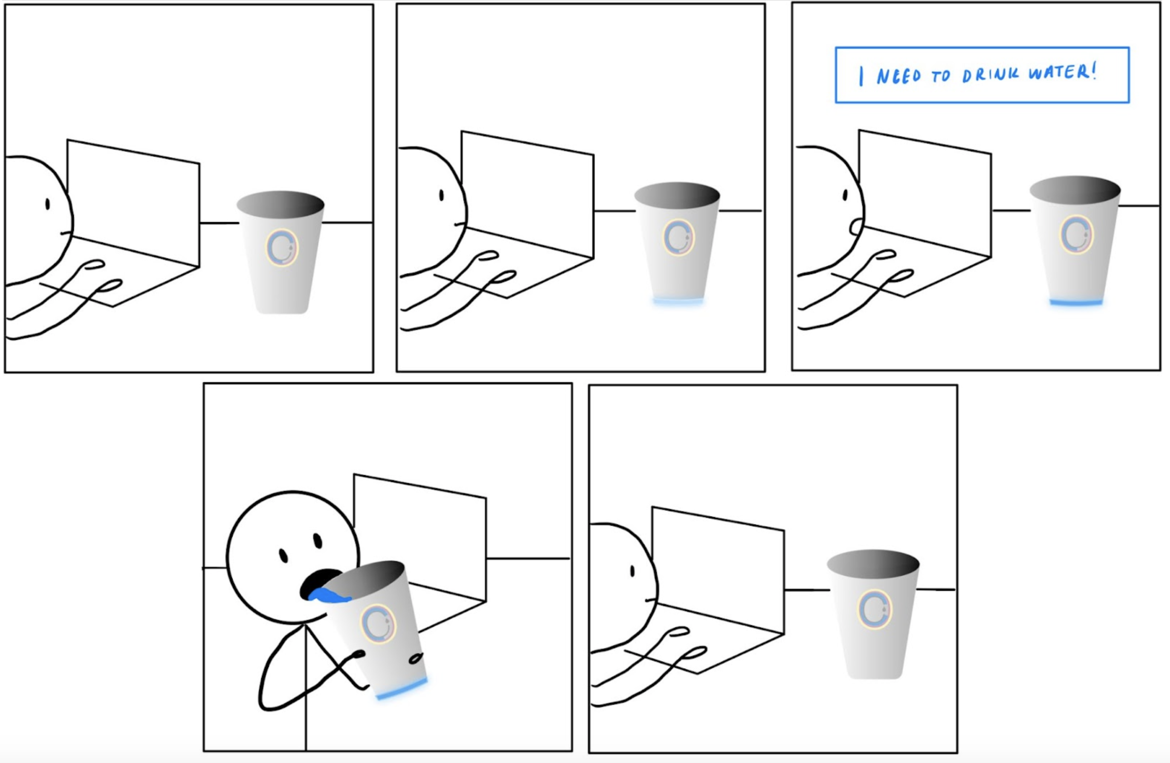
The user is reminded to drink more water after some time, and the progress ring fills accordingly.
Then say this user is now curious about how much sugar they’ve consumed in the past day. As shown in the series of images below, they can see that their sugar consumption seems to peak at four specific times as recorded by the cup. Seeing the yearly stats is also easy, by just clicking on the year button at the top. Now empowered with these statistics, the user can make changes to their diet/drinking habits accordingly.
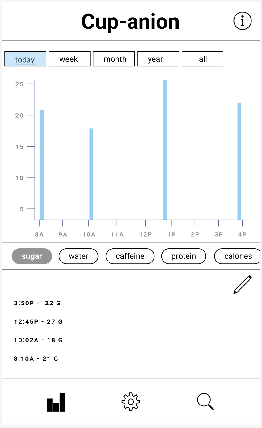


The user can look at their statistics for any time period since they started using Cup-anion.
Now looking at the statistics, the user forgot that they drank a Starbucks latte which wasn’t poured into the cup. By pressing the search button, they can manually log a drink that they had outside of their Cup-anion.


The user can search for a drink they did not use Cup-anion for in our database and add it to their drinks consumed in the app.