Closr
Bringing couples together in new ways
Team Members


Problem and Design Overview
Currently, the inability to communicate is pointed out as the most common reason why marriages and relationships end (65%) [1]. Along with this, many couples don’t know how to improve their communication or relationships as “54 percent of Gen Z singles ‘regret following their friends' dating advice because they felt like they made the wrong decision in the end” [2]. This lack of open communication and improvement in relationships often leads to a partner feeling frustrated or disconnected, ultimately leading to seperation.
Perhaps if relationships had a tool to track their and their partner’s needs, the different activities they engaged in together, and how they spent their time, communication could open up and relationships could improve. Many services have set out to improve relationships and interactions; however, many of these focus on the tracking and problem, and give no solution or advice. Closr encourages positive behavior and includes fun, easy, and quick ways for partners to actively engage in their relationship. They can easily find time to spend together by having the app merge their calendars and find times they are both free. Couples can keep track of their desires and goals in their “bucket-list”, where they can easily add these events to the calendar or find a time to do them , find new activities, and actively engage in their relationship. Finally, the app suggests new things for partners to do based off of their bucket-list.

Design Research Process
Goals
The main goal of the interviews with the targeted participants was to gain a better understanding of how couples communicate, interact, and interests. We mainly focused on learning about their expertise and the patterns they have had the chance to observe in their own relationships.
Methods
Our design research consisted of semi-structured interviews with target participants. The questions were centered around patterns in their relationships and interests about certain services. Although we were concerned that these topics may be too vulnerable for people to talk about with us, we found that people were actually quite open and lots of information could be interpreted from body language.
Participants
We sought out individuals in our target demographic: 18-25 year-olds that have been in a relationship for 6 months or longer. We chose these participants because we didn’t want people to still be in their honeymoon phase, and thus could be interested in the app. Our participants were in varying lengths and types of relationships, as seen below:
- Daniel: 21 year-old student in a long distance relationship for ~2.5 years
- Sally: 20 year-old student in a relationship for just over 6-months, partner lives in neighboring city, first serious relationship
- Lauren: 21 year-old student in a relationship for ~10 months, partner lives a 5-minute walk away
Design Research Key Insights
Not Looking For Therapy
During the interview, we asked our participants if they thought a professional would be useful or important to them in terms of their relationship, to which our participants expressed how they did not want this. Our participants saw this as unnecessary, as it would be more so for a relationship with a serious problem. They felt as though if the focus of our technology was therapy, then they would need to have a problem within their relationship in order to use it. Instead, our participants wanted something more fun, playful, or lighthearted. This would allow them to improve and grow in their relationships without adding any undue burde
Couples Often Repeat the Same Activities / Stay in the Same Cycles
We observed that our participants often repeated the same activities when they were with their partners. This happened for a vast amount of reasons: time, distance, energy, lack of organization or motivation, and feeling stuck on ideas of what to try. When prompted, however, the individuals stated that they get bored with their typical routines and want to try new things. For example, Sally feels she can’t see her partner often enough and doesn’t have time to plan new things. We believed this is where the most room for design was possible, as we could suggest to couples ideas for activities, given the restraints of their relationship.
Couples most often communicate verbally
Each participant stated their most common form of communication is verbally. It is notable, however, to point out that participants did also use non-verbal communication, although less so. Lauren referenced writing letters to her partner, and Sally mentioned journaling as a way to process emotions and feelings personally. Nonetheless, all mentioned they believed verbal communication was most frequent and were most likely to talk about hard conversations verbally
Iterative Design Process
Tasks
We focused our iterative design process around accomplishing two main tasks:
- Couples finding time to spend together.
- Couples finding and doing new activities based on interests.
Process
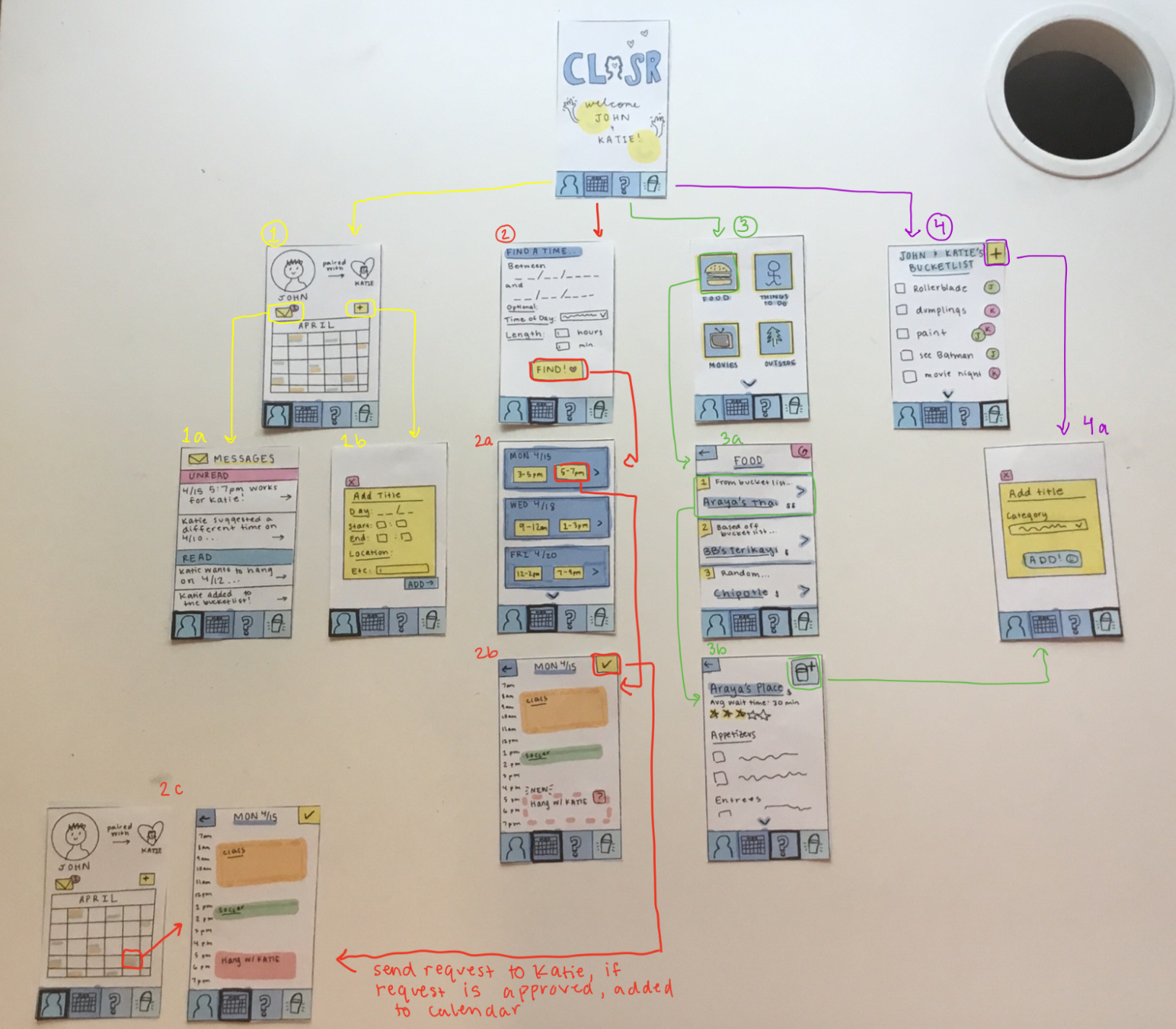
We began with an initial paper-prototype based off of our design research:
Set-Up

Overall
We then conducted heuristic evaluations with our peers to help identify simple usability errors and common issues within our design (seen under “Simple Insights/Revisions” below).
Finally, we conducted usability tests with participants within our target audience. The usability tests included giving participants a paper prototype and tasks to finish, such as setting up the app.
Then we asked them to talk out loud as they completed specific tasks such as setting-up their profile and syncing with their partner, finding a new time to hang out with their partner, finding a new activity to do with their partner, and adding something to the bucket-list.

Iterative Design Process Key Insights
Simplifying Scheduling
Participants were confused that there were two different tabs that had similar appearances but different functionality. We originally had a profile tab where your personal schedule was stored and a separate tab for finding time where both partners are available. This caused issues during our testing, as it was unclear what the differences were since both tabs had a calendar-like appearance. Thus, participants gravitated towards the calendar button when prompted to visit their personal calendar, despite it being located under the profile icon. To resolve this, we combined them into a single, “home screen” tab where a user could see their own schedule as well as choose an option to find time to spend with their partner.
Removing Relationship Assumptions
In an effort to be more inclusive, we ultimately decided to include a tab during the setup process that allows users to select different categories of activities that they would like to have suggested to them. Originally, we had thought of some broad categories that we thought might be applicable to all types of people, such as food, movies, and outdoor activities. However, we recognize that making these assumptions limits who can use our technology because some users with disabilities might not want to receive recommendations for activities that aren't suitable for them. Thus, we decided to add in a screen during the setup process to select categories that would be enjoyable to them so that the suggestions would be valuable.

Improving Functionality
Many users were confused by our original “messaging” system that alerted users of app notifications. They were confused if these were written by their partner or if sent automatically by the app. Thus, we changed them to look like notifications one may receive on their phone from other apps. This makes it clearer that this is not a messaging tool and just an alert that users can interact with if desired.

Users were also confused by the functionality of the bucket-list. They understood its purpose, but were disappointed that they could not directly add those specific desired activities to their calendar. To improve this, we added the calendar button under items in the bucket-list so users could find a time or enter a date for the desired activity. This made the bucket-list an active component in our design that users could engage with, rather than something passive.

Simple Insights/Revisions
In our initial design, we forgot to include back buttons and alert the user of what was happening. This often left users getting stuck and confused. Thus, we added back-buttons and a progress bar in the set-up.

We also added intermediate screens during the “Find A Time” to improve clarity of what was happening.

Additionally, many users found our icons and buttons to not be intuitive. To improve this, we made our icons more clear and consistent with other tools they may have interacted with before.
Resulting Design
Interactions with the design are outlined in bright pink or bright orange
Set-Up
Partners can set up their profile and their calendar, then can sync with their partner or invite them. They also choose their favorite categories of activities to do with their partner, which will be used later on in the app.

Home
When the app opens, the home screen is displayed. There, the user can see any new updates they may have received about scheduling or items added to the bucket list. They can interact with these updates using the buttons on the far right of the updates. Also, users can see their calendar on this page and click a date to see their schedule. They can also add events directly using the yellow “+” button, explained below.

Finding Time to Spend Together
To help couples find time to spend together, individuals have the option to add an event they already know the date/time of, or use the “Find A Time” function / button.
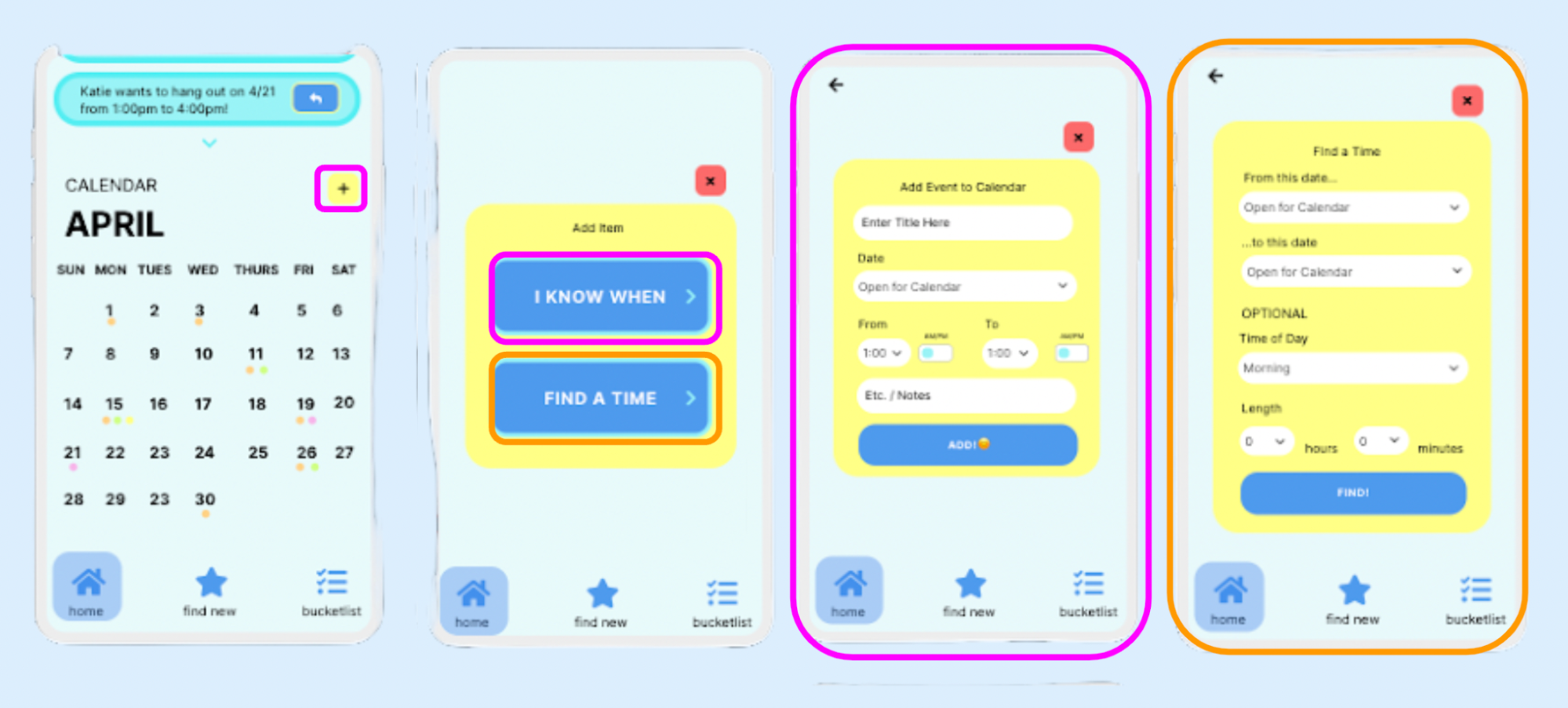
The “Find a Time” function then asks between what dates the user would like to find a time, and optional other customizations like the time of day or length.
The app then merges the partners’ calendars and finds times when they are both available. Once they have found one they like, they can send a request to their partner.

Upon receiving a request, the user can tap on the request and then approve or deny it. If approved, the other partner is notified of the approval (this looks like the top update on the home page) and the event is officially added to the calendar. If the request is denied, the partner is notified and the user is prompted to suggest another time which they can do by finding a new time or simply entering one (“I Know When”).

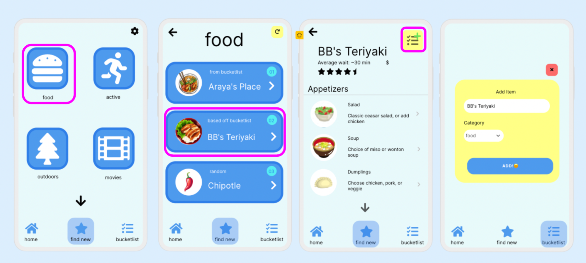
Find and Do New Activities Based on Interests
First, couples can keep track of new activities they want to try in their bucket-list. To the right, we see a filled out bucket list and who added each item.
To add new items, as a user just needs to click the “+” in the top right.

Users can also directly add items on their bucket-list to the calendar by selecting the calendar button. Then, they can find a time to do this or enter a time they already know.

Finally, the bucket-list allows users to view completed activities so couples can reflect and become inspired by past activities.

The bucket-list is also linked to the “find new'' tab that suggests new activities. Couples start by choosing their top 5 activities that they like to do together; these are the “categories” that will appear in their “find new” tab, which they can always adjust in the settings.
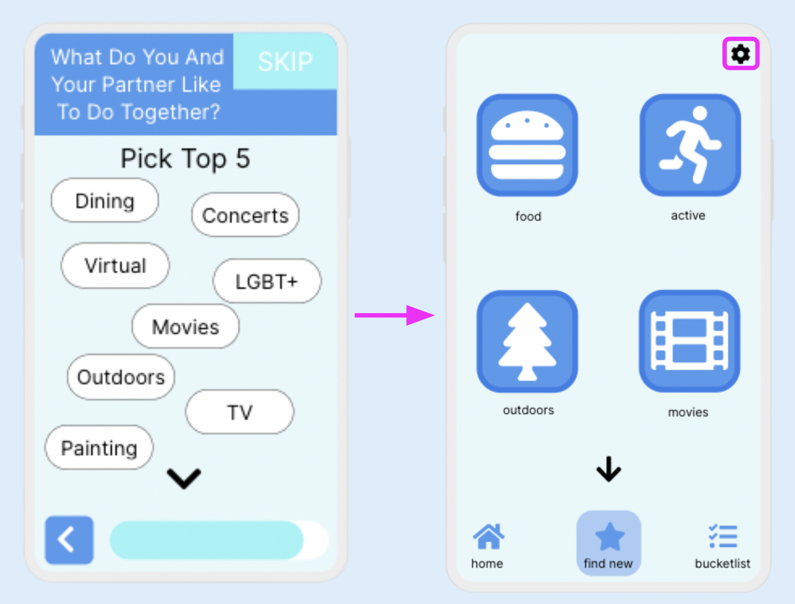
When a user selects a category, 3 options appear: the first item from the bucket-list, the second item based off the bucket-list, and the third item random. If there are no items within that category from the bucket-list, all three are random. The user can refresh until they are satisfied. Then, users can click on an item to view more details, and if they find something they like they can add it to their bucket list.