Clark
Presenting Made Easier
Team Members




Problem and Design Overview
Many people will agree that public speaking is terrifying. It is a daunting task that people are faced with at some point (or many points) in their lives. Despite how difficult it is and how often we are required to do it, it seems like there are not many ways to get feedback and know audience comprehension besides simply asking someone afterwards. Are there better or more accessible ways for people of all ages to improve their public speaking?
To solve this problem, Clark is a cross platform software focused on allowing the presenter to get real time feedback and the opportunity to review their presentation afterwards. This includes the ability to record presentations through the camera installed, review past recordings, as well as collect data on audience comprehension throughout the presentation in which the presenter can reflect back on. The hardware component is paired with a tablet screen that can display time left, submitted questions by the audience, or display emotional support messages. Clark will sit in front of the presenter for easy visibility and to monitor their presentation. This data is synced with the presenter’s phone app and combined with the feedback received through the audience app to give a comprehensive overview of the presentation.
Design Research Process and Key Insights
To tackle our problem, we decided to try to understand the magnitude of the problem first and conducted a series of interviews with students and faculty members who frequently presented in front of multiple people. We chose people who regularly gave speeches to learn what aspects helped them succeed and where we could possibly help them as well as those inexperienced in public speaking, and focused on stakeholders from UW as they were easily accessible. These included three students - a fraternity leader, a Ph.D student with extensive TA experiences, and a Business student - as well as a communications professor teaching public speaking courses. We created a list of open-ended questions to ask each participant, which was updated after each interview, and conducted our interviews with a single note-taker and facilitator. We chose interviews as our primary research method as we felt that there were many factors that would make someone a good public speaker, and we needed to learn from the experiences of our stakeholders themselves.
Delivery analysis:
We started our idea under the assumption that presenters want to learn more about statistics of their delivery: eye contact, number of filler words, pacing, words per minute, etc. This is because we started the project thinking about self-tracking, and these are statistics we can easily track. However, as we interviewed many participants, many of whom are great public speakers, we learned that they are more interested in connecting with the audience, adapting to the situation, and thinking fast on their feet. Moreover, we interviewed a public speaking professor. He conveyed to us that “many engineers try to solve a problem that doesn’t need to be solved,” namely tracking how many times someone used “um” because “even saying ‘um’ is not a problem.” We learned from him that the biggest problem with public speaking is that one speech structure does not fit all, and each occasion calls for different ways of presenting. From then on, our team decided to focus on helping the presenter receive feedback from the audience and connect with them to help the presenter improve. In our SmartWatch design, we incorporate buzzing for the audience to indicate interest/confusion real-time for the presenter to understand the audience’s reactions. In the Social app, we provide a platform for presenters to connect with other presenters with similar backgrounds/goals to practice together so that they can give more relevant feedback for their specific topics. In our Clark the robot design, we incorporated recording and emotional recognition (which we will edit later on) for the presenter to review after a presentation.
Emotion analysis:
Part of the problem we want to address is how the presenter can better record and analyze the impact of their presentation on the audience. From interviews, we learned that presenters’ common goals are to connect with the audience. However, because of anxiety and lack of experience, the presenter often cannot clearly analyze the audience’s reaction when they’re presenting. Therefore, our original idea is to use Clark to record the audience during the presentation and analyze their reaction using artificial intelligence. However, through further critiques, we learned that facial emotion recognition is unreliable and biased. It often works ineffectively for people of color, for instance. Another design of ours, the SmartWatch, doesn’t use emotional recognition to receive feedback, and instead, it buzzes when the audience indicates interest or confusion. The participants we interviewed gave feedback that the buzzing can induce anxiety. Moreover, it is a distraction. Therefore, we decided to choose the Clark design, remove the emotional recognition aspect, and opt for personal written feedback directly from the audience.
Importance of Speech Content:
One insight from our interviews that we hadn’t focused on previously was the significance of having good content within a speech. The communications professor from our interviews had emphasized that hitting all points within a rubric of main points or ideas was more important than the delivery of a speech, stating that “20% of a good speech is delivery. 80% is the actual content of the speech.” Thus, when we considered possible solutions and designs, we contemplated adding functions to help the speaker remember their key points of their speeches, or displaying the actual script itself. This was one of the main tasks we attempted to undertake with our mobile game and social media application design, where users can ensure key points are addressed within a speech. Though we decided to proceed with our Clark design due to the potential distractions of reading a script from a mobile device, we had provided options via customizable widgets for users to remember the main points of their presentations.
Iterative Design Process and Key Insights
Our iterative design process was heavily centered around usability testing in order to identify areas of our paper prototype that functioned properly, and likewise areas that were difficult or unusable. The goal here was to capitalize on favorable design choices while making adjustments to weaker areas to slowly bring Clark towards a design that presenters could find beneficial. In order for this to happen, we needed our participants to have a smooth and seamless experience with our paper prototype. On our side of the usability testing process, this was achieved via 5 key roles: the Presenter Operator (Clark + App), the Audience Operator (Audience UI), a Facilitator, and two Notetakers.
Our design focus was ensuring that presenters could easily interact with the Clark app and use it to give effective presentations whilst connecting with their audience. Thus, the tasks given to the presenters were to prepare for a presentation, give a presentation, and view the recording of a previous presentation. Additionally, we tasked the audience with interacting via their side of the Clark interface because we wanted to make sure that audience members were able to meaningfully communicate their content understanding to the presenter.
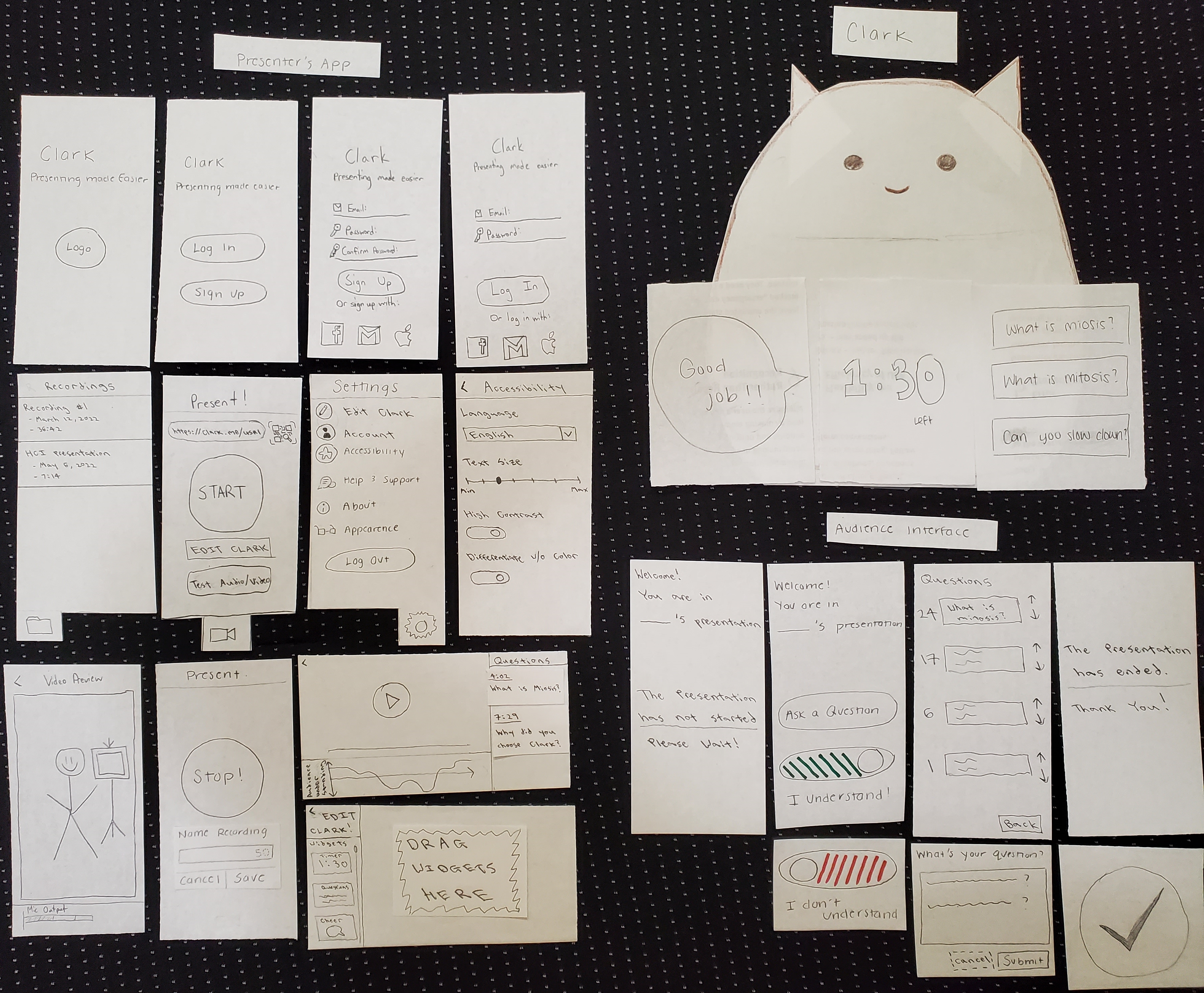
Through high repetition of usability testing and prototype adjustments, we were able to flush out a solid paper prototype.
Improving Edit Clark Option
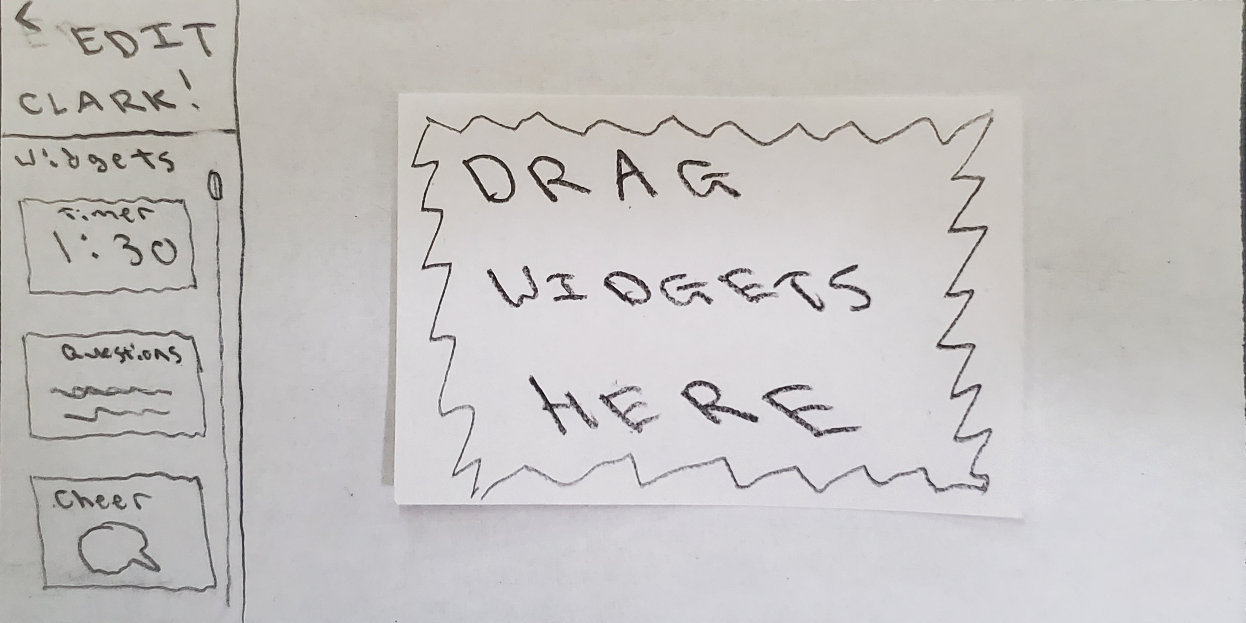
One area that was fleshed out thoroughly during usability testing was our option to edit Clark’s display screen. For instance in initial tests, it was not clear to a participant that they could edit Clark’s screen by going to settings and appearances, or when they got there what to do. Because the presenter’s ability to customize Clark to best suit their needs is important to us, we added an additional button on the home screen that directly goes to the edit clark screen. We also added text instructing the participant to move widgets to the representation of Clark’s screen. Some participants wanted a higher level of customization to be able to drag individual components to specific locations, while others did not mind the default layout of Clark, so we also included the option of presets.
Improving Audience Feedback
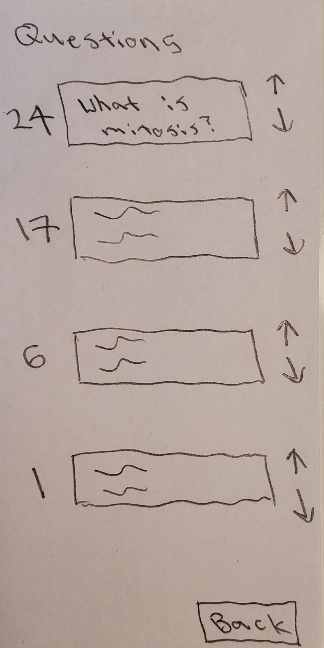
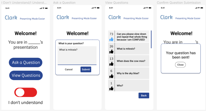
Initially, audience members are able to do two things: indicate understanding, and ask questions. While the audience interface is intended to be simple, we received a lot of feedback regarding the function that allowed audience members to ask questions throughout the presentation. Many participants felt that there ought to be a way for them to view questions asked by other audience members, as well as vote on the ones they felt were particularly good questions. This insight emerged when we prompted participants to ask a question, at which point, many of them wondered if a similar question had already been asked. Some direct quotes are “I wonder if anyone else is confused about this” and “Is there a way to see if someone has already asked this question?”. We iterated upon this design by adding a panel to allow audience members to view and vote on questions:
Improving Accessibility
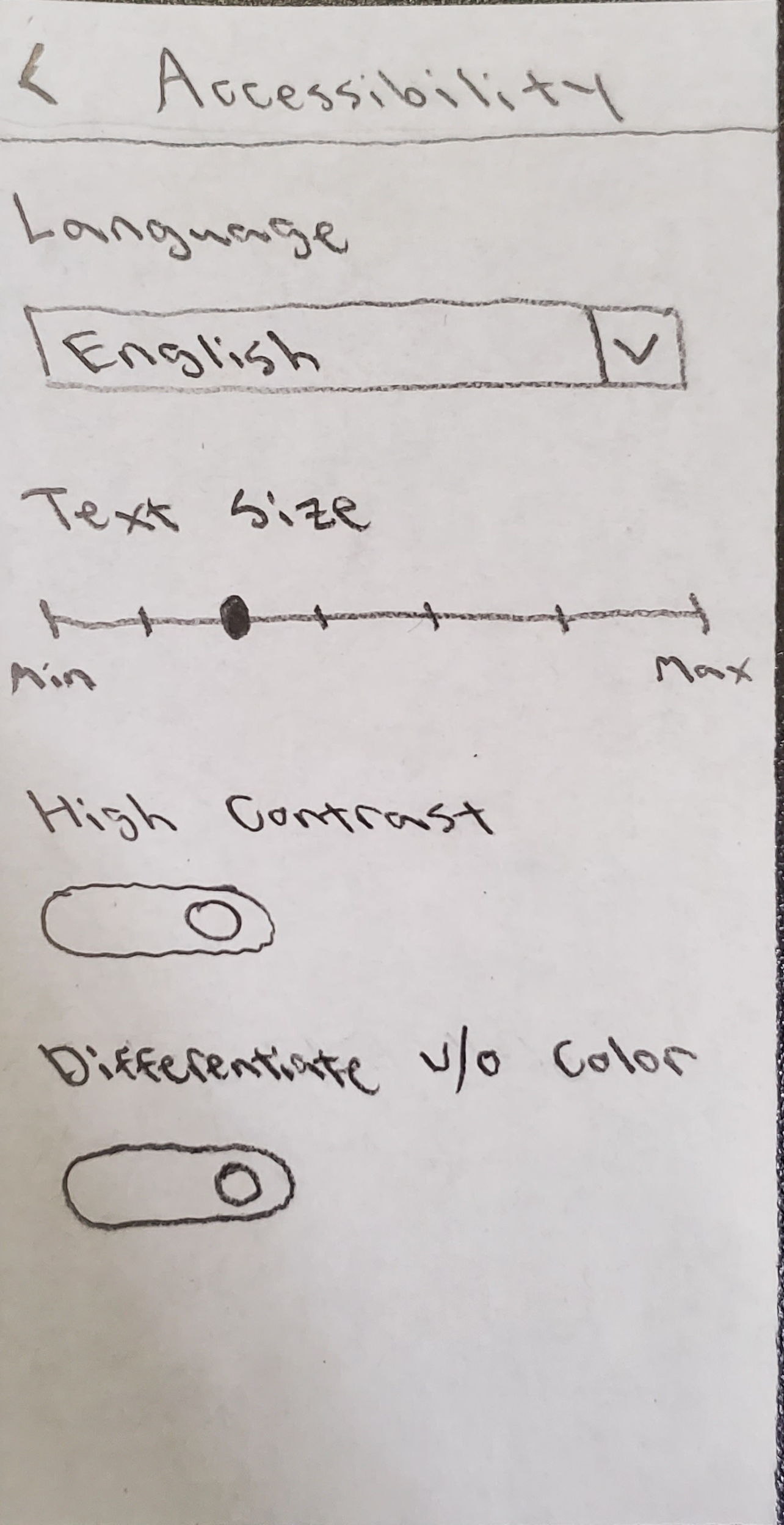
As we worked on our paper prototype, we referenced commonly used apps and interfaces. In addition to things like changing text size, we found that iPhones also offered the option to “differentiate without color”. One team member also pointed out that our prototype assumes that the user reads English. Because we wanted this to be accessible to people who spoke other languages, we also included the option to change the language the presenter’s app was in.
Resulting Design
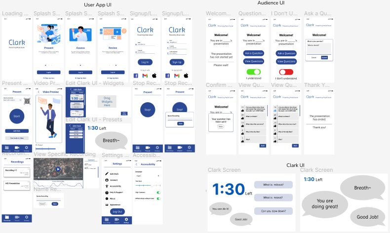
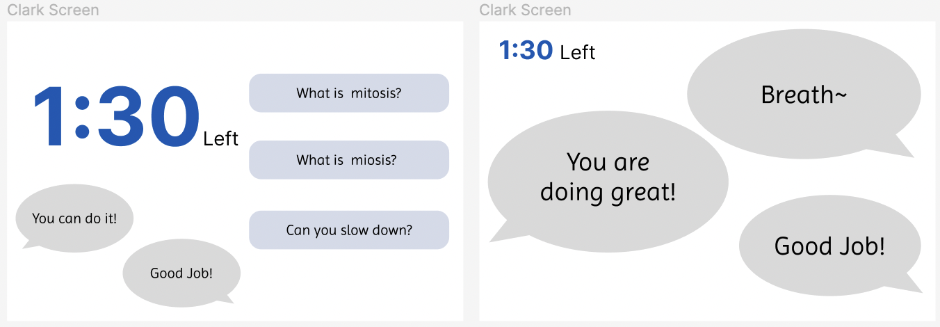
Our design has three components: the presenter app, the audience app, and the Clark screen. The presenter’s goal is to record and save a presentation, and look back at the recording and interest levels. The presenter app is for the presenter to start presentations, edit Clark screens, and review recordings afterwards. The audience app is the platform for audience to submit questions, indicate confusion, and give feedback. The Clark screen sits on the podium. Its display is customizable and can show information such as audience questions.
Task 1: Getting feedback during the presentation
Step 1:
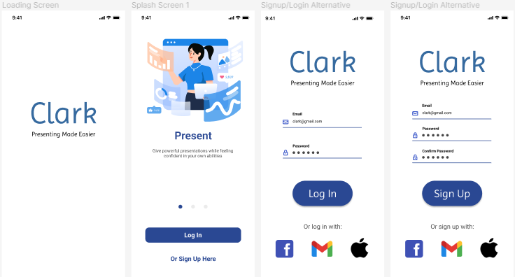
The presenter logs in/sign up through the app.

Step 2:
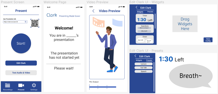
The presenter shares a QR code with the audience so they can access the presentation feedback platform on their phone. The presenter clicks Test Audio/Video to access a preview. The presenter clicks on Edit Clark to add/remove widgets from Clark. The presenter clicks Start to start presentation and recording.
Step 3:
The audience platform allows submissions for questions. Upon submitting a question, a check mark indicates the question submitted successfully. The audience also has the option to look at other questions that have been submitted and upvote the ones they agree with. To express general confusion not tied to a question, the audience also has a toggle to indicate confusion.
Step 4:
The submitted questions will show up on the Clark screen for the presenter to read.
Step 5:
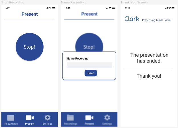
The presenter ends the recording and saves it with a particular name (with a character limit). The screens for each audience member that joined displays a thank you page.
Task 2: Accessing the interest / confusion level of the audience after the presentation
Step 1:
The presenter logs in/sign up through the app.
Step 2:
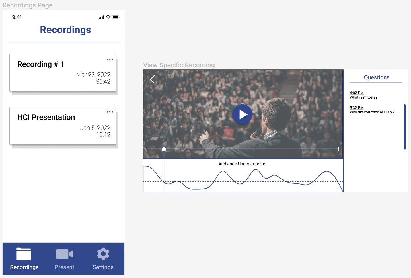
The presenter heads to the recordings tab and selects the recording they wish to view (img 1), and uses the slider to find where the audience asked the most questions and where a large portion of the audience understands or doesn’t understand the content (img 2).
One area that was fleshed out thoroughly during usability testing was our option to edit Clark’s display screen. For instance in initial tests, it was not clear to a participant that they could edit Clark’s screen by going to settings and appearances, or when they got there what to do. Because the presenter’s ability to customize Clark to best suit their needs is important to us, we added an additional button on the home screen that directly goes to the edit clark screen. We also added text instructing the participant to move widgets to the representation of Clark’s screen. Some participants wanted a higher level of customization to be able to drag individual components to specific locations, while others did not mind the default layout of Clark, so we also included the option of presets.
