Bloom
Where the future of your investment education lies
Team Members


Problem and Design Overview
Bloom is an investment education app that equips you with the personalized knowledge and tools to make the most informed investment decisions when it comes to stocks and crypto. Educational tracks help you get started or continue where you left off on your journey of learning about investing. Personalized tasks help you use your newfound knowledge by taking action: be it as simple as creating an investment account, or as complicated as analyzing a chart to identify crucial patterns. The focus of our design was to present information in the most beginner-friendly way, trying to stick to simplicity and try to make the interface as intuitive for the users as we can. Our design tries to incentivize learning in various ways: learning streaks, progress tracking, and an in-app currency awards for completing lessons and tasks which could be used to purchase merchandise. The target demographic of Bloom are students in college. Students often lack the investment knowledge and resort to putting off investment education until later in life. However, allowing the students to make mistakes and learn early when their financial decisions are perhaps not as impactful as the financial decisions they will make later in life allows them to succeed later in life and also increase their time in the stock and crypto markets.
Design Research Process and Key Insights
The primary focus of our design research was to better understand what college students already know about personal finance, and what specifically they struggle with in personal finance. For example, are they hesitant to begin learning about personal finance? Are there specific topics they struggle with, such as understanding budgeting versus understanding investing? Because our broader goal was to assist college students in personal finance and encourage them to start on it early, we needed to understand where students are in their personal finance journey.
The six participants for our design research were all college students, but were diverse in their areas of study and year. We had at least one participant from each year, and we included STEM majors as well as Business, CMS and International Relations majors. We chose to have a diverse set of participants because students from different majors and years would likely have different knowledge about personal finance, yet we wanted our design to cater to any college student. For example, a senior studying business may have very different knowledge about personal finance than a freshman in a STEM major. In our design research process, we focused on having interviews. Interviews would allow us to gain a better understanding of students’ personal finance knowledge as well as their expenses, investing, and budgeting without having them provide us any financial information they may want to keep private. In our interviews, we asked them what financial accounts they had, how they obtained information when making financial decisions, and the issues they faced when trying to become more involved in personal finance.
Key Insights
Lack of Substantial Information
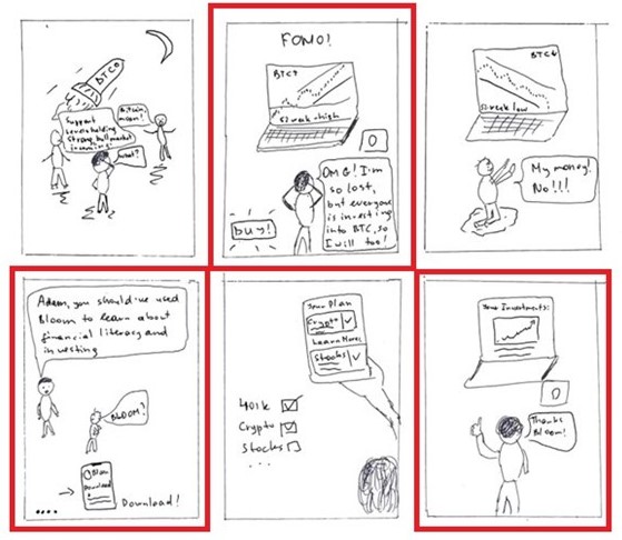
Every single one of our participants shared that they had the desire to become more financially literate. They were curious about investing, taxes,and cryptocurrency. When asked about how participants obtained financial information about these topics, they mentioned diverse sources, such as from friends and family, YouTube videos, Reddit and other social media, as well as a multitude of websites. However, several participants shared that this information was often overwhelming and confusing. The overload of information left them confused and still unsure where to begin. One of our participants said that they would enjoy “educational material that starts from ground zero”. Similarly, another participant said that she wanted to become an expert in investing. Another participant stated that while they felt confident in small-scale financial decisions, they were hesitant to invest because they did not have sufficient information. This insight tells us that participants could benefit from a centralized hub of information that is simple and inclusive for anyone regardless of their prior experience with personal finance. We felt that a mobile app is an easy way for any college student to learn in a way that is always accessible and cheap. As such, we decided to iterate on our mobile app design. Below, our storyboard for our design emphasized this insight of having insufficient information.
Balancing Personalization and Privacy
Multiple participants indicated that if there was some way to learn and guide them in investing/other personal finance topics, personalization would be helpful to differentiate it from the loads of information that is available online. However, participants also had a concern of privacy. For example, one participant said that she wanted to become an expert in investing and would love to view videos or use apps to learn more about it, but when suggested the idea of personalization said that she “doesn't know if personalized tracks are hard to trust”. As such, when we created our idea of a mobile app, we ensured that there was a good balance of personalization and privacy. We prioritized getting some financial information from the user such as how much knowledge they have and what kinds of accounts they have, but not asking for sensitive financial information.
Providing Other Pathways
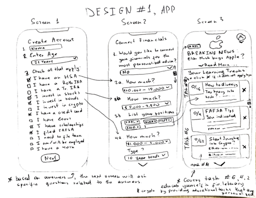
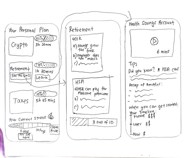
Multiple participants told us that they planned to save their money they were going to make in their summer internships and jobs. Because our focus is to teach college students about other actions they can take with their money (invest into stocks, crypto, etc), we wanted our mobile app to help users understand how else they can use their money. Multiple tasks were created from this insight: Understanding the Risks and Rewards of Cryptocurrency, and Investment Advice. When we were creating the design sketches for our app, we ensured that the learning tracks would prioritize tutorials on getting started with new concepts and taking action rather than simply learning these concepts simply theoretically. This can be demonstrated by screen 3 of our our initial app sketches below:
While we made the separation between tutorials and actually taking action later on, this insight made it clear we wanted to focus on having our app motivate users to learn about new concepts in personal finance and actually use these lessons to take action.
Iterative Design Process and Key Insights
Our iterative design process focused on three main tasks:
- Signing up and personalizing the content based on your knowledge of investing in stock and crypto markets
- Going through personalized educational tracks
- Taking action (creating a stock account, crypto account, etc.) to get rewarded for it.
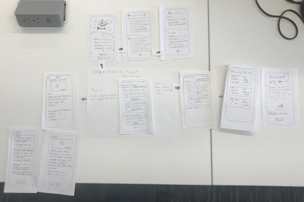
We started off with a rough paper prototype of our idea. We then iterated over our paper prototype as the design research methods we used revealed insights to make our design better. We conducted inspection based methods, usability testing and heuristic evaluations before finalizing the paper prototype and transferring it over to a digital mockup.
These design research methods revealed three key insights in our design iteration.
Make Information Easy to Read
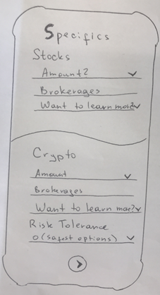
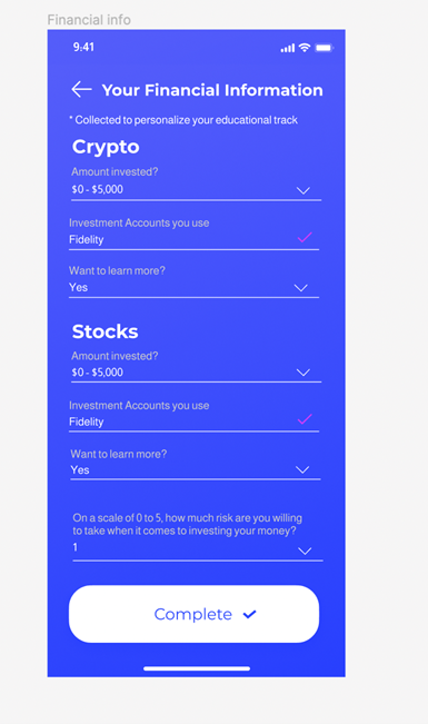
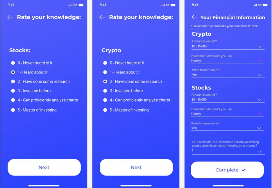
During our usability tests, we received feedback that stated our sign up process was too “overwhelming”, “too cluttered” and “asking for too much information at once”. The screen in question had drop downs for additional questions and was split into multiple categories such as current investment amount, risk tolerance, retirement accounts, and general questions about their knowledge. Users found it hard to understand how and why they had to enter all this information. We iterated over this feedback a few times and implemented these changes:
- We narrowed down the app to focus just on stocks and cryptocurrencies.
- We split the sign up questionnaire into 3 screens instead of trying to fit everything into a scrollable screen.
- We also included a mini click through tutorial to explain why we needed the information.
Mini Tutorial:
Our main screen:
Eliminate assumptions and increase inclusivity
Usability testing also revealed that users might not understand certain financial terms we used in our design such as “brokerage” and “risk tolerance”. Since our app is designed for college students at the start of their journey, we changed the wording of our designs to use simpler terms. For instance, we changed brokerage to investment account.
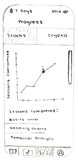
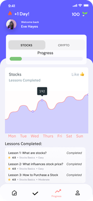
Implement User progress and result tracking
Participants indicated that it would be beneficial to see the lessons and tasks they have completed. During usability tests, they inquired about accessing their previous results but realized there was no way to do so because our initial prototype had no way to view progress, and we then iterated to create a way to view progress. However, we got further feedback that our progress tracker was not very intuitive and that a graph representation would be beneficial and easier to understand, thus we created a graph representation.
Resulting Design
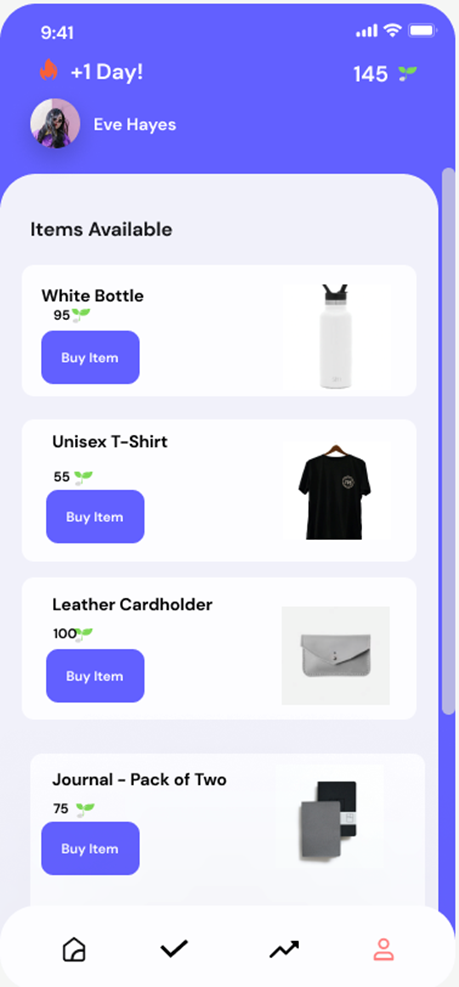
Our resulting design is as follows in the sequence of images below. Essentially, we wanted a clean design that was easy to follow. The first task is that the user learns about stocks or crypto through lessons and videos. The second task is them taking action. For example, one of the tasks they could do is create an investment account and then later, choose to apply their knowledge in the real stock and/or crypto market. They also can earn “bloom seeds”, our in-app cryptocurrency that they can later use to buy Bloom merchandise.
This is the welcome screen that the user sees as soon as they open the Bloom app.
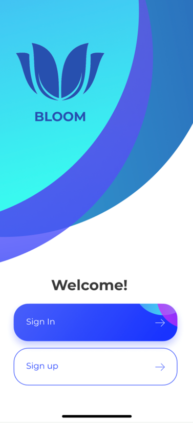
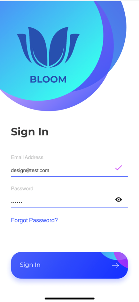
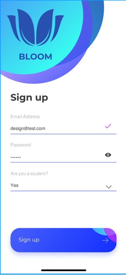
This is the log in/sign up screen the user sees next depending on whether they want to sign in or sign up.
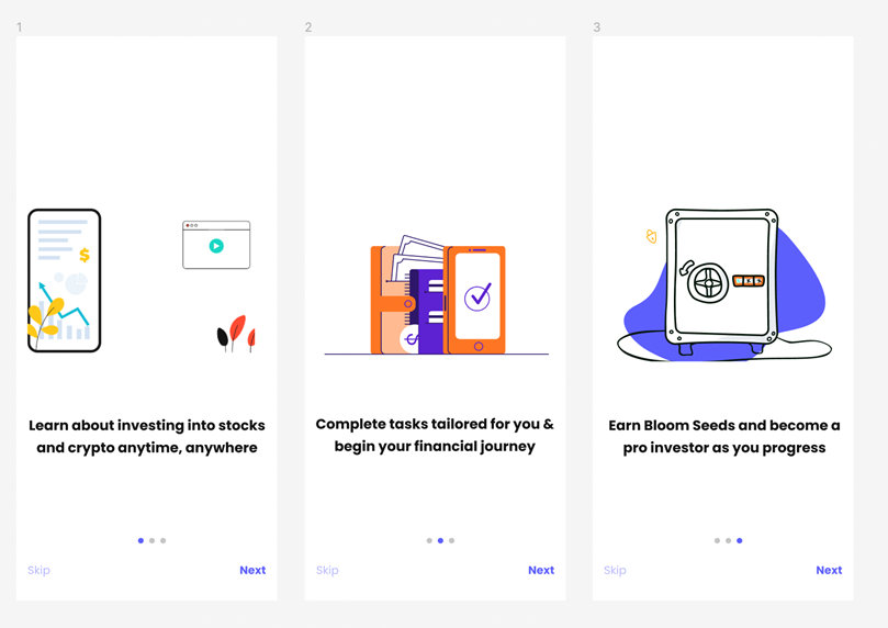
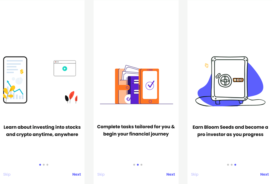
This is the next screen the user sees if they want to sign up to give the users a quick summary of what the Bloom app is.
They are then taken to a mini questionnaire where they are asked additional questions so that a specific plan is tailored for them.
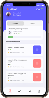
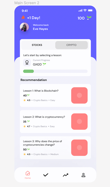
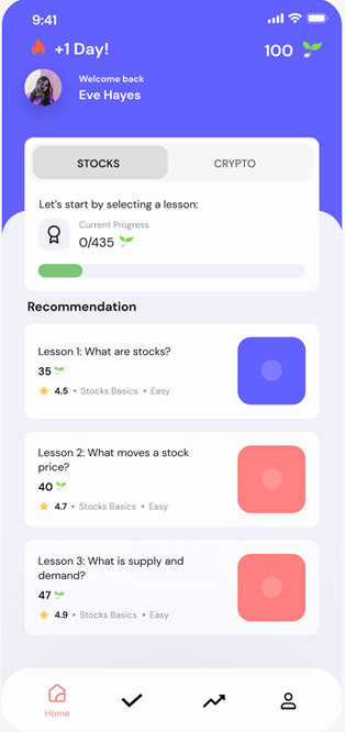
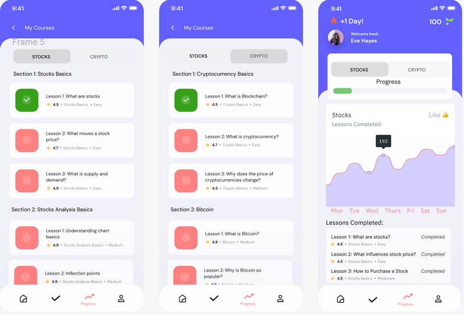
This is the home page where users will be able to see the stocks and crypto lessons.
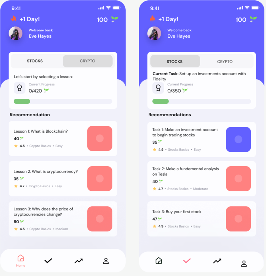
Task 1: Learn
Users are directed to the main screen where they can pick lessons to start.
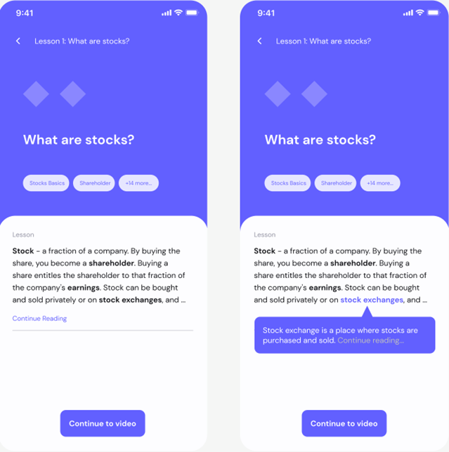
After picking a lesson, they are redirected to an information page that breaks down the concepts. There’s a pop-up to provide definitions for all financial literacy related terms that the user might not know.
They are then guided to watch a video. Here they can interact with other users and have a discussion.
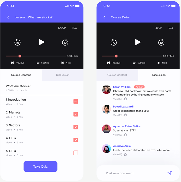
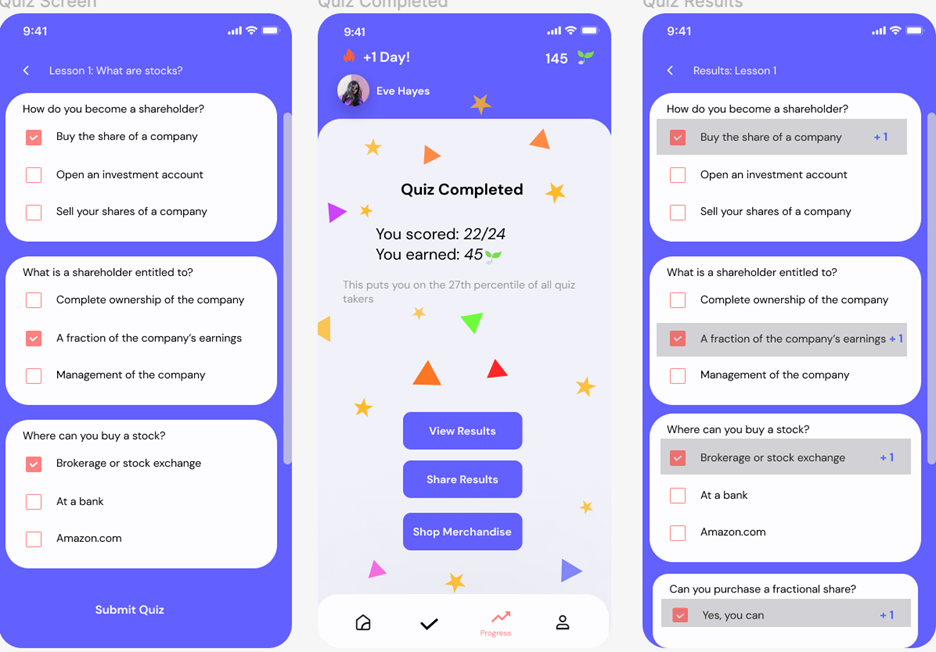
Next, they can take a quiz to see how well they’ve understood the material. The quiz is designed to test their knowledge of the lesson and users can view their results after taking it. They also earn bloom seeds as a reward.
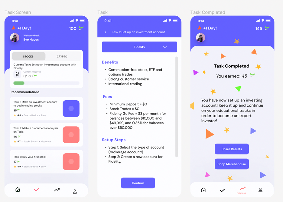
Task 2: Take Action
Users can follow step by step guides to get started on their financial literacy journey. They also earn bloom seeds as an incentive for completing the tasks.
We added a progress screen so that users can track progress. It allows you to view past (completed) lessons, and see any future lessons. It also allows you to filter by Stocks and Crypto progress.
Users can use their bloom seeds earned throughout their time on this app to purchase merch as a reward.