name: inverse layout: true class: center, middle, inverse --- # Interactive Application Design ## Design Principles and Metaphors Lauren Bricker CSE 340 Winter 23 --- layout: false # Interfaces .left-column50[ 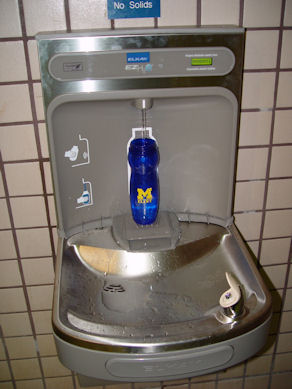 ] .right-column50[ Would you know how to drink out of this water fountain? - What are the human interfaces? - How can you tell how to interact with this machine? ] --- # Interfaces .left-column50[ 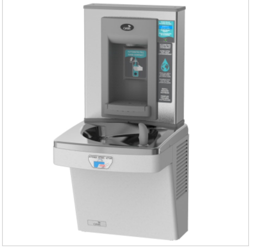 ] .right-column50[ Would you know how to drink out of this water fountain? - What are the human interfaces? - How can you tell how to interact with this machine? ] .footnote[[Oasis Cooler Ad](https://www.oasiscoolers.com/index.php/products/pressure/wall-mounted-and-recessed/contactless-versacoolerr-ii-with-contactless-versafillerr.html)] --- # Interfaces .footnote[[Oasis Cooler Ad](https://www.oasiscoolers.com/index.php/products/pressure/wall-mounted-and-recessed/contactless-versacoolerr-ii-with-contactless-versafillerr.html)] .left-column50[  ] .right-column50[ Does this help?  ] --- # Interfaces .footnote[[Oasis Cooler Ad](https://www.oasiscoolers.com/index.php/products/pressure/wall-mounted-and-recessed/contactless-versacoolerr-ii-with-contactless-versafillerr.html)] .left-column50[  ] .right-column50[ Or would this?  ] ??? - Realworld example, fails to work effectively. - Sign found right next to the fountain. Also sign on the fountain. - Good or bad example of interface design? Do you normally have to read instructions to use a water fountain? - What about an IR faucet? - Often, person using the interface feels stupid or that they shouldn't use it - Who can use your interface and who can't. As designers you have the power to make an interfaace usable. --- # Interfaces .footnote[[Oasis Cooler Ad](https://www.oasiscoolers.com/index.php/products/pressure/wall-mounted-and-recessed/contactless-versacoolerr-ii-with-contactless-versafillerr.html)] .left-column50[  ] .right-column50[ - Realworld interface fails to work effectively - May be frustrating to some users when first interacting with it. - If you need signage to use it, are there those who don't notice or can't read the sign? - But who *can* use the interface? As designers you have the power to make an interface usable and inclusive. ] --- [//]: # (Outline Slide) # Today's Agenda - Administrivia - Menus part 5-6, due Thur 16-Feb at 10pm - Post privately on Ed to ask for the `.apk` if you need it. - Undo will be out Wednesday. - Reminder: Analyzing menus - From the spec for your report: *You must use two different types of charts in this section (bar graph, histogram, scatter plot, etc.)* - Learning goals - Define Metaphor - Explore what it means to create a good mental model - List Design Tips for Interaction Design - Define Feedback and Feedforward --- # Metaphor .right-column[ Lakoff & Johnson, Metaphors We Live By .quote["...the way we think, what we experience, and what we do every day is very much a matter of metaphor."] ] --- # Metaphor .left-column30[ 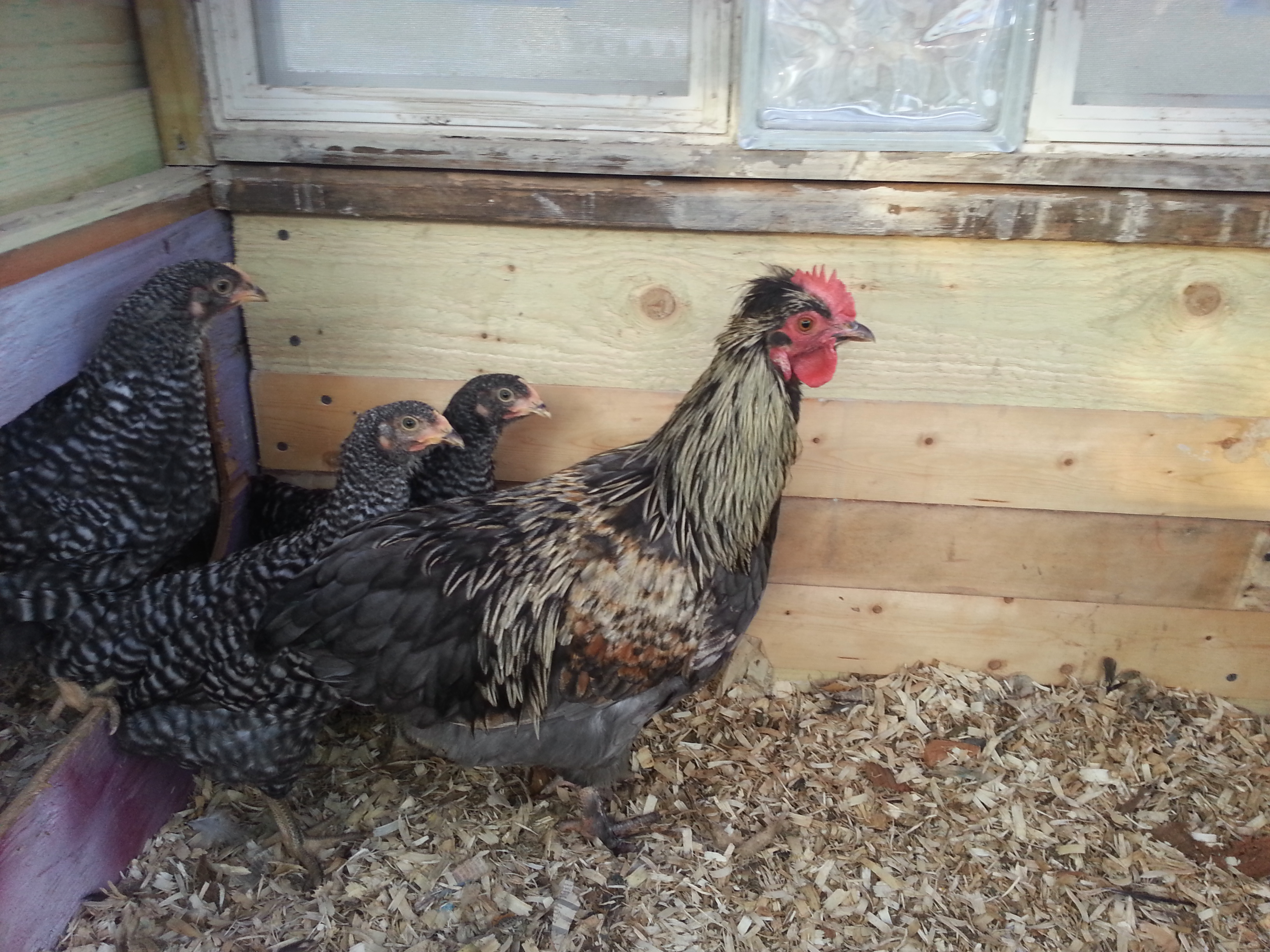 ] .right-column70[ Have you ever noticed how many chicken metaphors are in the English language? .font-smaller[ - “A hen is only an egg's way of making another egg.” - Samuel Butler - “The key to everything is patience. You get the chicken by hatching the egg, not by smashing it.” - unknown - "Regard it as just as desirable to build a chicken house as to build a cathedral." - Frank Lloyd Wright - "A chicken in every pot" - 1928 Republican Party campaign slogan - "Don't have a pot to put it in" - 1928 Democratic Party response slogan - Nest egg - to save a little money each week - Scratching out a living - to earn enough to get by on - Don't count your chickens before they hatch - don't plan on an outcome before it actually happens. - Don't put all your eggs in one basket - don't plan on an outcome before it actually happens. - Feather your nest - saving for the future - Mother hen - very protective - Flew the coop - gone - Walking on eggshells- treading softly where certain people are concerned; trying not to upset someone - Like a chicken with it's head cut off - running around with no direction - You're chicken! - being afraid - Hard-boiled - tough attitude - Ruffle your feathers - something annoys you - No spring chicken - you're old. Plain and simple. - Hatch an idea - put a plan into motion - Pecking order - finding your place - Brood over it - to worry; to hover over a problem - Chicken scratch - poor handwriting - Stick your neck out - go to bat for someone else - Stuck in your craw - upset about something and won't verbalize what's going on inside you; carrying a grudge. - Bad egg - less than honest person; poor moral standards - In a stew - got yourself in trouble - Raise your hackle feathers - visibly annoyed - Nesting behavior- preparing a home (especially pregnant women just before a baby is due) - Empty nest syndrome - depression and loneliness when children leave home - Made from scratch - made from raw materials by hand ]] --- # Desktop Metaphor (Magic Cap) .body[ 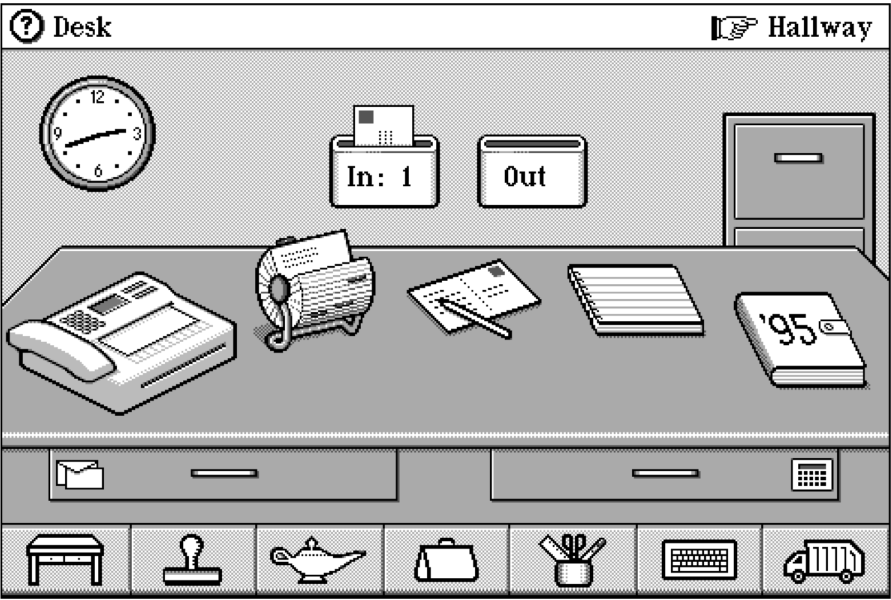 Critique! ] ??? - Is this a good interface or not? - What are some of the challenges of this? - Unwieldy, - Not great use of screen real estate - Other? --- # Are these better? .left-column50[ 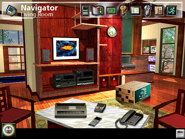 ] .right-column50[ 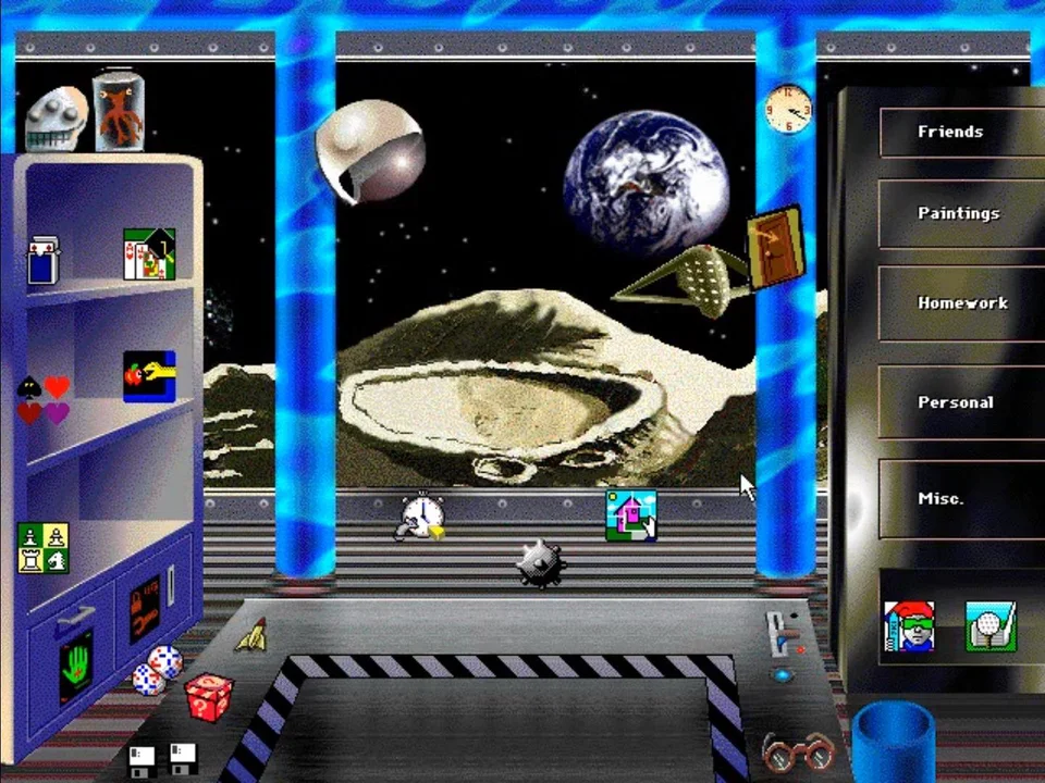 ] .footnote[[Packard Bell Planet Wiki](http://pbclub.pwcsite.com/wiki/index.php/Packard_Bell_Navigator), [reddit](https://www.reddit.com/r/nostalgia/comments/6w951x/packard_bell_navigators_kidspace/)] --- # Is this a better option? .right-column50[ Can use metaphors to leverage existing conceptual models - Not really an attempt to simulate a real desktop - Leverages existing knowledge about files, folders, trash - A way to explain why some windows seem blocked ] .left-column50[ 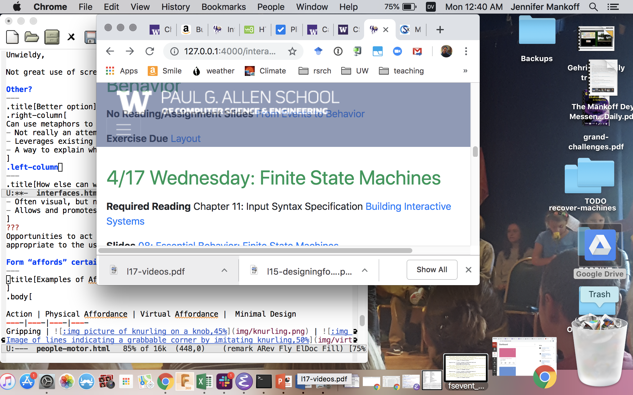 ] --- # How else can we minimize errors? ??? Key concept: mental models -- Key concept: [Mental Models](https://www.nngroup.com/articles/mental-models/) -- count: false .quote[ ... the model people have of themselves, others, the environment, and the things with which they interact. People form mental models through experience, training, and instruction" ] .footnote[Don Norman, _The Design of Everyday Things_, 1988] --- # Design Model What the system designer thinks the system does ("design model") 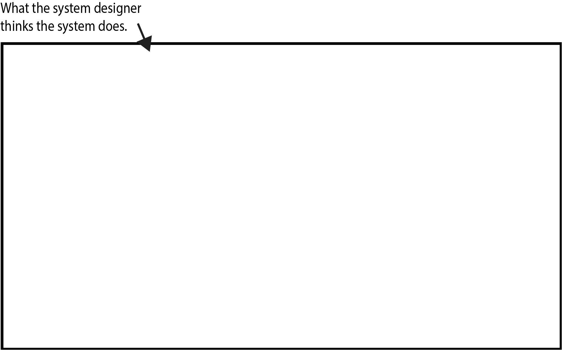 --- # Implementation Model What the system actually does ("system image") 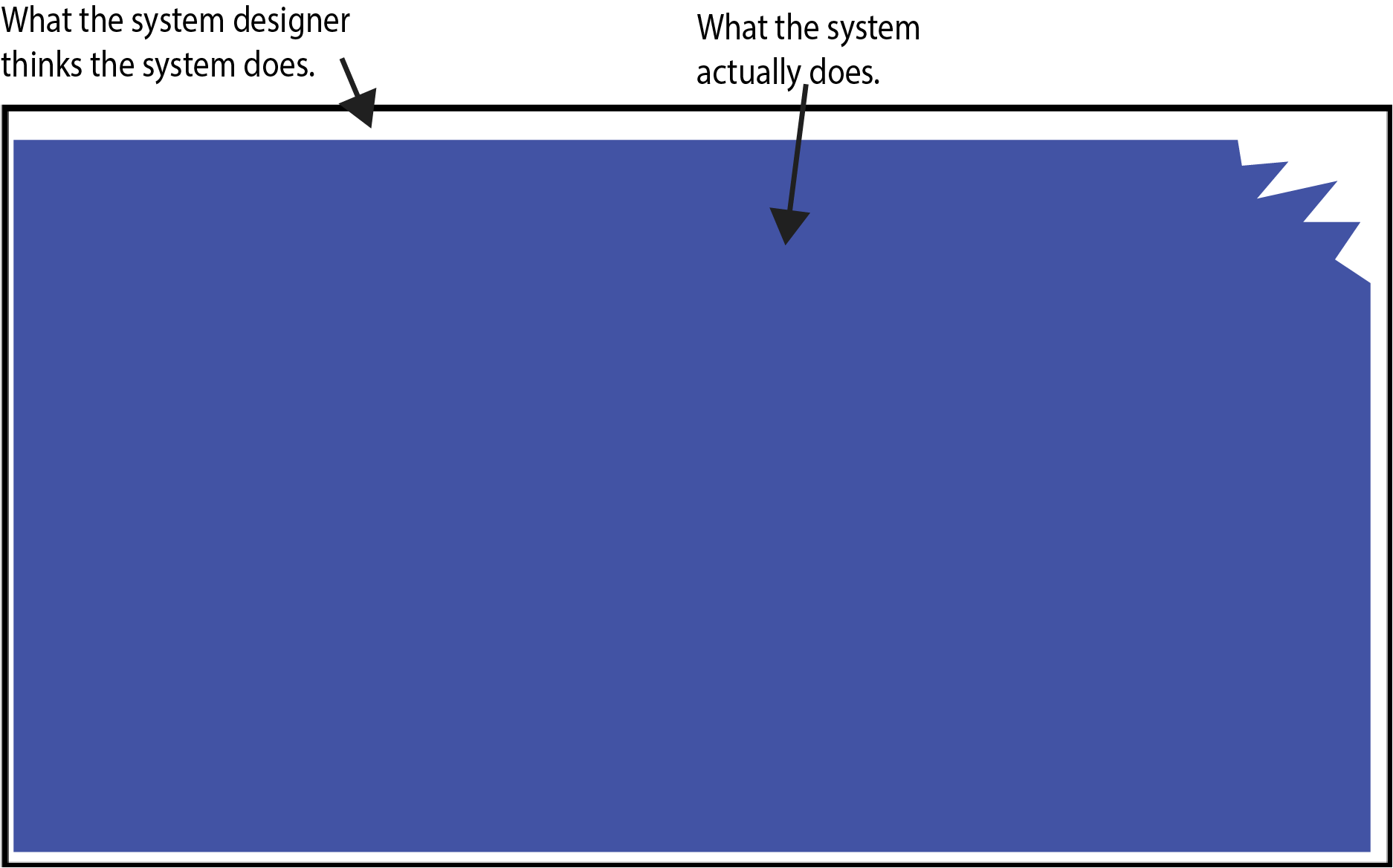 --- # User's Mental Model What the user knows about the system ("mental model") 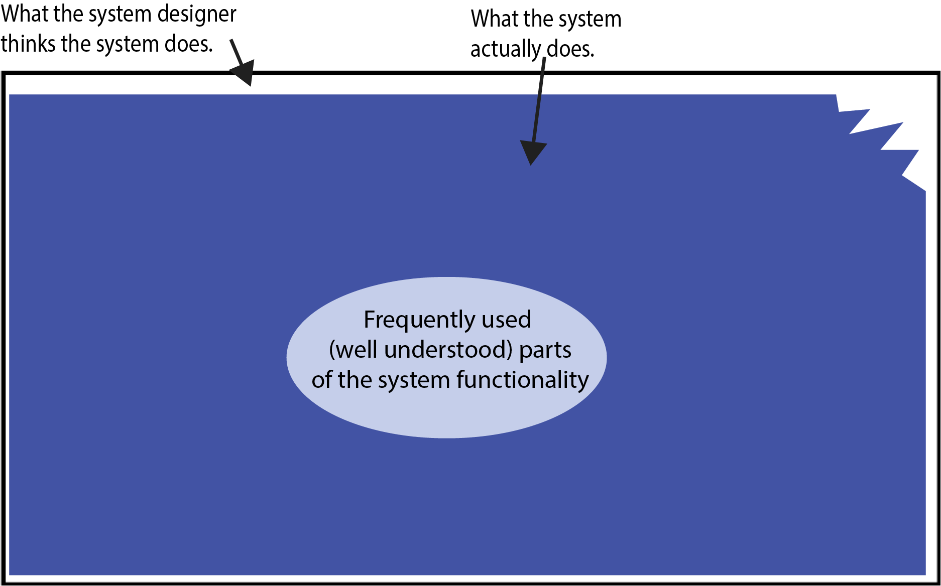 --- # User's Mental Model What the user knows about the system ("mental model") 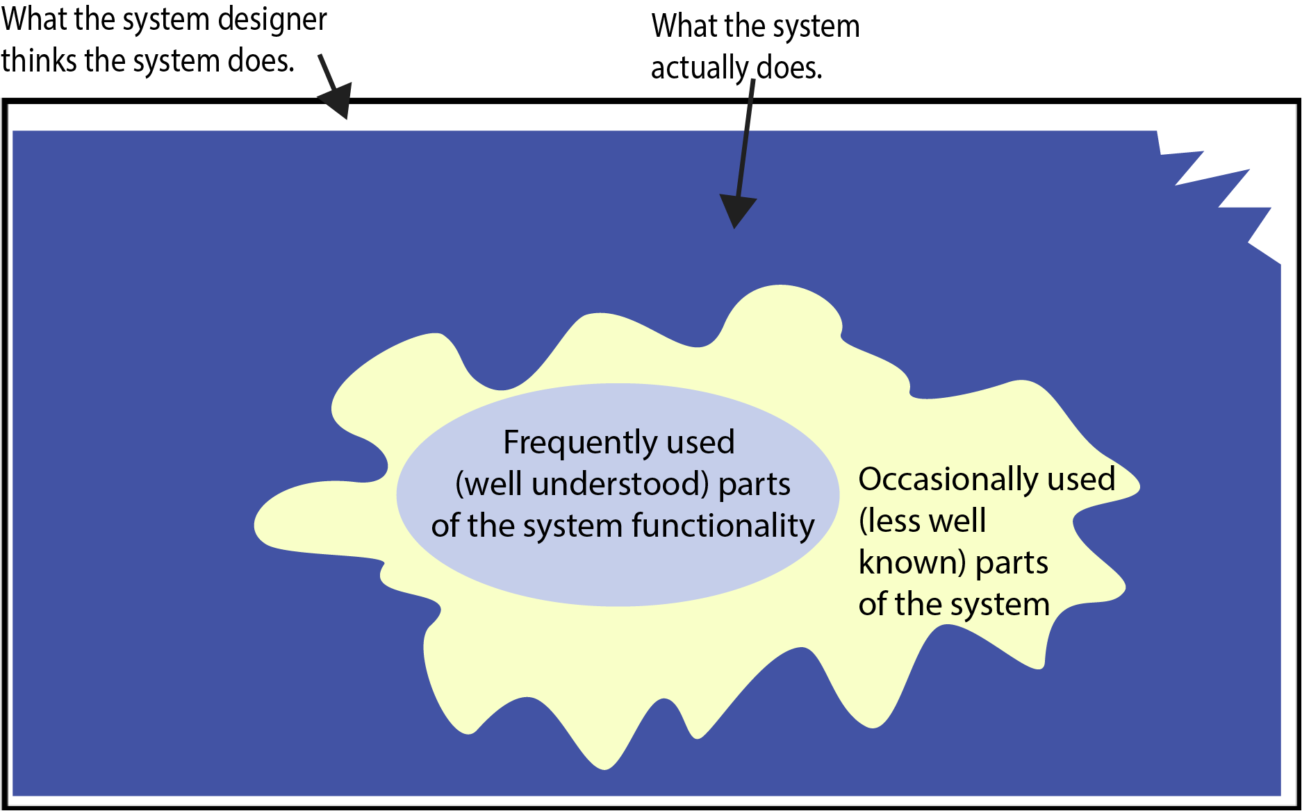 --- # User's Mental Model What the user knows about the system from use ("mental model") <br> <br> <br> 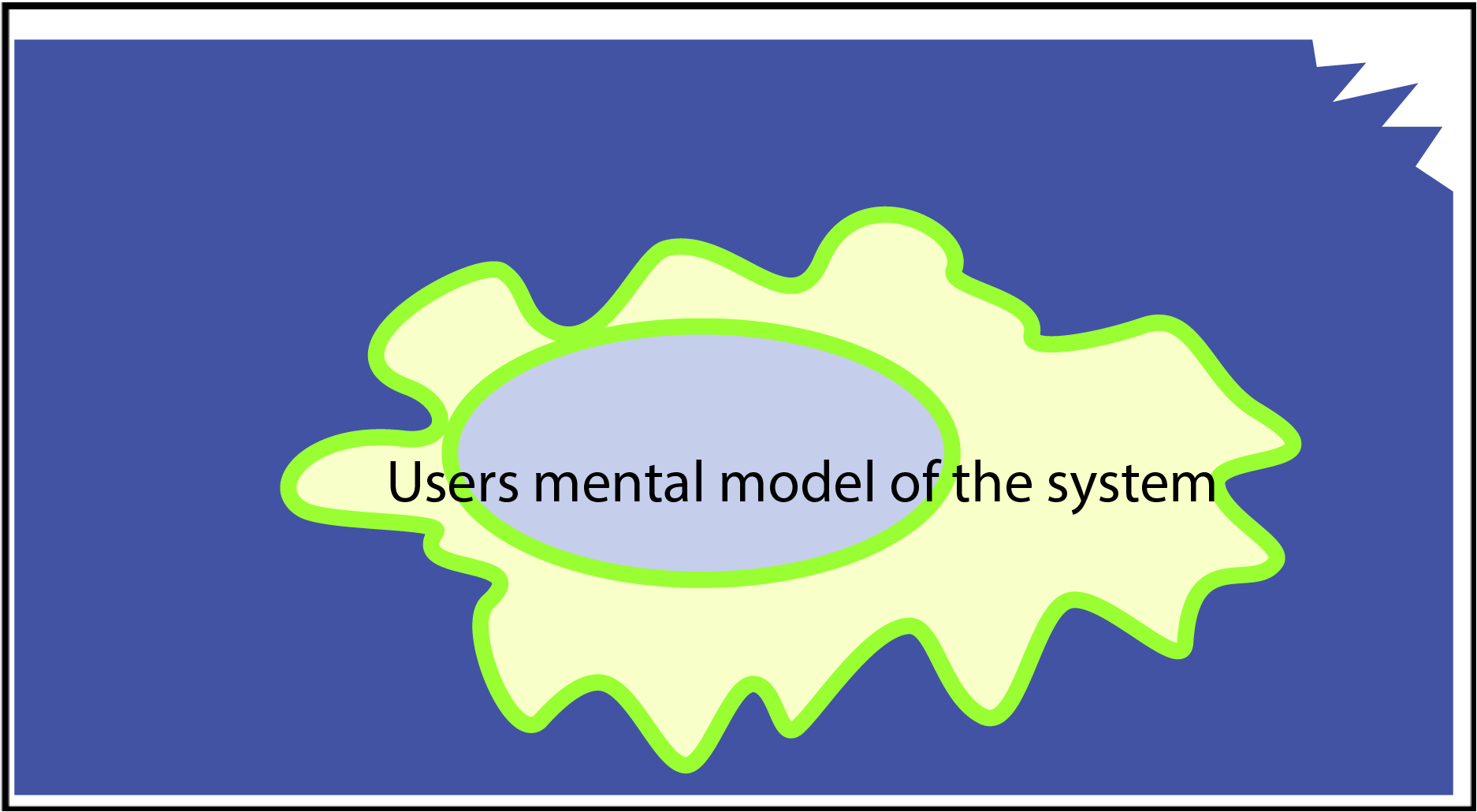 --- # User's Mental Model Everything the user thinks they know about the system ("mental model") 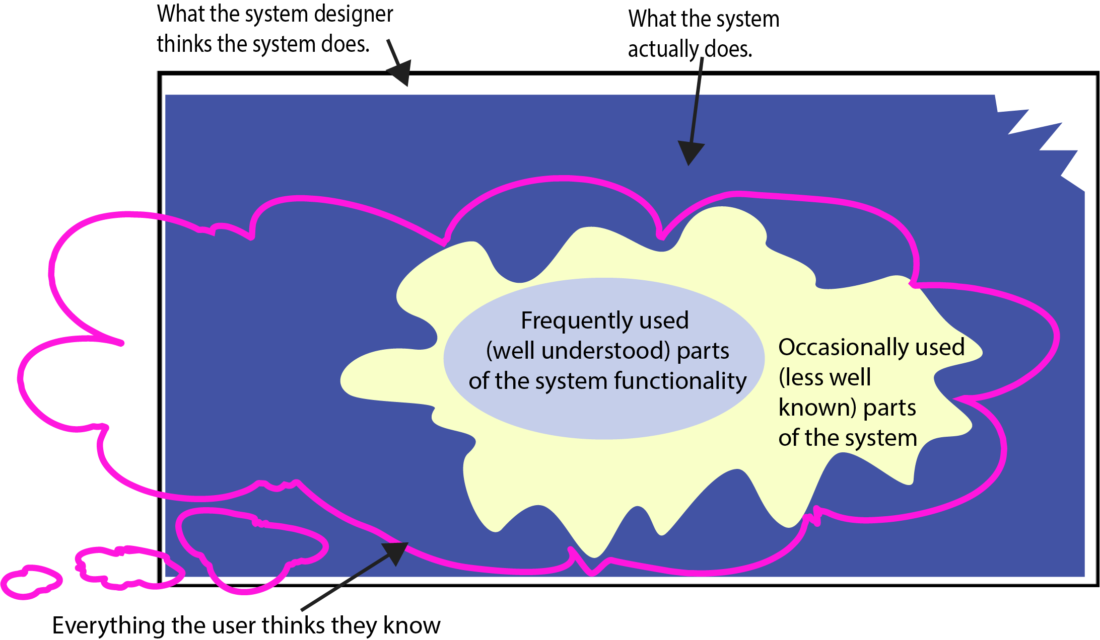 --- .left-column40[ # Every system has at least 3 different models ] .right-column60[ <br> <div class="mermaid"> graph TD S[System Image: <br>Your Implementation ] --> |System Feedback | U[User Model: How the user thinks <br>the system works] D[Design Model: How you <br>intend the system to work ]-->S U -->|User Feedback | S </div> ] --- # What is your mental model for how to open these doors? .column[  ] .column[ 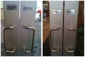 ] .column[  ] --- # Relating the Human and the Interaction .right-column50[ 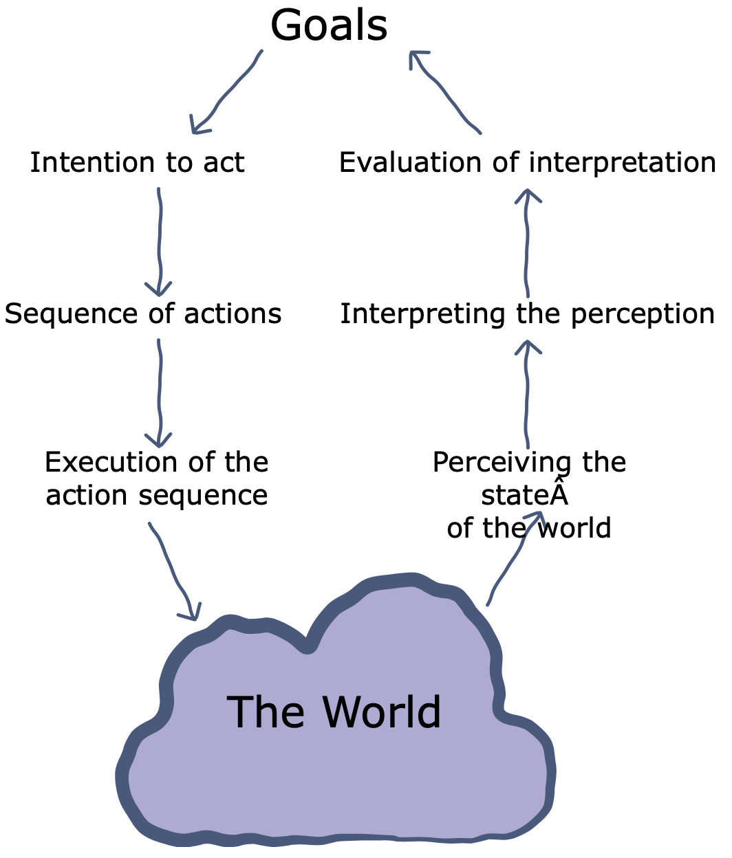 ] .footnote[[Don Norman, When Three World Collide: A model of the Tangible Interaction Process, 2009](https://www.researchgate.net/publication/221332102_When_three_worlds_collide_A_model_of_the_tangible_interaction_process)] ??? Note to instructors: Need to change image to mermaid --- # Relating the Human and the Interaction .left-column50[ **Gulf of Execution** is the user's belief that functions exist in the system that _actually don't exist_ - This is the users 'error' region **Gulf of Evaluation** is where the user _doesn't realize the system HAS a specific functionality_. ] .right-column50[  ] --- # Relating Gulfs and Mental Models .left-column50[  ] .right-column50[ Where are the gulf of evaluation and gulf of execution in this image? ] --- count: false # Relating Gulfs and Mental Models .left-column50[ 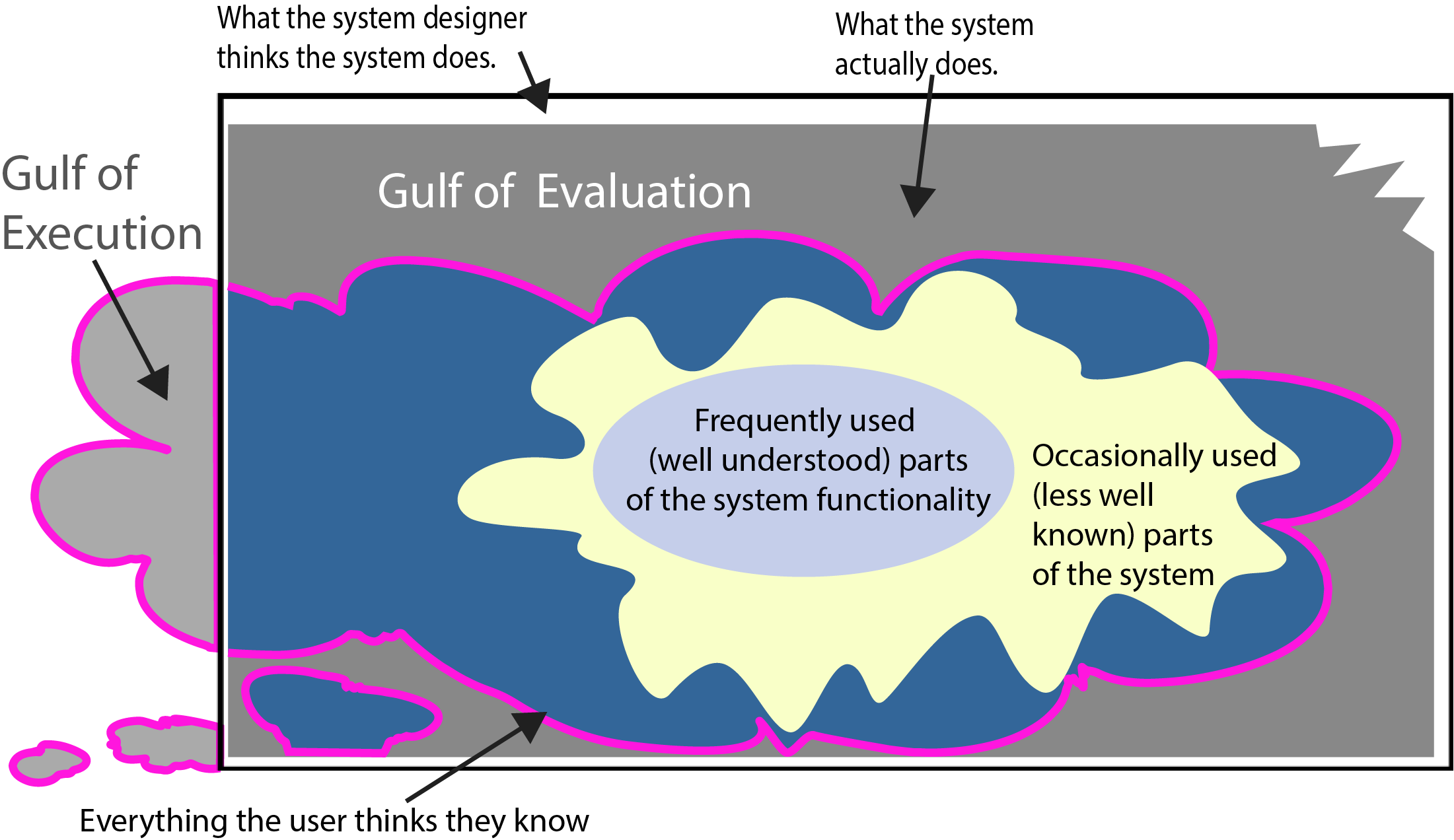 ] .right-column50[ Where are the gulf of evaluation and gulf of execution in this image? - Gulf of Execution is the user 'error' region (user requests function the __system DOESNT HAVE__) - Gulf of Evaluation is when the user __doesn't realize the system HAS a functionality__. ] --- # Causes of Gulf of Evaluation What can cause a user's Gulf of Evaluation? -- count: false - Hard to understand visual feedback - Poor use of colors - Bad layout, poor grouping - Unfamiliar display of information - Unfamiliar design patterns, or doesn’t follow convention - Forcing people to remember lots of things - Lack of feedback in response to inputs - Might not see visual updates - Can’t find info on screen - Might look same as unimportant - Irrelevant info on screen / important info missing ??? Recall: the user _doesn't realize the system HAS a functionality_. --- # Causes of Gulf of Execution What can cause a user's Gulf of Execution? -- count: false - Unfamiliar devices and inputs - Don’t know what is possible - Unfamiliar GUI components - Solvable with experience - Unfamiliar interaction patterns - Example patterns: Dialogs, Shopping Carts - Also solvable with experience ??? Recall: the user's belief in functions the system _doesn't have_ --- .left-column60[ What mental model error is this likely to create?  ] -- count: false .corner-ribbon.tr[ Design Tip #1: <BR> Consistency is Critical ] --- # Affordances Good Affordance| Bad Affordance ----|----  |  Well-designed objects have affordances - Clues to their operation that are readily apparent - Often visual, but not always (e.g., speech) - Allows and promotes certain actions ??? Opportunities to act which are readily apparent to the user ... and appropriate to the user’s abilities Form “affords” certain actions and makes that apparent --- .corner-ribbon.tr[ Design Tip #2:<BR> Use *Affordances* to minimize errors ] .left-column60[ ## Examples Action | Physical Afford. | Virtual Afford. | Minimal Design ----|----|----|---- Gripping | 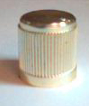 | 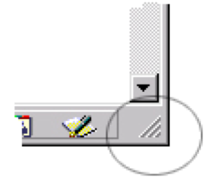 Pushing |  | | Search |  ||  ] ??? Knurling: increases friction/affords gripping don't kneed to know the word to get it --- # Feedback Response by the system to the actions of the user – Cause and effect Messenger Feedback | and | Gmail Feedback ----|----|---- 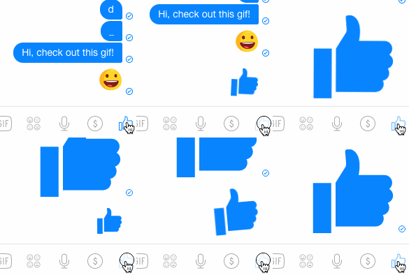||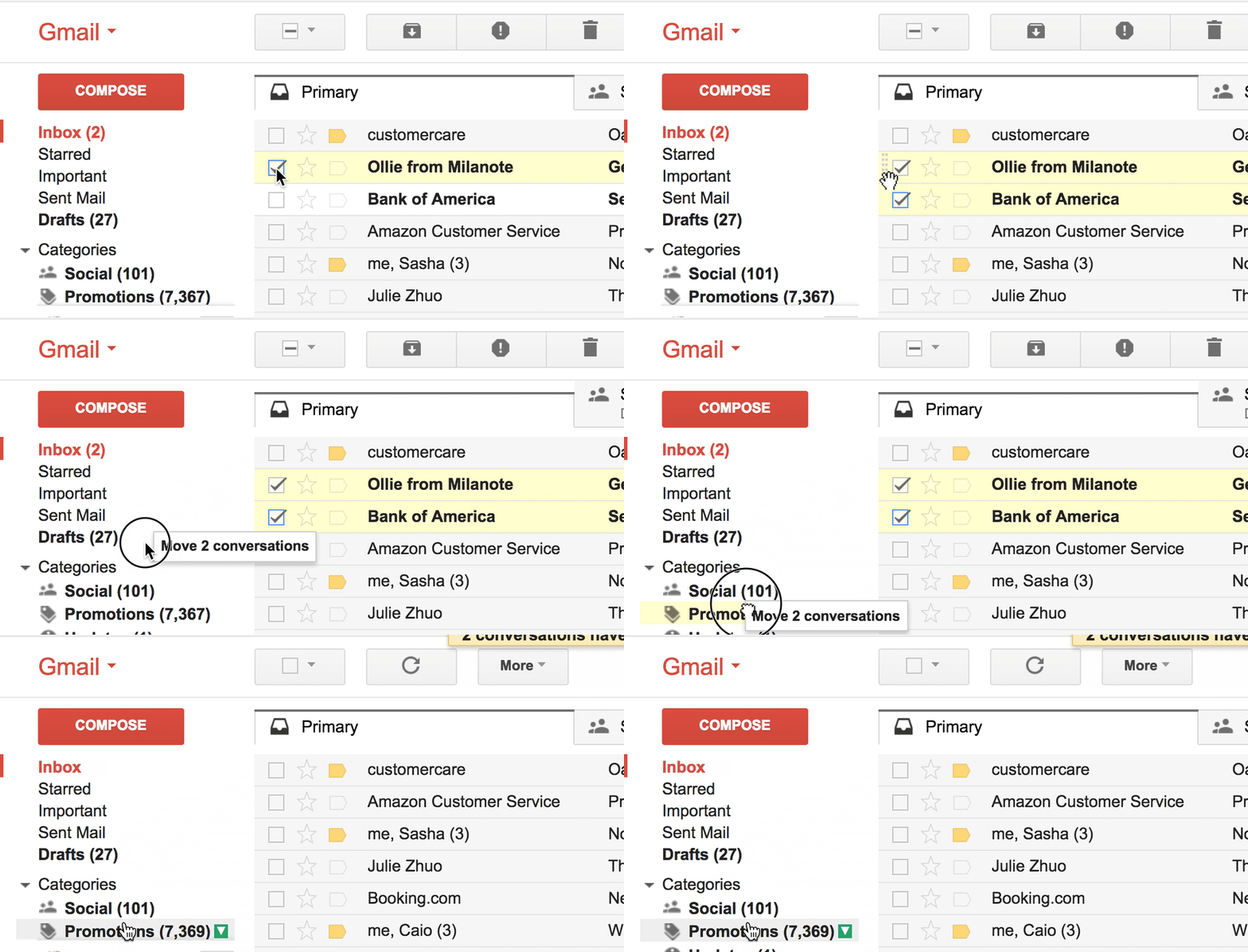 --- # Feed Forward .right-column[ What will happen if you execute action - Ex. Web page mouseover - Ex. Word processing I-bar - Ex. Label on a button Help people predict what will happen - Need feedforward at all scales - GUI widgets will handle basic feedforward - Don’t forget feedforward for screens ] .left-column[  ] --- .corner-ribbon.tr[ Design Tip #3: <BR> Use feedback and feedforward <br>to reduce the evaluation gap ] Feeback and Feedforward - Make the system state visible - Are essential for forming mental models --- .corner-ribbon.tr[ Design Tip #4:<BR> Reinforce the Conceptual Model <br>of the system ] .left-column60[ ## Explicitly design a conceptual model for the system Make the conceptual model visible to the user through affordances and feedback Ensure the system is consistent throughout so the interface reinforces the mental models the user forms ] --- # Application Design Tips (summary) - Design Tip #1: Consistency is Critical - Design Tip #2: Use *Affordances* to minimize errors - Design Tip #3: Use feedback and feedforward to reduce the evaluation gap - Design Tip #4: Make the Conceptual Model Visible -- count: false Now do the 🎟️ Exit Ticket: Application Design on [Ed](https://edstem.org/us/courses/32031/lessons/51118/slides/286448) --- # Case Study: Refridgerator/Freezer Example .left-column[ 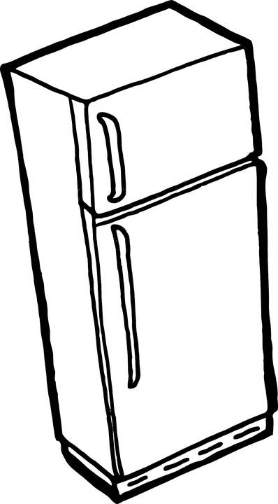 ] .right-column[ Problem: - Freezer too cold - Fridge just right ] --- # Refridgerator/Freezer Goal .left-column50[ 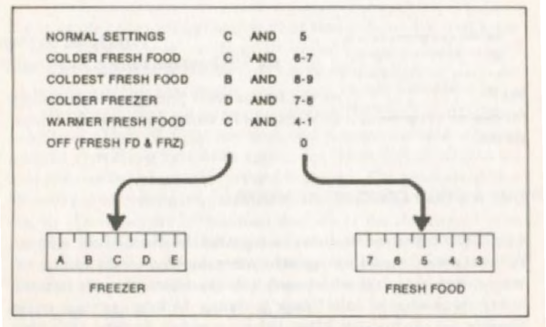 ] -- count: false .right-column50[ Goal: - Want to make the freezer warmer - Want the refridgerator to stay the same temperature ] .footnote[Don Norman, Design of Everyday Things] --- # Refridgerator/Freezer Mental Model .left-column50[ 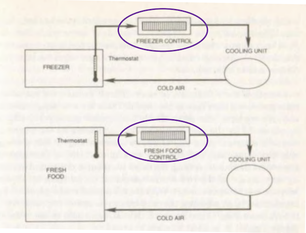 ] -- count: false .right-column50[ Mental model: - Fridge control controls fridge temperature - Freezer control controls freezer temperature ] .footnote[Don Norman, Design of Everyday Things] --- # Refridgerator/Freezer System Model .left-column50[ 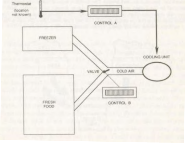 ] .right-column50[ Valve controls the flow of cold air from one cooling unit. ] .footnote[Don Norman, Design of Everyday Things] --- # Refridgerator/Freezer Feedback .left-column50[ 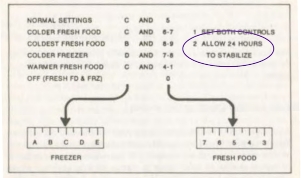 ] .right-column50[ 24 HOURS?!??! ] .footnote[Don Norman, Design of Everyday Things] --- # Revisit: What is this an example of? .left-column60[   ] .right-column40[ Hint: - Gulf of Execution is the user 'error' region (user requests function the __system DOESNT HAVE__) - Gulf of Evaluation is when the user __doesn't realize the system HAS a functionality__. ] --- count: false # Relating Gulfs and Mental Models .left-column50[  ] .right-column50[ Where are the gulf of evaluation and gulf of execution in this image? - Gulf of Execution is the user 'error' region (user requests function the __system DOESNT HAVE__) - Gulf of Evaluation is when the user __doesn't realize the system HAS a functionality__. ] .left-column50[ What happens when the user does something they think is a part of the system but is really not supported? ] -- count: false .right-column50[ - Need to undo! ]