name: inverse layout: true class: center, middle, inverse --- # Week 2 and Practice Quiz 2 Review Lauren Bricker CSE 340 Winter 23 --- name: normal layout: true class: --- # Layout Wireframe vs Interactor Hierarchy There was some confusion about what a Layout Wireframe is vs an Interactor Hierarchy. - In a **Layout Wireframe** you should graphically specify the positioning of the interactors - Must include the type of Layout, including for specifing horizontal or vertical for `LinearLayout` - You could also show where there are margins, constraints, etc - An **Interactor Hierarchy** graphically depicts the parent child relationships between the interactors used to render the app. You will need to to know this for Layout part 4. --- # Layout Wireframe A **Layout Wireframe** you should graphically specify the positioning of the interactors Interface mockup | Layout Wireframe -- | --  | 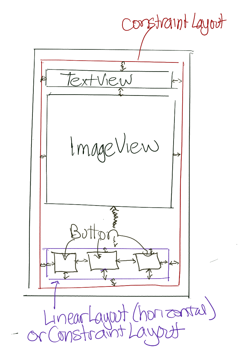 --- # Interactor Hierarchy An **Interactor Hierarchy** graphically depicts the parent child relationships between the interactors used to render the app. Interface mockup | Interactor Hierarchy -- | --  | 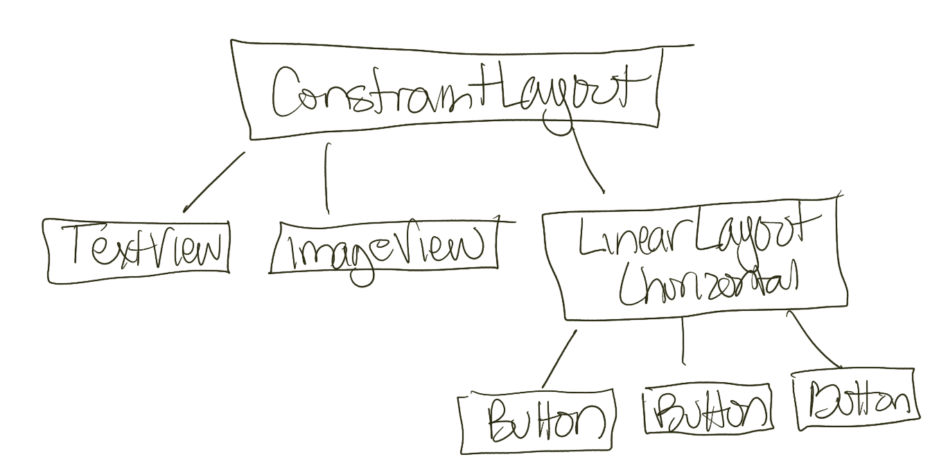 --- # Interactor Hierarchy You could depict this hierarchy also as an "outline" view .left-column[  ] .right-column[ - ConstraintLayout (could also be LinearLayout (vertical)) - TextView - ImageView - LinearLayout (horizontal) (could also be a ConstraintLayout) - Button - Button - Button ] --- # Spot the Heron activity .left-column-half[ 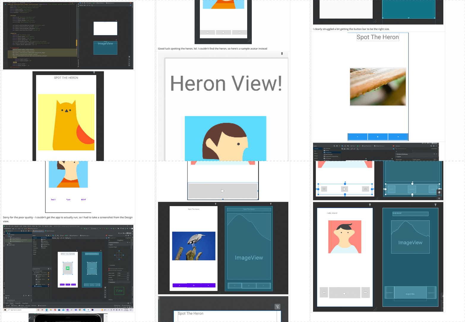 ] .right-column-half[ Fist to Five: How comfortable did you feel with creating this interface in Android Studio? - Fist/0 - I really didn't feel comfortable at all - Five - I really really felt comfortable, could do this in my sleep ] --- # Animation .left-column[ 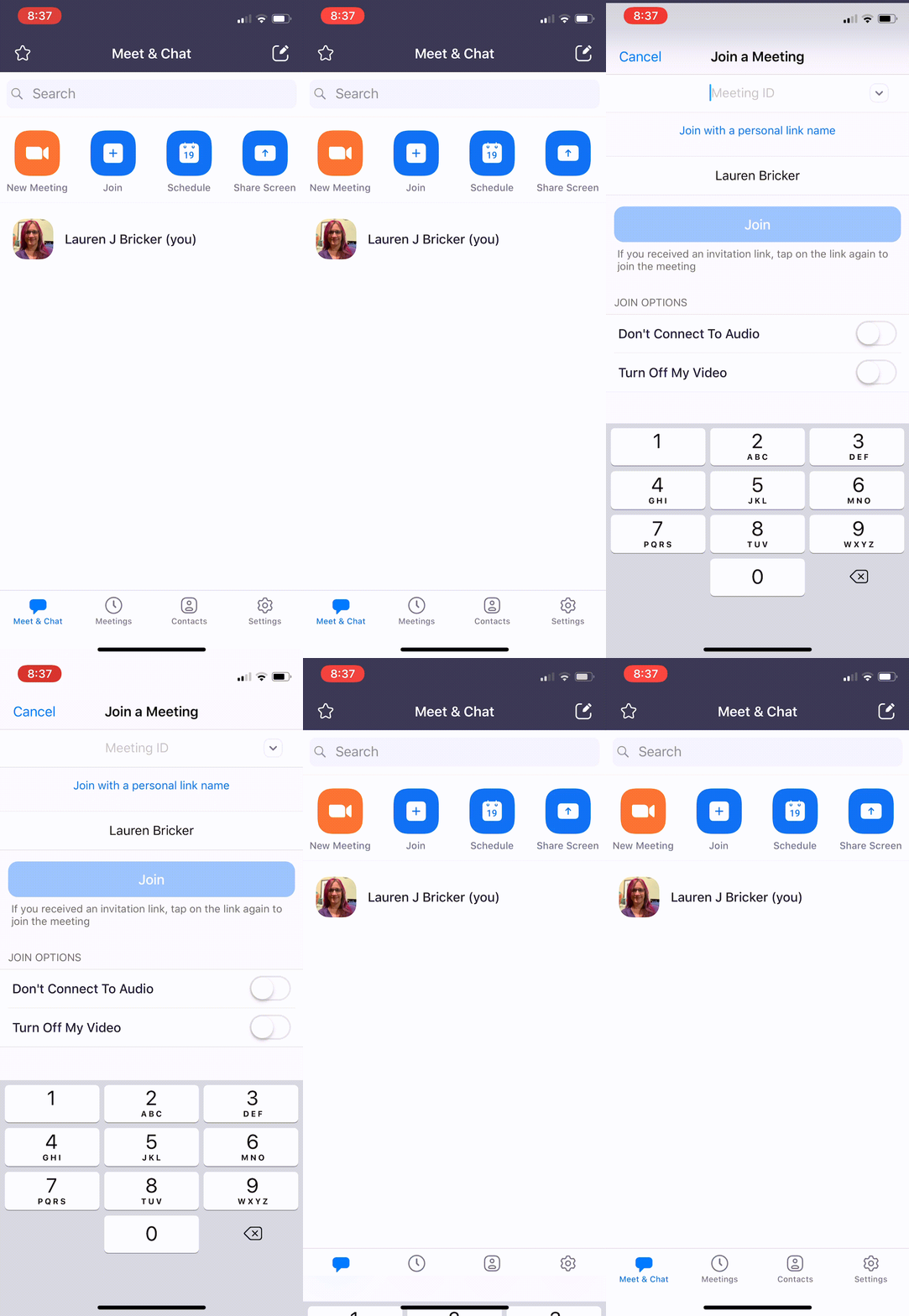 ] .right-column[ The Zoom app has incorporated Animation in the interface as seen on the left. What pacing function do you think they are using? ] -- count: false .right-column[ Pacing functions seen: - Bounce (at the end of the scroll) or Overshoots - Slow in (transition from Meetings to Schedule a meeting screen)/Slow out (some specifically said AccelerateDecelerateInterpolator) ] --- # Animation Design Tips .left-column[  ] .right-column[ Pick an Animation Design Tip and justify whether the interface programmer for this app met or violated that tip. 1. Used sparingly and understandingly, animation can enhance the interface … otherwise can distract! 2. Need to mimic real world 3. Observing motion tells us about size, weight, rigidity 4. No abrupt changes in velocity! 5. Think about accessibility. ] --- # Animation Design Tips .left-column[  ] .right-column[ Pick an Animation Design Tip and justify whether the interface programmer for this app met or violated that tip. 1. Used sparingly and understandingly, animation can enhance the interface … otherwise can distract! - Met: if justified: The animations do not distract from the function of the app - Violated: if justified: some might say the animation is superfluous 2. Need to mimic real world 3. Observing motion tells us about size, weight, rigidity 4. No abrupt changes in velocity! 5. Think about accessibility. ] --- count: false # Animation Design Tips .left-column[  ] .right-column[ Pick an Animation Design Tip and justify whether the interface programmer for this app met or violated that tip. 1. Used sparingly and understandingly, animation can enhance the interface … otherwise can distract! 2. Need to mimic real world - Met: things bouncing back when they hit a wall with the scrolling 3. Observing motion tells us about size, weight, rigidity 4. No abrupt changes in velocity! 5. Think about accessibility. ] --- count: false # Animation Design Tips .left-column[  ] .right-column[ Pick an Animation Design Tip and justify whether the interface programmer for this app met or violated that tip. 1. Used sparingly and understandingly, animation can enhance the interface … otherwise can distract! 2. Need to mimic real world 3. Observing motion tells us about size, weight, rigidity - Not obvious 4. No abrupt changes in velocity! 5. Think about accessibility. ] --- count: false # Animation Design Tips .left-column[  ] .right-column[ Pick an Animation Design Tip and justify whether the interface programmer for this app met or violated that tip. 1. Used sparingly and understandingly, animation can enhance the interface … otherwise can distract! 2. Need to mimic real world 3. Observing motion tells us about size, weight, rigidity 4. No abrupt changes in velocity! - Met: On the Schedule screen the screen rises up from the top with the slow in slow out. 5. Think about accessibility. ] --- count: false # Animation Design Tips .left-column[  ] .right-column[ Pick an Animation Design Tip and justify whether the interface programmer for this app met or violated that tip. 1. Used sparingly and understandingly, animation can enhance the interface … otherwise can distract! 2. Need to mimic real world 3. Observing motion tells us about size, weight, rigidity 4. No abrupt changes in velocity! 5. Think about accessibility. - Violated: These animations would not likely help a user with low or no vision. ] --- exclude: true # What is the interactor hierarchy? .left-column50[  ] --- exclude: true # What is the interactor hierarchy? .left-column50[  ] .right-column50[ root (LinearLayout, Vertical) - Search Bar - ImageView - Edit Box - ImageView - ImageView (or Menu) - Tab Bar - Button - Button - Button - ImageView - TextView - TextView (with link) - Button ] ??? Important: use multi-level tree