# [CSE 340](/courses/cse340/23wi/schedule.html) Lab 2 Winter 23 ## Week 2: Finishing Doodle, Introducing Layout .title-slide-logo[  ] --- # FrameLayout - FrameLayout is designed to block out an area on the screen to display a single item. - Can add multiple children to a FrameLayout and control their position by assigning gravity to each child (android:layout_gravity attribute) - Child views are drawn in a stack, with the most recently added child on top 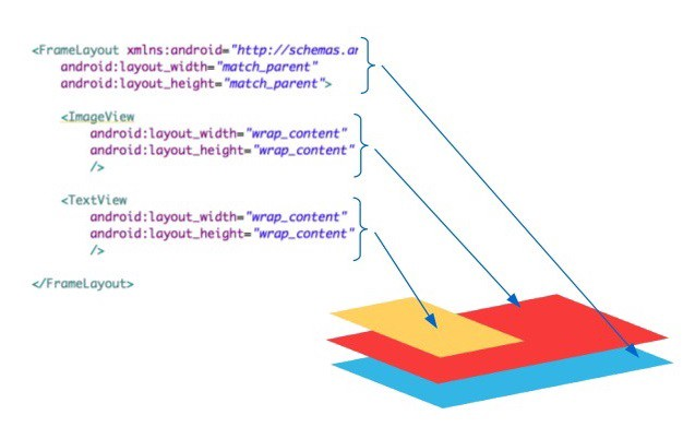 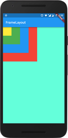 --- # LinearLayout - LinearLayout organizes its children into a single horizontal or vertical row. - Wrap it in a `ScrollView` to create a scrollbar if the length of the window exceeds the length of the screen. 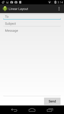 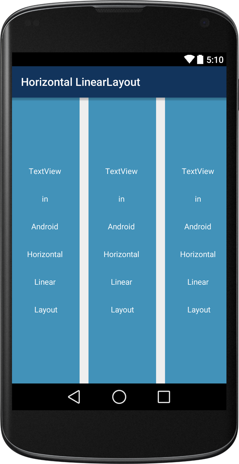 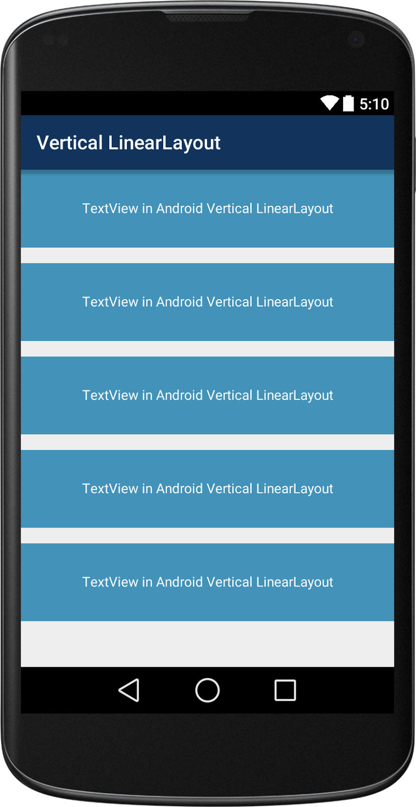 --- # RelativeLayout - Enables you to specify the location of child objects relative to each other (child A to the left of child B) or to the parent (aligned to the top of the parent). 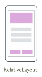 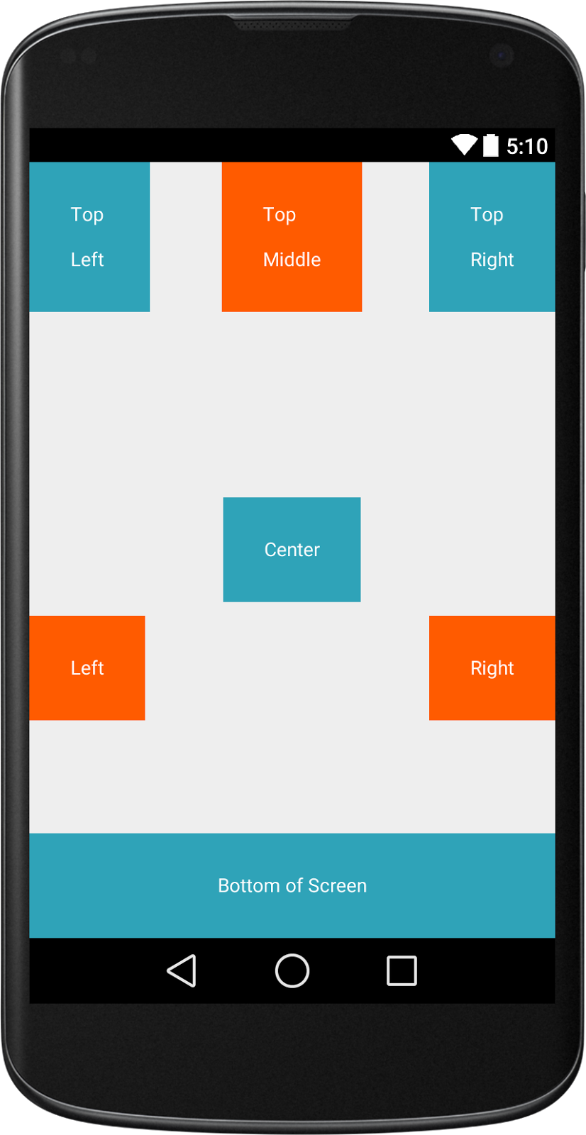 --- # TableLayout - Added in API 1 - TableLayout arranges its children into rows and columns - Can leave the cells empty - Found in the Accessibility assignment base code 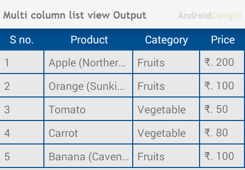 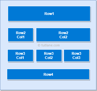 --- # GridLayout - Places its children in a rectangular grid - Must define the number of rows and columns first, then populate with Views - Why choose this over TableLayout? - Easy to arrange lots of data because you don’t need to specify each View’s width and height - [Preferable](https://android-developers.googleblog.com/2011/11/new-layout-widgets-space-and-gridlayout.html) to TableLayout (GridLayout added API 14) 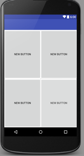 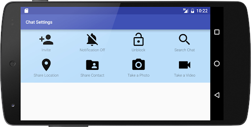 --- # Constraint Layout .left-column[ 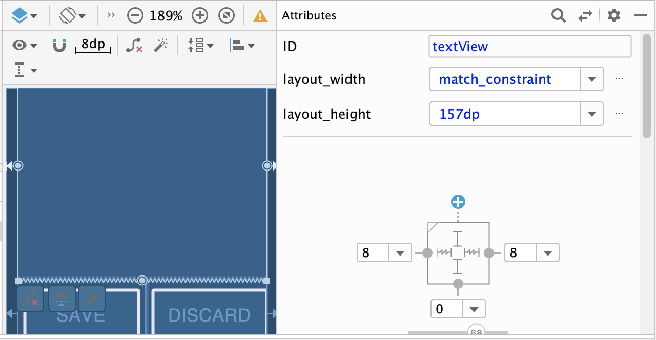 ] .right-column70[ - ViewGroup that allows you to position widgets in a flexible way - Useful for building responsive interfaces in Android. - You can see little lines connecting the `textView` to its container and it's sibling (the `linearLayout`). - This specifies how it's attached (can change type by clicking on right) - If you were to change the interface (e.g. a different sized screen), it would stay attached and keep filling the space ]