name: inverse layout: true class: center, middle, inverse --- # Properties of People II: Motor Control Lauren Bricker CSE 340 Spring 23 --- layout: false # Agenda - Administrivia - Menus video checkpoint due (Tues 2-May) - Menus code part 1-4 due (Fri 5-May) - Code is due **Saturday** - Resubmissions - Layout will be accepted until 05/14 - Accessibility will be accepted until 05/21 - Today <!-- - Please fill out the [Mid Quarter Section Feedback form](https://forms.gle/UkKuo3zo2koKttRs5) - Finish talking about [Menus](/courses/cse340/23sp/slides/wk05/menus.html#12) --> - Quick check on [Ed](https://edstem.org/us/courses/38124/lessons/59423/slides/331522) about Menus codebase - Fitts' Law and implications for interface design --- # Let's try an experiment .left-column-half[ ] .right-column-half[ - [Fitts' Law Experiment](http://simonwallner.at/ext/fitts/) (simonwallner.at/ext/fitts) Scroll down to just below 'A word of warning' - Click the red circles as fast as possible ] --- [//]: # (Outline Slide) # Today's goals - Experience Fitts' Law - Discuss its implications for design - Introduce Guiard's model of Bi-Manual Control - Discuss its implications for design --- .left-column-half[ # Throughput  - Note: We will use D for Dist and W for Width throughout the rest of this lecture ] .jax[$$MT = a + b*log_2({Dist \over Size} + 1)$$] .right-column-half[ where ] --- count: false .left-column-half[ # Throughput  - Note: We will use D for Dist and W for Width throughout the rest of this lecture ] .jax[$$MT = a + b*log_2({Dist \over Size} + 1)$$] .right-column-half[ where - *MT* is movement time (in seconds) ] --- count: false .left-column-half[ # Throughput  - Note: We will use D for Dist and W for Width throughout the rest of this lecture ] .jax[$$MT = a + b*log_2({Dist \over Size} + 1)$$] .right-column-half[ where - *MT* is movement time (in seconds) - ID is the *Index of Difficulty* of a movement (in bits) .jax[$$log_2({Dist \over Size} + 1)$$] ] --- count: false .left-column-half[ # Throughput  - Note: We will use D for Dist and W for Width throughout the rest of this lecture ] .jax[$$MT = a + b*log_2({Dist \over Size} + 1)$$] .right-column-half[ where - *MT* is movement time (in seconds) - ID is the *Index of Difficulty* of a movement (in bits) .jax[$$log_2({Dist \over Size} + 1)$$] - *ID/MT* is the *Throughput* of a device (in bits/second) ] --- count: false .left-column-half[ # Throughput  - Note: We will use D for Dist and W for Width throughout the rest of this lecture ] .jax[$$MT = a + b*log_2({Dist \over Size} + 1)$$] .right-column-half[ where - *MT* is movement time (in seconds) - ID is the *Index of Difficulty* of a movement (in bits) .jax[$$log_2({Dist \over Size} + 1)$$] - *ID/MT* is the *Throughput* of a device (in bits/second) - *a* and *b* are empirically derived constants ] ??? This is just a line Fitts’ law tells us about difficulty for pointing and selection tasks - Time to move the hand depends only on relative precision required - MT increases as __distance__ from target increases - MT decreases as __size__ of target increases - Diagram this --- # Original Fitts' experiment .left-column-half[  .font-small[[Wikpedia](https://en.wikipedia.org/wiki/Fitts%27s_law)] ] .right-column-half[ Original experiment from Paul Morris Fitts involved tapping on plates as quickly as possible. ] --- # Compare Device Performance & Human Performance .left-column-half[  ] .right-column-half[ .font-small[ Device/Part | Study | Throughput (bits/s) | Relative to Optimal -------|-------|------------ | ----------- Finger | Langolf (1976) | 38 Wrist | Langolf (1976) | 23 EyeTracker| Ware & Mikaelian (1987) | 13.7 | Hand | Fitts (1954) | 10.6 Arm | Langolf (1976) | 9.5 Xbox 360 | Zaranek (2014) | 5 | **.47** (arm) Mouse | Mackenzie (2001) | 4.9 | .46 (hand) Neck | Pfaff (1985) | 4.2 | Trackball | Mackenzie (2001)| 3.0 | .28 (hand) Touchpad | Mackenzie (2001) | 2.9 | .27 (hand) Head | Hansen (2018) | 2.5 | **.51** (neck) Gaze | Hansen (2018) | 2.1 | **.15** (eyetracker) Joystick | Mackenzie (2001)| 1.8 | .17 (hand) Playstation Move | Zaranek (2014) | 1.5 | .16 (arm) Kinect | Zaranek (2014) | 1 | .1 (arm) ] ] .footnote[Card, S. K., Mackinlay, J. D., & Robertson, G. G. (1991). <br> A morphological analysis of the design space of input devices. <br> ACM Transactions on Information Systems (TOIS), 9(2), 99-122. ] ??? Useful to know if you're designing something like VR Doesn't have much impact on interface design Doesn't capture everything; e.g. error rate is higher for eye tracker --- # Warnings Applies to *expert, errorless* use  .footnote[Error rate was manipulated by faking errors. Ahmed Sabbir Arif and Wolfgang Stuerzlinger. CHI 2010. Predicting the cost of error correction in character-based text entry technologies. In Proceedings of the SIGCHI Conference on Human Factors in Computing Systems, April 2010 ] ??? Axis: X is faked error rates, Y is the words per minute. Shows how WPM did change in the study where error rate is being changed. If you know you are going to make a lot of errors you slow down your motion The underlying way we're designed to move is with small motions, to eliminate jerk We accelerate and decelerate smoothly Trace of motion for different body parts - after the initial motion, which is a rapid aiming motion, then corrective motions if you misss the target. Lots of those corrections, that is where you are goign to see people slow down. Subtle effects here – like the time to fix errors goes up as the error rate goes up… Act of correcting an error also takes time. Not worry about in the assignment, but interesting to know. --- # Example: Arm based input Student project using a Kinect from 2012. Watch the movement of his arm... ![:youtube Bubble keyboard implemented by Chinmay N in 2012. Users swipe with their full arm to select letters in on a keyboard, mQ-pCDr3RCw] --- # Discussion: Implications of Fitts' law - Why are some things harder than others to click on? - Group discussion - fill in [Ed slide](https://edstem.org/us/courses/38124/lessons/59423/slides/331525) 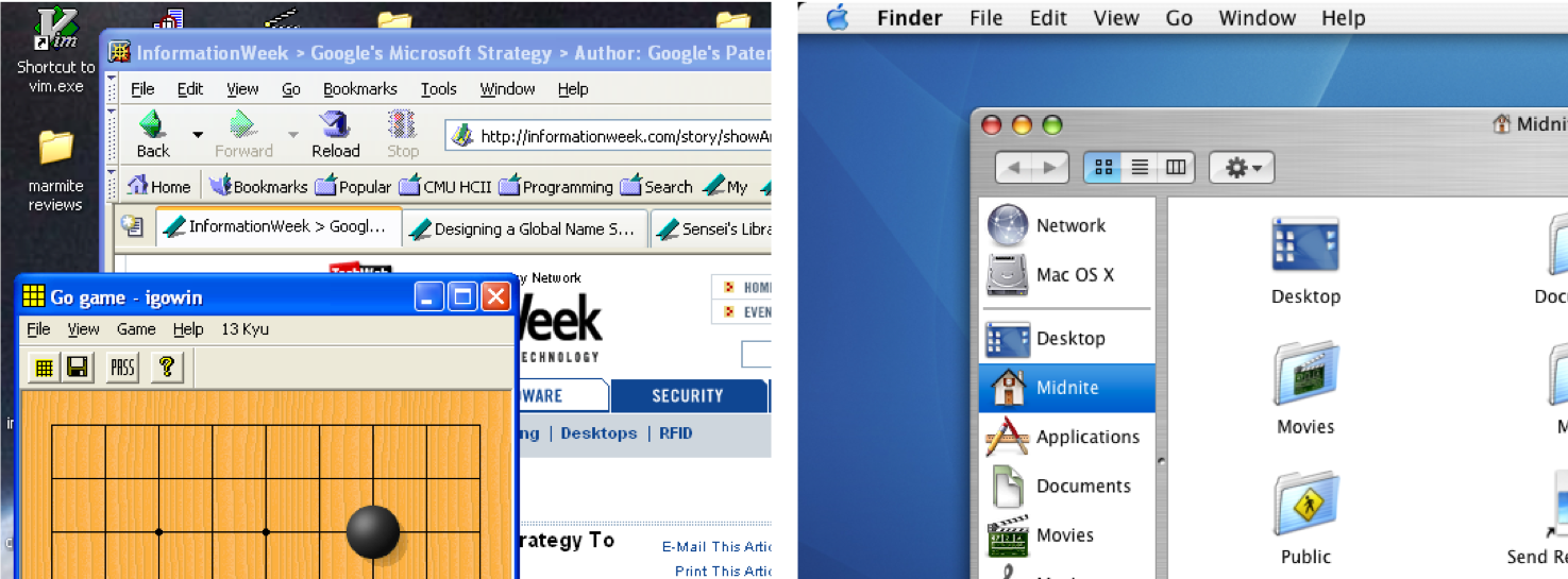 ??? Constantly relevant Intuitively, things that are closer and/or bigger are faster and easier to hit (and vice versa) What is different about the file location in Mac and Windows? What is the width at the top of the screen. - Add your thoughts on the bullet line with your group number in this [Google Doc](https://docs.google.com/document/d/10D3XfkzfU5RM426ueamy7fQA2QL-tWXNw7UxwR5Z3fQ/edit?usp=sharing) --- # Thinking about Design Tips Follow along on our [Exit Ticket Ed Lesson](https://edstem.org/us/courses/38124/lessons/59423/slides/331526) to participate. Recall Fitts law is: .jax[$$MT = a + b*log_2({Dist \over Size} + 1)$$] --- # Design Tip #1: Make small targets larger .left-column50[ ||| |--|--| Answer on [Ed](https://edstem.org/us/courses/38124/lessons/59423/slides/331526) What does making targets larger do to Fitts Law Predictions? ] --- count: false # Design Tip #1: Make small targets larger .left-column50[ ||| |--|--| Answer on [Ed](https://edstem.org/us/courses/38124/lessons/59423/slides/331526) What does making targets larger do to Fitts Law Predictions? Why should you not maximize all of the targets? ] -- count: false .right-column50[ Fitts' law involves a logarithmic calculation -- exponentially bigger gains for small targets, not so much of a gain for larger targets ] --- # Design Tip #1: Make small targets larger .left-column50[  ] .right-column50[ - How is the CNN marketing group using Fitts' law in this situation? ] -- .right-column50[ - intentionally making it HARDER to remove this window ] --- # Design Tip #2:<br> Put commonly used things close together  Answer on [Ed](https://edstem.org/us/courses/38124/lessons/59423/slides/331526) Is this minimizing distance, maximizing size, or both? --- # Design Tip #2:<br> Put commonly used things close together .left-column50[ 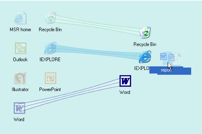 ] .right-column50[ ## Can also bring items closer to the cursor (to also minimize the distance) ] .footnote[ Baudisch, P., Cutrell, E., Robbins, D., Czerwinski, M., Tandler, P. Bederson, B., and Zierlinger, A. Drag-and-Pop and Drag-and-Pick: Techniques for Accessing Remote Screen Content on Touch- and Pen-operated Systems. In Proceedings of Interact 2003, Zurich Switzerland, August 2003, pp. 57-64. ] ??? Reduces Distance (D) Not good design to put everything close together No space to move all targets (contextual filtering helps) Could do with a fancy container... --- # Design Tip #2:<br> Put commonly used things close together .left-column50[  ] .right-column50[ Why not do this to all targets? ] -- .right-column50[ - Other usability goals matter too -- e.g. grouping related things - It is not good design to put everything close together - There is not enough space to move all targets (contextual filtering helps) How would you implement this? ] --- # Minimizing distance and maximizing size! We can make things *Closer* and *Larger* at the same time  --- # We're beating Beating Fitts' Law! How else can we do this? -- count: false Just don't use a mouse! Shortcut buttons; scroll wheel Or CHEAT... manipulate the interface - Minimize distance - Increase size --- # Menu Selection .left-column50[ Answer on [Ed](https://edstem.org/us/courses/38124/lessons/59423/slides/331526) Do these menus minimize distance or maximize size? ] .right-column50[ Select from a menu bar at top of screen 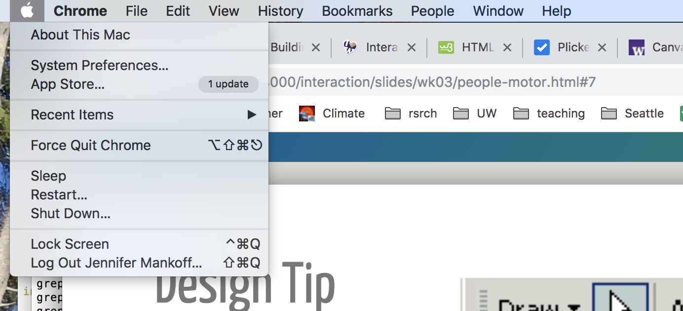 ] ??? Problems? - Can be tiring to reach edges of *very* large screens - Not all interfaces can do this (e.g. web designers) --- # Design Tip #3:<br>Make use of Edges: They are Infinite .right-column[ 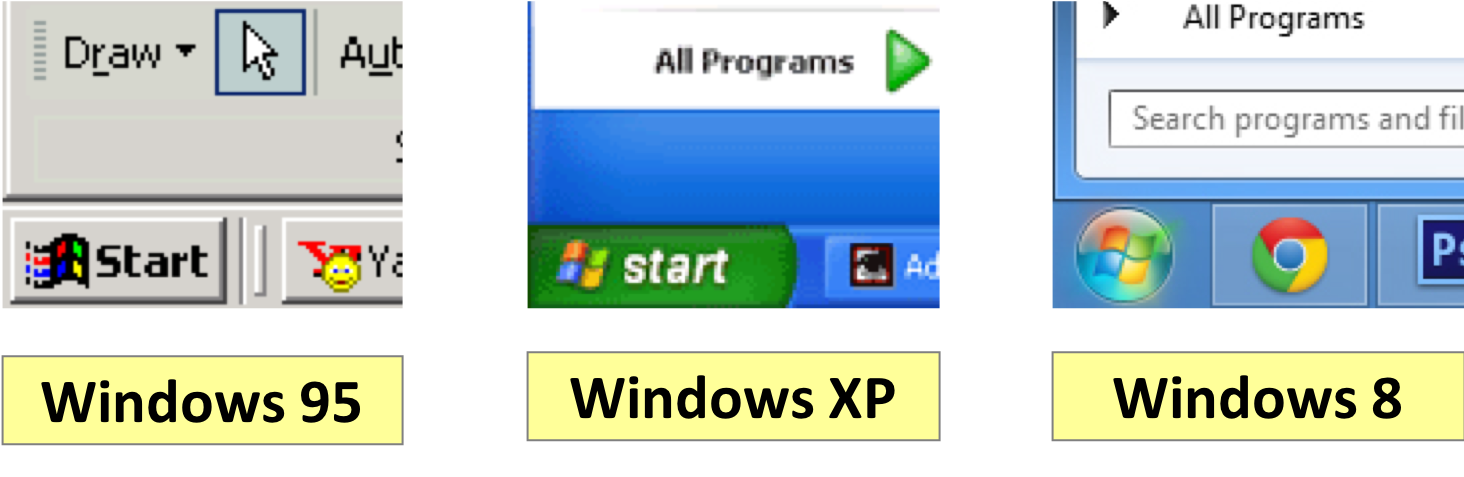 ] ??? - Windows 95 bug: bottom-left corner is offset by a few pixels, can’t click on it - Windows XP fixes it by making Start button go all the way to the corner - Windows 8 uses styling to make start menu circular, but still makes entire corner clickable --- # Recent Example (Zoom) Which of these do you think is a better button for maximizing size using the infinite edge? .left-column60[  ] .right-column30[ <br>  ] --- # Recent Example (Zoom) Which of these do you think is a better button for maximizing size using the infinite edge? .left-column60[   Although it looks like only the text is clickable, it turns out the whole edge was. Now we only have a "smaller" but brighter button to click. ] .right-column30[ <br>  ] --- # Design Tip #3:<br>Make use of Edges: They are Infinite Problems with infinite edges? - Can be tiring to reach edges of *very* large screens - Not all interfaces can do this (e.g. web designers) - Does this work for mobile devices or other touch screens? --- # Menu Selection .left-column50[ Answer on [Ed](https://edstem.org/us/courses/38124/lessons/59423/slides/331526) Do these menus minimize distance, maximize size, or both? ] .right-column50[  ] .footnote[ Left example: OneNote 2013, Right example: Firefox. Taken from [Fitts law and user experience](https://www.smashingmagazine.com/2012/12/fittss-law-and-user-experience/) by [https://www.smashingmagazine.com/author/anastasios-karafillis/](Anastasios Karafillis) ] --- # Why are marking menus rare & unfamiliar? Right click in place and then select (starting at :19) ![:youtube Illustration of advantages of marking menus,dtH9GdFSQaw?start=19] .footnote[ Kittenish, G., & Buxton, W. (1994, April). User learning and performance with marking menus. In CHI (Vol. 94, pp. 258-264). ] ??? Minimizes D AND increases W (only angle matters) --- ## Design Tip #4: Use marking menus instead of context menus for expert tasks Under some circumstances only... - Less than 8 options (Small target areas when too many menu entries are added) - Expert user (willing to memorize and gain advantage of marking menus) - Grouping not important (hard to group radially) Pie menus are often not implemented in production code - Needs to be seen as a high priority feature - Managers need to be able to assign staff to the project - Sadly, project constraints define an interface. (**Shouldn't be a thing! Whorfian effects**) --- layout: false # Example in Maya Example of how Marking Menus are used in practice (Maya) ![:youtube Example of marking menu in Maya, r8PQy8cX9dc] --- # Menus Assignment Goal: to compare pie menus, linear menus, and a custom menu you make! We provide support for running the experiment in `AbstractMainActivity` (and a testing harness in `ExperimentActivity`) You implement a variety of menus --- # Snapping .left-column50[ Answer on [Ed](https://edstem.org/us/courses/38124/lessons/59423/slides/331526) Does snapping to a target minimize distance, maximize size, or both? ] .right-column50[  ] --- # Design Tip #5:<br>Use snapping to minimize distance<br> when likely targets are known 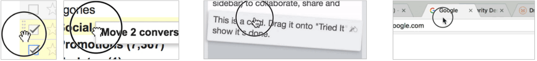 .font-small[ Gmail | Trello | Chrome ----- | ------ | ----- Drag Handle | No Handle |  No Handle Grab cursor | Pointer cursor | Default cursor Drop Shadow | Drop Shadow |  No Drop Shadow Drop Target | Drop Target |  No Drop Target  No Natural Movement | Natural Movement |  Natural Movement ] .footnote[Examples courtesy of [Drag and Drop for Design Systems](https://uxdesign.cc/drag-and-drop-for-design-systems-8d40502eb26d)] ??? Also common in drawing programs Most sophisticated approach: dynamic semantics: Check legality and consequences of each result at every move don’t catch errors, prevent them --- # Other Examples Fan Cursor, Area Cursor and Bubble Cursor ![:youtube Video showing a variety of schemes for making the cursor bigger including fan cursor; area cursor; and bubble cursor,bq1x5cRqgUc] .footnote[Su, X., Au, O. K. C., & Lau, R. W. (2014, April). The implicit fan cursor: a velocity dependent area cursor. In Proceedings of the SIGCHI Conference on Human Factors in Computing Systems (pp. 753-762). ACM.] --- ## Design Tip #6: Separate Motor Size from Visible Size .left-column[ 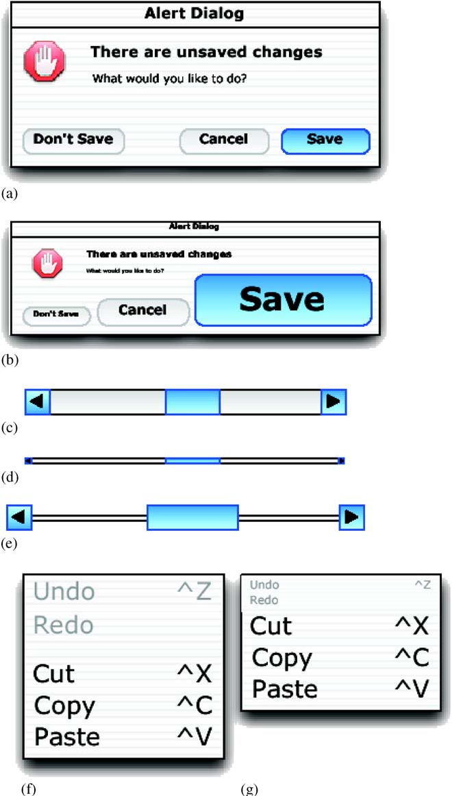 ] .right-column[ - (a) Visual space appearance of buttons in a dialogue box. - (b) Motor space version of button design in (a) with much larger targets for certain buttons. - (c) Standard scroll-bar design. - (d) Visual space appearance of scroll-bar redesigned to occupy smaller screen space. - (e) Motor space version of scroll-bar design in (d) with larger targets for active areas. - (f) Visual space appearance of menu. - (g) Motor space version of the menu design in (f) with the distance to more important items reduced by compressing the size of less important items) ] .footnote[Semantic pointing widget designs from Blanch et al. 2004] ??? How would you implement this? - Manipulate picking - Whorfian effects --- # Small on purpose? What might you make too small and why? -- count: false How about a cancel button? --- # How long will this take? .right-column-half[ Select 'Open New Window in Process' ] .left-column[ 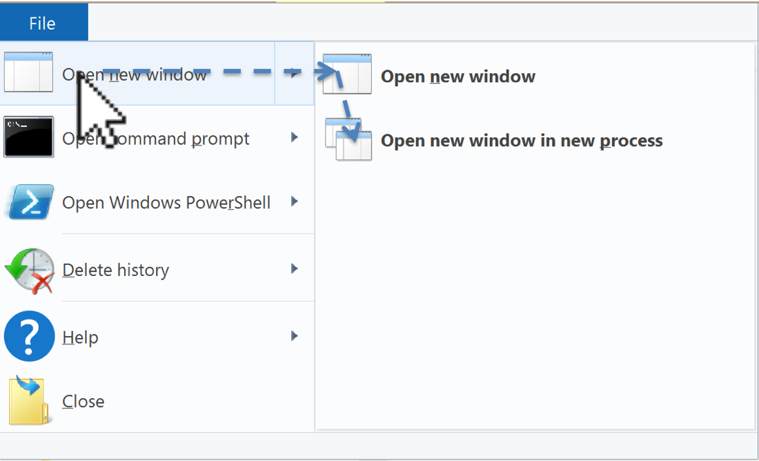 ] -- count: false .right-column-half[ Steering law ... Fitts law integrated over the path you have to follow ] -- count: false .right-column-half[ But it's not predictive at all. Why? ] -- count: false .right-column-half[ It doesn't account for actual user behavior ] --- # Actual User Behavior .left-column50[ 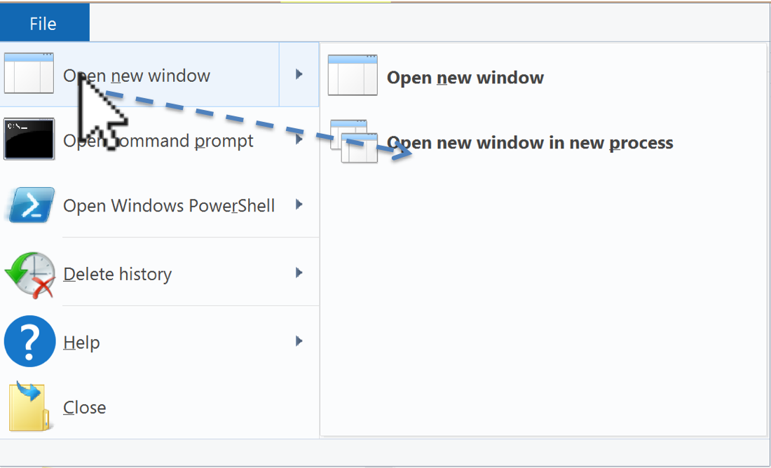 ] -- .right-column50[ 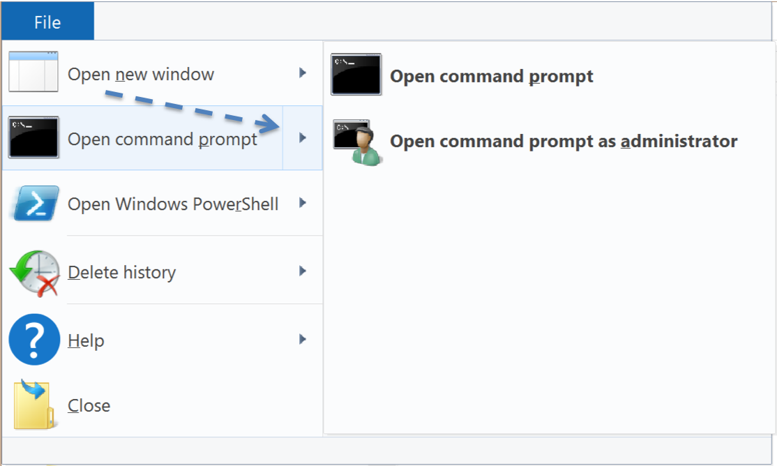 ] ??? Overly eager cascading menus, wrong submenu - Common problem w/ web menus (but not Mac or Win) - could brainstorm solutions (e.g. snapping? set focus somehow?) - whorfian effects: this is hard to implement --- # Fitts law has a huge limitation It is only predictive of **ERROR-FREE, EXPERT** behavior Related to our discussion of [Interaction Design](people-motor.html#33) --- # What else might we want to measure? -- - Time on Task -- How long does it take people to complete basic tasks? (For example, find something to buy, create a new account, and order the item.) -- - Accuracy -- How many mistakes did people make? (And were they fatal or recoverable with the right information?) -- - How strenuous (e.g. gaze has lower throughput but is less strenuous than head pointing Mackenzie 2018) -- - Recall -- How much does the person remember afterwards or after periods of non-use? -- - Emotional Response -- How does the person feel about the tasks completed? (Confident? Stressed? Would the user recommend this system to a friend?) ??? Build up a list of good UI design Principles from these basics - Undo - Predictability - ... What is missing? (e.g. fun) --- # What else might we want to measure? .left-column50[ - Time on Task - Accuracy - How strenuous - Recall - Emotional Response ] .right-column50[ What is missing? ] ??? (e.g. fun) - Undo - Predictability - ... -- .right-column50[ - Fun - Predictability - Error Likelihood & Recovery - ... ] --- # Summary of Design Tips - Design Tip #1: Make small targets larger - Design Tip #2: Put commonly used things close together - Design Tip #3: Use edges. They are infinite in size (W) - Design Tip #4: Use pie menus for expert tasks (better yet, marking menus) - Design Tip #5: Use snapping to reduce distance (D) when targets are known - Design Tip #6: Separate motor and visible size --- # End of Lecture Extra information is on the slides that follow --- # Two Handed Interaction  ??? Used to be a norm Seems we forgotten to include it in our interfaces --- # Guiard's model of bimanual control Hand | Role and Action ---- | ---- Non-preferred | Leads the preferred hand (in time) | Sets the spatial frame of reference for the preferred hand | Performs coarse movements Preferred | Follows the non-preferred hand | Works within established frame of reference set by the non-preferred hand | Performs fine movement Aside: Guiard is assuming right-handed. Tendencies somewhat less clear for left-handers, but we typically assume this still applies ] .footnote[ Seminal work Yves Guiard, “Asymmetric Division of Labor in Human Skilled Bimanual Action: The Kinematic Chain as a Model”, Journal of Motor Behavior, Vol. 19, No. 4, 1987, pp. 486-517. http://cogprints.org/625/ ] ??? non-preferred hand sets context for preferred coarser, slower movement tends to move first ??? Applications? - Mouse+keyboard - Lenses --- # What does theory say about keyboard layout?  .footnote[From [Evoluent keyboard advertisement](https://turningpointtechnology.com/KB/EV/KB1.asp)] --- # Analysis of alternative keyboard layout Task | Leading Movement | Trailing/Overlapping Movement ----|----|---- Delete | Right hand — manipulate pointer with mouse; select by double clicking/dragging | Left hand — press DELETE (probably with little finger) Select an option in a window (see Figure 15) | Right hand — manipulate pointer with mouse; click option | Left hand — press ENTER (Assumes OK button is default) Click on a link in a browser | Left hand — navigate to link via PAGE UP and/or PAGE DOWN keys | Right hand — manipulate pointer with mouse; select link by clicking Open file; open folder; launch program | Right hand — manipulate pointer with mouse; single click on icon | Right hand — press ENTER (avoids error prone double-click operation) --- # Other Examples: Tool Stone for Magic Lenses ![:youtube By manipulating a mouse and a cube (one in each hand) the user controls a lens and uses it on screen, V32SnUnAe2E] Inspired by [1994 CHI paper](https://dl.acm.org/citation.cfm?id=166126) Published in [UIST 2000](https://lab.rekimoto.org/projects/toolstone/) --- # Magnification  --- # Font Selection  ??? Fitts' law implications? --- # Debugging Lenses  .footnote[ Hudson, S. E., Rodenstein, R., and Smith, I. 1997. Debugging lenses: a new class of transparent tools for user interface debugging. In Proceedings UIST '97, 179-187. http://doi.acm.org/10.1145/263407.263542 ] --- # Advantages of Lenses In context interaction - Little or no shift in focus of attention and/or movement - Alternate views in context and on demand ??? - tool is at/near action point - can compare in context - useful for “detail + context” visualization techniques -- Structured well for 2 handed input - non-dominant hand does course positioning (of the lens) - dominant hand does fine work "Spatial modes" - Use “where you click through” to establish meaning - Typically has a clear affordance for the meaning --- # Implementing Lenses .small[ <div class="mermaid"> graph TD Root(Root) --> LP(Lens Parent) LP --> L[Lens] LP --> I(Interactor 1) LP --> II(Interactor 2) LP --> III(Interactor 3) </div> ] .footnote[Edwards, Hudson, et al., “Systematic output modification in a 2D user interface toolkit”, UIST ’97. http://doi.acm.org/10.1145/263407.263537 ] ??? Can be implemented with special "lens parent" container & lens interactors - Lens may need to change results of picking (only positional is affected) in collusion with lens parent - Lens parent forwards all damage to all lenses - Lenses typically change any damage that overlaps them into damage of whole lens area - Can pass a subclass of Drawable to "ambush and modify" drawing for output effects --- # Discussion: Should scrolling be dominant or non-dominant? What tasks is scrolling used for? Which precedes/follows? ??? Task | Characteristics Scrolling | precedes/overlaps other tasks | sets the frame of reference | minimal precision needed (coarse) Selecting, editing, reading, drawing, etc. | follows/overlaps scrolling | works within frame of reference set by scrolling | demands precision (fine) --- # Summary Slide Design tips for motor - Design Tip #1: Make small targets larger - Design Tip #2: Put commonly used things close together - Design Tip #3: Use edges. They are infinite in size (W) - Design Tip #4: Use pie menus for expert tasks (better yet, marking menus) - Design Tip #5: Use snapping to reduce distance (D) when targets are known - Design Tip #6: Separate motor and visible size Two-Handed input principles - Non preferred leads - Sets frame of reference - Preferred does fine movement
