name: inverse layout: true class: center, middle, inverse --- # Properties of People Lauren Bricker CSE 340 Spring 23 --- name: normal layout: true class: --- [//]: # (Outline Slide) # Today's goals - Administrivia - Reminder: [Layout](/courses/cse340/23sp/assignments/layout) part 1-2 checkpoint Wed 12-Apr (no resubmissions) - IMPORTANT: `git add/commit/push` frequently to back up your work - Turn in your code to [Gradescope](https://www.gradescope.com/courses/520574) for **part 1-2**!!!! - Reminder 2: Layout part 3-4 and reflection due next week - Resubmissions will be open this evening. - Prep for Section - please clone the [ColorPicker app](https://gitlab.cs.washington.edu/cse340/exercises/sectioncolorpicker/-/tree/section-3) app and optionally the [layout lab](https://gitlab.cs.washington.edu/cse340/exercises/layoutlab/) - Properties of People - Vision - Discuss visual properties of people - Discuss memory Future Goal: Discuss motor control --- # Warm up: Critique  Think...go to the [Properties of People 1](https://edstem.org/us/courses/38124/lessons/59405/slides/331421) Lesson on Ed and answer: - Something I like about this ad is... - Something I would change about this ad is... -- count:false Share - What is being sold here? By whom? - Why did they write the ad in this way? - Who can read the ad? Who can't? --- # Visual Properties of People People's visual abilities have a big impact on everything from how we model color to what makes for good design People have a variety of visual capabilities, which you should know - 4.5% of the world population (mostly men) is color blind<sup>1</sup> - Globally, at least 2.2 billion people have a near or distance vision impairment<sup>2</sup> Good design is generally more accessible design .footnote[ <sup>1</sup>[colourblindawareness.org](https://www.colourblindawareness.org/colour-blindness/)<br> <sup>2</sup>[WHO](https://www.who.int/news-room/fact-sheets/detail/blindness-and-visual-impairment)<br> ] ??? --- layout: false # What does this image show? .body[  Discuss with your neighbor... ] .footnote[ Example from http://10qviz.org/home/categories/rainbow-color-map/ ] --- # What does this image show? .body[   ] .footnote[ Example from http://www.research.ibm.com/people/l/lloydt/color/color.HTM ] --- # What does this image show? .left-column50[   ] .right-column50[ So why is the color choice on the left poor? ] -- count: false .right-column50[ - Colors on left don't map to nature (on right: blues are water, green is land) - Hue (rough color, ie red, green, blue, orange) maps to "Nominal" or discrete labeled data - Color saturation (purity) or value (brightness) can map to an ordinal (ordered) or qualitative scale ] --- # Visible Spectrum There are limits to human perception of light: 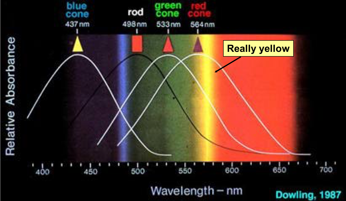 .footnote[ http://insight.med.utah.edu/Webvision/index.html] --- # Red Green Blue (RGB) Color Model .left-column50[ RGB matches the eye's model - Receptor cells for red, green, blue (cones) - Receptor cells for grayscale (rods) ] .right-column50[ 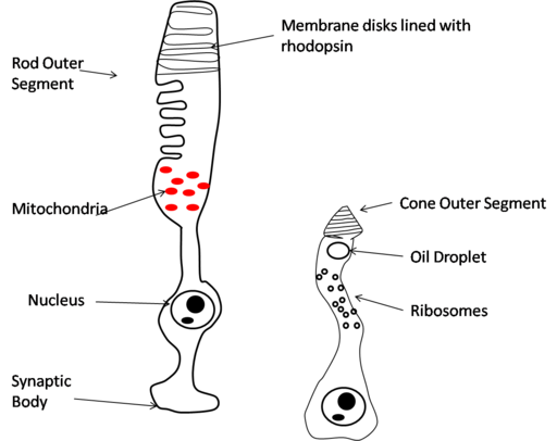 ] --- # Retina covered with light-sensitive receptors .right-column50[ Rods - Primarily for night vision & perceiving movement - Sense intensity or shades of gray - Can’t discriminate between colors - Mostly at edge of retina - ~75M – 150M rods ] .left-column50[ 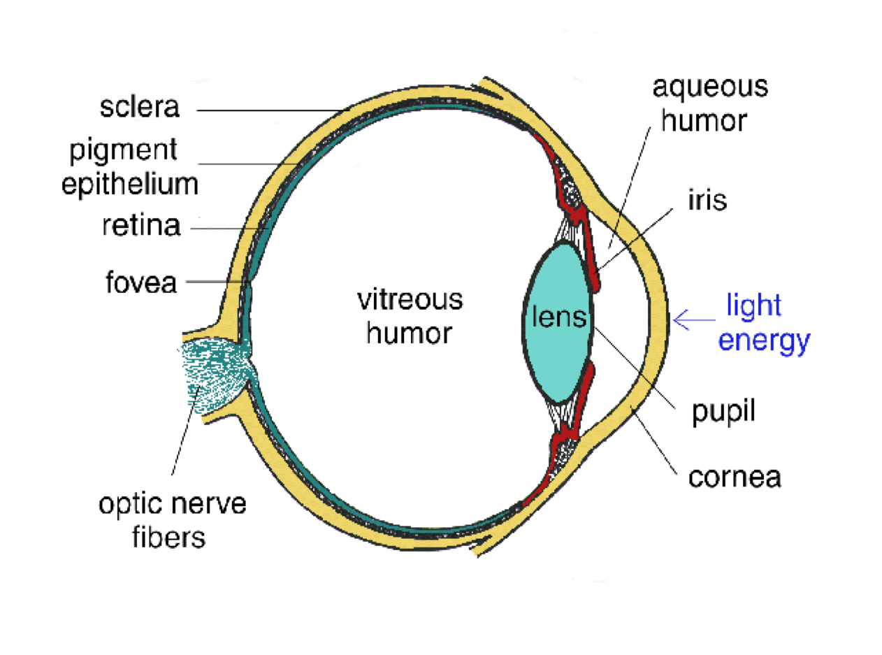 ] --- # Retina covered with light-sensitive receptors .right-column50[ Rods - ~75M – 150M rods Cones - Used to sense color - Mostly in center of retina - ~4.5M – 7M cones Many more rods than cones ] .left-column50[  ] --- # RGB Matches how human vision works .right-column50[ In Java, CSS, and other GUI programming, color is 24 bit (+ 8 bits for alpha transparency) So 8 bits for each of red, green, blue - Why not more bits? - Why not 64 bit color? Discuss! ] .left-column50[ 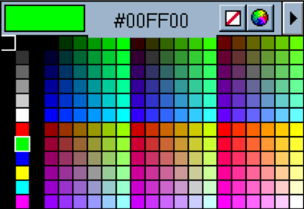 ] ??? Humans can’t really see much more colors --- # RGB Matches how human vision works .right-column60[ - However, RGB isn't all that intuitive (technology centric) - Especially artists and visual designers - Hard to pick colors in 3d on a 2d screen - Or actually perceive them at a cognitive level ] .left-column40[  ] ??? --- # RGB Matches how human vision works .right-column60[ - However, RGB isn't all that intuitive (technology centric) - Especially artists and visual designers - Hard to pick colors in 3d on a 2d screen - Or actually perceive them at a cognitive level - HSV is much better for *people* - Hue: Dominant wavelength of light - Saturation: Purity (how much white/black mixed in) - Value: Luminance or amount of light in color = max(R,G,B) ] .left-column40[ RGB  HSV 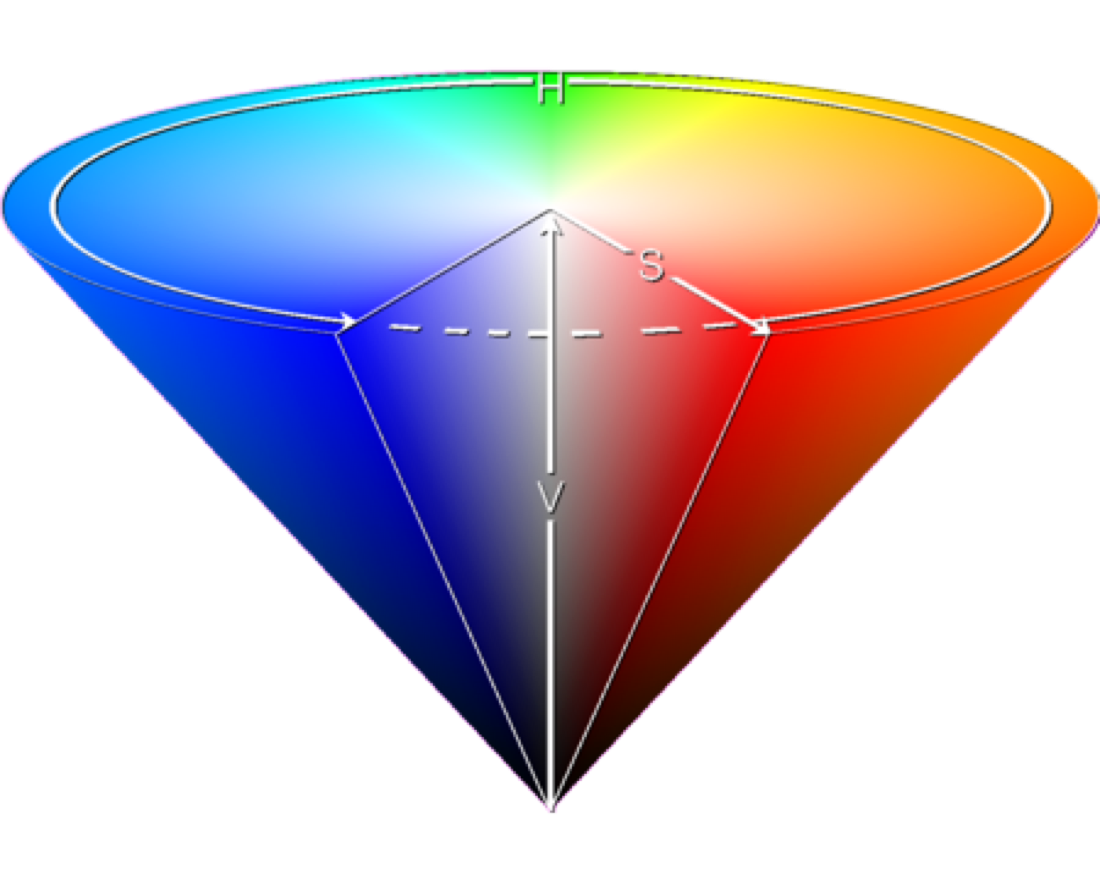 ] ??? HSV cylindrical – hue around the outside (angle) on the web value between 0 and 360 (red is 0, green is 120, blue is 240) and it’s in rainbow order), saturation from center to edge, value is top to bottom --- # Understanding HSV .left-column[  ] .right-column[ - Hue - or color value, is around the circle at the top of the cone. - Saturation - the colors get more saturated the further out from the center of the cone - Value - the color gets "brighter" the closer you are to the top of the cone and darker the further you go down. ] --- # Compare the following colors using HSV .left-column[  ] .right-column[ Which is correct? (answer on [Ed](https://edstem.org/us/courses/38124/lessons/59405/slides/331421)) - A: Top color has different *hue* than bottom color - B: Top color has higher *saturation* than bottom color - C: Top color has higher *value* than bottom color ] ??? B: Saturation --- # Value vs Saturation 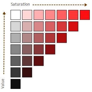 --- # Design choice You have been asked to create a interface that is compatible with digital-paper. As a result; you need to pick colors that will be easily distinguishable in black and white. Which of 'H' 'S' and 'V' should you vary to support black and white display? -- count: false V - Value (the brightness) --- # Perception of Color is Culturally Defined! .footnote[ <sup>1</sup>[New Scientist: Russian speakers get the blues](https://www.newscientist.com/article/dn11759-russian-speakers-get-the-blues/) ] .left-column30[ 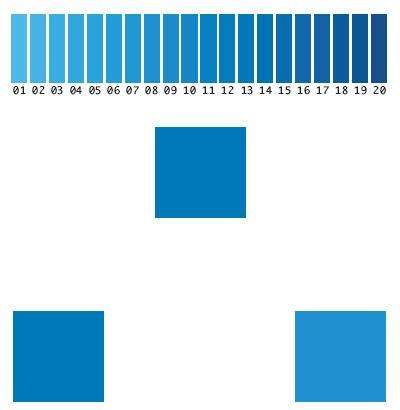 ] .right-column70[ Not only are we limited to RGB, we also disagree how to interpret it<sup>1</sup> .quote[The language you speak can affect how you see the world, a new study of colour perception indicates. Native speakers of Russian – which lacks a single word for “blue” – discriminated between light and dark blues differently from their English-speaking counterparts...] ] --- # And Relative ![:youtube Vergeer and Van Lier illusion,Db4PwJ2LDVk] --- # People are easy to trick .left-column50[ 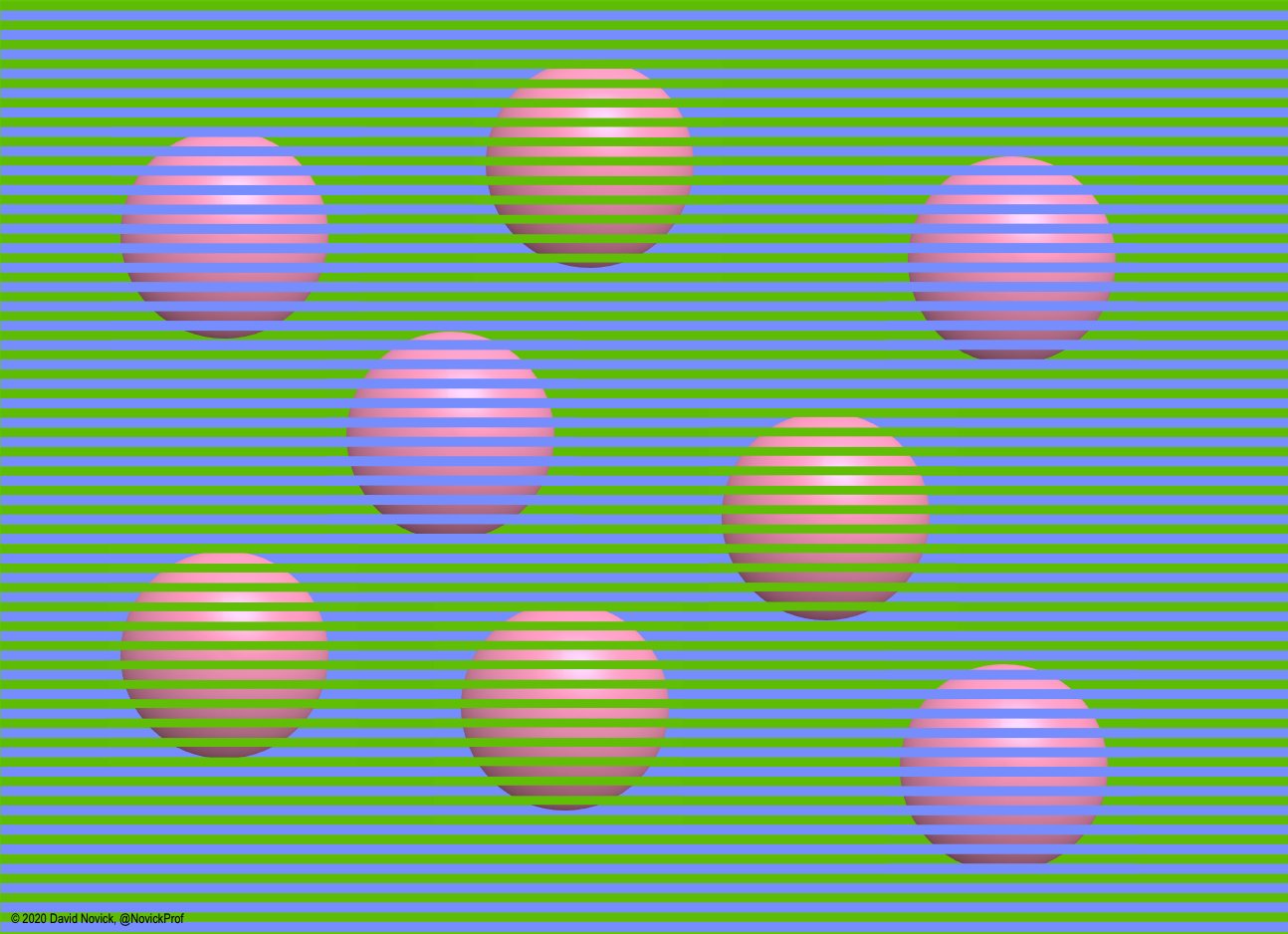 ] .right-column40[ From [@NovikProf](https://twitter.com/NovickProf/status/1270005909704638470/photo/1) *Surprising Spheres 4*: The foreground colors (hue 230° & 90°) appear similar but the background spheres (all base color RGB 255 157 194) appear distinctly pink and orange.. ] .footnote[Original .png file is at [http://bit.ly/2O74l2I](http://bit.ly/2O74l2I)] --- # People are easy to trick So how do we actually create color? We don't have LEDs of every color -- count: false - Three LCD cells per pixel - Keep them small! --- # Why pixels are enough .right-column-half[ There are limits of human perceptual system Our brain reconstructs what the eyes can't sense ] .left-column-half[   ] --- # People are easy to trick So how do we actually create color? We don't have LEDs of every color - Three LCD cells per pixel - Keep them small! How might we do grayscale? ??? make connection to video --- name: animation # How fast can people see things? .left-column[  ] --- count: false template: animation .right-column[ - From our animation class..... - 10-12 fps - Minimum humans see as continuous motion - < 16 fps - see visual stutter, can cause headaches - 24 fps - minimum tolerable motion, discrete images merge into continuous perception, cost efficient - 30 fps - Better, not lifelike. Standard NTSC - 48 fps - Good not great, images may still flicker - 60 fps - Most people can't perceive much smoother above 60 fps. - Peripheral vision more senstive to registering flicker - Attuned to movement in the periphery - Saves us from danger! ] .footnote[[The Illusion of Motion](https://paulbakaus.com/tutorials/performance/the-illusion-of-motion/)] --- template: animation .right-column[ How might we do grayscale? - Black 25% of the time - 40-60 frames per second (FPS)? ] --- name: inverse layout: true class: center, middle, inverse --- # How does this affect design? --- layout: false # Design Tip #1: Don't rely on blue for small objects .left-column40[  ] .right-column60[ - Photopigments not distributed evenly - Mainly reds (64%) & few blues (2-4%) - Less sensitive to short wavelengths (blue) ] --- count: false # Design Tip #1: Don't rely on blue for small objects .left-column40[  ] .right-column60[ - Photopigments not distributed evenly - Mainly reds (64%) & few blues (2-4%) - Less sensitive to short wavelengths (blue) - Few blue cones in fovea - Harder to see small blue objects - Blue text is slightly harder to read - So: blue hyperlinks as default is worst choice - Yet! strong contrast >> avoiding blue ] --- # Design Tip #2: Don’t rely on blue for older users .left-column50[ - As we age, our lens yellows and absorbs shorter wavelengths - Sensitivity to blue is even more reduced ] .right-column50[  ] --- # Design Tip #3: Make sure that contrast is high enough .left-column50[ **Accessibility Issue!** WCAG requires *at least 4.5:1* contrast, so you cannot round a contrast ratio up to 4.5:1. For example, #777777 <br>( ) is a commonly-used shade of gray with a 4.48:1 contrast ratio. It does not meet the WCAG contrast threshold.<sup>1</sup> ] .right-column50[ ] .footnote[ [WCAG guidelines on contrast](https://webaim.org/articles/contrast/) ] ??? Test in greyscale --- # Design Tip #3: Make sure that contrast is high enough .left-column50[ **Accessibility Issue!** WCAG requires *at least 4.5:1* contrast, so you cannot round a contrast ratio up to 4.5:1. For example, #777777 <br>( ) is a commonly-used shade of gray with a 4.48:1 contrast ratio. It does not meet the WCAG contrast threshold. ] .right-column50[ 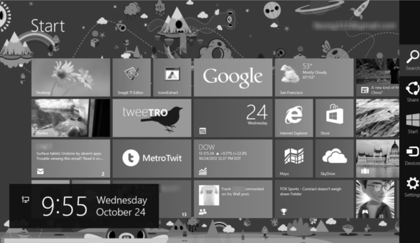 ] ??? Test in greyscale Focus on value over hue or saturation This will help ensure visibility Can use a b/w photocopier to help if you already have a GUI Keep luminance / intensity / value the same from grayscale when moving to color --- # Designing Tip #4: Minimize saturated colors .medium.right-column70[ - Different wavelengths of light focus at different distances behind eye’s lens - If your GUI has lots of reds and blues, will force lots of refocusing and cause fatigue - Design Implication - Pure (saturated) colors require more focusing than less pure (desaturated, pastel) - Avoid saturated colors in UIs unless really need something to stand out (stop sign) - Don't follow this advice! [Vibrant Colors in Web Design](https://uxplanet.org/vibrant-colors-in-web-design-20-visually-impactful-websites-to-inspire-you-bc7988da1e95) ] .left-column[ 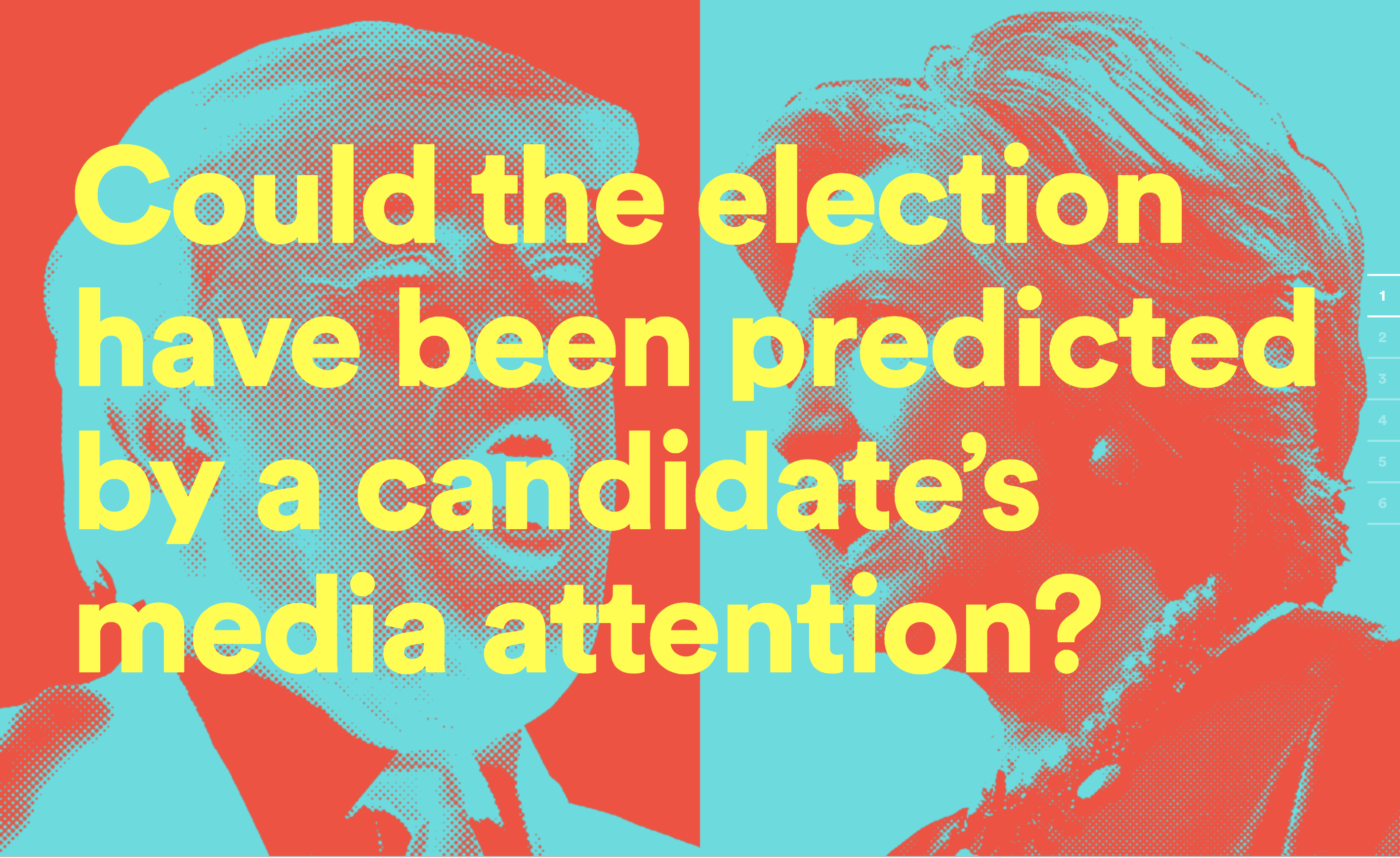 [mediaelection.com](http://mediaelection.com/) ] --- # Where to find more color advice? .medium.right-column70[ - Martin Krzywinski<sup>1</sup> on <br>[Brewer Palettes](http://mkweb.bcgsc.ca/brewer/) - [Color Brewer](http://colorbrewer2.org/), [Color Scheme Designer](http://colorschemedesigner.com), [Color Schemer](http://colorschemer.com), [Laws of UX](https://lawsofux.com/) ] .left-column[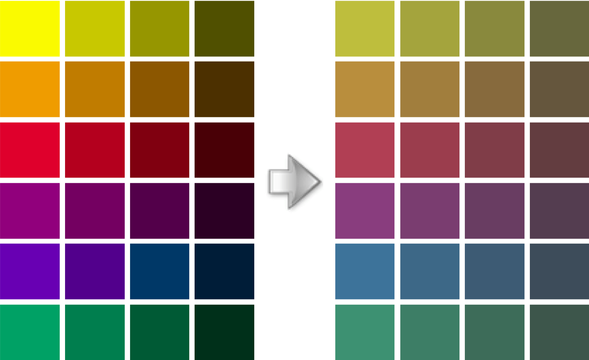] .footnote[ <sup>1</sup>Famous information graphics artist, [bio](http://mkweb.bcgsc.ca/bio/martin-krzywinski-bio.pdf)] --- # Color blindness: Ishihara Test ![:youtube Ishihara Colorblindness test showing colored dots inside colored dots showing numbers,WzAW41DugXQ] If you can’t see numbers, don’t worry - Projectors, LCD screens, CRT, and print all have different dynamic ranges, hard to get them to match --- # Trouble discriminating colors Occurs in approximately 9% of males, 0.5% of females<sup>*</sup> - Different photopigment response is common - Reduces capability to discern small color differences - Two main types - Red-green deficiency is best known (Lack of either green or red photopigment can’t discriminate colors dependent on R & G) - More rare are blue-yellow and total color blindness Some women have a fourth type of cone - Estimates are 12% women - Some can see more colors than ordinary humans .footnote[Genes that cause color blindness are on the X chromosome. In people with two X chromasomes, on can compensate for the other (from [Wikipedia](https://en.wikipedia.org/wiki/Color_blindness)) ] ??? Story about student doing website who didn't know they were color blind. --- # Design Tip #5: Use redundant cues .left-column-half[  ] .right-column-half[ Don't rely solely on Hue: Use mixtures of colors (red / green issues) Also have contrast in intensity Consider having other redundant cues too - What redundant cues used for traffic signs? ] ??? Traffic signs have multiple cues: color, word, shape Another case for using greyscale to test --- # Gestalt Psychology This draws from Gestalt Psychology. _Gestalt_ means "an organized whole that is perceived as more than the sum of its parts." Read about other [gestalt psychology](https://www.interaction-design.org/literature/article/the-law-of-similarity-gestalt-principles-1) principles - similarity - continuation - closure - proximity - figure/ground - symmetry and order --- # Let's try an experiment --- # Also useful for Pre-attentive processing .left-column50[ 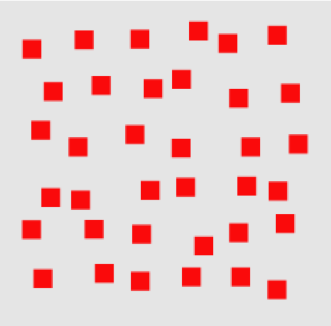 ] .right-column50[ On the next couple of slides you're going to see a picture. - If all of the shapes are the same, you'll call out "same", call out "different" if they are different. - One of the TAs will time us. Need a ~~victim~~ volunteer with a stopwatch ] ??? Grouping looks at how to make things look related What if we want to make things look different and stand out? Let's try it: Say out loud: Same if every object is the same Different if at least one object is different --- # Pre-attentive processing 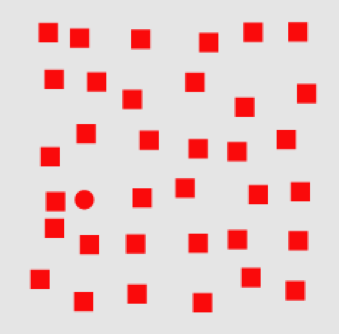 ??? this is about shape --- # Pre-attentive processing 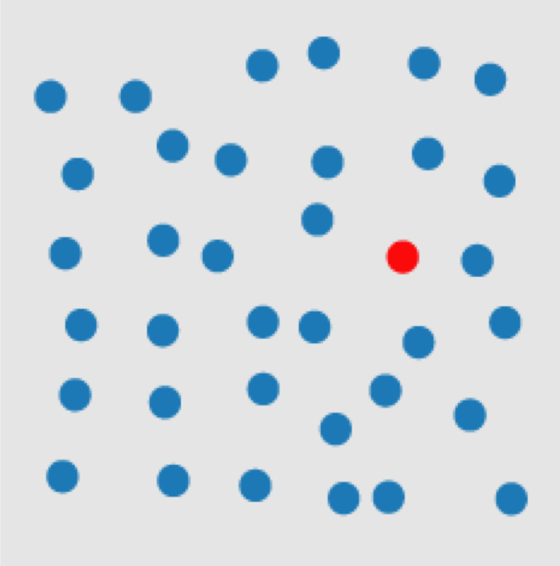 ??? this is about color --- # Pre-attentive processing  ??? gotcha! --- # Pre-attentive processing  ??? this is about size --- # Pre-attentive processing 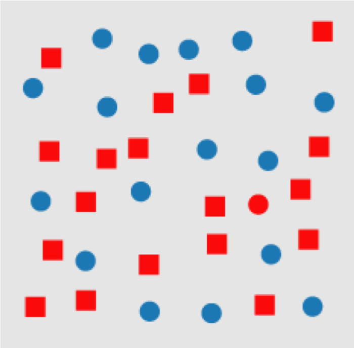 ??? This one doesn't work well --- # Design Tip #6: Make things Distinct 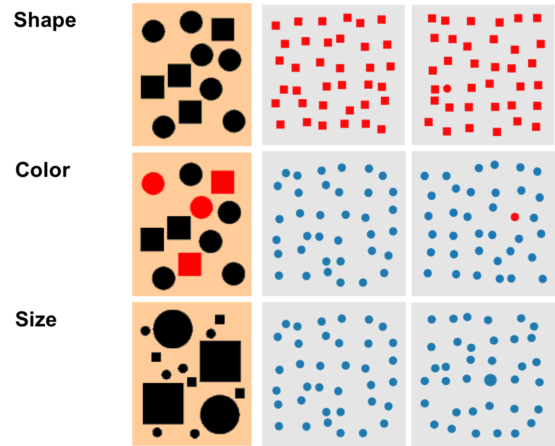 What other variables might be important to making things distinct? ??? From Kevin Mullet and Darrell Sano, Designing Visual Interfaces - Value - Orientation - Texture - Position (2d/3d) --- # Design Tip #7: Use [Small Multiples](https://en.wikipedia.org/wiki/Small_multiple) .left-column50[  ] 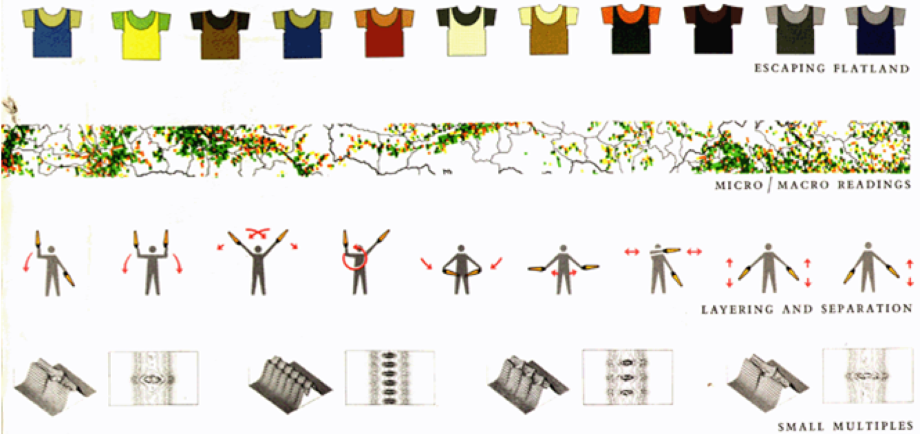 .footnote["Information consists of differences that make a difference" -- Edward -- -- Tufte, Envisioning Information] --- template: animation .right-column[ - < ~40ms (1/24 sec) discrete images/flashes merge into continuous perception - < ~100-200ms seems like “instant response”* - Hard to tell response times below this apart - Upper range of eye saccades ] --- # How fast can people see things? .left-column-half[ - < ~40ms (1/24 sec) discrete images/flashes merge into continuous perception - < ~100-200ms seems like “instant response” - .bold.blue[< 1-2 seconds typically “good response time”] - Similar times in conversational turn taking protocols - Longer delays ~5 sec have to say something to keep conversation alive - Note: numbers fuzzier as we go out ] --- # How fast can people see things? .left-column-half[ - < ~40ms (1/24 sec) discrete images/flashes merge into continuous perception - < ~100-200ms seems like “instant response” - < 1-2 seconds typically “good response time” - .bold.blue[More than 10-15 sec is typically “bad response time”] - Short Term Memory (STM) decay effects - Web has trained us to accept slower response times ] -- count: false .right-column-half[ .quote["Two hundred fifty msec, either slower or faster, is close to the magic number now for competitive advantage on the Web"] ] .footnote[Harry Shum, a computer scientist and speed specialist at Microsoft] --- # Design Tip #8: Manage expectations Long response times are more manageable if you - Tell people what to expect, be predictable (follow through) - Also good to support interrupts --- # How fast can people see things? .left-column-half[ - < ~40ms (1/24 sec) discrete images/flashes merge into continuous perception - < ~100-200ms seems like “instant response” - < 1-2 seconds typically “good response time” - .bold.blue[More than 10-15 sec is typically “bad response time”] ] .right-column-half[ Can also manipulate perception: [Chris Harrison's work](http://chrisharrison.net/index.php/Research/ProgressBars2) ![:youtube Harrison progress bar manipulation shows how animation of progress bars changes perception of response time,CDnN3wLY3OE] ] --- # How fast can people see things? .left-column-half[ - < ~40ms (1/24 sec) discrete images/flashes merge into continuous perception - < ~100-200ms seems like “instant response” - < 1-2 seconds typically “good response time” - More than 10-15 sec is typically “bad response time” - .bold.blue[No response: Change Blindness] ] .right-column-half[ ![:youtube Video of someone asking for directions while another person walks by with a door,FWSxSQsspiQ] ] ??? - Subtle changes over time - Distractors - Discontinuities (Ex. in movies) --- # How fast can people see things? .left-column-half[ - < ~40ms (1/24 sec) discrete images/flashes merge into continuous perception - < ~100-200ms seems like “instant response” - < 1-2 seconds typically “good response time” - More than 10-15 sec is typically “bad response time” - .bold.blue[No response: Change Blindness] ] .right-column-half[ ![:youtube Video of basketball players, 0grANlx7y2E] ] --- # Design Tip #9: Replace subtle changes with obvious ones  --- # Design Tip #9: Replace subtle changes with obvious ones  --- # Design Tip #9: Replace subtle changes with obvious ones  --- # What's wrong with these buttons? 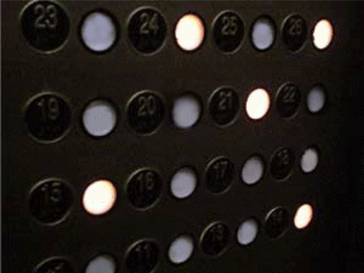 ??? No clear association between buttons and labels --- # Better grouping strategy 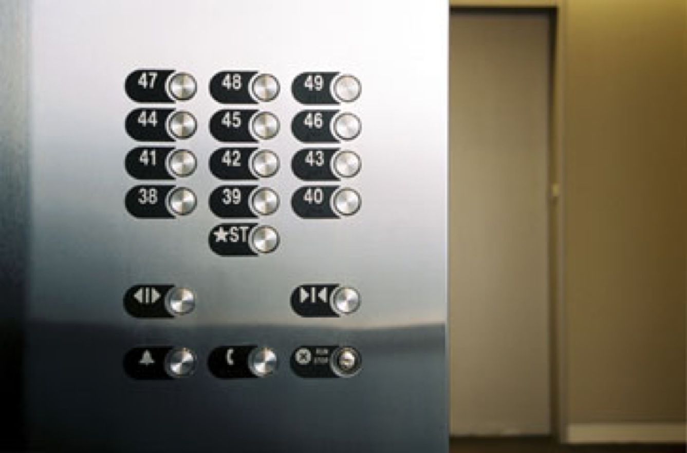 ??? Clear association between buttons and labels --- # Good or bad? Review Star Labels | Icon Labels ----|---- 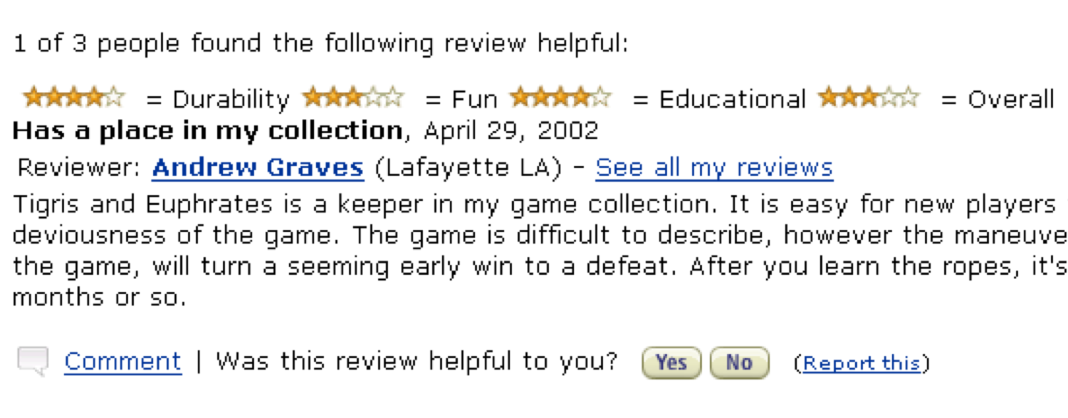 |  ??? No clear association between icons and labels --- # Design Tip #10: Use well-tested visual grouping strategies .right-column[ ] --- # But not too many groups! [Hick's law](https://en.wikipedia.org/wiki/Hick%27s_law): Reaction time (RT) is logarithmically related to the number of options .jax[$$RT = T * log_2(n+1)$$] - in other words people use *binary search* - Assumes there is a logic to the ordering (worse when random) - General case: Information foraging theory (Pirolli & Card) --- # Design Tip #11: Minimize the number of options With every additional choice the time it will take more time for selection --- # How much can a person remember? Short term (working memory) - Famous 7 +/- 2 “chunks” (Somewhat outdated model) - 2461827176 - YBEAMBIMGC --- count: false # How much can a person remember? Short term (working memory) - Famous 7 +/- 2 “chunks” (Somewhat outdated model) - 2461827176 vs (412) 268-1776 - YBEAMBIMGC vs EBAY IBM GMC --- # Chunking in practice  --- # How much can a person remember? Short term (working memory) - Famous 7 +/- 2 “chunks” (Somewhat outdated model) - Basically: “very limited” and “decays quickly” - Has become “worse” with constant multitasking -- count: false Long term - Essentially unbounded - But requires effort & may not always work on cue - Can’t explicitly forget! Even though you try! --- # How much can a person remember? Short term - 7 +/- 2 "chunks" (or less); decays quickly Long term - Essentially unbounded, but slower Novice / expert differences - Experts have learned items in long term memory to draw on, novices don’t --- # Design Tip #12: Rely on recognition rather than recall .right-column[ Cannot count on memory to be there, or be fast! - Generally better to rely on recognition (seeing it in front of you) than just recall (having to pull it out of long term memory) - But note that having the ability to operate from recognition does not preclude recall ] .left-column[  ] --- # Recap of Design Tips for Vision - #1: Don't rely on blue for small objects - #2: Don't rely on blue for older users - #3: Make sure that contrast is high enough - #4: Minimize saturated colors - #5: Use redundant cues - #6: Make things distinct - #7: Use small multiples - #8: Manage expectations if you can't change response time - #9: Replace subtle changes with obvious ones - #10: Use well-tested visual grouping strategies - #11: Minimize the number of options - #12: Rely on recognition rather than recall --- # Summary Human Physiology drives design - Number of colors - Pixel size (retina displays) Good design is accessible design - There is tons to know about good use of color and other visual design elements. For not, the simplest thing to do is to look for existing color palettes, and just those. That should account for the vast majority of your needs for colors. There is also red-green color blindness too. Simplest thing to do is to turn your screens into greyscale, and see if you can see differences. --- # End of deck (unused slides past here) --- # Aside: Color Gamuts<sup>1</sup> ![:youtube Explanation of color gamuts,8y9yENEdtG4] .footnote[ <sup>1</sup> See the [Wikipedia page on color gamuts](http://en.wikipedia.org/wiki/Gamut) for more information] ??? - no time to play video - Outside is wavelengths (hues) - Triangle shows primary colors for this gamut