Report on Menus Assignment
Comments about what should be in your report can be found in italics. You must remove the comments and replace them with your own words.
Introduction
Write two sentences describing the purpose of the experiment. This
can be the same text you use in your consent form under
Introduction and Purpose of study (Beneficience)
Method
Menus: Mention that there are three types of menus: Pie, Linear and Custom. Then include the following:
- The design your custom menu by including your sketches and a clear explanation of how you expect a user to interact with your custom menu. Also include the description and calculations for your essential geometry.
- Describe some of the design choices you made when you were conceiving your custom menu, and how you expected it would perform against Normal and Pie menus
- Include the screenshots of your custom menu in both a selected and unselected state.
- Discuss how your final product matches/doesn’t match your original vision.
Tasks: Describe the 9 conditions of the study. Explain how many items were selected per menu, and how many times each item was repeated. Describe how many trials each participant completed. This should be at most one paragraph
Setting: What device was used? Was it an emulator? Did they use a mouse or a finger? Where did the experiment take place?
Participants: Describe your participants (without identifying them). How were they recruited? How many were there? Were they consented? You should also add some optional information such as: What was there average age? What genders were present? How experienced were they with android?
Data Collected: What information was collected (time, errors, etc)
Results
To analyze your data, you should copy the following spreadsheet
and paste your data into the Raw Data subsheet, replacing the
contents/data that we placed there. To use this spreadsheet look at
the Example Chart sheet to see a chart of your data (you can click on
the hamburger menu in the chart to download it as an image). You can
also create your own charts if you are comfortable working in a spreadsheet.
The results will be broken into two parts. The first will describe the overall data, including how many erroneous selections took place, and how fast the user was in each condition.
You must use two different types of charts in this section (bar graph, histogram, scatter plot, etc.) Select the type of chart(s) that visually represent the properties of each menu you wish to highlight. Each chart must be accompanied by a written description that discusses the patterns you see.
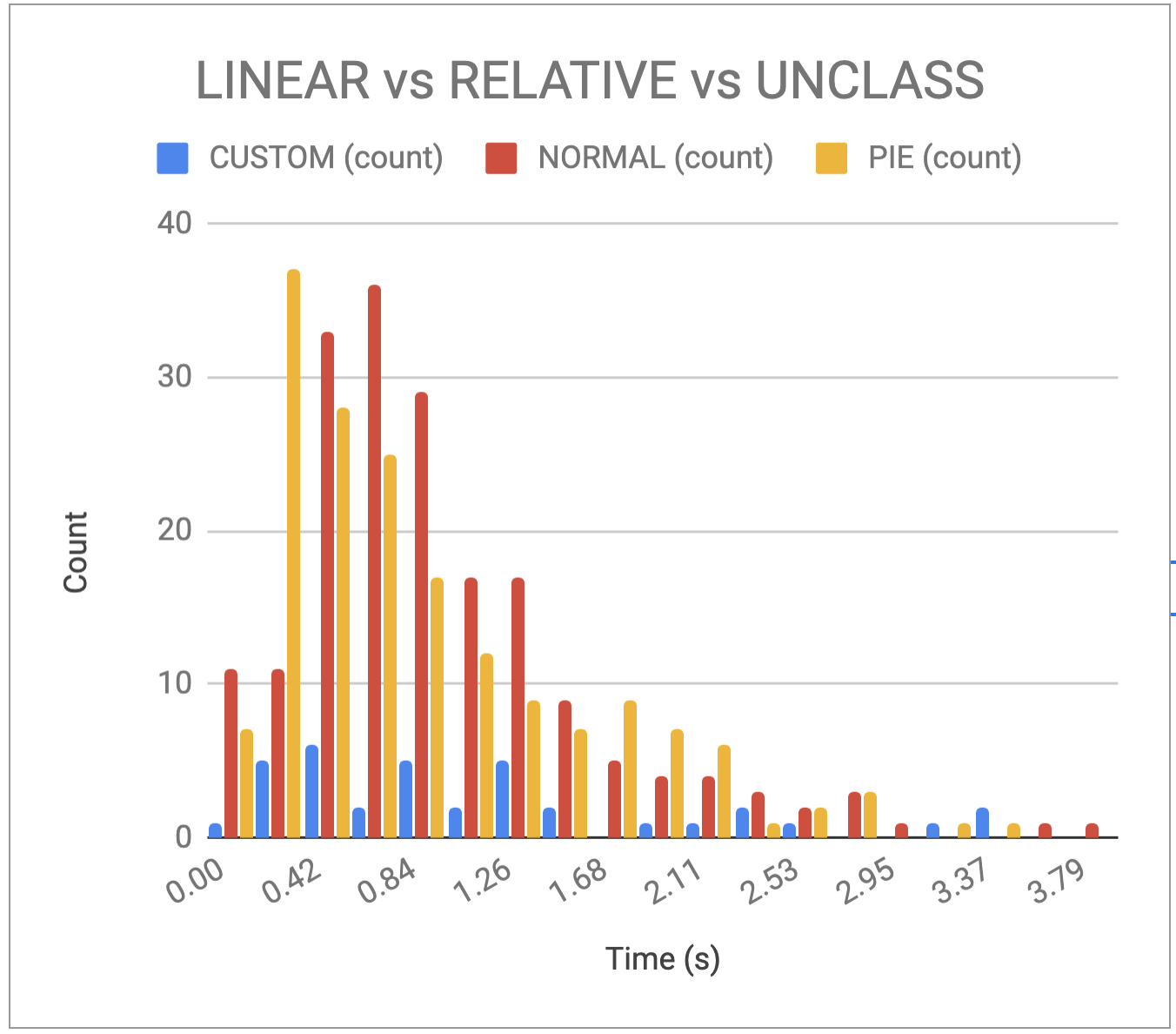
Speed Results
Describe your thoughts about overall speed in different conditions. Use at least one chart to illustrate what you say. Describe the axes and explain why this graph was chosen. Here is an example chart generated using our data, when you paste your data into the spreadsheet you’ll see that it updates to reflect your data.
Error Results
Describe what happened in terms of errors – provide at least one chart showing what you learned about errors in different conditions. Describe the axes and explain why this graph was chosen.
Conclusions and Future Work
Draw and describe your overall conclusions from this experiment. Do you think we should use pie menus more? normal menus more? or your custom menu? What can we conclude from your data?
Describe two areas of future work for your menus
- The menus we ceated as written are not accessible. Describe at least two issues that could be or were found by any of the Accessibility tools we used in our prior assignment. Describe why these issues might be an impediment to some users and how would you fix them?
- How might you change your custom menu based on your analysis of the data from this experiment?
Acknowledgements
Cite anything (website or other resource) or anyone that assisted you in creating your solution to this assignment. Remember to include all online resources (other than information learned in lecture or section and android documentation) such as Stack Overflow, other blogs, students in this class, or TAs and instructors who helped you during OH