# What went wrong? .left-column50[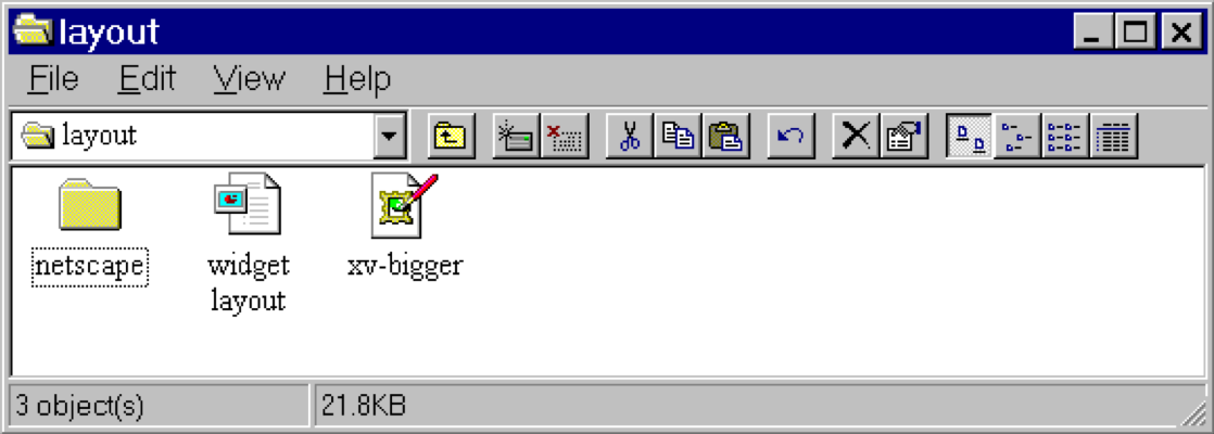] .right-column50[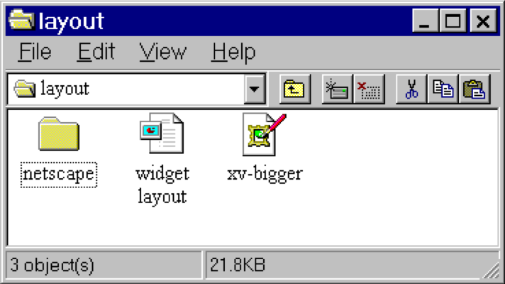] ??? - Changing available space e.g., window resized by user - Changing sizes, fonts, etc. - Adding and removing components - Layout mechanism has to deal with all cases --- # What went wrong? 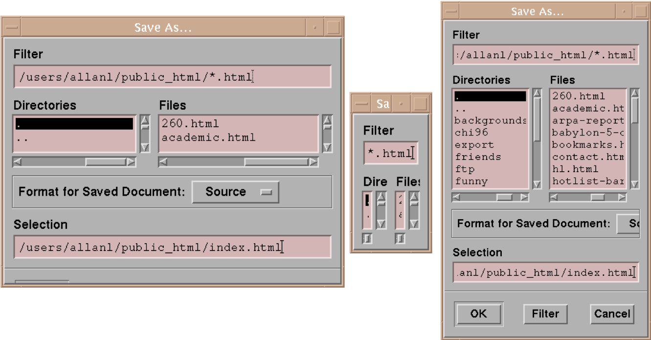 ??? - No scroll bar for text boxes that are too narrow - No way to redistribute space between directory & file list - Important controls (e.g., Open) get hidden - Min size is much too small - No way to send the dialog away (buttons gone) --- name: inverse layout: true class: center, middle, inverse --- # Layout II: Layout in Practice Lauren Bricker CSE 340 Spring 2022 --- name: normal layout: true class: --- layout: false [//]: # (Outline Slide) # Goals for today - Announcements - Peer reviews - Will be assigned on Canvas Friday night (automatically) for anyone who turns in a video. - Will be assigned manually for anyone who does not submit a video by Saturday morning - Due Sunday night. - Layout will be released soon (part 1-2 due next Thursday) - Practice Quiz 2 is on [Ed](https://edstem.org/us/courses/21053/lessons). - Quickly finish [Layout 1](layout.html#38) (inflation) - Android Layout Algorithm - **Constraints** - Creating Layout Programmatically --- # Reminder: Layout Types in Android - [FrameLayout](https://developer.android.com/reference/android/widget/FrameLayout) - good for position views on top of each other, or encapsulating a bunch of views. Used in [Doodle](/courses/cse340/22sp/assignments/doodle). - [LinearLayout](https://developer.android.com/reference/android/widget/LinearLayout) - places views one after the other in order according to the orientation (Horizontal or Vertical). Used in [Layout](/courses/cse340/22sp/assignments/layout). - [RelativeLayout](https://developer.android.com/reference/android/widget/RelativeLayout) - Positions of the children are desribed in relation to one another - [TableLayout](https://developer.android.com/reference/android/widget/TableLayout.html) - Rows and columns style way of declaring a layout - [GridLayout](https://developer.android.com/reference/android/widget/GridLayout.html) - Uses an [*adapter*](https://developer.android.com/reference/android/widget/Adapter.html) that provides i tems to display in a grid - [ConstraintLayout](https://developer.android.com/reference/android/widget/ConstraintLayout.html) Let's you use constraints to specify how things should lay out. Used in [Layout](/courses/cse340/22sp/assignments/layout). More on [declaring layout](https://developer.android.com/guide/topics/ui/declaring-layout.html) ??? Talk about different Toolkits may have different layouts. --- name: constraint-template # Constraints: A Powerful Option .left-column[ <br> ] --- template: constraint-template .right-column[ Can do everything we can do with springs, struts, and linear layouts Declare relationships (**what** should be true) System automatically maintains relationships under change (**how** this should happen) ] --- template: constraint-template .right-column[ Can do everything we can do with springs, struts, and linear layouts Declare relationships (what should be true) - This should be centered in that - This should be 12 pixels to the right of that - Parent should be 5 pixels larger than child System automatically maintains relationships under change (how) ] --- # Constraint Layout in Android .row[ You can see little lines connecting the `textView` to its container and its sibling (the `linearLayout`). ] .row[ .left-column30[ 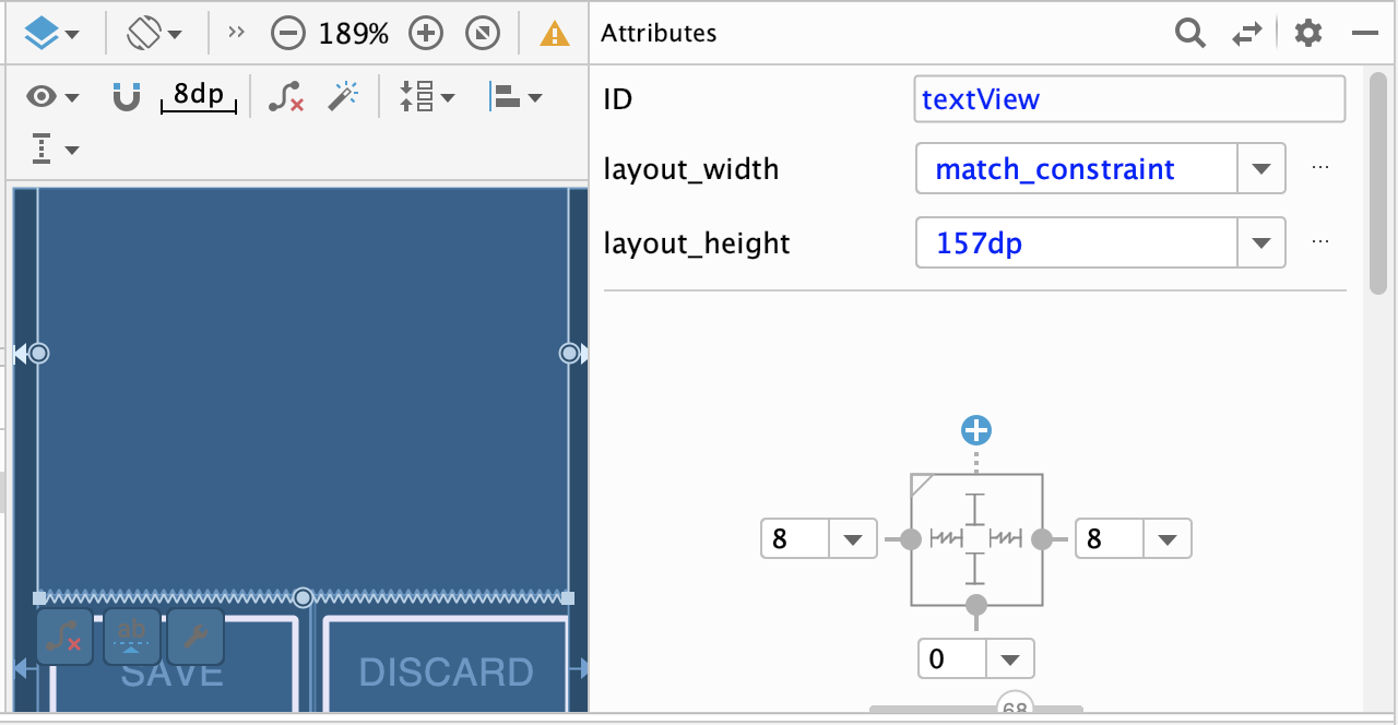 ] .right-column60[ - This specifies how it's attached (can change type by clicking on right) - If you were to change the interface (e.g. a different sized screen), it would stay attached and keep filling the space - All ends up in XML you can explore too ] ] --- # Constraint Layout in Android .left-column50[ 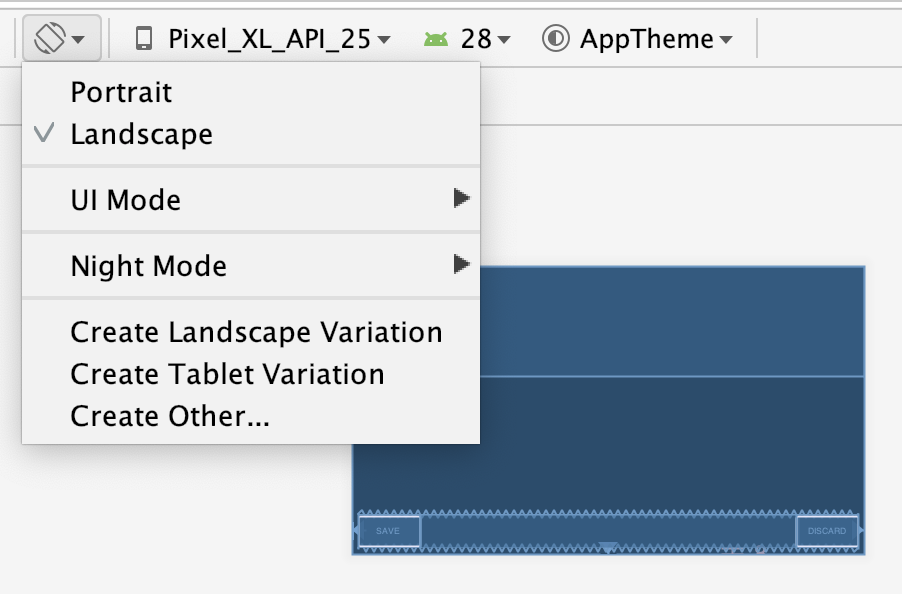 ] .right-column50[ You can test this in the emulator: modify the aspect ratio of your display, and flip it to horizontal to test things ] ??? Demonstration: consider demoing this interface live PRINT THIS LIST - Show dragging things to create layout - Show different size and orientation phones - Show editing attributes - Show clicking on constraints in box to change type - Show simple interface hierarchy - Show simplifying xml - Show changing button names/ids --- template: constraint-template .right-column[ - What do you think this does? `app:layout_constraintBottom_toTopOf="@+id/linearLayout"` ] --- template: constraint-template count: false .right-column[ - What do you think this does? `app:layout_constraintBottom_toTopOf="@+id/linearLayout"` - And this? `app:layout_constraintEnd_toEndOf="parent"` ] --- template: constraint-template count:false .right-column[ - What do you think this does? `app:layout_constraintBottom_toTopOf="@+id/linearLayout"` - And this? `app:layout_constraintEnd_toEndOf="parent"` - We also use `Start_toStartOf` and `Top_toTopOf` to create this layout ] --- # All of this can be specified in XML ```xml <TextView android:id="@+id/textView" android:layout_width="0dp" android:layout_height="0dp" android:text="@string/sample_text" app:layout_constraintBottom_toTopOf="@+id/linearLayout" app:layout_constraintEnd_toEndOf="parent" app:layout_constraintStart_toStartOf="parent" app:layout_constraintTop_toTopOf="parent" android:layout_marginStart="8dp" android:layout_marginTop="8dp" android:layout_marginEnd="8dp" android:layout_marginBottom="8dp"/> ``` --- .left-column[ ## Android's Limits 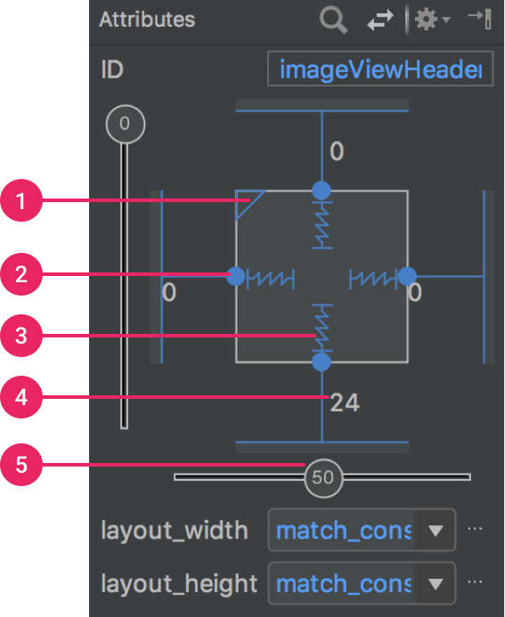] .right-column[ Android provides a limited set of constraints ([Docs](https://developer.android.com/training/constraint-layout/)): - 1 Size ratio - 2 Delete constraint (not a constraint, just removes them) - 3 Height/width mode (3 main types): - Wrap constraint  - Fixed size  - Match Constraint  - 4 Margins - 5 Constraint bias (essentially weights on competing constraints) Range of attachment options (e.g. button sides, corners) Worth getting to know additional abstractions (groups; guidelines; barriers; chains) ] ??? -bias lets us create something that is 2-3 of the way over rather than centered go back to android to demo again --- exclude: true # Note that these are one-way constraints You can change the right side, and it will update the left side (not the reverse) Can be very inefficient .jax[$$O(2^n)$$] But highly efficient incremental update algorithms exist ??? Only have to update things that might change Hudson's work on this was seminal can have a Directed Acyclic Graph (DAG) but not a cycle (thus, a tree) hard to guard against cycles --- # Constraints: Very General General mechanism for establishing and maintaining relationships between things - Layout is one use - Several other uses in UI - Connection of application to UI, e.g. deriving appearance from data - Multiple views of same data - Automated semantic feedback - Automatic arrangement of lines (Snapping in drawing) --- # Layouts in Play .left-column50[ Which layouts are used in these apps? ] .right-column50[  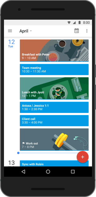 ] -- .left-column50[ Probably: - **LinearLayout** - **ConstraintLayout** Thinking about what layouts are in an app is part of your Part 4 of the Layout assignment. ] ??? FrameLayout and GridLayout could definitely be ruled out. TableLayout should really be used for much more regularly "excel" like tables, so that can also be ruled out. While RelativeLayout might be an option (it's older but still used), but still worth of selecting. Most likely this would be a combination of Constraint and Linear layouts. --- layout: false [//]: # (Outline Slide) # Goals for today - Constraints - **Layout in practice** --- # Time to talk about position again .left-column60[ .quote[You have been asked to create a new `SquareView` object that can draw a square. The user wants to add a square with its top left corner at (150,50) and a width of (20). In `SquareView#onDraw(Canvas)` you will need to call `canvas.drawRect(left, top, right, bottom, paint)` What values should you use for `left` and `top`? ] ] ??? (0, 0) --- # Time to talk about position again .left-column60[ .quote[Consider the same square in a `SquareView` object that is to be positioned in a `FrameLayout` at `150,50` with a size of `20` in its parent. How should we set up the bounding box for the `SquareView` so that its `Canvas` is correctly clipped? What are `x`, `y`, `width` and `height` for the bounding box (in parent coordinates?) ] ] ??? x = 150 y = 50 width = 20 height = 20 --- # So what have we learned (from Doodle)? -- count: false When an interactor draws itself, its drawing area always starts at (0,0) The `View` that the interactor is inside of (that interactor's *parent* `View`) determines the location the iteractor's bounding box. The **parent** is what correctly positions the interactor! --- # How does layout come into this? In Doodle you hard-coded the position of everything (or used animation to set it) But in most interfaces, we use *layout containers* to accomplish this. - Layout containers make decisions like "stack these views vertically" or "make them fit into this size area" and set their position and bounding box on this basis - The *toolkit architecture* then helps to enforce this --- # Key Issues Containers have to Consider - Where do components get placed? - How much space should they occupy? - How should components to react to changes in layout (such as screen rotation) - number of components - size of window - How to enforce this during drawing? --- # Example: Spot the Heron .left-column50[ | Prototype | Wireframe | |--|--| |  |  | ] -- .right-column50[ Interactor Hierarchy <div class="mermaid"> graph TD W(ViewGroup 1) --> V[ViewGroup 2] W --> V1[View 1.1] W --> V2[View 1.2] V --> V3[View 2.1] V --> V4[View 2.2] V --> V5[View 2.3] classDef blue font-size:14pt,text-align:center classDef darkblue font-size:14pt,text-align:center class W,V darkblue class V1,V2,V3,V4,V5 blue </div> ] --- # Example: Spot the Heron .left-column60[ Goal: Using Android studio, create the layout for Spot the Heron Steps: 1. Create a new empty activity. 2. Open up `activity_main.xml`. Use the design, split, or code view of the activity to create the main layout for this activity. 3. Student choice of breakout rooms, or working independently. 4. Turn in a screen shot of your Spot the Heron App screen on [Ed](https://edstem.org/us/courses/21053/lessons) ] .right-column40[  ] --- name: measure-layout # Measure, then Layout, then Draw .left-column40[ <div class="mermaid"> graph TD W(ViewGroup 1) --> V[ViewGroup 2] W --> V1[View 1.1] W --> V2[View 1.2] V --> V3[View 2.1] V --> V4[View 2.2] V --> V5[View 2.3] classDef blue font-size:14pt,text-align:center classDef darkblue font-size:14pt,text-align:center class W,V darkblue class V1,V2,V3,V4,V5 blue </div> ] ??? let's talk about how the size and position of each view is determined --- template: measure-layout .right-column60[ ## Measure - Parent calculates some constraints (based on its measured size) - Passes them to child and calls `onMeasure()` - Child calculates and stores its measured width and height ] -- .bottom[ In Doodle (`DrawView`) we ignore the specs and return a fixed width and height ```java protected void onMeasure(int widthMeasureSpec, int heightMeasureSpec) { setMeasuredDimension(getMaxWidth(), getMaxHeight()); } ``` ] ??? Note that we ignore the specs here and always return a fixed width and height --- template: measure-layout .right-column60[ ## Measure - Typically this is recursive, [depth-first post-order](https://www.tutorialspoint.com/data_structures_algorithms/tree_traversal.htm) (i.e. based on its childrens' responses to `onMeasure()`) - Why does a container need to know about its kids' sizes to measure itself? ] ??? Example: it might need to be big enough to fit them all (LinearLayout) -- .right-column60[ What if the child needs to `WRAP_CONTENT`? What if the child needs to `MATCH_PARENT`? ] --- # Example: Spot the Heron .left-column50[ | Prototype | Wireframe | |--|--| |  |  | ] .right-column50[ - Title text: - `width` is `MATCH_PARENT` and the `height` is `WRAP_CONTENT` and - constrained to the top of the screen. - Button Bar: - `width` is `MATCH_PARENT` and the `height` is `WRAP_CONTENT` and - constrained to the bottom of the screen. - Image: `width` and `height` are `MATCH_PARENT` ] -- .bottom[ The outer ConstraintLayout needs to "ask" the Title Text and Button Bar<br> "How big are you?" ] --- # Parent-child communication Child can define `layoutParams` in XML or java (`setLayoutParams()`) - These are type-specific, examples: - `LinearLayout` defines [`LinearLayout.LayoutParams`](https://developer.android.com/reference/android/widget/LinearLayout.LayoutParams) - `RelativeLayout` defines [`RelativeLayout.LayoutParams`](https://developer.android.com/reference/android/widget/RelativeLayout.LayoutParams) - `ConstraintLayout` definte [`ConstraintLayout.LayoutParams`](https://developer.android.com/reference/androidx/constraintlayout/widget/ConstraintLayout.LayoutParams) - `LayoutParams` give the parent hints (such as "center me" or "give me priority") and can also specific preferred width and height: ```java ViewGroup.LayoutParams params = view.getLayoutParams(); param.width = width; // the width the view wants param.height = height; // the height the view wants view.setLayoutParams(param); ``` --- # Parent-child communication In [Layout](/courses/cse340/22sp/assignments/layout) we see this in a few places: In `MainActivity` we define: ```java public static final RelativeLayout.LayoutParams PARAMS = new RelativeLayout.LayoutParams(RelativeLayout.LayoutParams.MATCH_PARENT, RelativeLayout.LayoutParams.MATCH_PARENT); ``` Then these params are set on the each child view as it is added to the `contents` -- In Part 3 & 4 you will have to define the appropriate `LayoutParams` for your layout, then attach them to each view in that Layout. --- # Parent-child communication - When the parent wants to place the child, it forces the child to measure itself using [`View#measure(int, int)`](https://developer.android.com/reference/android/view/View#measure(int,%20int) - The parameters to this `measure` method are a "spec" for width and height - Pre-defined [`View.MeasureSpec`](https://developer.android.com/reference/android/view/View.MeasureSpec) include ('AT_MOST' or 'EXACTLY' or 'UNSPECIFIED') - You can also make a new spec using [`MeasureSpec.makeMeasureSpec`](https://developer.android.com/reference/android/view/View.MeasureSpec#makeMeasureSpec(int,%20int) ```java // Pre defined MeasureSpecs child.measure(MeasureSpec.EXACTLY, MeasureSpec.EXACTLY) // Defining your own MeasureSpec MeasureSpec ms1 = MeasureSpec.makeMeasureSpec(myWidth, MeasureSpec.EXACTLY); MeasureSpec ms2 = MeasureSpec.makeMeasureSpec(myWidth, MeasureSpec.AT_MOST); MeasureSpec ms3 = MeasureSpec.makeMeasureSpec(0, MeasureSpec.UNSPECIFIED); child1.measure(ms1, ms1); child2.measure(ms2, ms3); ``` --- # Parent-child communication - The `View#measure` call triggers the an `onMeasure` "callback"<sup>*</sup> in the child. - The child **must** respond with `setMeasuredDimension()` which sets the child's desired width and height - Lots of helpers for this in `View` class (such as `resolveSize(size, measureSpec)`, `getMaxHeight()`, `getMaxWidth()`, `getMeasuredHeight()`, `getMeasuredWidth()`...) - These helpers handle things you would otherwise deal with manually such as padding ```java protected void onMeasure(int widthMeasureSpec, int heightMeasureSpec) { super.onMeasure(widthMeasureSpec, heightMeasureSpec); // compute desired_width and desired_height setMeasuredDimension(desired_width, desired_height); } ``` .footnote[<sup>*</sup>We will be learning about "callbacks" soon!] --- # A few notes You may not need to override `onMeasure` - this only happens if your `View` needs to do something specific about its sizing. Example - [Spot the Heron](https://gitlab.cs.washington.edu/cse340/exercises/cse340-spot-the-heron-v-1.0) case study code - [Layout](/courses/cse340/22sp/assignments/layout) `Part2View` Other times you do: - [Layout](/courses/cse340/22sp/assignments/layout) `Part3View` and probably `Part4View` --- # End of deck