# [CSE 340](/courses/cse340/22sp/schedule.html) Lab 2 Spring 2022 ## Week 2: Finishing Doodle, Introducing Layout .title-slide-logo[ 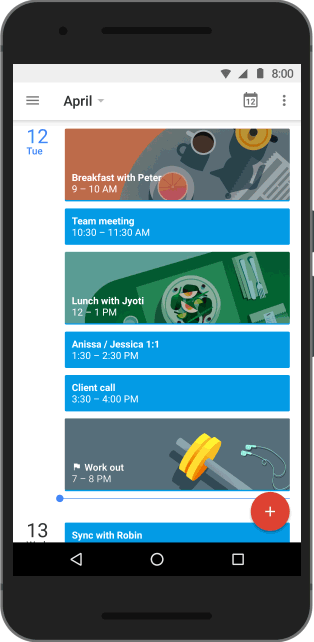 ] --- # Doodle and Layout Timeline Doodle - Doodle Code, Video, Reflection Due: Fri 8-Apr - Doodle Peer Evals: Out Fri 8-Apr, Due Sun 10-Apr Layout - Out: Wed 6-Apr - Code Checkpoint: Thur 14-Apr - Due: Thur 21-Apr --- # Section 2 Objectives - [Reflection Grading Activity](#5) - [Different Layouts in Android](#12) - [Worksheet: Interactor Hierarchy](#20) - (Optional) Layout Lab [practice](#25) - Section 2 [Exercise](#26) (submit on Ed) --- # Wrapping Up Doodle... - **Submit 3 peer reviews** on [Canvas](https://canvas.uw.edu/courses/1546965/assignments/7183245) - This is graded, responses will be automatically sent to you after the Canvas deadline - Please remember to mark the rubric on the side (clicking on each point as needed) and leave a comment so your submission shows up as “completed” on our side. - [Submit Doodle video](https://canvas.uw.edu/courses/1546965/assignments/7183247) on Canvas. Rubric is on the assignment page. - Submit Reflection to [Gradescope](https://www.gradescope.com/courses/378144/assignments/1926830) --- # Reflections Rubric - You will be writing a reflection for each assignment. - Imagine you were given the prompt: "What did you learn from reading the peer evaluation about the user experience of your doodle?" - Please rate the following reflections out of 3 points using the rubric on the next page. - [How to Write a Reflection](https://courses.cs.washington.edu/courses/cse340/22wi/assignments/reflection.html) - You will be able to see this rubric when you submit and match your pages to the questions. --- # Rubric (also on [Gradescope](https://www.gradescope.com/courses/378144)) - (+1) Student gives at least a minimum answer to all parts of the guiding question. - (+1) Clear/concise but descriptive examples are given throughout the response. An uninformed reader can create a mental picture of the situation being described. Abstract concepts are explained accurately. - (+1) Student elaborates on the significance and meaning of the examples; why they are important / how it changed their thinking process / implications for future work. - (+1) Extra cred: particularly insightful reflection (rarely given) --- # Gradescope: IMPORTANT Please match all uploaded pages on Gradescope before hitting submit. 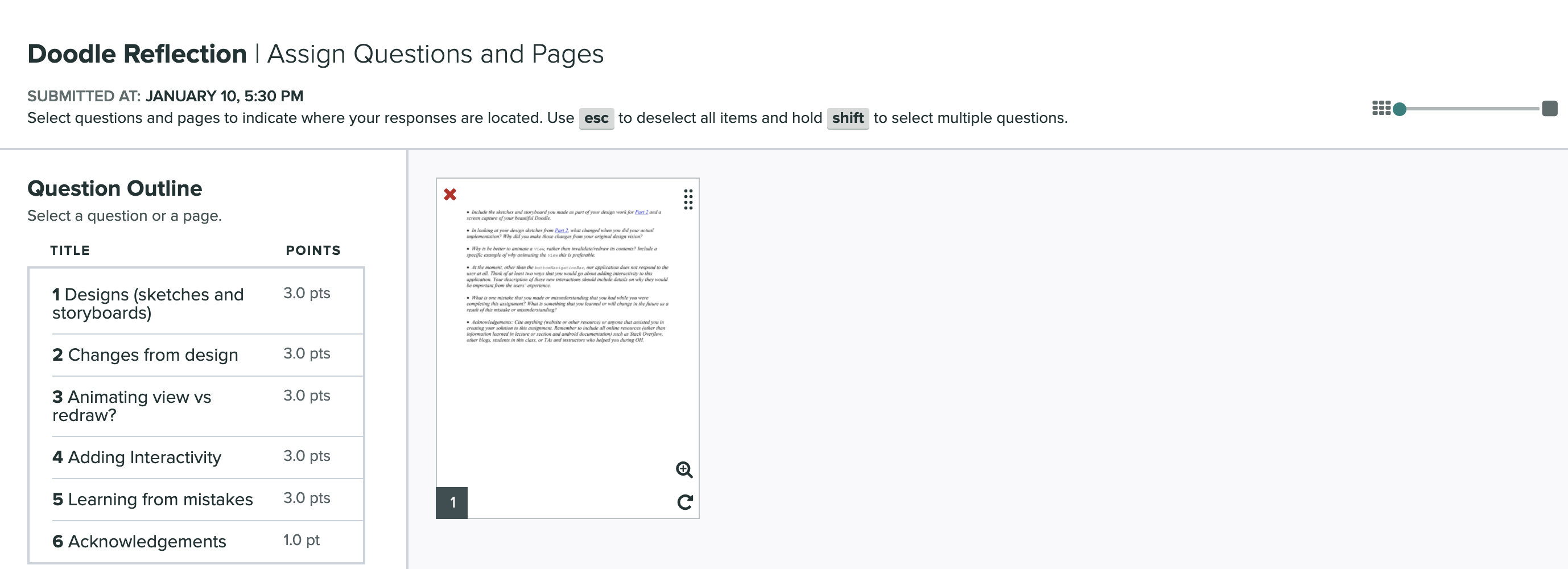 --- # Sample Reflection 1 People said they liked how I used a rainbow gradient effect on my triangle shapes and a bouncing effect to my CircleViews in the animation. People didn’t like the lack of a central aesthetic theme. --- # Sample Reflection 2 My peer reviewers liked my object transformations. --- # Sample Reflection 3 Users found my app too jarring; animations were too abrupt to comprehend, part of the text was cut off on the side, and there were intense flashing colors that increased eye strain and might induce seizures. I would change my doodle to have less sudden animations and less contrasting colors. --- # Reflection Answers Reflection 1 (2/3): Provided some detailed descriptions, but could have mentioned the significance of people’s feedback or what they could improve on for future apps. Reflection 2 (1/3): Answers what they got from feedback, but does not provide enough details that would be understandable to an “uninformed reader.” Reflection 3 (3/3): Answered all parts of the question, mentioned how aspects of the app could have negatively impacted the user, and what they would change. --- exclude: true # Possible Extra credit - +1 possible extra credit examples: - I was surprised to learn that some of my peers felt physically sick from watching the animations. - My feedback relates to the lecture on animation pacing; my animation didn’t mimic the real world (objects moving randomly/abruptly), so people may have found it “jarring”. - Next time, I would have a second person give their opinion about my app before putting out a final product to avoid alienating users with my assumptions. --- exclude: true # Tips for Projects moving forwards... - Students should read starter code and understand what all the variables and methods are for, the architecture of the class, the logic of the implementation before starting! - Start EARLY so you can go to OH and utilize Ed - Read the entire spec and write down questions you have about it - Understand the class hierarchy --- exclude: true # Tips for Projects moving forwards... - Students should read starter code and understand what all the variables and methods are for, the architecture of the class, the logic of the implementation before starting! - Start EARLY so you can go to OH and utilize Ed - Read the entire spec and write down questions you have about it - Understand the class hierarchy - What is onCreate() doing? (Check inside the class that extends AppCompatActivity) --- exclude: true # Tips for Projects moving forwards... - Students should read starter code and understand what all the variables and methods are for, the architecture of the class, the logic of the implementation before starting! - Start EARLY so you can go to OH and utilize Ed - Read the entire spec and write down questions you have about it - Understand the class hierarchy - What is onCreate() doing? (Check inside the class that extends AppCompatActivity) - Work through the TODOs. You will not have to work beyond the TODOs. - Reread the spec before turning in --- # Layout Types in Android (1/2) - [FrameLayout](https://developer.android.com/reference/android/widget/FrameLayout) - good for position views on top of each other, or encapsulating a bunch of views. Used in [Doodle](https://courses.cs.washington.edu/courses/cse340/21wi/assignments/doodle.html). - [LinearLayout](https://developer.android.com/reference/android/widget/LinearLayout) - places views one after the other in order according to the orientation (Horizontal or Vertical). Used in [Layout](/assignments/layout). - [RelativeLayout](https://developer.android.com/reference/android/widget/RelativeLayout) - Positions of the children are described in relation to one another --- # Some more Layout Types in Android (2/2) - [TableLayout](https://developer.android.com/reference/android/widget/TableLayout.html) - Rows and columns style way of declaring a layout. Used in Accessibility assignment. - [GridLayout](https://developer.android.com/reference/android/widget/GridLayout.html) - Uses an [adapter](https://developer.android.com/reference/android/widget/Adapter) that provides items to display in a grid - [ConstraintLayout](https://developer.android.com/reference/androidx/constraintlayout/widget/ConstraintLayout) Lets you use constraints to specify how things should lay out. Used in [Layout](../../assignments/layout). - More documentation [here](https://developer.android.com/guide/topics/ui/declaring-layout.html) --- # FrameLayout - FrameLayout is designed to block out an area on the screen to display a single item. - Can add multiple children to a FrameLayout and control their position by assigning gravity to each child (android:layout_gravity attribute) - Child views are drawn in a stack, with the most recently added child on top 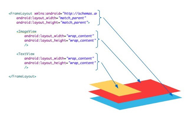 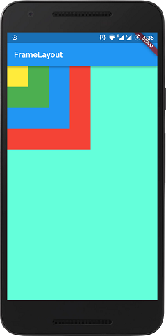 --- # LinearLayout - LinearLayout organizes its children into a single horizontal or vertical row. - Creates a scrollbar if the length of the window exceeds the length of the screen.    --- # RelativeLayout - Enables you to specify the location of child objects relative to each other (child A to the left of child B) or to the parent (aligned to the top of the parent).  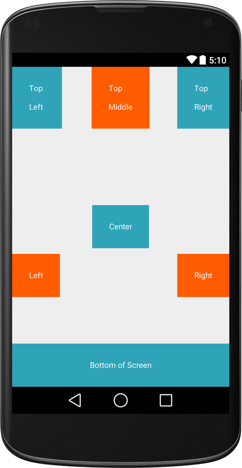 --- # TableLayout - Added in API 1 - TableLayout arranges its children into rows and columns - Can leave the cells empty - Found in the Accessibility assignment base code 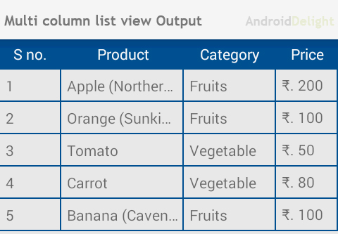 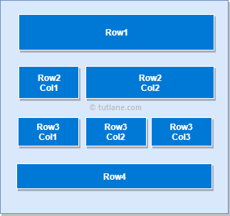 --- # GridLayout - Places its children in a rectangular grid - Must define the number of rows and columns first, then populate with Views - Why choose this over TableLayout? - Easy to arrange lots of data because you don’t need to specify each View’s width and height - [Preferable](https://android-developers.googleblog.com/2011/11/new-layout-widgets-space-and-gridlayout.html) to TableLayout (GridLayout added API 14) 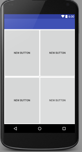  --- # Constraint Layout .left-column[  ] .right-column70[ - ViewGroup that allows you to position widgets in a flexible way - Useful for building responsive interfaces in Android. - You can see little lines connecting the `textView` to its container and it's sibling (the `linearLayout`). - This specifies how it's attached (can change type by clicking on right) - If you were to change the interface (e.g. a different sized screen), it would stay attached and keep filling the space ] --- # Worksheet: Interactor Hierarchy - [Worksheet](https://docs.google.com/document/u/3/d/1B-yXakmg34yBFD5dmo1MnOZmPTjf3l3k/copy) - Click on the link above to make a copy of the Google Docs, spend around 3 minutes to work on it --- # Worksheet: Interactor Hierarchy Q1 What would be the Component Tree for the Layout Part 1-2 program? .left-column50[  ] -- .right-column50[ <div class="mermaid" style="font-size: small;"> graph TD LL(LinearLayout) --> S[StatusBar] LL --> RL[RelativeLayout] RL --> SV[ScrollView] RL --> BN[BottomNav] SV --> CL[ConstraintLayout] CL --> V2[ImageView] CL --> V3[...] CL --> V4[ImageView] class LL,RL,SV,CL darkblue class S,SV,BN,V2,V3,V4 blue </div>] --- # Worksheet: Interactor Hierarchy Q2 **What is the basic idea you have for how to fix it?** > Constrain the top of the scroll to the bottom of the text view. **Which view would you need to modify (provide the value you would set `android:id` to)?** > `@+id/scrollView` --- # Worksheet: Interactor Hierarchy Q2 **What one line of XML would you add? Pseudocode ok here, you don't have to use exact names.** > `app:layout_constraintTop_toBottomOf="@id/textView"` --- # (Optional) Practice with [Layout Lab](https://github.com/harshitha-akkaraju/layoutlab) - Clone [https://gitlab.cs.washington.edu/cse340/exercises/layoutlab/](https://gitlab.cs.washington.edu/cse340/exercises/layoutlab/) - Switch between the challenges via the `AndroidManifest.xml` - Try getting the four buttons to show on the screen using only XML, then using Java (harder). - [Possible Solutions](https://gitlab.cs.washington.edu/cse340/exercises/layoutlab/-/tree/jay-solution-with-comments): don't peek until you've tried first! --- # Section 2 Exercise .left-column50[ 1. Take a screenshot of any app and draw 2 different interactor hierarchies to represent it. 2. Choose and justify which interactor hierarchy provides the better design for the functionalities of your chosen application. 3. Submit on [Ed Lessons](https://edstem.org/us/courses/21053/lessons/31157/slides/180466). ]  --- # Any Last Questions about Doodle?