name: inverse layout: true class: center, middle, inverse --- # Analyzing Quantitative Data Jennifer Mankoff CSE 340 Winter 2021 --- layout:false [//]: # (Outline Slide) # Today's goals - Review - How to use the Menus spreadsheet - Dependent and independent variables - Discuss how we determine causality - Practice onboarding participants - Practice data analysis --- # Fitts' Law review Confusing quiz quesion. After looking at the first version of the app (at left) you change it to make interaction easier. Did you succeed? .left-column40[  ] .right-column60[ How are W and D different and how does this change the Index of Difficulty (ID) according to Fitts’ Law on a **Computer screen** (meaning you can assume the app is taking up the whole screen of a tablet and the pointer is a mouse). W? D? ID? ] --- # Fitts' Law review Confusing quiz quesion. After looking at the first version of the app (at left) you change it to make interaction easier. Did you succeed? .left-column40[  ] .right-column60[ How are W and D different and how does this change the Index of Difficulty (ID) according to Fitts’ Law on a **Computer screen** (meaning you can assume the app is taking up the whole screen of a tablet and the pointer is a mouse). W: Infinite D: larger ID: Much smaller ] --- # Fitts' Law review Confusing quiz quesion. After looking at the first version of the app (at left) you change it to make interaction easier. Did you succeed? .left-column40[  ] .right-column60[ How are W and D different and how does this change the Index of Difficulty (ID) according to Fitts’ Law on a **phone screen** (meaning you can assume the app is taking up the whole screen of a phone and the pointer is a finger). W? D? ID? ] --- # Fitts' Law review Confusing quiz quesion. After looking at the first version of the app (at left) you change it to make interaction easier. Did you succeed? .left-column40[  ] .right-column60[ How are W and D different and how does this change the Index of Difficulty (ID) according to Fitts’ Law on a **phone screen** (meaning you can assume the app is taking up the whole screen of a phone and the pointer is a finger). W: same D: larger ID: larger ] --- # Biker app accessibility You notice a biker with a disability using a reclining bike. You approach your boss about adding people with disabilities to the study, and they refuse because they believe it will be onerous and expensive. What ethical principle is violated if you agree with your boss?  --- name: inverse layout: true class: center, middle, inverse --- # Determining Causality ## thinking theoretically... --- layout:false # Dependence/independence Events that are independent - Flipping heads and then tails - Day of week and whether a patient had a heart attack (probably?) Events that are dependent - Vice presidential candidate and presidential nominee - Diagnostic test being positive and whether patient has a disease -- What are some dependent and indepenent relationships in the Menus study? ??? Think about a coin flip: one flip does not depend on another. What if we collect this kind of data, what might be true about it? --- # What might we expect to see is true of dependent variables? - When one changes, the other changes at the same rate - When one changes, the other changes at a faster rate - When one changes, the other does the opposite ??? Called a correlation We can see it in a scatter plot Go look at data and make one --- # This is called *Correlation* We can see it in a *scatterplot* 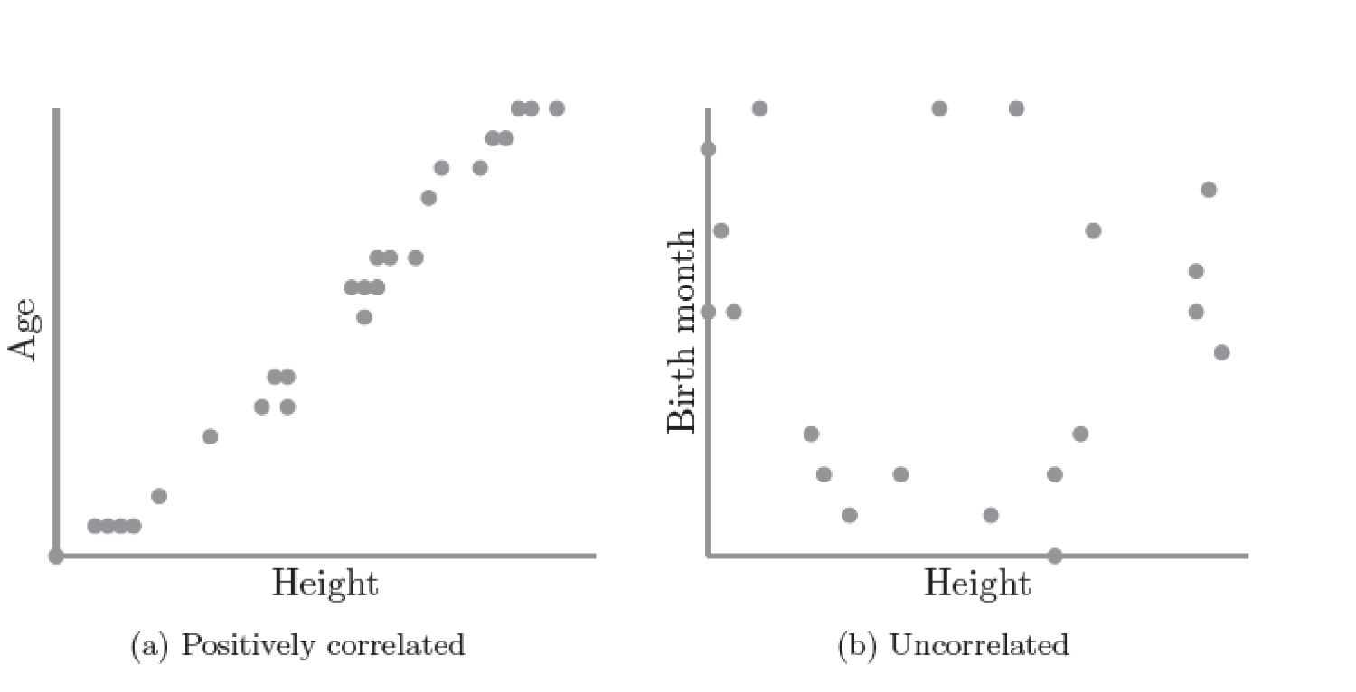 --- # Correlation (active) Demo [OpenSecrets.org data set on internet privacy resolution](https://www.opensecrets.org/featured-datasets/5) Active demo: Open it yourself: [tinyurl.com/cse340-ipdata](https://tinyurl.com/cse340-ipdata) Make a copy of this sheet to your own drive using File->Make a copy. (You must be logged into a Google account to make a copy) --- # Correlation demo [OpenSecrets.org data set on internet privacy resolution](https://www.opensecrets.org/featured-datasets/5) - Select two columns (use command/control click to select 2 columns) - Use Insert->Chart - Make sure this is a scatterplot --  Is there a correllation? --- # Correlation != Causation 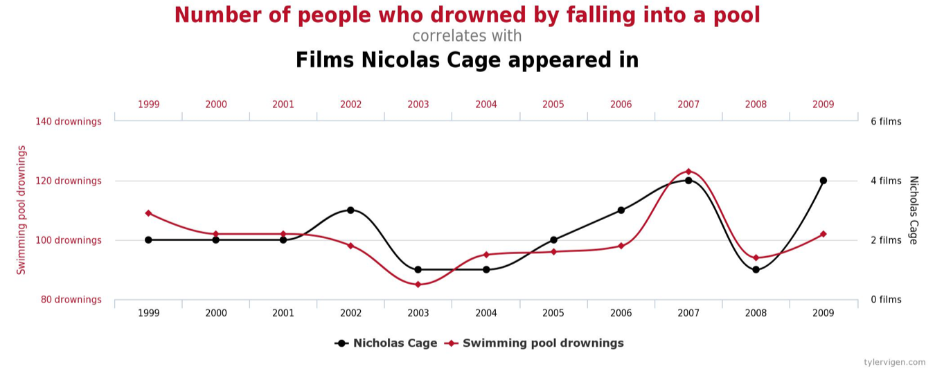 --- # Correlation != Causation 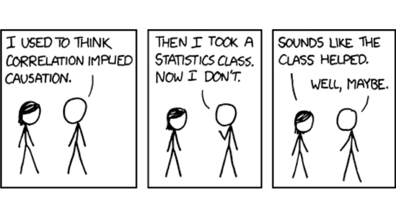 .footnote[[XKCD](https://xkcd.com/552/)] --- # Grouping for analysis Pivot Tablest demo [tinyurl.com/cse340-ipdata](https://tinyurl.com/cse340-ipdata) -- 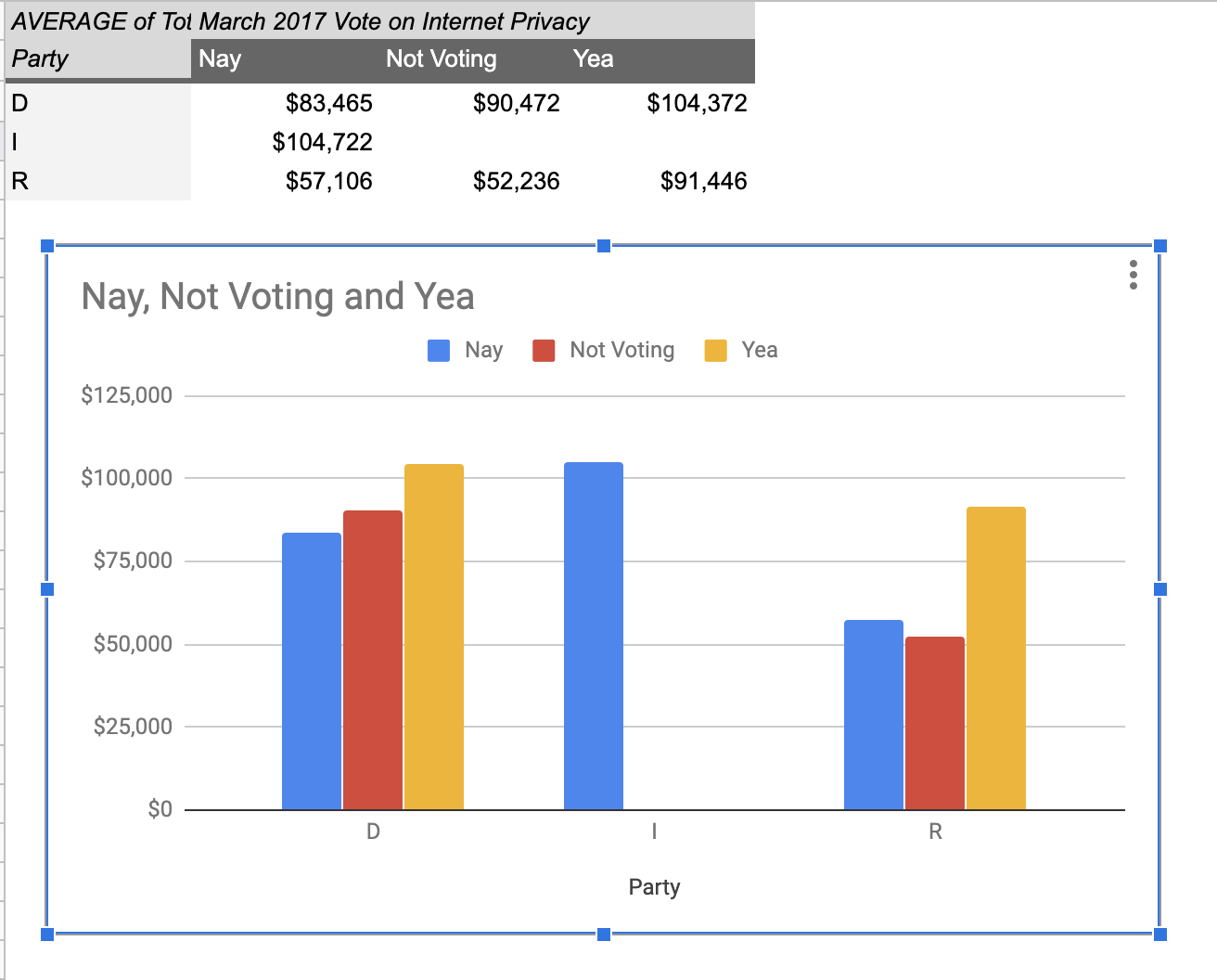 --- # Grouping and charting helps you check your assumptions  What do you see in the difference between tasks on each of these menus types? -- Charting gives you a place to start, what questions you might want to ask. --- # Grouping and charting helps you check your assumptions [20sp Sample data](https://docs.google.com/spreadsheets/d/1JqfKhHugIF-kebs_bVztCnkUe0CizXN8PU_Ar3kXtK4/edit?usp=sharing) Not that different in this sample set (just Jen doing it 3 times). You likely will get better results with your data We will get even better results with ALL of the data merged together (Remember to turn your CSV into the Canvas Assignment) --- # Data Collection .left-column[  ] .right-column[ Click on `Example Chart`. Here you can - Analyze and chart data: Simple Statistics - Min, Max, Mean (Sum/#), Median (Middle #), Mode (Most Common #) Demo Do this for speed *and* error. ] --- # Comparing groups to see if they are different Bar charts are not enough to assess difference though. Need to see the *distribution* A distribution is looking at how the people we are studying distributed over a specific variable we care about. A histogram graphically shows a distribution. --- # Histogram shows you a *distribution* Pivot Tablest demo [tinyurl.com/cse340-ipdata](https://tinyurl.com/cse340-ipdata) --  --- # But having the right chart matters  --- # Normal Vs Pie |Normal | Pie| |--|--| ||| The cause of the difference only shows here. --- # What do we learn from a histogram?  ??? - shows a distribution - helps us tell if things are INDEPENDENT --- # Histograms What do we learn from a histogram? - shows a distribution - helps us tell if things are INDEPENDENT --- # Comparing two groups  --- # Comparing two groups  --- # Comparing two groups  --- # Comparing two groups  --- # Comparing two groups  --- # Comparing two groups  --- # Common Statistical Test for comparison: t-test Tests for difference between two samples Best used to determine what is ‘worthy of a second look’ Limited in its applicability to normal, independent data Does not help to document effect size [the actual difference between groups], just effect likelihood --- .left-column[ ## Problems with t-tests The more implausible the hypothesis, the greater chance that it is a ‘false alarm’ ] .right-column[  ] ??? Top row: Prior (what's known to be true before the experiment) bottom row: Calculated p-value Notice the middle column, where something that is a toss-up has higher plausability than we would expect. This is a "Type 1 error" Alternatively, a small sample may cause a Type II error (failure to detect a true difference) due to random sampling bias --- .left-column[ ## Problems with t-tests ] .right-column[ - Doesn’t take prior knowledge into account - Susceptible to ‘data dredging’ - The more tests you conduct the more likely you will find a result even if one is not there - Adjustments mid experiment - Gives a yes or no answer: Either the null hypothesis is rejected (the result would be unlikely in a world where the null hypothesis was true) or it cannot be rejected - Based on assumed ‘average’ sample ] --- # Which problems might affect our study? ??? Too many comparisons -- 18 separate comparisons (3x3 conditions, 2 measures) ANOVA (**An**alysis **O**f **Va**riance): Fancy t-test that accounts for the whole group effect before doing pairwise comparisons ??? - Doesn’t take prior knowledge into account - Susceptible to ‘data dredging’ - The more tests you conduct the more likely you will find a result even if one is not there - Adjustments mid experiment - Gives a yes or no answer: Either the null hypothesis is rejected (the result would be unlikely in a world where the null hypothesis was true) or it cannot be rejected - Based on assumed ‘average’ sample --- # Demo of t-tests in our spreadsheet [20sp Sample data](https://docs.google.com/spreadsheets/d/1JqfKhHugIF-kebs_bVztCnkUe0CizXN8PU_Ar3kXtK4/edit?usp=sharing) --- # Document what all of this in your [report](/courses/cse340/21wi/assignments/menu-report) Speed Results `Describe your thoughts about overall speed in different conditions. Use at least one chart to illustrate what you say. Here is an example chart generated using our data, when you paste your data into the spreadsheet you’ll see that it updates to reflect your data` Error Results `Describe what happened in terms of errors -- provide at least one chart showing what you learned about errors in different conditions` --- .left-column[ ## Document what all of this in your [report](/courses/cse340/21wi/assignments/menu-report) ] .right-column[ - Describe your hypothesis - Illustrate with graphs - Optional: use Table of results found in `Speed Analysis` and `Error Analysis` to describe Statistical Significance: `Pie menus were twice as fast as normal menus (M=.48s vs M=.83s), F(1,43)=295.891, p<.05. Unclassified menu items were harder to find than linear and relative ones (M=.84s, .59s, and .59s respectively), F(2,43)=93.778, p<0.5. We also found an interaction effect between menu and task (as illustrated in the chart above), F(5, 43) = 51.945, p<.001.` ] --- # Using the right chart matters .left-column40[  ] .right-column50[ |Normal | Pie| |--|--| ||| ] --- # Can we determine *causality*? We'd like to be able to argue the task/menu type influenced the speed and error results. -- This implies *dependence* between speed/error, task, and menu type -- And it assumes you have measured the right variables! --- # Drawing Conclusions <div class="mermaid" style="font-size:.5em"> graph LR S(.) --> Hypothesis(Hypothesis:<br>Decreased seek <br>time and errors) Hypothesis -- "Study Design" --> Method(3 menus x <br> 3 task conditions ) Method -- "Run Study" --> Data(Data) Data -- "Clean and Prep" --> Analysis(Analysis) Analysis --> Conclusions(Conclusions) classDef finish outline-style:double,fill:#d1e0e0,stroke:#333,stroke-width:2px,font-size:.7em,height:2.5em; classDef normal fill:#e6f3ff,stroke:#333,stroke-width:2px,font-size:.7em,height:2.5em; classDef normalbig fill:#e6f3ff,stroke:#333,stroke-width:2px,font-size:.7em,height:4em; classDef start fill:#d1e0e0,stroke:#333,stroke-width:4px,font-size:.7em,height:5em; classDef startsmall fill:#d1e0e0,stroke:#333,stroke-width:4px,font-size:.7em,height:2.5em; classDef invisible fill:#FFFFFF,stroke:#FFFFFF,color:#FFFFFF linkStyle 0 stroke-width:3px; linkStyle 1 stroke-width:3px; linkStyle 2 stroke-width:3px; linkStyle 3 stroke-width:3px; linkStyle 4 stroke-width:3px; class S invisible class Hypothesis start class Conclusions startsmall class Method normalbig class Data,Analysis normal </div> - Describe your hypothesis - Illustrate with graphs - Optional: Statistical Significance Draw Conclusions - Were errors less? - Was time faster? `Describe your conclusions. Do you think we should use pie menus more? What can we conclude from your data?` --- # Limitations of Laboratory Studies ??? Simulate real world environments - Location and equipment may be unfamiliar to participant [Coyne & Nielsen 2001] - Observation may effect performance - “Hawthorne Effect” [Mayo 1933] - Participant may become fatigued and not take necessary rest - “Demand Effect” [Orne 1962] - Tasks frequently artificial and repetitive, which may bore participants and negatively effect performance Studying real world use removes these limitations -- Simulate real world environments - Location and equipment may be unfamiliar to participant [Coyne & Nielsen 2001] - Observation may effect performance - “Hawthorne Effect” [Mayo 1933] - Participant may become fatigued and not take necessary rest - “Demand Effect” [Orne 1962] - Tasks frequently artificial and repetitive, which may bore participants and negatively effect performance Studying real world use removes these limitations