name: inverse layout: true class: center, middle, inverse --- # Fitts' Law and Interactor Design Jennifer Mankoff CSE 340 Winter 2021 --- layout: false # Agenda - Administrivia - Color Picker is due Thursday - Feedback from you all - - **Reminder:** Please fill out this [form](https://docs.google.com/forms/d/e/1FAIpQLSdQrpZx-gexgDcKEF1SRp4egObimDP9qqVwLD56w0V2sYJDpw/viewform) by tonight, so we can plan for our next assignment - Menus. - Fitts' Law and implications for interface design --- # Feedback - "Wait so we really have five total late days now?" Yes!! - "What about reflections" No late days -- 10% off if late. Start them early. - "The structure, office hour, and especially the lecture that act as a Q&A and review of the previous knowledge. That was really helpful." -- Thanks, good to know - "in section I think the ethusiasm is really good, and I feel welcomed in section." -- Thanks too :) - "Grades in canvas would be nice." -- Thanks for the heads up that publishing to canvas wasn't actually showing you anything! Everything is posted now --- # Room for improvement - "More prep specific to assignments. I know this class has a lot of theory to learn too, but oftentimes I find the applications of the concepts to be really difficult without more guidance. Also, the spec is very overwhelming to get through and throws a lot of details at us that are difficult to parse so more explanations would be helpful." We will try to go over the spec in section in more detail - "hard to discuss with classmates when working on projects. I feel very isolated in class." Added [Need a study partner find a study partner](https://edstem.org/us/courses/3019/discussion/258560) thread - "Mental health" Such a hard quarter. Please let us know how we can help. This is one reason we increased late days. What other things can we do? --- # Let's try an experiment .left-column-half[ ] .right-column-half[ - [Fitts' Law Experiment](http://simonwallner.at/ext/fitts/) (simonwallner.at/ext/fitts) Scroll down to just below 'A word of warning' - Click the red circles as fast as possible ] --- [//]: # (Outline Slide) # Today's goals Experience Fitts' Law Discuss its implications for design Introduce Guiard's model of Bi-Manual Control < Discuss its implications for design --- .left-column-half[ # Throughput  - Note: We will use D for Dist and W for Width throughout the rest of this lecture ] .jax[$$MT = a + b*log_2({Dist \over Size} + 1)$$] .right-column-half[ where ] --- .left-column-half[ # Throughput  - Note: We will use D for Dist and W for Width throughout the rest of this lecture ] .jax[$$MT = a + b*log_2({Dist \over Size} + 1)$$] .right-column-half[ where - *MT* is movement time ] --- .left-column-half[ # Throughput  - Note: We will use D for Dist and W for Width throughout the rest of this lecture ] .jax[$$MT = a + b*log_2({Dist \over Size} + 1)$$] .right-column-half[ where - *MT* is movement time - ID is the *Index of Difficulty* (ID, in bits) of a movement .jax[$$log_2({Dist \over Size} + 1)$$] ] --- .left-column-half[ # Throughput  - Note: We will use D for Dist and W for Width throughout the rest of this lecture ] .jax[$$MT = a + b*log_2({Dist \over Size} + 1)$$] .right-column-half[ where - *MT* is movement time - ID is the *Index of Difficulty* (ID, in bits) of a movement .jax[$$log_2({Dist \over Size} + 1)$$] - *ID/MT* is the *Throughput* of a device in bits/second ] --- .left-column-half[ # Throughput  - Note: We will use D for Dist and W for Width throughout the rest of this lecture ] .jax[$$MT = a + b*log_2({Dist \over Size} + 1)$$] .right-column-half[ where - *MT* is movement time - ID is the *Index of Difficulty* (ID, in bits) of a movement .jax[$$log_2({Dist \over Size} + 1)$$] - *ID/MT* is the *Throughput* of a device in bits/second - *a* and *b* are empirically derived constants ] ??? This is just a line Fitts’ law tells us about difficulty for pointing and selection tasks - Time to move the hand depends only on relative precision required - MT increases as __distance__ from target increases - MT decreases as __size__ of target increases - Diagram this --- # Original Fitts' experiment .left-column-half[  .font-small[[Wikpedia](https://en.wikipedia.org/wiki/Fitts%27s_law)] ] .right-column-half[ Original experiment from Paul Morris Fitts involved tapping on plates as quickly as possible. ] --- # Compare Device Performance & Human Performance .left-column-half[  ] .right-column-half[ .font-small[ Device/Part | Study | Throughput (bits/s) | Relative to Optimal -------|-------|------------ | ----------- Finger | Langolf (1976) | 38 Wrist | Langolf (1976) | 23 EyeTracker| Ware & Mikaelian (1987) | 13.7 | Hand | Fitts (1954) | 10.6 Arm | Langolf (1976) | 9.5 Xbox 360 | Zaranek (2014) | 5 | **.47** (arm) Mouse | Mackenzie (2001) | 4.9 | .46 (hand) Neck | Pfaff (1985) | 4.2 | Trackball | Mackenzie (2001)| 3.0 | .28 (hand) Touchpad | Mackenzie (2001) | 2.9 | .27 (hand) Head | Hansen (2018) | 2.5 | **.51** (neck) Gaze | Hansen (2018) | 2.1 | **.15** (eyetracker) Joystick | Mackenzie (2001)| 1.8 | .17 (hand) Playstation Move | Zaranek (2014) | 1.5 | .16 (arm) Kinect | Zaranek (2014) | 1 | .1 (arm) ] ] .footnote[Card, S. K., Mackinlay, J. D., & Robertson, G. G. (1991). <br> A morphological analysis of the design space of input devices. <br> ACM Transactions on Information Systems (TOIS), 9(2), 99-122. ] ??? Useful to know if you're designing something like VR Doesn't have much impact on interface design Doesn't capture everything; e.g. error rate is higher for eye tracker --- # Warnings Applies to *expert, errorless* use  .footnote[Error rate was manipulated by faking errors. Ahmed Sabbir Arif and Wolfgang Stuerzlinger. CHI 2010. Predicting the cost of error correction in character-based text entry technologies. In Proceedings of the SIGCHI Conference on Human Factors in Computing Systems, April 2010 ] ??? Axis: X is faked error rates, Y is the words per minute. Shows how WPM did change in the study where error rate is being changed. If you know you are going to make a lot of errors you slow down your motion The underlying way we're designed to move is with small motions, to eliminate jerk We accelerate and decelerate smoothly Trace of motion for different body parts - after the initial motion, which is a rapid aiming motion, then corrective motions if you misss the target. Lots of those corrections, that is where you are goign to see people slow down. Subtle effects here – like the time to fix errors goes up as the error rate goes up… Act of correcting an error also takes time. Not worry about in the assignment, but interesting to know. --- # Example: Arm based input Student project using a Kinect from 2012. Watch the movement of his arm... ![:youtube Bubble keyboard implemented by Chinmay N in 2012. Users swipe with their full arm to select letters in on a keyboard, mQ-pCDr3RCw] --- # Discussion: Implications of Fitts' law - Why are some things harder than others to click on? (type in chat)  ??? Constantly relevant Intuitively, things that are closer and/or bigger are faster and easier to hit (and vice versa) What is different about the file location in Mac and Windows? What is the width at the top of the screen. - Add your thoughts on the bullet line with your group number in this [Google Doc](https://docs.google.com/document/d/10D3XfkzfU5RM426ueamy7fQA2QL-tWXNw7UxwR5Z3fQ/edit?usp=sharing) --- # Design Tip #1: Make small targets larger .left-column50[ ||| |--|--| What does this do to Fitts Law Predictions? How does it work ? ] .right-column50[ <iframe src="https://embed.polleverywhere.com/multiple_choice_polls/7DpwumEhdlW98lLUVLl1X?controls=none&short_poll=true" width="500px" height="400px"></iframe> ] --- # Design Tip #1: <br>Make small targets larger .left-column50[ ||| |--|--| What does this do to Fitts Law Predictions? How does it work ? Why should you not maximize all of the targets? ] -- .right-column50[ Fitts' law involves a logrithmic calculation -- exponentially bigger gains for small targets, not so much of a gain for larger targets ] --- # Design Tip #2:<br> Put commonly used things close together  <iframe src="https://embed.polleverywhere.com/multiple_choice_polls/3lO8LUl79FQnMahvUmGmG?controls=none&short_poll=true" width="800px" height="300px"></iframe> --- # Design Tip #2:<br> Put commonly used things close together .left-column50[  ] .right-column50[ # ... Or bring them closer to cursor (also minimizes D) ] .footnote[ Baudisch, P., Cutrell, E., Robbins, D., Czerwinski, M., Tandler, P. Bederson, B., and Zierlinger, A. Drag-and-Pop and Drag-and-Pick: Techniques for Accessing Remote Screen Content on Touch- and Pen-operated Systems. In Proceedings of Interact 2003, Zurich Switzerland, August 2003, pp. 57-64. ] ??? Reduces Distance (D) Not good design to put everything close together No space to move all targets (contextual filtering helps) Could do with a fancy container... --- # Design Tip #2:<br> Put commonly used things close together .left-column50[  ] .right-column50[ Why not do this to all targets? ] -- .right-column50[ - Other usability goals matter too -- e.g. grouping related things - It is not good design to put everything close together - There is not enough space to move all targets (contextual filtering helps) How would you implement this? ] --- # We can make things *Closer* and *Larger* at the same time  --- # We're beating Beating Fitts' Law! How else can we do this? -- Just don't use a mouse! Shortcut buttons; scroll wheel Or CHEAT... manipulate the interface - Minimize D - Increase W --- # Do these menus minimize Distance (D) or maximize Size (W)? .left-column50[ Select from a menu bar at top of screen  ] .right-column50[ <iframe src="https://embed.polleverywhere.com/multiple_choice_polls/Zwxwzvw0Qe8zEHSduroYx?controls=none&short_poll=true" width="500px" height="400px"></iframe> ] ??? Problems? - Can be tiring to reach edges of *very* large screens - Not all interfaces can do this (e.g. web designers) --- # Design Tip #3:<br>Make use of Edges: They are Infinite .right-column[  ] ??? - Windows 95 bug: bottom-left corner is offset by a few pixels, can’t click on it - Windows XP fixes it by making Start button go all the way to the corner - Windows 8 uses styling to make start menu circular, but still makes entire corner clickable --- # Recent Example (Zoom) Which of these do you think is a better button for maximizing size using the infinite edge? .left-column60[  ] .right-column30[ <br>  ] --- # Recent Example (Zoom) Which of these do you think is a better button for maximizing size using the infinite edge? .left-column60[   Although it looks like only the text is clickable, it turns out the whole edge was. Now we only have a "smaller" but brighter button to click. ] .right-column30[ <br>  ] --- # Does this minimize Distance (D) or maximize Size (W)? .left-column50[  ] .right-column50[ <iframe src="https://embed.polleverywhere.com/multiple_choice_polls/otveGZd5vvLE1QH7VEctl?controls=none&short_poll=true" width="500px" height="400px"></iframe> ] .footnote[ Left example: OneNote 2013, Right example: Firefox. Taken from [Fitts law and user experience](https://www.smashingmagazine.com/2012/12/fittss-law-and-user-experience/) by [https://www.smashingmagazine.com/author/anastasios-karafillis/](Anastasios Karafillis) ] --- # Why is it so rare & unfamiliar? Right click in place and then select (starting at :19) ![:youtube Illustration of advantages of marking menus,dtH9GdFSQaw?start=19] .footnote[ Kittenish, G., & Buxton, W. (1994, April). User learning and performance with marking menus. In CHI (Vol. 94, pp. 258-264). ] ??? Minimizes D AND increases W (only angle matters) --- # Design Tip #4:<br>Use marking menus instead of context menus for expert tasks -- .left-column50[ Under some circumstances only... - Less than 8 options (Small target areas when too many menu entries are added) - Expert user (willing to memorize and gain advantage of marking menus) - Grouping not important (hard to group radially) ] .right-column50[ Pie menus are often not implemented in production code - Needs to be seen as a high priority feature - Managers need to be able to assign staff to the project - Sadly, project constraints define an interface. (**Shouldn't be a thing! Whorfian effects**) ] --- # Menus Assignment Goal: to compare pie menus, linear menus, and a custom menu you make! We provide support for running the experiment in MainActivity (and a testing harness in TestActivity) You implement a variety of menus --- # Does this minimize Distance (D) or maximize Size (W)? .left-column50[  ] .right-column50[ <iframe src="https://embed.polleverywhere.com/multiple_choice_polls/G9q4mXqgeNqBPMrc0WqDm?controls=none&short_poll=true" width="500px" height="400px"></iframe> ] ??? Snapping to a target - [A] Minimize D? - [B] Maximize W? minimizes D --- # Design Tip #5:<br>Use snapping to minimize distance<br> when likely targets are known  .font-small[ Gmail | Trello | Chrome ----- | ------ | ----- Drag Handle | No Handle |  No Handle Grab cursor | Pointer cursor | Default cursor Drop Shadow | Drop Shadow |  No Drop Shadow Drop Target | Drop Target |  No Drop Target  No Natural Movement | Natural Movement |  Natural Movement ] .footnote[Examples courtesy of [Drag and Drop for Design Systems](https://uxdesign.cc/drag-and-drop-for-design-systems-8d40502eb26d)] ??? Also common in drawing programs Most sophisticated approach: dynamic semantics: Check legality and consequences of each result at every move don’t catch errors, prevent them --- # Another example: Fan Cursor, Area Cursor and Bubble Cursor ![:youtube Video showing a variety of schemes for making the cursor bigger including fan cursor; area cursor; and bubble cursor,bq1x5cRqgUc] .footnote[Su, X., Au, O. K. C., & Lau, R. W. (2014, April). The implicit fan cursor: a velocity dependent area cursor. In Proceedings of the SIGCHI Conference on Human Factors in Computing Systems (pp. 753-762). ACM.] --- # Design Tip #6:<br>Separate Motor Size from Visible Size .left-column[  ] .right-column[ - (a) Visual space appearance of buttons in a dialogue box. - (b) Motor space version of button design in (a) with much larger targets for certain buttons. - (c) Standard scroll-bar design. - (d) Visual space appearance of scroll-bar redesigned to occupy smaller screen space. - (e) Motor space version of scroll-bar design in (d) with larger targets for active areas. - (f) Visual space appearance of menu. - (g) Motor space version of the menu design in (f) with the distance to more important items reduced by compressing the size of less important items) ] .footnote[Semantic pointing widget designs from Blanch et al. 2004] ??? How would you implement this? - Manipulate picking - Whorfian effects --- # Would you ever make something too small virtually? -- How about a cancel button? --- # How long will this take? .right-column-half[ Select 'Open New Window in Process' ] .left-column[ 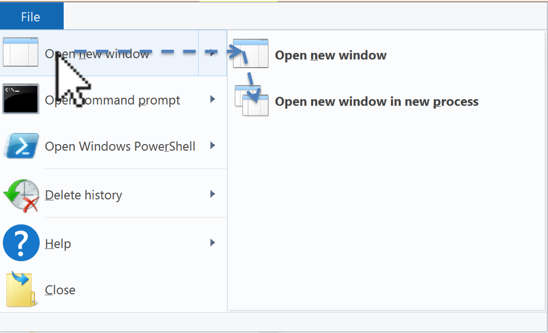 ] -- .right-column-half[ Steering law ... Fitts law integrated over the path you have to follow ] -- .right-column-half[ But it's not predictive at all. Why? ] -- .right-column-half[ It doesn't account for actual user behavior ] --- # Actual User Behavior .left-column50[ 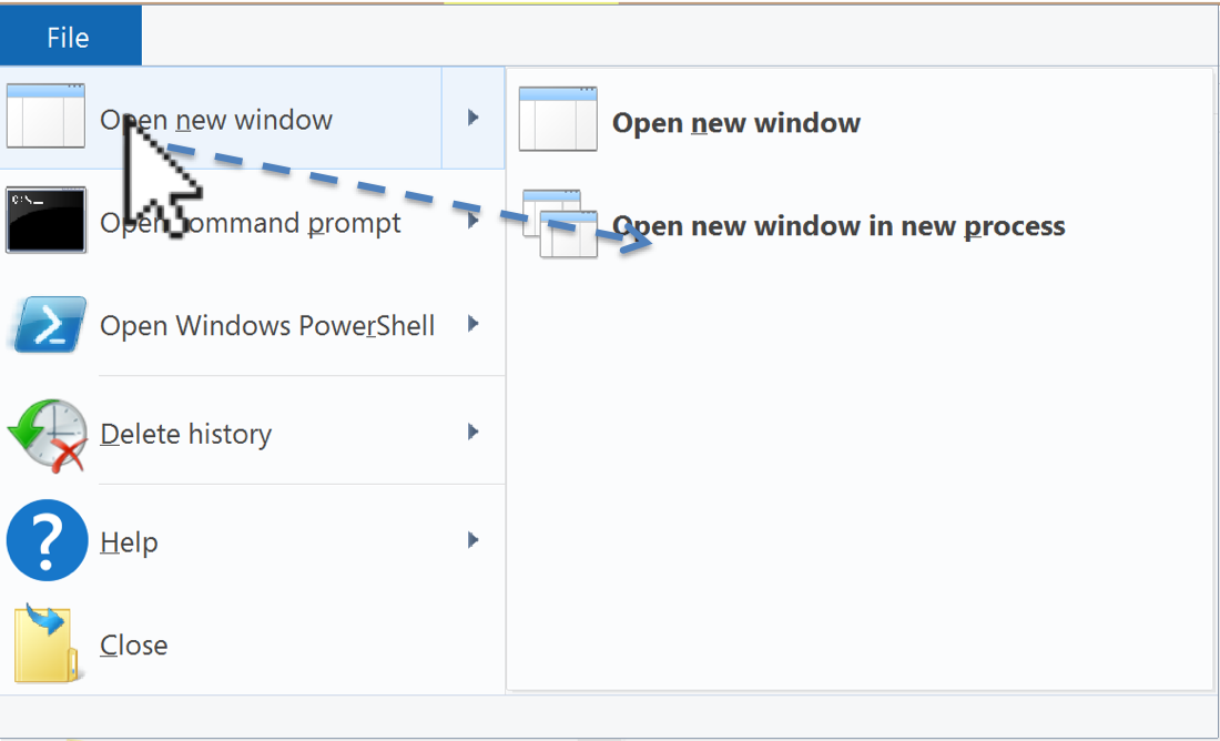 ] -- .right-column50[ 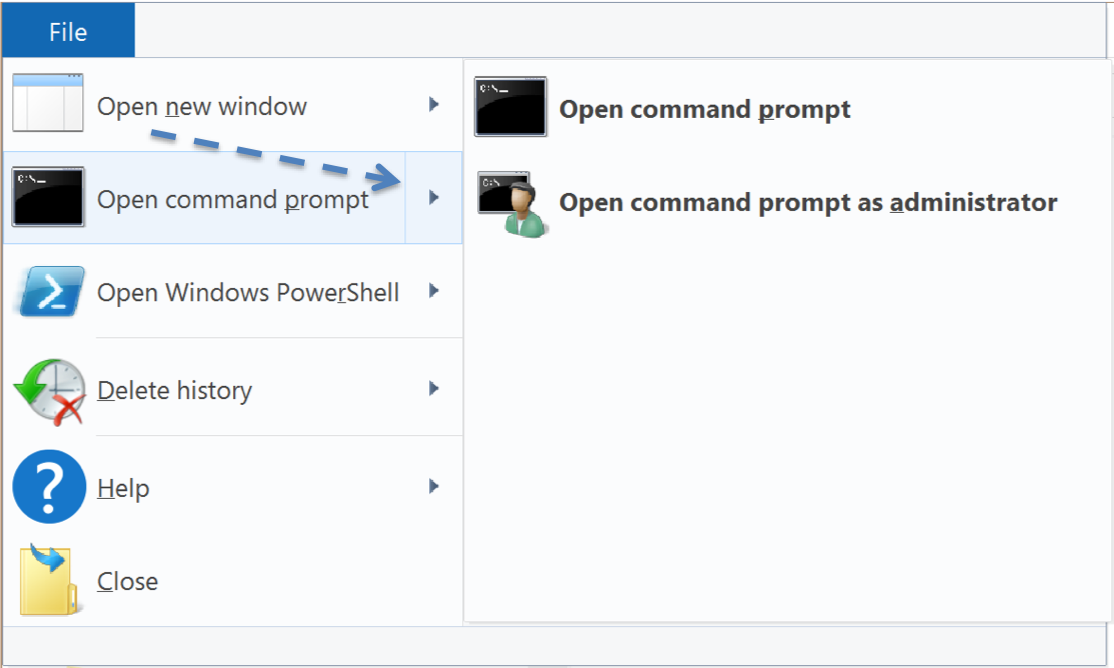 ] ??? Overly eager cascading menus, wrong submenu - Common problem w/ web menus (but not Mac or Win) - could brainstorm solutions (e.g. snapping? set focus somehow?) - whorfian effects: this is hard to implement --- # Fitts law has a huge limitation It is only predictive of **ERROR-FREE, EXPERT** behavior Related to our discussion of [Interaction Design](people-motor.html#28) --- # What else might we want to measure? -- - Time on Task -- How long does it take people to complete basic tasks? (For example, find something to buy, create a new account, and order the item.) -- - Accuracy -- How many mistakes did people make? (And were they fatal or recoverable with the right information?) -- - How strenuous (e.g. gaze has lower throughput but is less strenuous than head pointing Mackenzie 2018) -- - Recall -- How much does the person remember afterwards or after periods of non-use? -- - Emotional Response -- How does the person feel about the tasks completed? (Confident? Stressed? Would the user recommend this system to a friend?) ??? Build up a list of good UI design principals from these basics - Undo - Predictability - ... What is missing? (e.g. fun) --- # What else might we want to measure? .left-column50[ - Time on Task - Accuracy - How strenuous - Recall - Emotional Response ] .right-column50[ What is missing? ] ??? (e.g. fun) - Undo - Predictability - ... -- .right-column50[ - Fun - Predictability - Error Likelihood & Recovery - ... ] --- # Summary of Design Tips - Design Tip #1: Make small targets larger - Design Tip #2: Put commonly used things close together - Design Tip #3: Use edges. They are infinite in size (W) - Design Tip #4: Use pie menus for expert tasks (better yet, marking menus) - Design Tip #5: Use snapping to reduce distance (D) when targets are known - Design Tip #6: Separate motor and visible size