as4: Color Picker
Last revised: April 28, 2021- 29 April, 2021
- Checkpoint due 6-May, 10:00pm
- Code and Reflection due 13-May, 10:00pm
- Code and Reflection lock 15-May, 10:00pm
Android Goals:
- Understand Android event handling APIs
- Handle touch input properly
- Understand app lifecycle
- Save app state in Bundle
HCI Goals:
- Create non-rectangle interactor
- Propositional Production System
- Event handlers and event bubbling
- Callbacks
- Interactor Design
- GitGrade links
- Goal
- Getting Started
- Part 1: Creating your Circle Color Picker
- Part 2: Implementing the application layer
- Part 3: Save and Restore Application Model using Bundle
- Part 4: Implementing your own color picker
- Part 5: Reflection
- Debugging tips and tricks
- Misc.
- Turn-in
- Grading (45pts)
GitGrade links
Goal
There are two parts to this assignment, creating an RGB color picker interactor which lets you choose a color on a rainbow circle (color wheel), and creating a second color picker of your choice. Both are used in a very simple application that displays the chosen color.
Here is a video of our solution playing on the Pixel 2 emulator (API level 28)
You will play two developer roles in this assignment
- You will be a Component Developer as you implement your RBG Color Pickers
- You will be an Interface Programmer as you use this new interactor in your App.
Component Developer Role
Your primary goal in this assignment is to create
CircleColorPickerView.java and MyColorPickerView.java. These are your custom interactors and must
be implemented so they can be used by any application. Both inherit from
ColorPickerView.java which inherits AbstractColorPickerView.java. AbstractColorPickerView.java must remain untouched.
A second goal in this assignment is to properly handle input by separating the model code, geometric details and drawing (view code) from the controller code (which is in onTouchEvent in this case). You will implement onTouchEvent in ColorPickerView and handle model updates and the essential geometry and drawing methods in each of your custom views.
Tasks in ColorPickerView
- Handle different input events in
onTouchEvent - Allow the app to set your color
Tasks in CircleColorPickerView
- Handle updates to your model
- Initialize properties during
onLayout - Draw yourself and your thumb in
onDraw - Compute the relation of clicks to colors
Tasks in MyColorPickerView
- Handle updates to your model
- Initialize properties during
onLayout - Draw yourself and your thumb in
onDraw - Compute the relation of clicks to colors
Interface Programmer Role
You will also edit MainActivity.java. This is your
application which will use your custom color picker interactor. MainActivity
inherits from AbstractMainActivity which must remain untouched.
Tasks for MainActivity
- Register callbacks
- Save application state in bundle
- Restore activity state from bundle
Note: We will be asking you to re-use your color picker (CircleColorPickerView and ColorPickerView) in a later assignment so it is important that you understand
how the custom interactor communicates with an application.
Getting Started
You will be editing ColorPickerView, CircleColorPickerView, MyColorPickerView and MainActivity. As such it is important to understand the inheritance chains of these two files, as you will be using a lot of variables and functions defined in both these and parent classes.
Read the abstract base classes, including all of the comments in AbstractColorPicker.java and AbstractMainActivity.java before you begin. Where applicable, you must use the inherited variables and functions (do not overload the inherited functions).
The structure of the code is represented by the
Unified Modeling Language (UML)
diagram shown below. The symbols can be read as follows: + is a public field or method, #
is protected, and - is private. Any method that is in italics is an abstract method, meaning
is must be overridden in the child class. We are showing the absolute minimum necessary for MyColorPickerView.
Related Readings: It will be helpful to read Android/Custom-Drawing and Android/UI-Events to understand parts of the assignment that seem tricky.
Part 1: Creating your Circle Color Picker
Implementing your color picker interactor will require you to support input handling, maintaining and mutating state, and drawing to the screen in CircleColorPickerView.java.
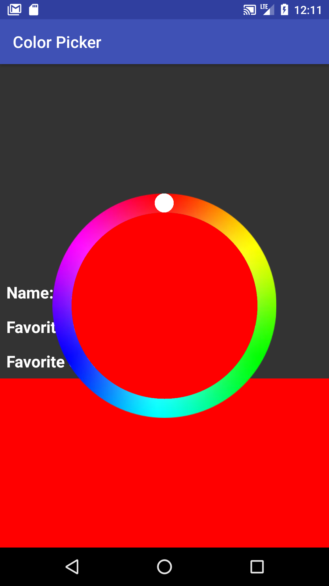
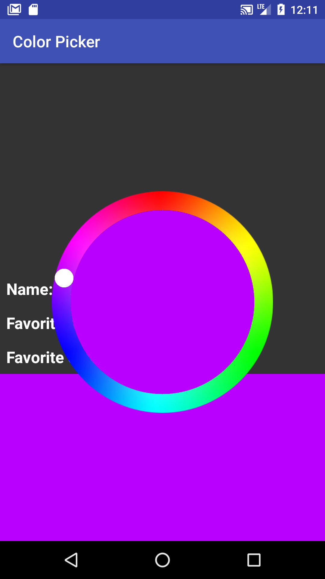
The Circle Color Picker
Important definition: The term wheel used throughout the spec refers to the dial and inner circle; it is the larger circle that contains all interface you will be drawing.
The RGB color picker works as follows: There is a small white “thumb” that marks the color currently indicated on the dial (the outer rim of the color picker), and that indicated color is displayed in the inner circle of the color wheel. The user interacts with this thumb by pressing down on it, then rotating it around the wheel. While the thumb is moving it is 50% opaque, and it will return to 100% opaque as soon as the user lifts their pointer from the screen and a new color is selected.
When the user has completed the selection of a new color using the RGB color picker interactor, the application will change the color displayed on the screen behind the wheel.
Drawing
Drawing is implemented in CircleColorPickerView#onDraw(Canvas). You will need to draw the thumb and the color in the center of the circle. We provide a color
dial in the drawable folder and it is already being drawn by ColorPickerView#onDraw(Canvas)
which is called because CircleColorPickerView inherits from ColorPickerView.
The height and width of the of the dial determined by the bounding box of the CircleColorPickerView. The
the radius of the actual ColorPicker interactor is the half the smaller of the width or the height of that
that bounding box.
Important Variables
- Some parts of your drawing code will require you to know the size of the view you are drawing in.
The variables
mRadius(the radius of both dial and inner circle),mCenterX, andmCenterYmust be calculated in youronLayoutmethod. - The CircleColorPicker displays the last selected color on the wheel when it is made visible on the screen.
The CircleColorPicker saves its internal state in the CircleColorPicker model which, for the purposes
of this assignment, is stored in the protected
mCurrentPickerColorvariable accessible through the publicsetPickerColormethod. The CircleColorPicker interactor will need to be redrawn when the model changes.
Related APIs: View#onLayout
Thumb
In the screenshots above there is a visible thumb (the white circle) that marks the selected color
on the dial. The thumb is drawn in CircleColorPickerView#onDraw(Canvas). It must move around as a user
interacts with the color picker.
The thumb must be constrained to move along a circular track that places it within the dial. It must move along that track even when the user is dragging their finger inside the inner circle.
Visually, the thumb’s radius is 0.085 times the outer-radius of the dial (center of circle to outside edge of color). This value is provided to you as a constant in CircleColorPickerView. Positioning the thumb is similar to #getTouchAngle(float, float) but instead of finding the angle based on the thumb location, you’re finding the thumb location based on the angle, additionally constraining the thumb to stay within the color band.
The PPS specification (found below) uses a float [0,1] to represent alpha, but Paint expects an int
[0, 255]. Be sure to make the correct conversion (multiply by 255, then cast the result to int).
Center Circle
Inside the multi-color dial is a circle whose color is the same as the live selected color. It must be centered on the center of the wheel, and use up all available space up to the dial. The color of the inner circle, which represents the RGB Color Picker model, must update while you drag the thumb. In contrast, the colored box and text, which represent the application’s model (remember the Model View Controller (MVC)), must update only when the mouse is released.
Touch Input Events
Where
- A is updateModel();invalidate()
- B is invokeColorChangeListeners();invalidate()
- C is updateModel();invalidate()
- D is doNothing()
Note that the End state only exists to show the lifetime of a single interaction. Because the user can interact with the color picker any number of times, we would actually return to the Start state when the thumb is released. For some examples of single interactions, see the images below.
We’ll handle touch input by implementing ColorPickerView#onTouchEvent(MotionEvent). This is the event handler that will be called when a touch occurs in this view. Feedback is needed when the user is interacting with the color picker, so you will have to ensure that the view is redrawn. Recall that we want to use invalidate() to do this and even though invalidate() does not directly trigger redraws and may have no impact, you still do not want to call it more than needed. In other words, it is considered good code quality to only call invalidate() when necessary.
In fact we will be taking off points for unnecessary invalidate() calls. Follow the PPS spec and don’t call anything it doesn’t specify. You should never need to call onDraw() directly.
As you write the PPS, make sure to utilize proper coding style to ensure that the code is readable to someone not familiar with the project. For an example of how to translate PPS into code, see the PPS page.
Related APIs: View (see documentation on Drawing)
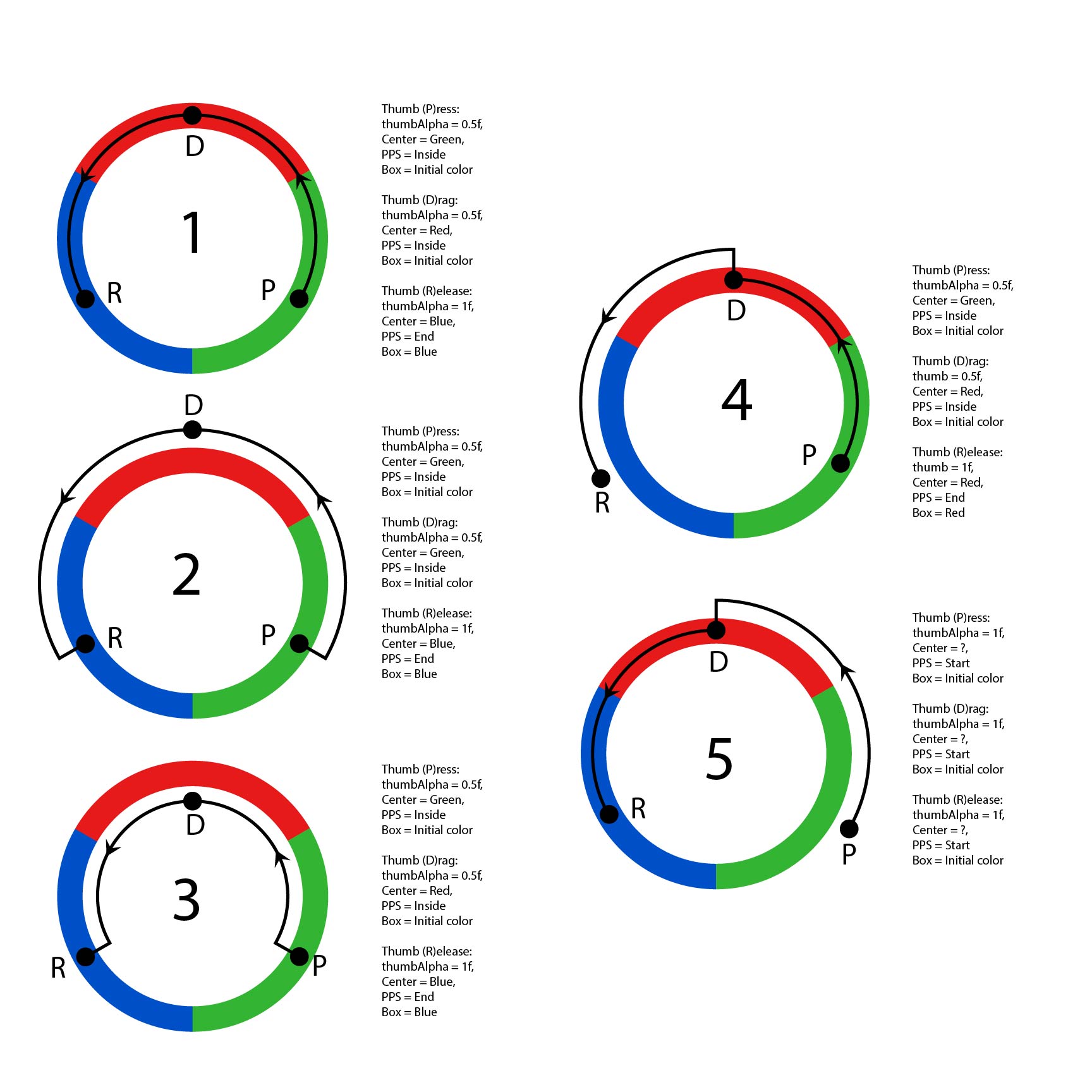
Transitioning out of the Start State
As shown in the state diagram, when in the Start state (before interaction begins), we ignore any touches that are outside of the wheel. These events must be rejected by your PPS so that other interactors can use them if they want. Specifically, views that may lie underneath our CircleColorPickerView must be able to react to events outside the wheel, but within the square of the CircleColorPickerView. Only transition out of the start state when the user presses on or inside the wheel. When you transition out of the start state, color is updated, thumb transparency is changed (alpha becomes 0.5f), and thumb position is updated.
The starter code already has some built-in functionality to help you test whether or not you are correctly rejecting input. When you click outside the wheel, there will be a Toast (a pop up message) that says “You have clicked outside the wheel!”. If this message does not appear when you click outside the wheel, then you are not correctly rejecting input.
Transitions within the Inside State
Once interaction with the wheel begins, you must only update the CircleColorPickerView’s local model
when the user is dragging their finger inside the wheel.
- When a finger drags on screen inside the wheel, the thumb will follow the angle the finger is at, and the color of the center circle will update to reflect the change in the local model for the Color Picker.
- When a finger drags on screen outside the wheel, the thumb will stay at the most recent angle within the wheel. If the finger re-enters the wheel at a different angle, the thumb must jump to that angle and the color within the wheel must display the corresponding color.
Transition to the end state.
When the user finishes interacting with the wheel, you must update the UI to reflect the new selected color, by calling the onColorSelected method in the ColorChangeListener with our newly selected color. In addition, the thumb transparency must be reset to an alpha of 1f (fully opaque).
Essential Geometry
When a motion event occurs, we must change the coordinates into the form consumed by the state
machine queries. The essentialGeometry method translates these coordinates into an ENUM which
represents whether or not the motion event was inside of the dial. This is important because the
state machine only relies on whether or not the motion event is within the color wheel and
must not be interpreting “raw” coordinates.
Related APIs: MotionEvent / Color / ColorUtils / View#onTouchEvent / EssentialGeometry
Part 2: Implementing the application layer
Your application is to make use of your color picker. The application needs to be notified from the ColorPickerView when the color changes. In our case, it will use the information to display the newly chosen color in a rectangle at the bottom of the screen and update the application model, though other applications might do something different. Examples of other applications that use their own implementation of a color picker include Photoshop, MS Paint, etc.
In our application, the hamburger menu at the top right can be used to switch between color picker types and hide them.
Setting up the Application
The code you will write for the application is in MainActivity which inherits from AbstractMainActivity. An important variable stored in AbstractMainActivity is the ColorPickerView named mColorPicker.
The application layer must set the default color of mColorPicker using
MainActivity#setStartingColor(Bundle). We provide this default as ColorPickerView.DEFAULT_VALUE
(it’s red). MainActivity#setStartingColor(Bundle) must also
ensure that the default color value is shown on the screen.
Managing Application State with Listeners
To find out about color changes, the application needs to register a callback by calling
ColorPickerView.addColorListener(ColorChangeListener). This callback
must update the application’s mColorView and mLabelView whenever onColorSelected
is called to demonstrate that the application correctly retrieved a color from colorPickerView.
This means you are prohibited from leveraging publicly accessible
fields/functions on the color picker to observe the CircleColorPickerView state.
(Optional) As good practice, you should always unregister listeners when they are no longer relevant. This should be
done in MainActivity.java#onDestroy() which is called when the application is killed.
You may notice that ColorPickerView.java keeps a List of ColorChangeListeners. This allows for our interactor to be more flexible because it can register many listeners that will all be notified when a new color is selected. For more on custom listeners, see CodePath’s guide to creating custom listeners. For more information about Fragments, see the Android Fragment API.
Part 3: Save and Restore Application Model using Bundle
You are to also save application model (i.e. the current color as known by the application) in the
onSaveInstanceState bundle object. When user switches focus to some other app, Android kills our Activity.
We will use the bundle to get the saved state back.
We want to manage the state at the application level (MainActivity.java) versus at the interactor level.
Thus you will need to set the state of the color picker in the application layer when the bundle is loaded.
Notice from the documentation that onRestoreInstanceState is called after onCreate if a bundle
exists. This is where you will access the information we saved in onSaveInstanceState to restore
the current color with the color we had before our Activity was killed.
We will kill your application during our testing process to ensure the state is properly saved. To simulate our tests, you can use the adb to test killing it, or in your phone’s Developer options set Apps -> Don’t keep activity.
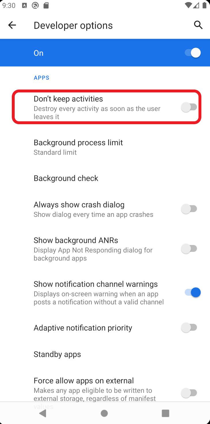
If you do not already have developer options enabled follow the guide here.
Wheel default state and bundle interaction
The best way to test this functionality is to enable the setting referenced above, and then press home, then return to the app. The color that was selected when you killed the app should still be restored when the app is restarted. Quitting the app from multitasking (i.e. when the app is open, click on the square) will destroy the bundle. Steps to test this is working correctly are as follows:
Using the bundle:
- User opens app for first time. The wheel is invisible and color in the box is red (the default).
- User clicks on box to show wheel and changes color to blue.
- User leaves app (via home button) while wheel is still visible.
- User returns to app. The color in the box is blue and the wheel is invisible.
- User clicks in the color box and the wheel becomes visible with blue as the selected color.
No bundle exists when app is unloaded:
- User opens app for first time. The wheel is invisible and color in the box is red (the default).
- User clicks on box to show wheel and changes color to blue.
- User leaves app (via home button).
- User unloads the app completely from memory.
- User returns to app. The color in the box is red and the wheel is not visible. Clicking on the color box brings up the Color Picker with red as the selected color.
Note that you do not have to do anything to handle the logic for displaying the wheel. The wheel is invisible by default when the activity is created, and its visible/invisible state is NOT stored in the bundle.
Related APIs: Saving and Restoring State | Android Developer Options | Explanations for how to use Bundle
Part 4: Implementing your own color picker
Once you have implemented the CircleColorPickerView and gotton ColorPickerView working properly,
you will also implement a color picker of your choice. In the solution video, we show a simple two-color color picker. This works without any further modifications to ColorPicker and without over riding ColorPickerView#onTouchEvent() or AbstractColorPickerView#setPickerColor(). Nevertheless, you are welcome to override (not edit) one or both of these methods for your MyColorPickerView. You will need to implement MyColorPickerView#essentialGeometry() and MyColorPickerView#updateModel() and MyColorPickerView#onDraw() at a minimum for this to work.
You can make your color picker look any way you want as long as it has a minimum of four colors to choose from.
Tasks:
- Before you start, sketch what you want your color picker to look like. Describe what how the user will interact with your color picker view, including when the color selection actually happens.
- Next, draw out the PPS for your interactor. Be sure to include your start and end state, as well as any transitions that may be pertinent to the user interaction.
- Finally, implement and test your new color picker interactor.
Your sketch, description, and PPS will be turned in as part of your reflection in Part 5.
Part 5: Reflection
For this part, you will submit your reflection on this assignment to Gradescope. Create a MS Word, Google or other type of document and copy the following questions (in italics below) into that document. Add your responses below each question. You can have more than one answer per page, but if you can, please try to avoid page breaks in the middle of a question. Insert page breaks between questions as needed.
For more information on what makes for a good reflective answer, see What is a reflection?
-
Tell us about
MyColorPickerView- Include the sketch you drew for Part 4 along with your description of the user’s interaction with this interface.
- Draw a state diagram showing how one interacts with it and describe its interaction.
- Include a screen capture of your final working
MyColorPicker.
-
The ColorPicker app as it is written is not accessible.
- Without actually running the Accessibility Scanner, describe at least two issues that you think you would find with that tool. Why would these issues be an impediment to some users? How would you fix them? Note: If you do not think Scanner will find two issues with the accessibilty of this app, then you should describe why you think issues will not be found in your app.
- After you responded to the above, run accessibility scanner on the app. List some of the things the scanner found and what surprised you about any of the results?
-
You are implementing checkboxes for a map for whether a route should include highways, left turns, etc (for route customization). You need to implement a custom CheckboxView. A CheckBoxView should work as follows:
- When the user presses inside a checkbox, it highlights.
- When the user releases inside a checkbox, it’s selection toggles.
- If the user moves outside the checkbox, it unhighlights. Release does nothing in that state.
- If the user (who has moved outside of the checkbox while the mouse is down), returns to the checkbox, the checkbox highlights again.
- If the user presses or releases outside the checkbox (i.e. on a different checkbox in the view, or any other view), nothing happens.
You may assume:- The following enums are provided:
State = { PRESSED, NOT_PRESSED, START }EssentialGeometry = { INSIDE, OUTSIDE }
- The current state is stored in a field of type
StatecalledmState. -
EssentialGeometry essentialGeometry(MotionEvent)is implemented for this view and correctly returns whether the touch is inside it or not. - The following methods are provided for you:
-
void toggleCheckbox()is provided for this view and correctly reads and modifies the selection state by updating the model an invoking any callbacks. -
highlight()/unhighlight()to allow for indication that the the check box is being activated or used.
-
-
onDraw(...)is implemented for this view and will:- Correctly highlight the checkbox if drawing is triggered while pressed based on the current
mState. - Correctly render a ✓ inside the checkbox if drawing is triggered while selected based on the current value of
isSelected().
- Correctly highlight the checkbox if drawing is triggered while pressed based on the current
Draw a PPS that captures this description. You can sketch it on paper and upload an image. -
The GE Oven/Microwave combo has a REALLY annoying knob for changing the time on a timer. You can see a video of how this works in action but the gist is this:
1. Start: Timer mode has been selected and your cursor is on the Minutes/Seconds menu item.
2. Press the rotating dial button to switch to “change minutes” mode. However if you (by mistake) rotate as you are pressing you will switch back to the Hours/Minutes mode (the rotate takes precedence, hence why this is an annoying interactor).
3. Rotate the dial clockwise to add a minute.
4. Rotate the dial counter clockwise to subtract a minute.
5. Press the button to switch to “change seconds” mode.
6. Rotate the dial clockwise to add a second.
7. Rotate the dial counter clockwise to subtract a second.
8. Press the button to “end” the setting and start the timer.Draw the PPS for this interactor. To help you with this problem you can use the following:
- EssentialGeometry: Clockwise, Counterclockwise
- The following events: Press, Rotate
- And the following methods or actions:
initTimer(),subMinute(),addMinute()switchToSeconds(),addSecond(),subSecond(),startTimer() - You are to define the states.
-
In which of the following situations is focus dispatch used during event handling, and in which is positional dispatch used? Explain each choice
- When the mouse moves off a scrollbar
- When clicking on a button
- When selecting a word in a text area
- When typing in a text area
- Acknowledgements: Cite anything (website or other resource) or anyone that assisted you in creating your solution to this assignment. Remember to include all online resources (other than information learned in lecture or section and android documentation) such as Stack Overflow, other blogs, students in this class, or TAs and instructors who helped you during OH
Debugging tips and tricks
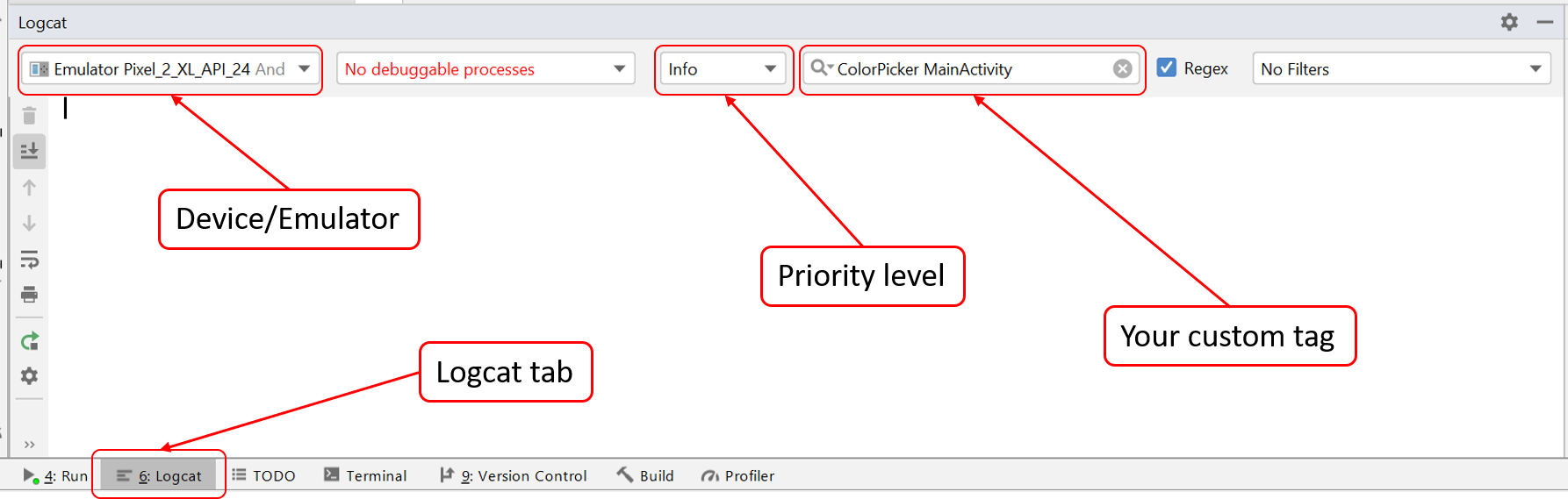
Logging output is especially useful for testing the functionality of sections of code. Much like System.out.print in Java, Android provides its own class for producing output: Log. We suggest that you use Log.i and create your own custom tag so that you can filter the output for the information you want. Below is an example of how to use the Log.i function.
private static final String TAG = "ColorPicker MainActivity";

Log.i(TAG, "Hello world!");
To make full use of Logcat, make sure to configure the priority level (in this case, the “i” in Log.i stands for “Info”) and use the correct tag (in this case, “ColorPicker MainActivity”). It’s also good to check that you have the correct device/emulator selected.
Note: Remember to take your Log.i debugging calls out of your code before turning it in.
Related APIs: Android Log.* | Using Logcat
Misc.
This assignment does require doing some math, and you are welcome to use the Java Math functions.
Hint: Remember that the y direction is positive pointing down the canvas, not pointing up
like a traditional cartesian coordinate system. This may impact the
values returned from trigonometric functions.
Related APIs: Java Math.*
Integer representations of RGB colors
Colors on computer screens are often thought of as R, G, B, (and alpha) values ranging from 0 to 255, using
hexidecimal representations (#00 to #FF) of those numbers for each value. For example the
hexidecimal representation of the color #FF0410 would be
FF <- red value = 255 in decimal 04 <- green value = 4 in decimal 10 <- blue value = 16 in decimal
But the real int representation of this RGB value is
255 * 256 ^ 2 + 04 * 256 + 16 * 1 = 16712720.
Turn-in
Submission Instructions
Week 1 Checkpoint
One week into this assignment you are to turn in a video (in lieu of code) to Canvas to demonstrate that you have
implemented Part 1-2. You will receive full credit if you can demonstrate that you can interact
with your CircularColorPickerView and change the color in the main app. Partial credit will be
given if you can demonstrate some of this functionality.
- To see how to capture a your running animation on the emulator, watch this video.
- To capture your doodle on your phone (tethered to Android Studio), do this, but you have to put your phone into Developer mode first.
Completed code (Part 1-4):
Remember to continually commit your changes to Gitlab (git add/git commit/git push), and then turn in your code using the GitGrade link at the top of this page.
Note: we will ONLY be using your code in the following files, do not modify any other files beyond this list:
 - MainActivity.java
 - ColorPickerView.java
 - CircleColorPickerView.java
 - MyColorPickerView.java
 - content_main.xml (only MyColorPickerView attributes)
 - res/ (you may add strings, drawables, etc.)
Part 5:
You are to turn in Part 5 to Gradescope.
Grading (45pts)
Week 1 checkpoint (2pts)
Your week 1 checkpoint will be turned into Canvas.
Code (25 pts)
This code portion of this homework will be out of 25 points and will roughly (subject to small adjustments) be distributed as:
- Code quality(1 pts)
- Code compiles and runs
- Does not duplicate inherited instance variables
- Utilizes callback and MVC correctly
- Event Handling (
onTouchEvent(), etc) : (9 pts)- Correctly determines essential geometry
- Implement PPS properly
- Implements circular interaction properly
- Visual Feedback (
onDraw()) (3pts) - Colorpicker Layout (
onLayout()) (2 pts) - View Model Management (2 pts)
- Correctly calls
invalidate()whensetPickerColor()is called - Correctly update model in the view whenever internal state changes
- Correctly calls
- Application model management (2 pts)
- Application/View Resilience (Bundle) (3 pts)
- MyColorPickerView (3 pts)
- Correctly interacts with
ColorPickerViewclass - Supports selection among at least 4 colors
- Correctly interacts with
Reflection (18pts)
The reflection will be turned in to Gradescope.
- Sketches and description of
MyColorPickerView(4pts) - Accesibility check and reflection (5pts)
- Checkbox (3pts)
- GE Microwave (3pts)
- Dispatch (2pts)
- Acknowlegement (1pt)
IDE Errors/Warnings you can ignore
NOTE: An error/warning that can be ignored for this assignment cannot be ignored for every assignment. Check IDE notices against specs on per assignment basis.
-
onTouchEvent- Custom view CircleColorPickerView overrides
onTouchEventbut notperformClick
- Custom view CircleColorPickerView overrides
- Anonymous Class Replaced with Lambda
- “anonymous new
ColorPickerView.ColorListener()can be replaced with lambda”
- “anonymous new