layout: false # Visual Design Tips Employed or Avoided? .left-column-half[ <br> <br>  <br> <br> <br> <br> <br> <br> <br> ] .right-column-half[ - #1: Don't rely on blue for small objects - #2: Don't rely on blue for older users - #3: Make sure that contrast is high enough - #4: Minimize saturated colors - #5: Use redundant cues - #6: Make things distinct - #7: Use small multiples - #8: Manage expectations if you can't change response time - #9: Replace subtle changes with obvious ones - #10: Use well-tested visual grouping strategies - #11: Minimize the number of options - #12: Rely on recognition rather than recall ] .footnote[Shile W, 20sp from a Facebook group page] --- # Visual Design Tips Employed or Avoided? .left-column-half[ <br>  <br> <br> ] .right-column-half[ - #1: Don't rely on blue for small objects - #2: Don't rely on blue for older users - #3: Make sure that contrast is high enough - #4: Minimize saturated colors - #5: Use redundant cues - #6: Make things distinct - #7: Use small multiples - #8: Manage expectations if you can't change response time - #9: Replace subtle changes with obvious ones - #10: Use well-tested visual grouping strategies - #11: Minimize the number of options - #12: Rely on recognition rather than recall ] .footnote[Lauren Bricker after visiting Jackbox games in 20sp] --- name: inverse layout: true class: center, middle, inverse --- # Introduction to Layout Lauren Bricker CSE 340 Spring 2020 --- name: normal layout: true class: --- [//]: # (Outline Slide) # Today's goals - Announcements - Reminder: Peer review emails will go out Saturday night/Sunday morning - Layout will be released later today - Review of tree construction - Using tree for layout - Container components --- # Hall of Shame (from [CSE 154](https://courses.cs.washington.edu/courses/cse154/19au/lectures/lec05-css-iii-more-layout/index.html#/))  Thoughts? .footnote[[gatesnfences.com](http://www.gatesnfences.com/)] ---  ??? Key Issues - where do components get placed? - how much space should they occupy? --- # Review of tree construction Circle all of the interactors in this interface. .left-column[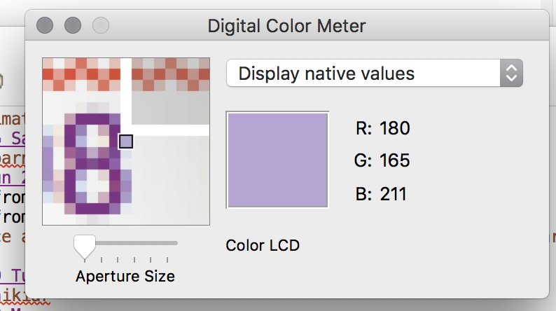] --- # Review of tree construction Circle all of the interactors in this interface. .left-column[] --- # What is the interactor hierarchy? <br> .left-column30[ ] --- # What is the interactor hierarchy? Naive version... .left-column30[ ] .right-column-half[ <div class="mermaid"> graph TD W(Window) --> M[Icon:Mag Window] W --> A[Slider:Aperture Size x y w h] W --> C[Menu:Choice x y w h] W --> I[Icon:Color x y w h] W --> T[Text:RGB x y w h] W --> La[Text:Label x y w h] classDef blue font-size:14pt,text-align:center classDef green font-size:14pt,text-align:center class W green class M,A,C,I,T,La blue </div> ] ??? Start talking here about meta data that maters, they know about x, y, w and h from doodle Ask them to think about what else you might want to know to position something? --- # Why do we need layout? .left-column[ <br>  ] .right-column[ How can you center something? How can you lock it to an edge? How can you design layout that reacts (responds) well to turning your phone? Examples for web (from [CSE 154](https://courses.cs.washington.edu/courses/cse154/19au/lectures/lec05-css-iii-more-layout/index.html#/6)) - c0FFEE shop with [no layout](https://courses.cs.washington.edu/courses/cse154/19au/lectures/lec05-css-iii-more-layout/code/coffee-shop-solution/coffee-shop.html) - c0FFEE shop with [layout](https://courses.cs.washington.edu/courses/cse154/19au/lectures/lec05-css-iii-more-layout/code/coffee-shop-starter/coffee-shop.html) ] --- # User Interfaces on Android .left-column-half[ - Views - Base class for __all__ UI elements - Interactors (e.g buttons, labels, image views, etc) - ViewGroups - Encapsulates one or more views (e.g. Android Components, **Layouts**) - Can define specific **layout** properties We will use the word *Components* to include both layout components and interactors (Views) since you don't generally "interact" with layouts ] .right-column-half[ <div class="mermaid"> graph TD W(ViewGroup) --> V[ViewGroup] W --> V1[View] W --> V2[View] V --> V3[View] V --> V4[View] V --> V5[View] classDef blue font-size:14pt,text-align:center classDef darkblue font-size:14pt,text-align:center class W,V darkblue class V1,V2,V3,V4,V5 blue </div> ] --- # Practice: Let's try to recreate this layout using containers and spacers .left-column[] -- .right-column-half[ <div class="mermaid"> graph TD W(Window) --> L(LeftSide:DisplayVert) W --> R(RightSide:DisplayVert) L --> Z[Space:Fixed] L --> Y[Space:Stretchy] R --> D(RGB DisplayHor) D --> V[Space:Fixed] D --> U[Space:Flexible] classDef bluegreen font-size:14pt,text-align:center classDef blue font-size:14pt,text-align:center classDef green font-size:14pt,text-align:center classDef yellow font-size:14pt,text-align:center class W bluegreen class L,R,D green class Z,Y,V,U yellow class M,A,C,I,T,Q blue </div> ] --- # Practice: Let's try to recreate this layout using containers and spacers .left-column[] .right-column-half[ <div class="mermaid"> graph TD W(Window) --> L(LeftSide:DisplayVert) W --> R(RightSide:DisplayVert) L --> Z[Space:Fixed] L --> M[Icon:Mag Window] L --> A[Slider:Aperture Size] L --> Y[Space:Stretchy] R --> C[Menu:Choice] R --> D(RGB DisplayHor) D --> V[Space:Fixed] D --> I[Icon:Color] D --> T[Text:RGB] D --> U[Space:Flexible] R --> Q[Text:Label] classDef bluegreen font-size:14pt,text-align:center classDef blue font-size:14pt,text-align:center classDef green font-size:14pt,text-align:center classDef yellow font-size:14pt,text-align:center class W bluegreen class L,R,D green class Z,Y,V,U yellow class M,A,C,I,T,Q blue </div> ] --- # Vertical Container Components .left-column[  Linear (1D) layout of components - Always layout in the same direction - Places its direct descendants, in order, in that direction ] .right-column[ <div class="mermaid"> graph TD W(Window) --> L(LeftSide:DisplayVert) W --> R(RightSide:DisplayVert) L --> Z[Space:Fixed] L --> M[Icon:Mag Window] L --> A[Slider:Aperture Size] L --> Y[Space:Stretchy] R --> C[Menu:Choice] R --> D(RGB DisplayHor) D --> V[Space:Fixed] D --> I[Icon:Color] D --> T[Text:RGB] D --> U[Space:Flexible] R --> Q[Text:Label] classDef bluegreen font-size:14pt,text-align:center classDef darkblue font-size:14pt,text-align:center classDef blue font-size:14pt,text-align:center classDef green font-size:14pt,text-align:center classDef yellow font-size:14pt,text-align:center class L,R darkblue class W bluegreen class D green class Z,Y,V,U yellow class M,A,C,I,T,Q blue </div> ] --- # Horizontal Container Components .left-column[  Same: Linear (1D) layout of components - Always layout in the same direction - Places its kids, in order, in that direction ] .right-column[ <div class="mermaid"> graph TD W(Window) --> L(LeftSide:DisplayVert) W --> R(RightSide:DisplayVert) L --> Z[Space:Fixed] L --> M[Icon:Mag Window] L --> A[Slider:Aperture Size] L --> Y[Space:Stretchy] R --> C[Menu:Choice] R --> D(RGB DisplayHor) D --> V[Space:Fixed] D --> I[Icon:Color] D --> T[Text:RGB] D --> U[Space:Flexible] R --> Q[Text:Label] classDef bluegreen font-size:14pt,text-align:center classDef darkblue font-size:14pt,text-align:center classDef blue font-size:14pt,text-align:center classDef green font-size:14pt,text-align:center classDef yellow font-size:14pt,text-align:center class D darkblue class W bluegreen class L,R,D green class Z,Y,V,U yellow class M,A,C,I,T,Q blue </div> ] --- # Spacers .left-column[  - Work extra well with layout containers - We can add *Fixed Space* (struts) - Think of it like a strut in a building - They hold things a fixed distance apart - We can also add *Stretchy Space* (springs) - they push things apart as much as possible ] .right-column[ <div class="mermaid"> graph TD W(Window) --> L(LeftSide:DisplayVert) W --> R(RightSide:DisplayVert) L --> Z[Space:Fixed] L --> M[Icon:Mag Window] L --> A[Slider:Aperture Size] L --> Y[Space:Stretchy] L --> C[Menu:Choice] R --> D(RGB DisplayHor) D --> V[Space:Fixed] D --> I[Icon:Color] D --> T[Text:RGB] D --> U[Space:Flexible] R --> Q[Text:Label] classDef bluegreen font-size:14pt,text-align:center classDef darkblue font-size:14pt,text-align:center classDef blue font-size:14pt,text-align:center classDef green font-size:14pt,text-align:center classDef yellow font-size:14pt,text-align:center class Y,Z,V,U darkblue class W bluegreen class L,R,D green class Z,Y,V,U yellow class M,A,C,I,T,Q blue </div> ] --- .left-column-half[ # Example (Layout Assignment)  ] .right-column30[  ] ??? This is the kind of stuff we can do thanks to viewgroups --- # Example (Layout Assignment, part 3) .left-column-half[ I've highlighted things that are visible (as opposed to just doing layout work) <div class="mermaid"> graph TD C[ViewGroup:ConstraintLayout] C --> Column1[ViewGroup:Column1] C --> Column2[ViewGroup:Column2] Column1 --> V1[View:Fox] Column1 --> V2[View:Squirrel] Column1 --> V3[...] Column2 --> V4[View:Duckling] Column2 --> V5[...] classDef darkblue font-size:14pt,text-align:center classDef blue font-size:14pt,text-align:center class C,Column1,Column2 blue class V1,V2,V3,V4,V5 darkblue </div> ] .right-column30[  ] ??? This is the kind of stuff we can do thanks to viewgroups --- # Android's runtime view of the same .left-column[  VERY IMPORANT debugging tool ] .right-column-half[ 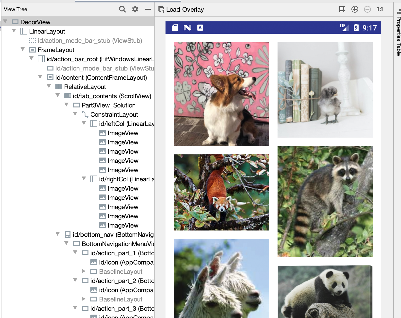 ] --- # Layout Assignment .left-column[ 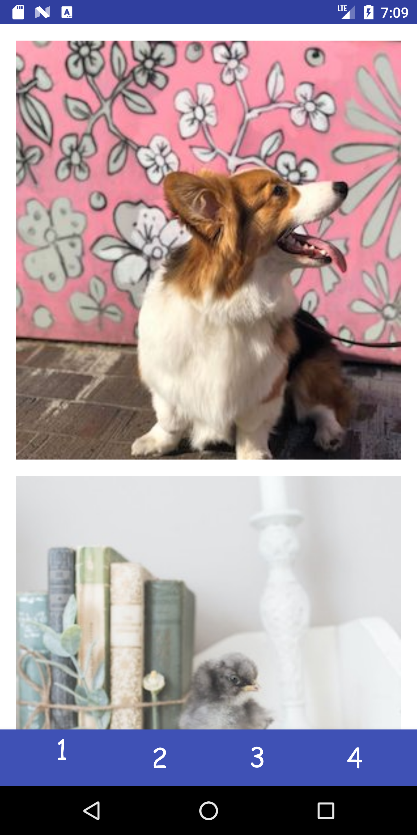 You can scroll this and the images are all equidistant. ] .right-column[ - Part 1 is about basic reactive layout using XML and constraints for a fixed number of images - Part 2 replicates this in code for a fixed number of images - Part 3 you create a *Layout Container* that can do a fancier layout, for an arbitrary number of images **Pintrest** style! - Part 4 you try to recreate a layout of your choice! ] --- # Brief Diversion: What is XML? - XML stands for eXtensible Markup Language - A superset of HTML - Tag names are surrounded by '<' and '>''s (Alligators or "wakkas") - Tags are generally in pairs such as `<html>` `</html>` or can be self closing `<ImageView />` - Tags can have attributes such as `<tagname attribute="value" attribute="value"> content </tagname>` --- # Layout in Android .left-column-half[ 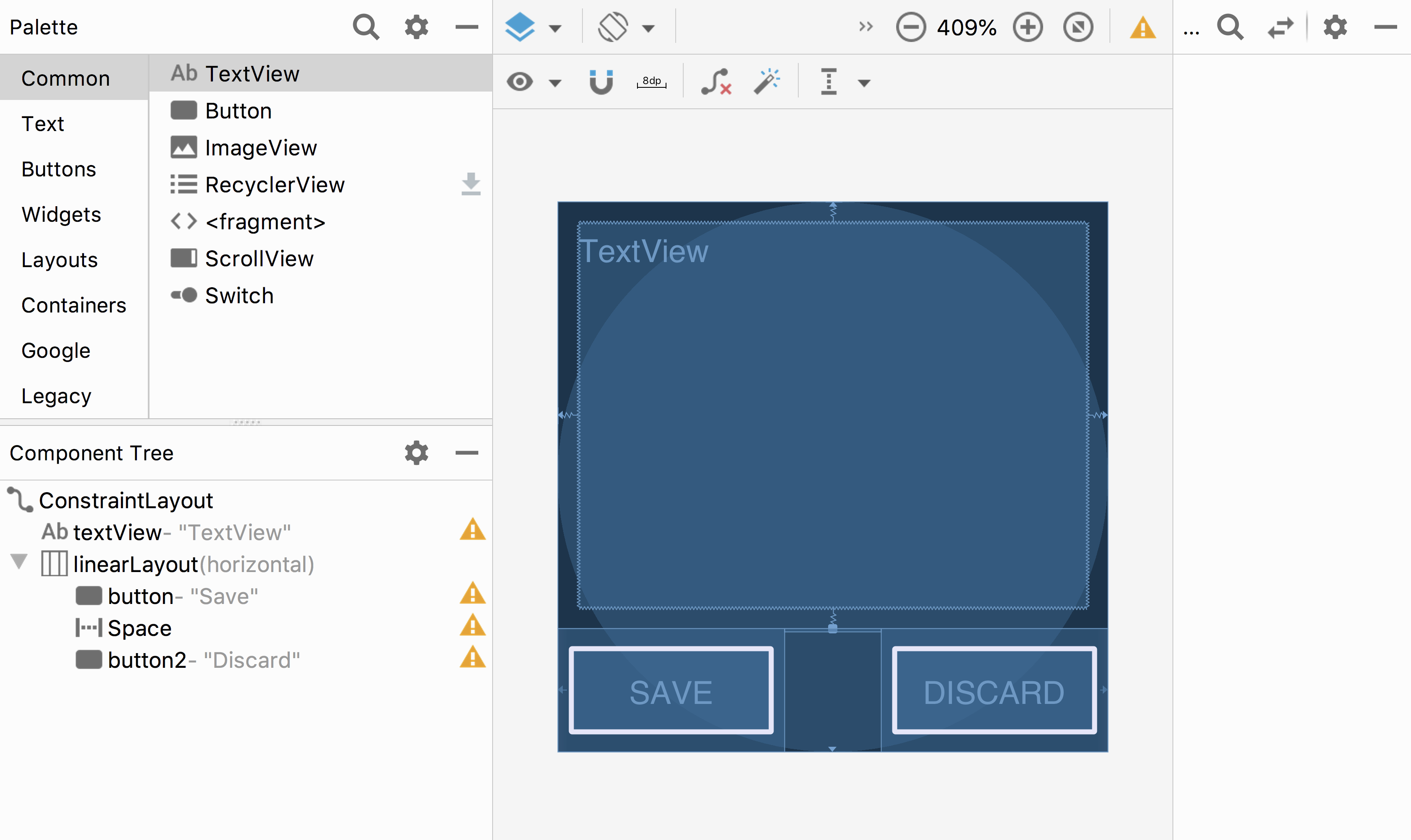 ] .right-column-half[ This is Android's GUI layout editor Where's the interactor hierarchy here? ] ??? point out the "space" --- # Layout in Android .left-column-half[  ] .right-column-half[ This is Android's GUI layout editor Where's the interactor hierarchy here? - It's the component tree! - The XML is a visual way of specifying the hierarchy that exists once the XML is loaded into the application What are the leaf nodes? Do you see anything unusual? ] ??? point out the "space" --- # What is a spacer? .left-column-half[  ] .right-column-half[ What is a Space? - Works extra well with layout containers - We can add *struts* - Think of it like a strut in a building - They hold things a fixed distance apart - We can also add *springs* - they push things apart as much as possible ```xml <Space android:layout_width="0dp" android:layout_height="wrap_content" android:layout_weight="1" /> ``` ] ??? see next slide! --- # Layout in Android .left-column-half[  ] .right-column-half[ In this case, they are in a `LinearLayout` - It always has a direction (horizontal or vertical) - And it places its kids, in order, in that direction, within its bounds Where is the linear layout on the screen? ] --- # Layout in Android .left-column-half[  ] .right-column-half[ In this case, they are in a `LinearLayout` - It always has a direction (horizontal or vertical) - And it places its kids, in order, in that direction, within its bounds Where is the linear layout on the screen? It's the box around 'Save and Discard' - We call this a *Layout Container* - Note: this is not visible in the actual GUI, it's a hidden interactor tree element ] --- # Layout in Android .left-column-half[  ] .right-column-half[ A Layout Container can - automate a lot of the layout tasks - make it much simpler to ensure reliable results - use these whenever they do the job - you will implement one for your assignment ] --- # Layout in Android Many layout and other attributes for components. You should explore!  ??? Talk about how there's many layout and other attributes for components that they should explore! --- # End of Deck The slides that were here have move to [Layout Part II](../wk03/layout-ii.html)