name: inverse layout: true class: center, middle, inverse --- # Heuristic Evaluation for Analyzing Interfaces Jennifer Mankoff CSE 340 Spring 2019 --- layout: false [//]: # (Outline Slide) .left-column[ ## Today's goals] .right-column[ - Introduce Heuristic Evaluation - Describe UARs ] --- .left-column[ ## Introducing Heuristic Evaluation] .right-column[ .quote[Discount usability engineering methods] -- Jakob Nielsen Involves a small team of evaluators to evaluate an interface based on recognized usability principles Heuristics–”rules of thumb” ] ??? "serving to discover or find out," 1821, irregular formation from Gk. heuretikos "inventive," related to heuriskein "to find" (cognate with O.Ir. fuar "I have found"). Heuristics "study of heuristic methods," first recorded 1959. --- .left-column[ ## Introducing Heuristic Evaluation] .right-column[ First introduced in 1990 by Nielsen & Molich Quick, inexpensive, popular technique ~5 experts find 70-80% of problems n Based on 10 heuristics Does not require working interface ] --- .left-column[ ## Overview of HE process] .right-column[ <div class="mermaid"> graph TD Interface[<b>Designer Provides Setting:</b><br>Description of Interface<br>List of Tasks] --> E1 Interface-->E2 Interface-->E3[... Around 5 Evaluators] E1[Evaluator 1] --> Problem1(Problem 1<br>Heuristic Violated<br>Severity<br>Description) E2[Evaluator 2] --> Problem1 E1 --> Problem2(Problem 2<br>...) E2 --> Problem3(Problem 3<br>...) Problem1 --> Synthesize(<b>Designer Groups Like Problems:</b> <br>Lists all problems<br>Includes average severity<br>Prioritize and decide on fixes) Problem2 --> Synthesize Problem3 --> Synthesize classDef evaluator fill:#e6f3ff,stroke:#333,stroke-width:2px; classDef designer fill:#d1e0e0,stroke:#333,stroke-width:2px; classDef data fill:#f4e242,stroke:#333,stroke-width:2px; class E1,E2,E3 evaluator class Interface,Synthesize designer class Problem1,Problem2,Problem3 data </div> ] --- .left-column[ ## So what are the heuristics?] -- .right-column[ H1: Visibility of system status H2: Match between system and the real world H3: User control and freedom H4: Consistency and standards H5: Error prevention H6: Recognition vs. recall H7: Flexibility and efficiency of use H8: Aesthetic and minimalist design H9: Error recovery H10: Help and documentation ] ??? These should not be hugely surprising after everything we've talked about... --- .left-column[ ## H1: Visibility of System Status] .right-column[  Keep users informed about what is going on ] ??? What input has been received--Does the interface above say what the search input was? What processing it is currently doing--Does it say what it is currently doing? What the results of processing are--Does it give the results of processing? Feedback allows user to monitor progress towards solution of their task, allows the closure of tasks and reduces user anxiety (Lavery et al) --- .left-column[ ## H2: Match between system and real world] .right-column[  Speak the users’ language Follow real world conventions ] ??? Use concepts, language and real-world conventions that are familiar to the user. Developers will need to understand the task from the point of view of users. Cultural issues relevant for the design of systems that are expected to be used globally. A good match minimizes the xtra knowledge required to use the system, simplying all task action mappings (re-expression of users’ intuitions into system concepts) --- .left-column[ ## H2: Huge Violation of this heuristic 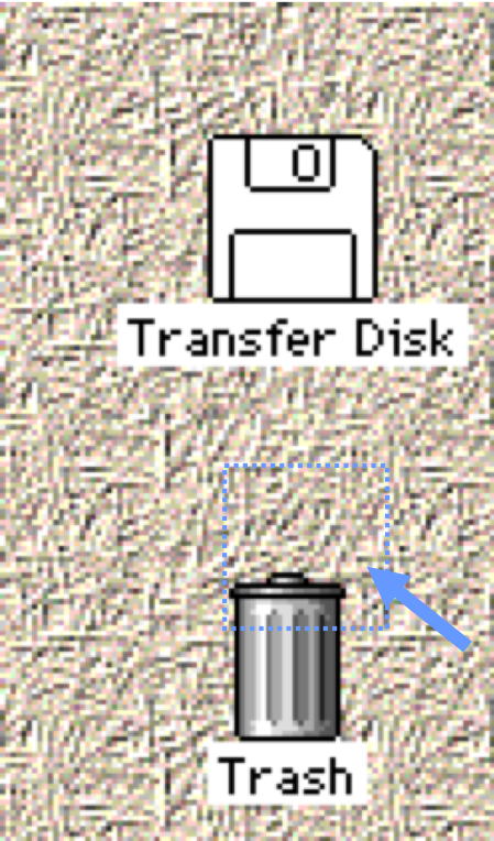 ] .right-column[ Possibly the biggest usability in problem in the Macintosh. Heuristic violation--people want to get their disk out of the machine--not discard it. ] --- .left-column[ ## H2: Mismatch depends on knowledge about users] .right-column[ ] Would an icon with a red flag for new mail be appropriate in all cultures? ] --- .left-column[ ## H3: User Control and Freedom] .right-column[ 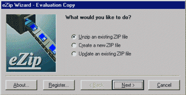 “Exits” for mistaken choices, undo, redo Don’t force down fixed paths ] ??? Users choose actions by mistake --- .left-column[ ## H4: Consistency and Standards ] .right-column[ Same words, situations, actions, should mean the same thing in similar situations; same things look the same, be located in the same place. Different things should be different 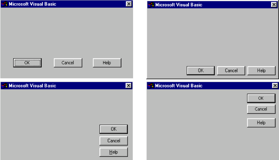 ] ??? Difference between H2 (Match between system and the real world). and H4--both are related to user’s prior knowledge--H2 of world; H4 of others parts of application and other applications on the same platform. Consistency within an application and within a platform. Developers need to know platform conventions. Consistency with old interface Consistency maximizes the user knowledge required to use the systems by letting users generalize from existing experience of the system to other systems --- .left-column[ ## H4: Consistency and Standards ] .right-column[ Evidence: Should include at least two inconsistent elements or an element and a platform guideline Explanation: What inconsistent element is inconsistent with  ] --- .left-column[ ## H5: Error Prevention] .right-column[ 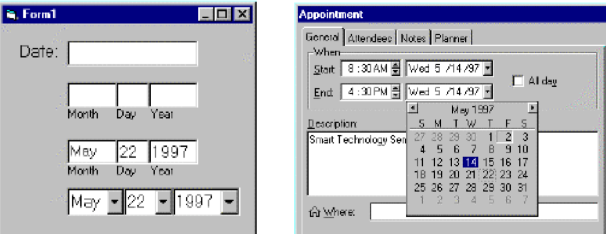 Careful design which prevents a problem from occurring in the first place ] ??? Help users select among legal actions (e.g., greying out inappropirate buttons) rather than letting them select and then telling them that they have made an error (gotcha!). It is a subset of HA (Visibility of system status) but is so important it gets a separate heuristics. Motivation: Errors are a main source of frustration, inefficiency and ineffectiveness during system usage (Lavery et al) Explanation in terms of tasks and system details (adjacency of function keys and menu options, discriminability of icons and labels). --- .left-column[ ## H6: Recognition Rather than Recall] .right-column[  Make objects, actions and options visible or easily retrievable ] ??? Command line interfaces classic example Rm * Arrows on keys that people can’t map to functions Much easier for people to remember what to do if there are cues in the environment Coming into working memory through perceptions. --- .left-column[ ## H7: Flexibility and Efficiency of Use] .right-column[ 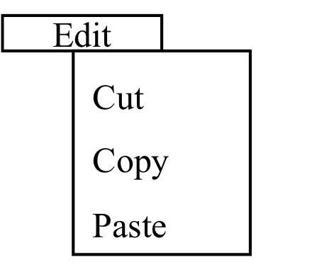 Accelerators for experts (e.g., gestures, kb shortcuts) Allow users to tailor frequent actions (e.g., macros) ] ??? Typing single keys is typically faster than continually switching the hand between the keyboard and the mouse and point to things on the screen. Skilled users develop plans of action, which they will want to execute frequently, so tailoring can capture these plans in the interface. --- .left-column[ ## H8: Aesthetic and Minimalist design] .right-column[ 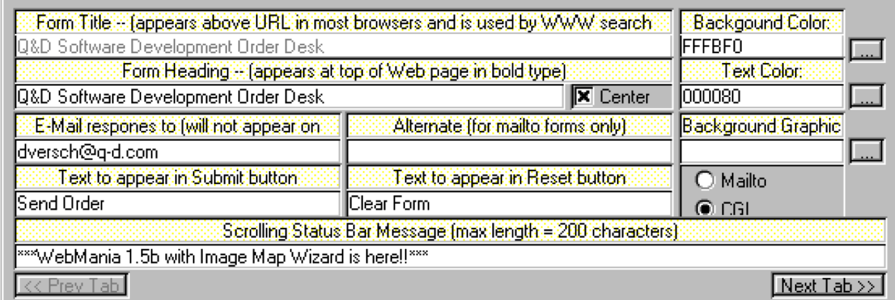 Dialogs should not contain irrelevant or rarely needed information ] ??? Tufte: Chart junk Visual search--eyes must search through more. More (irrelevant info) interferes with LTM retrieval of information that is relevant to task. Cluttered displays have the effect of increasing search times for commands or users missing features on the screen (Lavery et al) --- .left-column[ ## H9: Help users recognize, diagnose, and recover from errors] .right-column[ 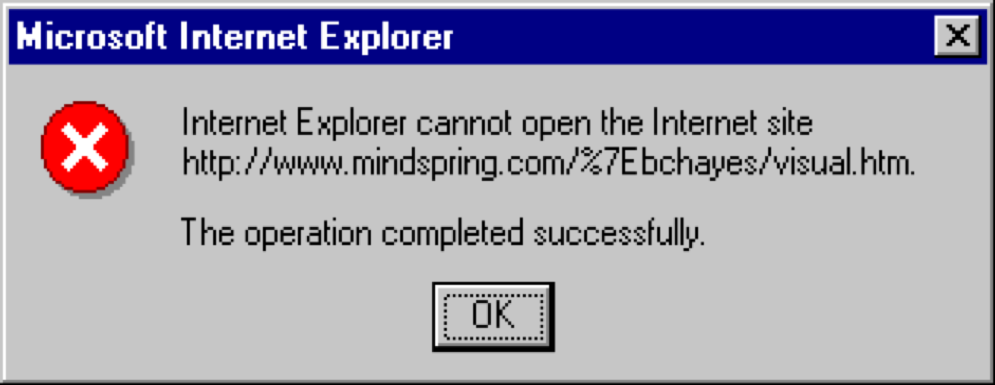 Error messages in language user will understand Precisely indicate the problem Constructively suggest a solution ] --- .left-column[ ## H10: Help and Documentation] .right-column[  Easy to search Focused on the user’s task List concrete steps to carry out Always available ] ??? Allow search by gist--people do not remember exact system terms (if user ever even knew system terms). --- .left-column[ ## What does the evaluator do?] .right-column[ Briefing (HE method, Domain, Scenario) Two passes through interface: Inspect flow Inspect each screen, one at a time against heuristics Fill out a *Usability Action Report* (we'll keep this simple in peer review) ] ??? NOT a single-user empirical test that is, do not say “I tried it and it didn’t work therefore I’ll search for a heuristic this violates” --- .left-column[ ## Usability Action Report ] .right-column[ UAR rather than “Problem report” because you report good aspects as well as problems -- you want to preserve them in the next iteration of the system! - **UAR Identifier** (Type-Number) Problem or Good Aspect - *Describe:* Succinct description of the usability aspect - *Heuristics:* What heuristics are violated - **Evidence:** support material for the aspect - **Explanation:** your own interpretation - *Severity:* your reasoning about importance - **Solution:** if the aspect is a problem, include a possible solution and potential trade-offs - **Relationships:** to other usability aspects (if any) ] .footnote[We'll ask you to do the things in italics in peer grading] --- .left-column[ ## Writing a description] .right-column[ Should be *A PROBLEM*, not a solution Don't be misleading (e.g., “User couldn’t find state in the list” when the state wasn’t in the list) Don't be overly narrow (e.g., “PA not listed” when there is nothing special about PA and other states are not listed) Don't be too broad, not distinctive (e.g., “User can’t find item”) ] --- .left-column[ ## Picking a Heuristic] .right-column[ Ok to list more than one This is subjective. Use your best judgement ] --- .left-column[ ## Deciding on a severity] .right-column[ Make a claim about factors and support it with reasons Consider *Frequency* (e.g., All users would probably experience this problem because…) Consider *Impact* Will it be easy or hard to overcome. NOT is the task the user is doing important (put importance of task in explanation and in justification of weighting, if relevant). Consider *Persistence* Once the problem is known, is it a one-time problem or will the user be continually bothered? NOT low persistence because the user abandons goal (that is impact--can’t overcome it. If can’t detect and can’t overcome, problem persists). ] ??? Why? Make claim (All users would PROBABLY experience this problem BECAUSE…) and IMMEDIATELY --- .left-column[ ## Rating Severity] .right-column[ 5-point scale 0 - Not a problem at all 1 - Cosmetic problem only 2 - Minor usability problem (fix with low priority) 3 - Major usability problem (fix with high priority) 4 - Usability catastrophe (imperative to fix before release) ] --- .left-column[ ## Why 5 or more people? ] .right-column[ 4 or 5 are recommended by Nielsen (this is a point of contention. I aim for *saturation*). A single person will not be able to find all usability problems Different people find different usability problems Successful evaluators may find both easy and hard problems ] ??? You can estimate how many you need (see NM book, pp 32-35). 4 or 5 are recommended by Nielsen --- .left-column[ ## Advantages of HE] .right-column[ “Discount usability engineering” Intimidation low Don’t need to identify tasks, activities Can identify some fairly obvious fixes Can expose problems user testing doesn’t expose Provides a language for justifying usability recommendations ] --- .left-column[ ## Disadvantages of HE] .right-column[ Un-validated Unreliable Should use usability experts Problems unconnected with tasks Heuristics may be hard to apply to new technology Coordination costs ] --- .left-column[ ## Summary] .right-column[ Heuristic Evaluation can be used to evaluate & improve user interfaces 10 heuristics Heuristic Evaluation process Individual: Flow & screens Group: Consensus report, severity Usability Aspect Reports Structured way to record good & bad ]
layout: true