Objectives
By the end of this lesson, students will be able to:
- Apply data visualization principles to effective data communication
- Tell a clear story with data insights
- Organize and structure a report or presentation
Setting up
To follow along with the code examples in this lesson, please download the files in the zip folder here:
Make sure to unzip the files after downloading! The following are the main files we will work with:
lesson9.ipynbeda.ipynbufos.csv
Data Literacy
Data literacy is defined as the ability to explore, understand, and communicate with data in a meaningful way (Tableau). You’ve already had an introduction to these skills in the past couple of weeks as we’ve introduced and walked you through data manipulation and visualization in pandas and seaborn. When we talked about data visualization principles and encodings, we were communicating certain goals, applications, and consequences of data-driven decision making.
Reading Code for Data
Let’s say you gave me a dataset home/sharks.csv that contains data about different kinds of sharks. You ask me to create some kind of visualization that represents the relationship between a shark’s age and its fin length. Suppose that I come up with the following code:
import pandas as pd
import seaborn as sns

data = pd.read_csv('home/sharks.csv')

data = data[['name', 'fin_length', 'age']]
data = data.dropna()

sns.relplot(data=data, kind=scatter, x='age', y='fin_length', hue='name')
plt.title('Shark Ages vs. Fin Length')
plt.xlabel('Age (months)')
plt.ylabel('Fin Length (in)')

plt.savefig('/home/sharkplot.png', bbox_inches='tight')
It’s not runnable, so you won’t be able to run and see what the code produces or how different parts of it work. But hopefully some of this code looks familiar from Lesson 8. In fact, the code here might look similar to how you’d approach the same task.
Does code by itself tell us anything about the data?
Sometimes it can! Let’s take a closer look at what we can infer from the code I’ve written:
- The dataset might be pretty big (which is why I filtered down to just 3 columns in line 6)
- The dataset contains missing values (which is why I used
.dropna()in line 7) - Both the
ageandfin_lengthcolumn contain numerical data (which is why I used a scatter plot in line 9) - The
agecolumn is measured in months (from the label in line 11) - The
fin_lengthcolumn is measured in inches (from the label in line 12)
Code and datasets go hand-in-hand when it comes to data programming. Without data, we wouldn’t have things to code, and without code, we’d have no way of analyzing or interpreting our data! When we write code, we are finding some lens through which to view our data.
In this example, my task was to create a visualization that showed the relationship between a shark’s age and its fin length. But I also included the ‘name’ column so that we can tell which point represents which shark in the scatter plot. That was a design choice I made by myself that the task didn’t necessarily ask for!
Info
For your checkpoints and take-home assessments, you should stick to following the guidelines we provide in the specs. You can get creative with your design choices in your final project or portfolio instead!
Technical and Non-Technical Skills
Much of what we’ve taught in the past few weeks have been what many programmers and data scientists call technical skills, which include but are not limited to:
- Writing code
- Manipulating data
- Creating visualizations
Technical skills often involve lots of math and programming, so some people consider these skills to be more trainable, objective, and analytical. In the example above, I used my technical skills to write some code and produce a visualization from some data.
Non-technical skills are sometimes called “soft skills”, but they can be hard to define! This skillset includes but is not limited to:
- Critical thinking
- Research skills
- Domain knowledge
- Effective communication
- Teamwork
We’ve actually practiced non-technical skills all throughout the quarter! When we ask you to work in small groups in class sessions and quiz sections, or make your own calls about what should go into your function comments, or even when you come ask us questions in office hours and on Ed; you are actually practicing these kinds of skills.
We’ll focus more on developing non-technical skills in these readings. It’s important to remember, though, that just like coding or any other technical skill, that non-technical skills need practice for progress. The well-rounded data programmer needs a good balance between coding sense and common sense!
Food for thought: In the example above, I mentioned that I used technical skills to write the code that produced the visualization. Where did I use non-technical skills, if at all?
Data Context
In the previous section, I gave an example of how you can sometimes extrapolate information about data by looking at the code that uses it. Most of the time, though (as you’ve probably noticed), you’ll need to write code for the data you have. Unless you’re using an analysis that someone else has already done, or you are building off of a previously established code base, you’ll be responsible for communicating data insights through the code you write.
How does that work?
Data context (or metadata) is the information and connections surrounding and accompanying a collection of data. In other words, it is any context or background you can use to make more informed decisions about how to use data.
Consider the following visualization:
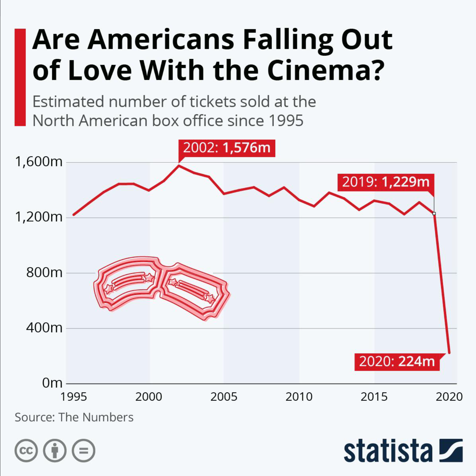
Just by looking at this graph, we see a sharp decline in box office sales between 2019 and 2020. The title of the visualization makes us think that Americans don’t really want to go to the movies anymore. However, this graph leaves out the fact that the COVID-19 pandemic hit in 2020, which confined many people to their homes. The effect of the global pandemic and lockdown is important information that helps contextualize the huge drop that we see in this graph.
When we are thinking about data context, we start off with six keywords
- Who: the people represented in the data or responsible for its collection and usage (this could also be applied to you, as a researcher and data programmer!)
- What: the information that is represented in the data, such as demographics or measurements
- When: the timeframe associated with data collection or represented in the data
- Where: the location of the data, virtual or otherwise
- Why: the stated (or unstated) purpose of collecting the data
- How: the methods used for data collection and storage
Note that I didn’t write any complete sentences for these keywords! That’s because one keyword can actually yield a lot of different questions, and which questions you ask might depend on the answers you want to get. Here are some examples of questions for each category:
- Who is the data about? Who has collected or maintained the data? Who is represented or not represented in the dataset? Who is the data prepared for? Who is your analysis prepared for?
- What information is stored in the dataset? What are the missing values, if any? What information is included or excluded? What do individual values mean, if they are coded? What experiences do data collectors and analysts bring to their work?
- When was the data collected? What time period is represented in the dataset? When is data updated or presented?
- Where was the data collected? Where is the data stored now? Is it in an accessible place?
- Why were certain data collection methods used? Why were certain encodings used? Why did the original data collectors create the dataset? Why are you interested in using this data, too?
- How was the data collected? How is the data currently maintained, if at all? How might this data be used for analysis?
Note that these are not exhaustive! There are also many questions that fall between categories, but this is just meant as a starting point for thinking about data context.
Sometimes, you might have prior knowledge about the field that your dataset belongs to. We call this prior knowledge domain knowledge. For example, your dataset might be about sharks’ bodily measurements, but as a marine biologist, you might know more about shark migration and feeding habits that could also affect shark size. You’d also be a more credible person to interpret and analyze the data, as opposed to, say, a random person whose only exposure to sharks was the Jaws movies.
You do not necessarily need to be well-versed in any field to use data from it, but it certainly helps. You might refer to a domain expert, who has more experience working with data and interpreting results in a particular field.
There are always challenges to collecting and using data that can impact your analysis and findings. It’s important to be open about these challenges and work collaboratively to solve them, rather than taking an “easy way out” and not actually addressing data issues. This can lead to widespread malpractice and oversights, even in professional settings!
How can you find data context?
Many data collectors and maintainers will include some data context on sites or in manuals where they store their data. Here are some things to look out for:
Data dictionaries
Sort of like Pythonic dictionaries, data dictionaries create a mapping between an encoding in your dataset and what it actually means. Many large datasets might use abbreviations, codes, or shorthand for column names or values. Data dictionaries are essential for figuring out what data types are in each column, what those values mean, and what columns represent.
Here’s an example of a data dictionary for our sharks dataset:
| Column name | Feature | Encodings | Type |
|---|---|---|---|
| id | unique identifier for sharks | N/A | int64 |
| name | name of shark species | 0 - great white 1 - whale 2 - mako 3 - leopard | object |
| age | shark’s age at time of capture, in months | N/A | int64 |
| fin_length | length of pectoral fin, in inches | N/A | float64 |
| dorsal_length | length of dorsal fin, in inches | N/A | float64 |
| sex | sex of the shark | 0 - female 1 - male | object |
| health | treated by on-site veterenarian | 0 - no 1 - yes | object |
Note here that if we just had the dataset without knowing what the columns or column values meant, we might have gotten stumped by a 1 in the health column! Data dictionaries won’t always be formatted like a table, nor will they provide data types, but at the minimum, they will include descriptions of what the columns mean, as well as any encodings or abbreviations.
The df.info() function can be very helpful when figuring out the data types of each of your DataFrame columns. Recall that str are called objects in pandas!
README
A README (all caps) can be thought of as a combination of a data dictionary and instruction manual. READMEs are often formatted in Markdown (.md) and provide a description of how to run all files in a workspace or give an overview of what each file does. As an example, here’s what a README for a theoretical Take-Home Assessment 0 might look like:
# Take-Home Assessment 0: Startup

## Included files

    - `hw0.py`: A file where you will complete the assessment code

    - `hw0_test.py`: A file where you will complete assessment code relevant to testing

## Running tests and checking `flake8`
To run your own tests, open a terminal and enter the following command:

`python hw0_test.py`

To check any file for `flake8`, open a terminal and enter the following command:

`flake8 <file_name>`

where `<file_name>` is replaced by the name of the file you are checking. For example, checking `hw0.py` for `flake8` would look like:

`flake8 hw0.py`.

## Submitting your work

To submit your work, go to Gradescope and make an initial submission.

**Initial submissions for HW0 must be made by 29 June 2023, 11:59pm PST**
You can view more Markdown shortcuts here, if you’re interested.
Food for thought: Find an open-source dataset on Kaggle, Github, or some other data source. What context is given by the data provider? What can you infer about the data? What other questions might go unanswered?
More food for thought: What are some possible applications of data programming where you have some domain knowledge? How does your own identity as a person or data programmer affect how you interact with data?
Data Storytelling
Let’s talk multiverses for a moment.
It’s been sort of a hot topic with movies in the past few years, like Everything Everywhere All At Once and Spider-Man: Across the Spider-Verse. One of the appeals of a multiverse story is seeing the same character archetype in multiple variations across different imaginings of the same story. We get to see how an alternate timeline might have played out (for better or worse), and it can be both fun and heart-wrenching. Usually, we follow one character with different variations, and we get to see what the pivotal moments are in their home universe that makes them different than their multiversal counterparts.
What does this have to do with data science?
Data communications, at their core, tell stories in big universes. A dataset is like a multiverse, and one specific analysis is one specific universe. There are common threads tying the whole multiverse together, like using the same data or processing it in Python. In fact, depending on the dataset, most analyses might end up looking pretty similar (multiple variations of text analysis, for example).
Characters, Conflict, and Conclusions
Today, stories can take a number of formats, whether on the big screen, in a book, or through PDFs, slide decks, and JupyterHub! You can also tell lots of different stories with the same dataset, depending on your research questions and methods of analysis. Consider the ufos.csv dataset from Lesson 7. Here’s a glimpse into the multiverse of analyses for this data:
- A set of bar graphs illustrating different categorical qualities of the different UFOs
- A YouTube tutorial using this dataset to demonstrate how to drop or replace missing values
- A neural network using all columns to predict how long the UFO would be visible
- A single string representing the most common UFO shape in the dataset
When thinking about the multiverse of data stories, it can be overwhelming at first. Let’s focus on one universe— the story that you’re going to tell. What are you interested in? How can you get your audience interested and invested in your interests? Whether it’s a movie, book, or data project, all stories are guided by questions.
Who is the main character?
Your main character(s) give your audience the perspective that they follow and sympathize with for the story you tell. A well-rounded cast of main characters focus the audience’s experience to two or three main perspectives on the same series of events. When it comes to a data story, your main characters are your research questions! The “plot” of the data story is all about finding answers to those questions.
We’ve probably all seen at least one fictional character that just felt flat or unrelatable. Research questions can feel the same way, if they’re too easily answerable or irrelevant to the data you have. Here are some tips on creating compelling and interesting research questions:
- Make sure the questions are relevant to your data, and the data is relevant to your questions.
It may seem obvious, but you should always check to make sure that the data you have can actually answer the questions you want to ask. If questions are like characters, then datasets are like settings. (If Spider-Man needs tall buildings to swing from, he probably shouldn’t live in rural Nebraska!) It’s OK to look for different datasets that are more relevant to the analysis you want to do, or update the scope of your questions depending on the data you have. - Ask questions that don’t have simple answers.
Generally, if you feel like you can answer your question in 1 or 2 lines of code (after necessary data cleaning and preparation), it’s probably not too compelling. You have a character that looks cool, but that’s about it. One of the best ways to turn a flat character three-dimensional is to kick a bit of motivation into them. Let’s say you’ve answered your question in 2 lines of pretty straightforward code. What happens next? What does that answer mean? Why is this answer important? - Use your domain knowledge to come up with interesting questions!
As mentioned in the previous slide, domain knowledge can give us extra insights into methodology and results that we might not get just by looking at a dataset. A common piece of advice for folks in the creative business is: write what you know. The same goes for data projects! (It’s also a lot of fun for us to follow your project when you bring a personal touch to them.)
There is such a thing as too many research questions, especially if you’re pressed for space in your report. It’s better to focus on 3-4 questions in depth than answer 8-9 questions briefly.
What happens to your characters?
The plot thickens! The goal of your analysis is finding an answer to each of your research questions, even if that answer is “We don’t know”. The journey between posing your research questions and finding answers is the heart of analysis, with all its ups and downs. Fiction writers conceptualize this journey as a series of events that make up one big narrative. When we follow how characters respond to and learn from these events, we are following their character arcs. For data stories, we think about the journey as a series of steps that we take to answer our research questions.
If you’re familiar with plot mountains, we can use the analogy of a plot mountain to break down different parts of the data story:
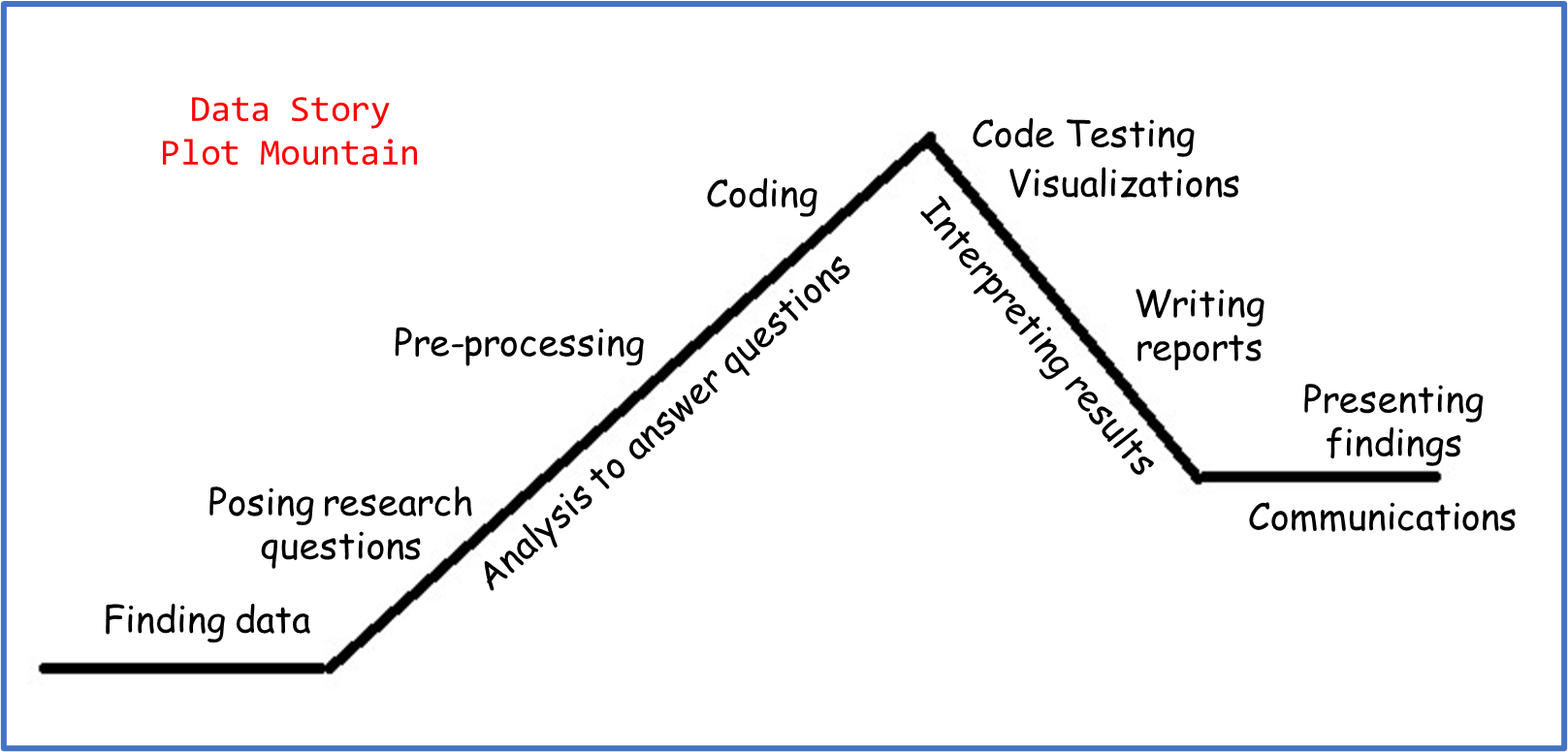
- We start the “story exposition” by finding data and posing research questions. This establishes the universe and characters we’re working with.
- The “rising action” involves preliminary data manipulation and processing, in order to prepare the datasets for the code that we’ll use to answer the questions.
- The “climax” usually looks like finding initial answers or results.
- The “falling action” involves testing code and interpreting results. Visualizations are placed here because they are an essential part of data communications, but you could use data visualizations at any stage of your analysis to summarize steps or assist in exploratory data analysis.
- The data story concludes with a consolidated summary of the questions, methodology, and findings. This can take the form of a written report, oral presentation, or both!
Pacing matters. Pacing is how quickly or slowly action moves in a story. You’ll probably figure out the pacing of your analysis as you work through it. For example, you might anticipate spending 1 hour on data cleaning, 4 hours on data analysis, and 1 hour interpreting your results. But after downloading all your data, you realized that there were lots of missing values and re-encoding that you had to do. Maybe you had to make several unit conversions or standardize your data, and the pre-processing ended up taking 10 hours! It doesn’t mean that there was anything wrong with your analysis; it just means that certain steps ended up taking unexpected amounts of time.
As much as you’re the creator of your data story, you’re also (sort of) a character! When you’re writing about your analysis, here are some other things to keep in mind that are also part of the story you tell:
- What was surprising or unexpected about your process?
- What did you learn during the analysis that you hadn’t thought about at the beginning?
- Did your research questions change or develop as you worked through your project? How and why?
Writing in Data Programming
Writing might look easier for some folk than others, because many of us have a very rigid idea of what “good writing” looks like. When we break down this idea, though, “good writing” becomes a more abstract concept. Does “good writing” always mean perfect grammar? Using advanced jargon in every other sentence? Take the following sentence:
The jocular earthworm exuberantly rejoiced with unabated exultation.
That’s a grammatically correct sentence with some pretty advanced vocabulary, and it technically makes sense. But what is it trying to communicate? What assumptions might you make about the writer or their audience? (If you followed along, that was one happy worm!)
This isn’t a writing class, but part of data programming and data science is effective communication, and part of effective communication is effective writing. To that end, you will have to do some writing for us. Note, effective writing does not mean perfect writing. We care a lot more about what you have to say rather than how you say it. (Sound familiar?)
Aside from file headers and doc-string comments, there are two main places where you’ll have to do some writing for us:
- Writeups
- Final report
Writeups
The writeups in this class will consist of 2-4 questions about the code you’ve written, asking you to reflect on some of the coding tasks and the possible impact of the work you’ve done in the take-home assessment. Here’s a (non-exhaustive) list of some things you can expect to be asked for the writeups, along with some guiding ideas to help you formulate your answers:
- Is a certain visualization effective?
- Note that this is a yes/no question, and there’s no right or wrong answer (as long as you can back up your argument)!
- Think back to the discussions we’ve had about Data Visualization Principles. All visualizations communicate something. Is this visualization communicating what you want it to? Why or why not?
- What encodings are present in this visualization? Are they relevant and meaningful?
- What might improve this visualization, if anything?
- What sources of bias might exist in the dataset?
- Do you know how the data was collected? Why might it be important to know how data is collected?
- Who or what is represented in the dataset? Is anyone or anything overrepresented? Underrepresented?
- Are there systemic or institutional patterns that might yield this kind of data? For example, women may be underrepresented in a dataset about software engineers since historically there have been more obstacles and fewer opportunities for women to have jobs in or participate in software engineering.
- Is there anything in the data to suggest biases introduced from the data collectors or providers (intentional or not)? Note that these might not all be “bad” bias—for example, maybe the first round of data collection produced lots of missing values, so the data collectors decided to fill in all the missing values with the maximum of the values they observed.
- Is it practical or ethical to use machine learning for X task?
- What is your train and test accuracy, and how do they compare? Do you think your model is overfit?
- What would be the impact if the machine learning model made a correct prediction?
- What would be the impact if the machine learning model made an incorrect prediction?
- Is there a way to do this task without using ML? Why might we use ML instead?
- What results might someone get from your analysis, and how might those results be used?
- What problems might be solved using this dataset or analysis?
- Who might be the intended audience of such an analysis?
- Who or what might change depending on the results you find?
Tip
A tip for you! If you’re ever on the fence between two answers, write out a list of supporting evidence for each answer, or possible arguments you might make. Then, write out whichever side you had more evidence/arguments for, regardless of whether you actually agree with that side. As mentioned earlier, there aren’t really right or wrong answers– we are more interested in your ability to think critically and format a clear response!
We don’t have a minimum or maximum word count for how long your answers should be, but keep in mind that a well-formulated response will usually be at least 2-4 sentences long. Here are a couple ways you might choose to structure your answers:
- Answer the question, then explain your answer.
- Answer the question, think about a counterexample or a counterargument to your answer, and refute that counterexample/counterargument.
- Answer the question, then pose a follow-up question, then answer the follow-up.
Info
Note that these are not the only ways you can answer the writeup questions! We encourage you to get creative in your approach to the written responses!
Notice something in common? You should always start by answering the questions we ask, and make sure your answer is relevant to what we’re asking! It might sound a bit silly for us to say, but here’s an example of a really good response that doesn’t really answer what we asked:
Thinking back to the visualization we created in the ‘Data Literacy’ slide to show shark ages vs. their fin lengths, what might be one conclusion marine biologists might draw from this visualization?
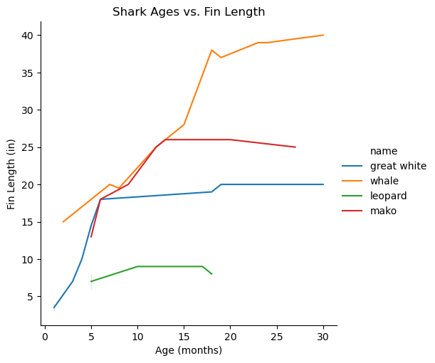
[Sample Answer 1] It’s important for marine biologists to know what kinds of sharks are in the dataset, that way they can track tagged sharks more easily. Tagging sharks, especially endangered species, helps marine biologists observe the sharks’ behavior and patterns. Marine biologists might then be able to come up with better conservation strategies, such as increasing wildlife patrols or calling for reduced fishing in some parts of the oceans. Because the visualization tells us which sharks are in the dataset, marine biologists might conclude that these are the sharks that need the most protection.
Tagging sharks, monitoring their behavior, and coming up with conservation strategies are all important parts of what marine biologists do! But that’s not really related to the question we asked, which was specifically about the visualization we created. Here’s a response that does answer the question:
[Sample Answer 2] From the line plot, the shark fin lengths seem to even out after a certain age. This might suggest to the marine biologists what age each shark species can be considered “fully grown”. Further, not all sharks reach their fully-grown fin lengths at the same age, which might also suggest that some species of shark reach maturity faster than others, or that their lifespans vary.
When you are the one writing the questions, then you can choose what to answer and how to go about doing it– which brings me to the longer-form writing that you’re expected to do…
Final Report
Your final report (yes, the one for the final project or portfolio!) might look or feel like the writeups in some ways. Before listing out the similarities, I’ll highlight the differences:
- The report is expected to be much longer than the writeups! While we don’t have a strict page count, we expect that you’ll have somewhere between 5-10 pages in the report, including figures.
- Instead of being provided a spec, you will come up with the questions you want to ask of your data, or the vision you have of your portfolio. This means you’ll also have to come up with the post-analysis “writeup” questions as part of your analysis.
- Your report is expected to have certain subsections where you talk about different parts of your analysis and methodology. While not exhaustive, you can expect to write about the following if you choose to do a final project:
- Research questions
- Data contexts and cleaning/manipulation
- Results from your analysis
- Discussion of strengths or limitations
- And if you choose to do a portfolio, you can expect to write about the following:
- Summary of creative work
- Response to feedback
- Cohesion of different elements in the portfolio
- Reflection on personal growth this quarter
Here are some things you might find in common between your writeups and the writing you do in the final report (for either the portfolio or the project). Keep in mind that these are more related to things that you’ll write about, rather than format:
- Thinking about how your analysis might be used or interpreted
- Considering biases in your data and analysis
- Analyzing impact, ethics, and consequences
- Connecting your process to your own experiences
As I mentioned earlier, we’re not a writing class, which means we care much more about what you say rather than how you say it. When it comes to the final reports, you can think of this as paying attention to larger structural details, as opposed to sentence-level details. Consider the following scenarios:
[Scenario 1] Marcus is working on a project analyzing court speeches to train a machine learning model that can predict whether the jury finds the defendant guilty or innocent. His initial research question is “What features about court speeches are most influential on a jury’s decision?” While he works on his project, though, he realizes that there are hidden features not in his dataset, such as the length of the trial and gender of the lawyer, that might influence the decision. He doesn’t have time to run a full analysis on the hidden features, so he decides to write a small section on those limitations in the report instead. He chooses to put this section in the beginning of his report when he introduces the research question, so that his readers are aware of this limitation as they read through his methodology and results.
[Scenario 2] Gwen is working on a project analyzing drumming patterns in popular music, to see how drumming techniques and rhythms have changed over the last century. For her project, she creates lots of different visualizations for different genres or specific rhythms. As Gwen makes these visualizations, though, she realizes that some of the labels may be difficult to read if the figures are small. She also doesn’t want to clutter up her report with lots of figures, so she decides to number all her figures and put them into an appendix– that way, the figures are large, and they don’t take up unnecessary space in the report body. In her analysis section, she references different figures by their numbers, and she includes captions in the appendix that summarize each figure.
In the first scenario, Marcus made a structural choice when he decided to write the limitation of his analysis alongside the research question. If you were doing the same project, you might choose to place the limitations after the analysis section, towards the end. It doesn’t change the technical work you’ve done for the project, but it might change how your readers respond to your report!
In the second scenario, Gwen’s structural choice came in the form of adding an appendix to her report that contained all her visualizations and figures, instead of adding them as in-line figures. You can also create appendices for your report if you want, or you might choose to include figures in the text body. Again, this doesn’t change any technical work, but you should consider ease of reading or accessibility if details may be lost in small figure sizes.
Here are some examples of sentence-level details that could be applied to either scenario:
- Writing in the first-person (“I/We did X for my/our analysis to find Y” as opposed to “X was used to find Y”)
- Active voice vs. passive voice (“The results of A proved B” as opposed to “B was proven using A”)
- Present vs. past tense
- Using abbreviations or shorthand instead of full names
Depending on the writing experience you have, the “correct” approach to writing reports may vary. Some professors forbid first-person, while others encourage it. Our final stance on sentence-level details is this: you can write in whatever way you want, as long as we are able to understand your meaning and intent.
Food for thought: What are structural choices and sentence-level choices that you might apply to the writeups or final report? How are they similar, and how are they different?
⏸️ Pause and 🧠 Think
Take a moment to review the following concepts and reflect on your own understanding. A good temperature check for your understanding is asking yourself whether you might be able to explain these concepts to a friend outside of this class.
Here’s what we covered in this lesson:
- Data literacy
- Technical and non-technical skills
- Data context
- Data dictionaries
- READMEs
- Data storytelling
- Writing in data programming
- Writeups for class
- Reports
Here are some other guiding exercises and questions to help you reflect on what you’ve seen so far:
- In your own words, write a few sentences summarizing what you learned in this lesson.
- What did you find challenging in this lesson? Come up with some questions you might ask your peers or the course staff to help you better understand that concept.
- What was familiar about what you saw in this lesson? How might you relate it to things you have learned before?
- Throughout the lesson, there were a few Food for thought questions. Try exploring one or more of them and see what you find.
In-Class
When you come to class, we will work together on the problems in eda.ipynb. We will also need ufos.csv for this notebook. Make sure that you have a way of editing and running these files!
Canvas Quiz
All done with the lesson? Complete the Canvas Quiz linked here!
Note: Because of the free-form nature of this quiz, it will not be autograded. However, you can view your answers after submitting and resubmit as many times as you want before it’s due.