The content for this lesson is adapted from material by Hunter Schafer and by Kevin Lin.
Objectives
By the end of this lesson, students will be able to:
- Sort
pandasDataFrames - Skim library documentation to identify relevant examples and usage information.
- Apply seaborn and matplotlib to create and customize relational and regression plots.
- Describe data visualization principles as they relate the effectiveness of a plot.
Setting up
To follow along with the code examples in this lesson, please download the files in the zip file here:
The notebook contains some images that would be a hassle to download individually, so we’ve included everything into one zip folder. Make sure to unzip the files after downloading! The following are the main files we will work with:
lesson8.ipynbpokemon.csviris.ipynbiris.csviris_missing.csv
Because of the interactive nature of this lesson’s contents, you are highly encouraged to follow along with the code examples in lesson8.ipynb rather than just reading the content here!
Keyword Arguments
This section doesn’t describe anything particular about pandas, but a general feature of Python which will show up in other libraries that we will learn about this quarter. In the following code snippet, we define a function called div and show two different ways to call it! The first is the way we have seen it this whole time and the second is a brand-new way!
def div(a: float, b: float) -> float:
    print('Dividing', a, 'by', b)
    return a / b

# Method 1: Pass "by position"
div(1, 2)

# Method 2: Pass "by name"
div(a=1, b=2)
# When specifying by name, you can provide them in any order!
div(b=2, a=1)
# Notice, this is different!
div(b=1, a=2)
Why did we call these two methods “by position” and “by name”? When you were originally calling div(1, 2) you might have taken it a bit for granted how it determined that a should be 1 and b should be 2. When calling a function in the way we showed originally, it determined that the first value passed (1) should be assigned to the first parameter (a), the second value (2) for the second parameter (b), and so on if there were more parameters. This is why we call this “by position” since the position of the value in the function call determines which parameter will have that value.
Instead, Python also provides a way to specify which parameter should have which value by using the names of the parameters in the function call! When you say div(b=2, a=1) you are telling Python you want the parameter b to have value 2 and the parameter a to have value 1. Now the position of the arguments doesn’t matter, but the name you specify does. Notice that div(b=1, a=2) is very different than div(b=2, a=1)!
We will see these named-parameters pop up quite often in the libraries we learn! They usually provide functions with tons of parameters (with some default values)! It would be horrible if you had to specify them all by position (requiring you to know which parameter came 3rd in the list). Instead, you can pass them by name and it simplifies your code!
To see how many parameters a pandas function actually takes, look at its documentation!
import pandas as pd

help(pd.read_csv) # Press q to quit
Documentation
This is why doc-strings are so important!
Python lets you use both passing by-name and by-position in a single function call. For example, if you want to use the print function, but don’t want the new-line on the end, you would write:
# Try changing end to something else to see it print at the end!
print('Hello world', end='')
How does Python determine which is which? It first uses the arguments passed by-position to fill up the first parameters and then fills in the remaining with the ones passed by-name. You aren’t allowed to specify something by-name if it was already specified by-position.
This might make more sense with an example we define.
def method(a: int, b: int, c: int) -> None:
    print(str(a) + ',' + str(b) + ',' + str(c))

# 1 will be interpretted as a's value, rest are by-name
method(1, b=2, c=3)

# Causes an error because we tried to specify a twice!
method(2, a=1, c=3)
Default Parameters
Keyword arguments help programmers define methods that take many parameters without needing to memorize the exact position of each parameter. But specifying each and every parameter can still be a complicated task; for example, pd.read_csv actually defines 50 parameters. Thanks to default parameter values, we only need to specify the arguments that we actually want to customize.
When defining the parameter list for a function, the syntax param: type = value assigns the param a default value. Remember we use param: type to provide an annotation for the method signature, and then after that variable we use = value to give it a default value.
def div(a: int = 10, b: int = 1) -> float:
    return a / b


print('div(2, 3)', div(2, 3))
print('div(2)', div(2))
print('div(b=3)', div(b=3))
print('div()', div())
Notice that on many of the calls, we omit passing one of a or b. This does not cause an error because a and b were assigned default values of 10 and 1, respectively!
Missing Values
Most data in the world is messy. It might be in a format that you will have trouble reading from or it might contain errors. One of the most common types of errors in datasets is missing data: some entries or values might not be available in the dataset. This was the task you were working on in the Creative Component of THA 2! When you read in pokemon_missing.csv, you probably encountered something called NaN.
NaN represents a special number whose value is invalid or missing. In Python, NaN operates by two rules:
- Any arithmetic operation on
NaN, evaluates toNaN. - Any boolean comparison on
NaN, evaluates toFalse.
We can access the value NaN most easily by using the library numpy (commonly imported as np). We will learn more about numpy when we start working with image data later in the quarter.
import numpy as np

print(np.nan)            # nan
print(1 + np.nan)        # nan
print(np.nan * 1)        # nan
print(1 == np.nan)       # False
print(np.nan == np.nan)  # False
That last line is pretty surprising since we compared np.nan to np.nan. Remember though, one of the rules of NaN is that every boolean comparison on NaN is False!
How is NaN different than None? None doesn’t allow any numeric operations on it, it will cause an error!
print(1 + None)
pandas methods automatically ignore NaN values for many simple operations such as mean. In situations where this automated behavior is not desired, we can manage NaN values using a few pandas DataFrame and Series methods.
Note
We did not introduce these methods before you started working on THA 2 because the focus there was on replacing individual missing values, rather than working with them en masse!
To detect if there are missing values in a Series:
isnull()returns a boolSeries, whereTruemarksNaNvalues.notnull()returns a boolSeries, whereTruemarks non-NaNvalues.
To return a new DataFrame with NaN removed:
dropna()removes all rows with missing data.fillna(value)replaces missing data with the givenvalue.
Food for thought: When would it be better to drop NaN rows, and when would it be better to fill them with another value?
Data Visualization in seaborn

Before we begin, let’s put a word of caution about how to approach learning these libraries:
Trying to memorize all of these function calls and patterns is a ridiculous task. We will throw a lot of new functions at you very quickly and the intent is not for you to be able to memorize them all. The more important thing is to understand how to use them as examples and adapt those examples to the problem you are trying to solve.
The most important thing is to understand the big ideas highlighted by the code!
We won’t always be able to explain every bit of code. The purpose is to give you some examples that you can run for your own projects and help you navigate the libraries so that you can find relevant documentation in the future.
We will be using a modified dataset of pokemon to explore how to visualize our data!
import pandas as pd

data = pd.read_csv('pokemon.csv')
data  # For display
We’ll learn two well-known plotting libraries matplotlib and seaborn.
matplotlib (commonly abbreviated plt) is a well-established plotting library that’s used in many different contexts.
seaborn (commonly abbreviated sns) that extends matplotlib for popular data science workflows. Since seaborn extends matplotlib, writing seaborn code can sometimes involve overlapping with matplotlib parts.
As an example, even when we import the seaborn library, it’s also necessary to call sns.set_theme() to use the seaborn visual style rather than the default matplotlib visual style.
import matplotlib.pyplot as plt
import seaborn as sns

sns.set_theme() # Important!!

# This line is needed in Jupyter notebooks to make the plots show up automatically
%matplotlib inline
Let’s start by making our first plot! We want to make a scatter plot that shows how Pokemon Attack and Defense compare.
We will explain what this code does after this cell.
sns.relplot(x='Attack', y='Defense', data=data)
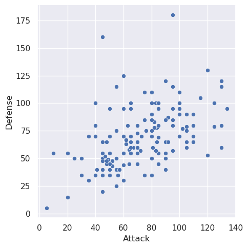
It’s so cool that we can generate a pretty plot from so little code! The relplot function is just one example function you can call from seaborn.
Here is how I would go about reading that documentation I just linked:
- Skim the examples to see what the function is capable of, don’t focus too much on code yet.
- Read the overview to get a general description of what the function does.
- Look at examples and the code in depth. Look at documentation for relevant parameters to see what they do and what other options you can specify.
- If necessary, skim parameter list to check out other parameters.
Importantly, the skill we are developing here is how to adapt examples seen previously to new tasks. This is a critical skill for data scientists since there is a new library to learn all the time!
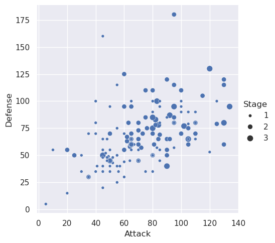
Looking through the examples on that page, I see that I can set the size of the dots by some other value. Let’s go ahead and do that!
sns.relplot(x='Attack', y='Defense', size='Stage', data=data)
In CSE 163, we will ask you to use the following seaborn functions for plotting. Notice that most of them can generate different types of plots with the kind parameter.
Again, don’t memorize these functions or their parameters! You might want to look through their examples to see all the different types of plots you can make.
Warning: These pages of documentation link to other functions in
seabornfor plotting. We recommend you stick to these ones here using thekindparameter rather than using the other functions since they have a slightly different behavior. Most bugs in graded assessments are related to plotting using otherseabornfunctions that aren’t one of the 6 listed above!
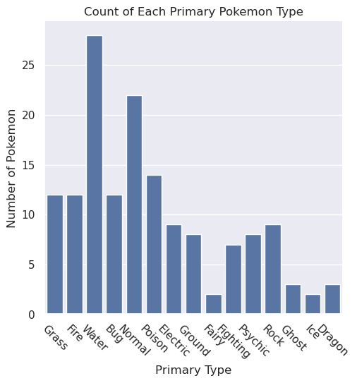
Let’s try using another one of those functions to make a plot to show how many pokemon are of each type!
sns.catplot(x='Type 1', kind='count', data=data)
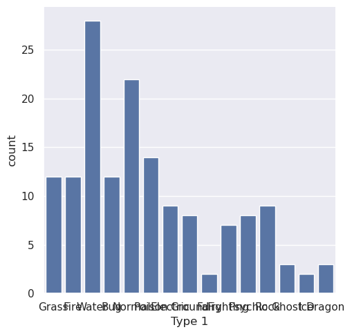
Yikes! I can’t read the x-axis labels; can you? seaborn does a great job making visualizations that look pretty good by default, but makes it really hard to customize them in small ways. This is is where matplotlib comes in to help us customize the chart.
To fix this specific issue of being unable to read the x-axis, we need to rotate the x-axis ticks. The following cell does that using matplotlib (remember that we imported it as plt.).
Note: We add a
passcall at the end of the cell to surpress extra output in the notebook. This is not an important detail, but makes the notebook slightly cleaner to avoid the automatic display of the value returned by the last function call.
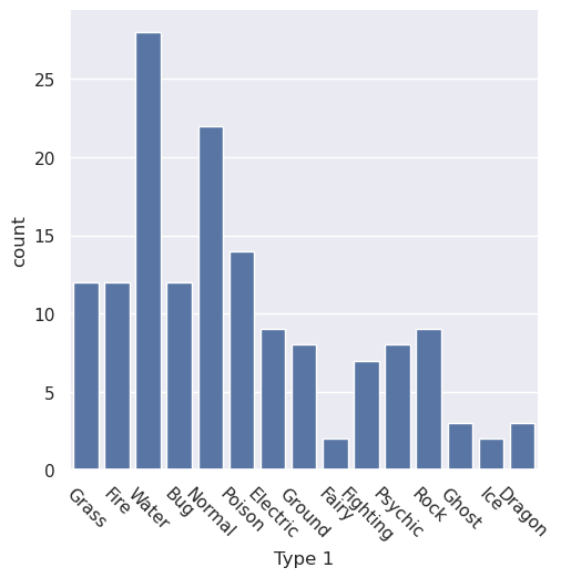
sns.catplot(x='Type 1', kind='count', color='b', data=data)
plt.xticks(rotation=-45)

pass
For the purpose of this course, we’ll focus on three key matplotlib functions to make minor customizations:
plt.title('My Title'): To set the title of the chartplt.xlabel('X-Axis Label'): To set the x-axis labelplt.ylabel('Y-Axis Label'): To set the y-axis label
The following cell shows how to set all of these for the bar-plot.
sns.catplot(x='Type 1', kind='count', color='b', data=data)
plt.xticks(rotation=-45)

plt.title('Count of Each Primary Pokemon Type')
plt.xlabel('Primary Type')
plt.ylabel('Number of Pokemon')

pass
We’ll revisit this topic later in the quarter to show how to make more complex plots, such as side-by-side plots. But it’s important to keep in mind that we’re just starting out in data visualization.
Data visualization is an opportunity for you to learn the develop your skill of reading documentation and building your own working knowledge. This reflects the learning you will need to do in the real world, and seaborn is such a great case-study for this because their documentation is quite incredible!
Food for thought: We noted earlier that either a bar or violin plot could be made with the catplot function. Look through the documentation for catplot. What other types of plots can be made with the catplot function?
Data Visualization Principles
Graphs, maps, and plots are designed to communicate information. Here, function is more important than form. In other words, we should prioritize making your graph effective and only keep aesthetics as a secondary concern. We should also be aware of and avoid perceptual traps that can trick people in reaching the wrong conclusions. A single visualization will rarely answer all questions, but the ability to generate appropriate visualizations quickly is critical!
Types of Data
There are three broad categories of data that we use when thinking about visualizations:
- Quantitative: Numeric data that can be measured or meaningfully manipulated with algebraic and logical operations. Examples include salary, age, and distance.
- Ordinal: Categorical data that has an inherent odering. Examples include finishing places in a race or levels of education.
- Nominal: Categorical data without ordering. Examples include the name of your school, colors, or ID labels.
An encoding is a shorthand of representing data in another format, in this case, visually. In 1986, Jock Mackinlay researched ways that we could effectively encode different types of data. In his thesis, he came up with these orderings for encoding effectiveness.
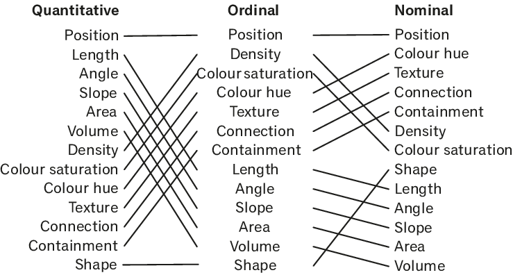
For all three types of data, the Position encoding (referring to the placement of a data point in the visualization plane) is the most effective encoding. But then the rest of the rankings differ drastically depending on the type of data you have! Length, angle, slope, area, volume and density are really effective for quantitative data, but less effective for ordinal and nominal data.
Remembering the specific ordering of this chart is not important, but thinking critically about how you encode different types of information is! It’s important to always have a good reason to justify using a certain type of mark to best convey your data.
Ineffective Visualizations
If you follow the news or use social media, you likely see histograms, heatmaps, or infographics on a daily basis. These visualizations can give us a clear idea of what an information source means by providing visual context through maps or graphs. Unfortunately, some visualizations may be unintentionally confusing or intentionally misleading. Here are two. See if you can answer the questions for each graph.
NSW Clusters compared
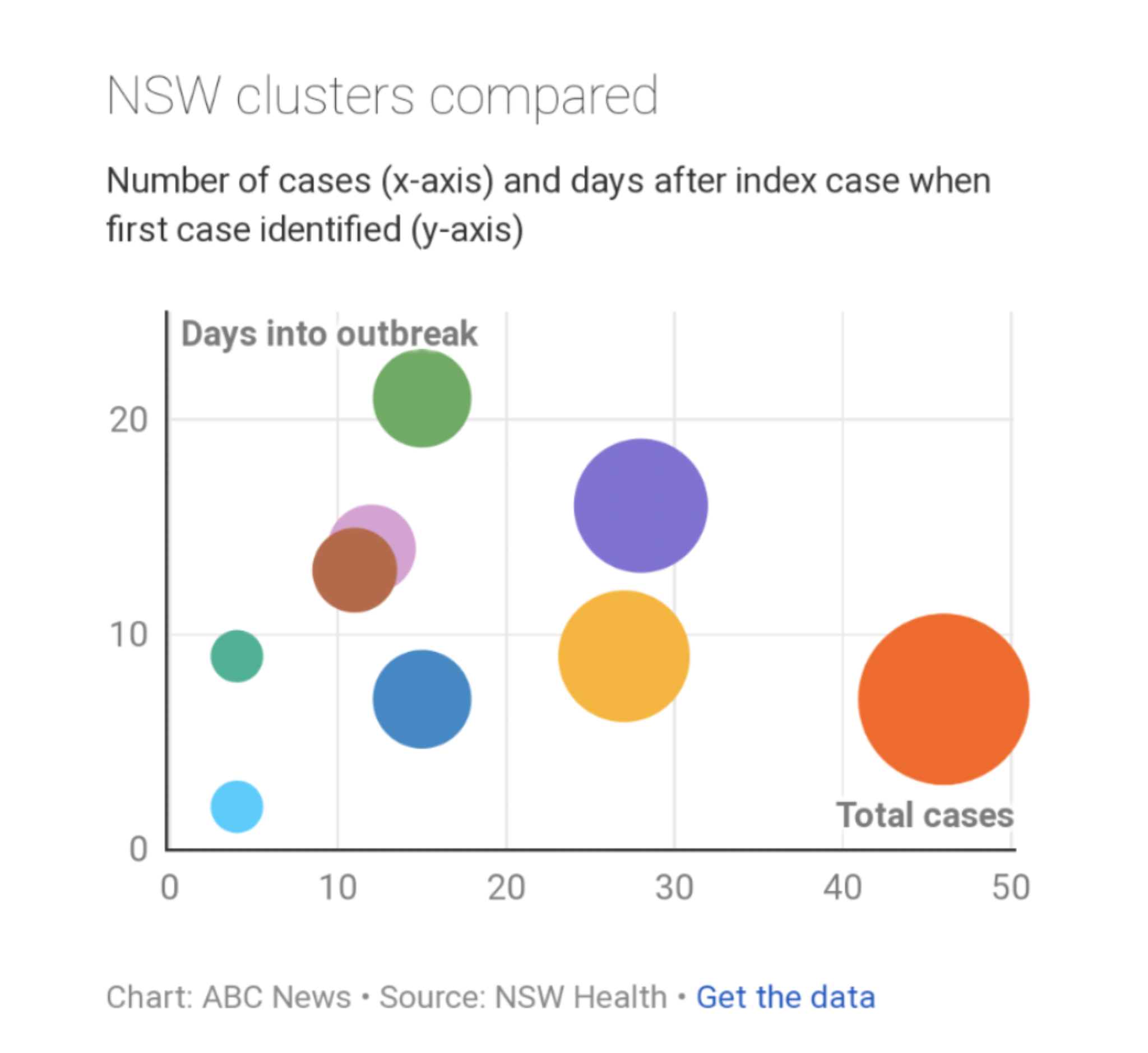
- What encodings are used in this visualization?
- What do you think this visualization is trying to communicate?
- What aspects of the visual are effective?
- What aspects are confusing?
Consumption basket of millennials in 2018
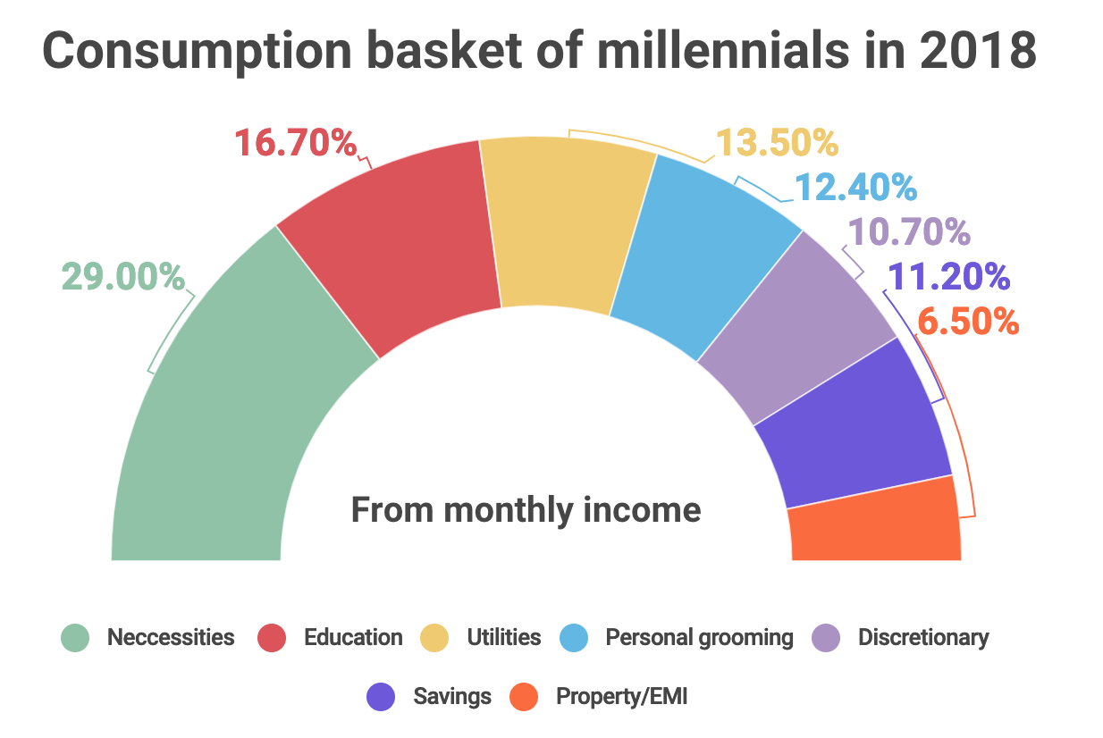
- What encodings are used in this visualization?
- What do you think this visualization is trying to communicate?
- What aspects of the visual are effective?
- What aspects are confusing?
⏸️ Pause and 🧠 Think
Take a moment to review the following concepts and reflect on your own understanding. A good temperature check for your understanding is asking yourself whether you might be able to explain these concepts to a friend outside of this class.
Here’s what we covered in this lesson:
- Keyword arguments
- Default parameters
- Missing values and functions
NaN.isnull().notnull().dropna().fillna()
seabornrelplotcatplot
- Data Visualization Principles
Here are some other guiding exercises and questions to help you reflect on what you’ve seen so far:
- In your own words, write a few sentences summarizing what you learned in this lesson.
- What did you find challenging in this lesson? Come up with some questions you might ask your peers or the course staff to help you better understand that concept.
- What was familiar about what you saw in this lesson? How might you relate it to things you have learned before?
- Throughout the lesson, there were a few Food for thought questions. Try exploring one or more of them and see what you find.
In-Class
When you come to class, we will work together on the problems in iris.ipynb. We will also need iris.csv and iris_missing.csv for these tasks. Make sure that you have a way of editing and running these files!
Canvas Quiz
All done with the lesson? Complete the Canvas Quiz linked here!