The content for this lesson is adapted from material by Hunter Schafer and by Kevin Lin.
Objectives
By the end of this lesson, students will be able to:
- Apply filters and plot geospatial data stored in shapefiles using geopandas.
- Describe the difference between numeric coordinate data and geospatial data.
- Draw multiple plots on the same figure by using subplots to specify axes.

Setting up
To follow along with the code examples in this lesson, please download the files in the zip folder here:
Make sure to unzip the files after downloading! The following are the main files we will work with:
lesson17.ipynbgeopandas_practice.ipynb
Note: Geospatial data requires several supplementary files in addition to the main .shp file that we will use in our code. You will need to unzip the data folder in lesson17.zip in order to use these files. Make sure to update any file paths in lesson17.ipynb to match your local paths!
Geospatial data
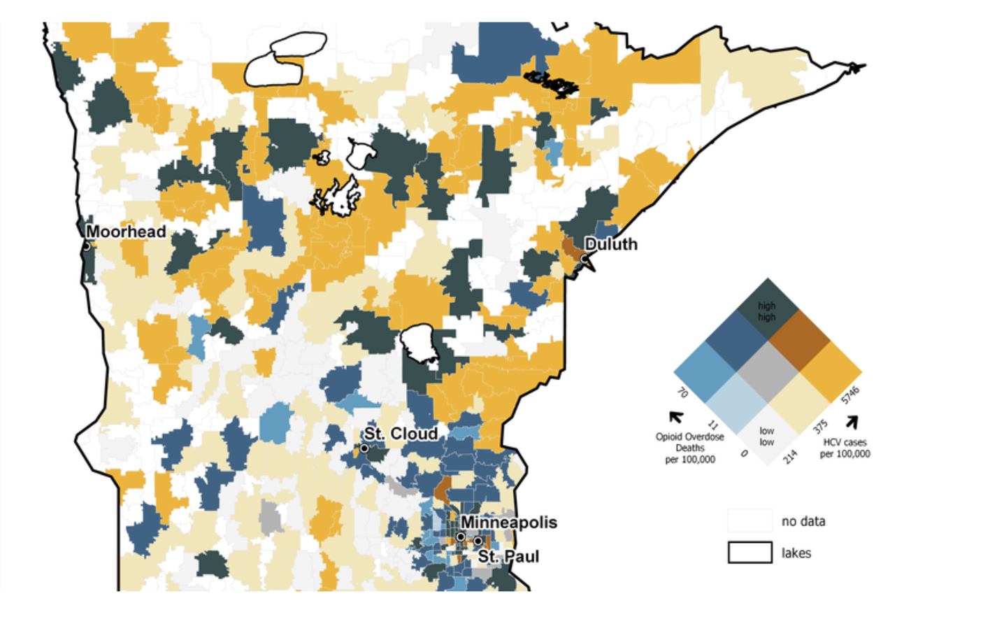
A lot of data is associated with people or places in the real world. Geospatial data represents places in the world. The plot below overlays opioid overdoses on a map of Minnesota. Each data point is drawn as an area of the map shaded according to its value. Geospatial data records the areas and shapes of an object to facilitate analysis and visualization.
A lot of data is associated with people or places in the real world. Geospatial data represents places in the world. The plot below overlays opioid overdoses on a map of Minnesota. Each data point is drawn as an area of the map shaded according to its value. Geospatial data records the areas and shapes of an object to facilitate analysis and visualization.
geopandas
Geospatial data is often tabular just like CSV files. But they typically contain extra data representing the geometry of each area. geopandas is a library that extends pandas to automatically process the geometries.
Geospatial data often comes in a specially-formatted file known as a shapefile .shp. Unlike CSV files that are stored as plaintext, shapefiles are not stored as plain text files, so we can only view the data after reading it into a geopandas GeoDataFrame. The following dataset contains information about various countries and information such as their population and GDP.
Note: The file paths in this lesson are written with the assumption that your
datafolder is in the same location aslesson17.ipynb. They are different in JupyterHub.
import geopandas as gpd

df = gpd.read_file('data/ne_110m_admin_0_countries.shp')

# Print out the columns
print('===== Columns ======')
print(df.columns)
print()

# Print out one row of data
print('===== First row =====')
print(df.loc[0])
The name df refers to a GeoDataFrame. It behaves exactly like a DataFrame but has some extensions to handle geospatial data. (There is also a GeoSeries type.)
Since geopandas is designed to handle geospatial data, we can plot that data directly using matplotlib.
import matplotlib.pyplot as plt

df.plot()
plt.savefig('world.png')
We can also color each country by population using the column parameter.
# POP_EST is the name of the colummn containing population information
# legend=True makes the legend appear
df.plot(column='POP_EST', legend=True)
plt.savefig('world_population.png')
Geometry Data Types
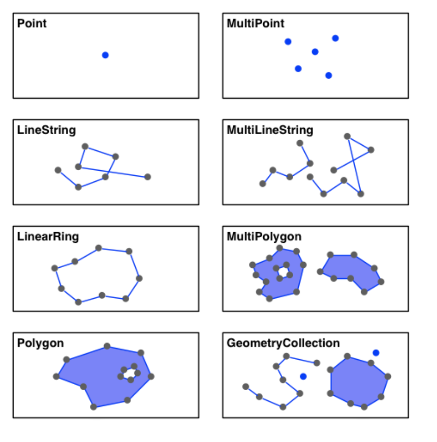
Each row in the data corresponds to one country. The dataset has a special column called 'geometry' that stores the shape of each country.
print(df['geometry'])
You don’t need to memorize all the different geometry data types, but it helps to have some familiarity. From the diagram of geometry data types below, countries are mostly represented as a Polygon if they’re an enclosed body or a MultiPolygon if they have multiple bodies of land.
Reviewing zip
Recall that zip is a built-in Python function that takes two lists and “zips” them up so you can iterate over pairs of elements from both lists.
x = [1, 2, 3]
y = [4, 5, 6]

for p in zip(x, y):
    print(p)
The result of a zip is pairs of values from each list! The first values from both lists, then the second values, then the third, and so on. The return type of zip is not a list of these pairs, though! Try printing out the result of zip.
x = [1, 2, 3]
y = [4, 5, 6]
z = zip(x, y)
print(z)
zip returns a zip object (also called zip) instead of a list! The zip object is what we call a generator. It’s like a list in the sense that it is a sequence of values you can iterate over in a loop, but it’s different because elements cannot be selected by index!
x = [1, 2, 3]
y = [4, 5, 6]
z = zip(x, y)
print(z[1])
To get all the pairs as a list, use the built-in list function.
x = [1, 2, 3]
y = [4, 5, 6]
z = list(zip(x, y))
print(z)
Food for thought: What might be a use of zip when it comes to geospatial data?
Axes and Subplots
In order to visualize geospatial data, we’ll need to learn more about matplotlib.
seaborn functions like relplot and catplot draw the plots on a single shared figure. Drawing two plots, one after the other, will only display the result of the final plot. pandas has a way to make simple plots that, by default, also plot on a global figure.
import pandas as pd

df = pd.DataFrame({
    'a': [1, 2, 3],
    'b': [1, 2, 3],
    'c': [3, 2, 1]
})

df.plot(x='a', y='b')
df.plot(x='a', y='c')

plt.savefig('plot.png')
This only produced one line because the second plot overwrote the first plot! How do we include both of these line plots in a single same figure?
A figure is a matplotlib term for a canvas to store drawings. A figure may have one or more axes where each axis can have multiple plots. To draw multiple plots in a single figure, we’ll need to introduce axes using the subplots function.
df = pd.DataFrame({
    'a': [1, 2, 3],
    'b': [1, 2, 3],
    'c': [3, 2, 1]
})

# Make a figure with one axis
fig, ax = plt.subplots(1)

# Use the special param `ax` to tell pandas which axis to draw on
df.plot(x='a', y='b', ax=ax)
df.plot(x='a', y='c', ax=ax)

# Ask the figure to save itself
fig.savefig('plot.png')
The ax parameter for plot instructs the plotter to draw on that particular axis.
subplots
So we know how to include multiple lines or plot data in a single plot. But what if we want multiple plots drawn side-by-side rather than overlaid on the same plot?
Each axis represents a single set of x/y axes. To draw two plots side-by-side, we need a figure that contains two axes. To plot the same graphs as above side-by-side, we could write the following code.
df = pd.DataFrame({
    'a': [1, 2, 3],
    'b': [1, 2, 3],
    'c': [3, 2, 1]
})

# Make a figure with one axis
fig, [ax1, ax2] = plt.subplots(2)

# Use the special param `ax` to tell pandas which axis to draw on
df.plot(x='a', y='b', ax=ax1)
df.plot(x='a', y='c', ax=ax2)

# Ask the figure to save itself
fig.savefig('plot.png')
The subplots function returns a Figure and a list of Axes objects. When calling plot, we specified the particular Axes object.
subplots takes two optional parameters nrows and ncols to specify how many rows and columns of axes you want.
fig, axs = plt.subplots(nrows=3, ncols=2)
print(axs)
print(type(axs))
print('nrows:', len(axs))
print('ncols:', len(axs[0]))
If you wanted to visualize this return value as a list of lists, it would look something like this:
[
  [ax1, ax2],
  [ax3, ax4],
  [ax5, ax6]
]
The return type is a numpy ndarray. numpy is a scientific computing library that we’ll see later. The ndarray allows you to conveniently access a specific row or column with the bracket notation. For example axs[0, 0] is the top left axes (ax1 in the output above). In general, the syntax is axs[row, col] where row 0, column 0 is the top left and the rows increase going down and columns increase going right; for example, axs[2, 1] would be ax6 in the output above.
There are generally two ways of working with axes return of subplots.
# Make the data
df = pd.DataFrame({
    'a': [1, 2, 3],
    'b': [1, 2, 3],
    'c': [3, 2, 1]
})

# Option 1: Index into the numpy.ndarray structure
fig, axs = plt.subplots(nrows=2)
df.plot(x='a', y='b', ax=axs[0])
df.plot(x='a', y='c', ax=axs[1])
fig.savefig('option1.png')

# Option 2: Unpack the axes using tuple assignment
fig, [ax1, ax2] = plt.subplots(nrows=2)
df.plot(x='a', y='b', ax=ax1)
df.plot(x='a', y='c', ax=ax2)
fig.savefig('option2.png')
Food for thought: Which option would you prefer for a figure that contains more than 4 plots?
# Make the data
df = pd.DataFrame({
    'a': [1, 2, 3],
    'b': [1, 2, 3],
    'c': [3, 2, 1]
})

# Option 1: Index into the structure
fig, axs = plt.subplots(nrows=2, ncols=2)
df.plot(x='a', y='b', ax=axs[0, 0])  # Top-left
df.plot(x='a', y='c', ax=axs[0, 1])  # Top-right
df.plot(x='a', y='c', ax=axs[1, 0])  # Bottom-left
df.plot(x='a', y='b', ax=axs[1, 1])  # Bottom-right
fig.savefig('option1.png')

# Option 2: Unpack the axes
fig, [[ax1, ax2], [ax3, ax4]] = plt.subplots(nrows=2, ncols=2)
df.plot(x='a', y='b', ax=ax1)  # Top-left
df.plot(x='a', y='c', ax=ax2)  # Top-right
df.plot(x='a', y='c', ax=ax3)  # Bottom-left
df.plot(x='a', y='b', ax=ax4)  # Bottom-right
fig.savefig('option2.png')
Hurricane Florence
The power of geospatial data is it allows you to combine many different types of data as long as you can “line up” how they occur in the real world. In this slide, we will plot two separate datasets on top of each other to generate a new visualization.
- The first dataset contains the geometry for each state in the United States.
- The second dataset contains information about the path of Hurricane Florence, a major hurricane that hit the Carolinas in 2018.
country = gpd.read_file('data/gz_2010_us_040_00_5m.json')
country.head()
country.plot()
This is a very tiny graph because it’s trying to show Alaska and Hawaii. Since the visualization won’t involve Alaska or Hawaii, we leave them out of this analysis for clarity.
This comes back to the discussion of how a data analyst has to choose what they include/exclude and deem relevant. This step is encoding a major assumption about the data into our analysis, which might not necessarily be true for your problems in the future.
country = country[(country['NAME'] != 'Alaska') & (country['NAME'] != 'Hawaii')]
country.plot()
Let’s read the CSV data of Hurricane Florence using pandas. Each row corresponds to the state of the hurricane at that time.
florence = pd.read_csv('data/stormhistory.csv')
florence.head()
florence.plot()
This doesn’t look like the path of Hurricane Florence at all! Even though there are columns for the longitude (Long) and the latitude (Lat), pandas is plotting the values as if they were any other numerical data like Wind speed!
We will need to convert each row’s Long and Lat into Point geometry. We will create a new column called coordinates that stores these Point objects from the shapely library of geometric shapes.
Don’t worry too much about understanding the exact details of this code. (If you’re curious, lon is negated to match the way that longitudes are represented in the US states dataset.)
from shapely.geometry import Point

coordinates = zip(florence['Long'], florence['Lat'])
florence['coordinates'] = [
    Point(-lon, lat) for lon, lat in coordinates
]
We can then turn convert this to a geopandas.GeoDataFrame with the following cell. The column coordinates stores the geometry for each row.
florence = gpd.GeoDataFrame(florence, geometry='coordinates')
florence.head()
florence.plot()
And now it prints out the path of the hurricane!
Key takeaway: use a GeoDataFrame for geospatial data.
Plot the Hurricane
So now that we have our country data and florence data, let’s try plotting them together to see where the hurricane hit the U.S. We pass in an extra parameters to the florence plot to make the dots black and a bit smaller.
country.plot()
florence.plot(color='black', markersize=10)
We want to plot these on top of each other. Let’s make a figure with a single axis and have both plots draw on that axis. The parameter figsize lets us make the figure slightly larger.
fig, ax = plt.subplots(1, figsize=(15, 7))

country.plot(ax=ax)
florence.plot(color='black', markersize=10, ax=ax)
Next time, we will pick up with this example and do something more complex that involves highlighting which states intersect with the hurricane’s path!
⏸️ Pause and 🧠 Think
Take a moment to review the following concepts and reflect on your own understanding. A good temperature check for your understanding is asking yourself whether you might be able to explain these concepts to a friend outside of this class.
Here’s what we covered in this lesson:
geopandasGeoDataFrameGeoSeries
zip- Axes and subplots
- Plotting on the same axis
- Plotting on multiple axes
Here are some other guiding exercises and questions to help you reflect on what you’ve seen so far:
- In your own words, write a few sentences summarizing what you learned in this lesson.
- What did you find challenging in this lesson? Come up with some questions you might ask your peers or the course staff to help you better understand that concept.
- What was familiar about what you saw in this lesson? How might you relate it to things you have learned before?
- Throughout the lesson, there were a few Food for thought questions. Try exploring one or more of them and see what you find.
In-Class
When you come to class, we will work together on completing geopandas_practice.ipynb! Make sure you have a way of opening and running this file.
Canvas Quiz
All done with the lesson? Complete the Canvas Quiz linked here!