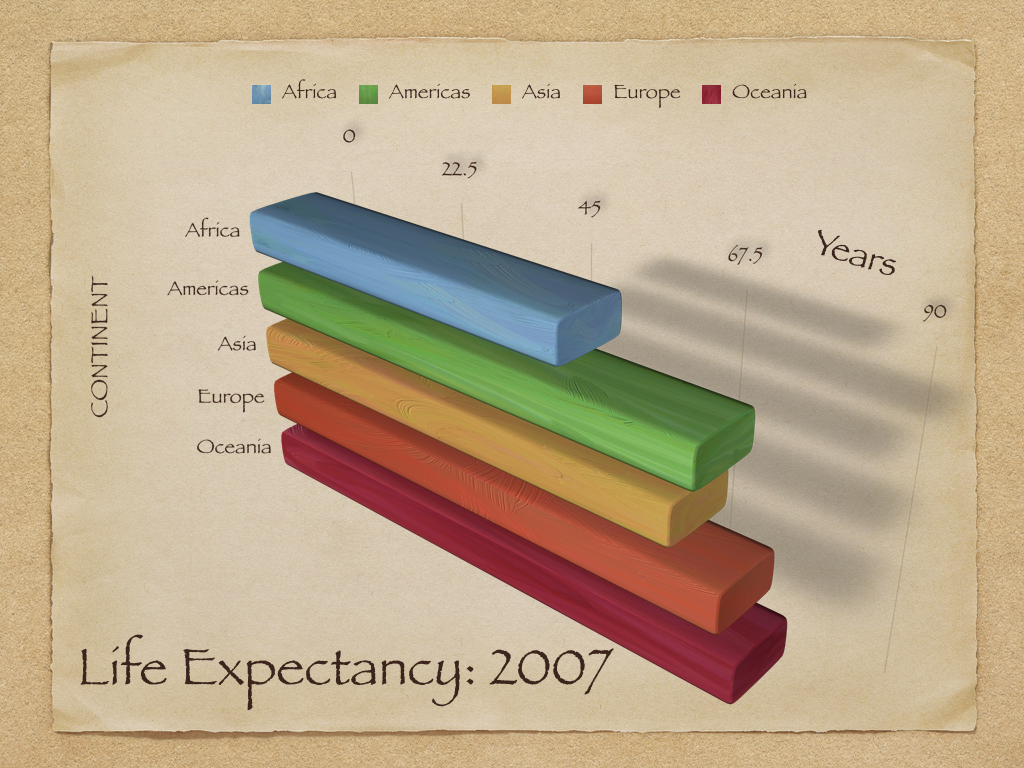
Data Visualization
In this lesson, we'll learn two data visualization libraries matplotlib and seaborn. By the end of this lesson, students will be able to:
- Skim library documentation to identify relevant examples and usage information.
- Apply
seabornandmatplotlibto create and customize relational and regression plots. - Describe data visualization principles as they relate the effectiveness of a plot.
Just like how we like to import pandas as pd, we'll import matplotlib.pyplot as plt and seaborn as sns.
Seaborn is a Python data visualization library based on matplotlib. Behind the scenes, seaborn uses matplotlib to draw its plots. When importing seaborn, it is recommended to call sns.set_theme() to apply the recommended seaborn visual style instead of the default matplotlib theme.
import matplotlib.pyplot as plt
import pandas as pd
import seaborn as sns

sns.set_theme()
Let's load this uniquely-formatted pokemon dataset.
pokemon = pd.read_csv("pokemon_viz.csv", index_col="Num")
pokemon
| Name | Type 1 | Type 2 | Total | HP | Attack | Defense | Sp. Atk | Sp. Def | Speed | Stage | Legendary | |
|---|---|---|---|---|---|---|---|---|---|---|---|---|
| Num | ||||||||||||
| 1 | Bulbasaur | Grass | Poison | 318 | 45 | 49 | 49 | 65 | 65 | 45 | 1 | False |
| 2 | Ivysaur | Grass | Poison | 405 | 60 | 62 | 63 | 80 | 80 | 60 | 2 | False |
| 3 | Venusaur | Grass | Poison | 525 | 80 | 82 | 83 | 100 | 100 | 80 | 3 | False |
| 4 | Charmander | Fire | NaN | 309 | 39 | 52 | 43 | 60 | 50 | 65 | 1 | False |
| 5 | Charmeleon | Fire | NaN | 405 | 58 | 64 | 58 | 80 | 65 | 80 | 2 | False |
| ... | ... | ... | ... | ... | ... | ... | ... | ... | ... | ... | ... | ... |
| 147 | Dratini | Dragon | NaN | 300 | 41 | 64 | 45 | 50 | 50 | 50 | 1 | False |
| 148 | Dragonair | Dragon | NaN | 420 | 61 | 84 | 65 | 70 | 70 | 70 | 2 | False |
| 149 | Dragonite | Dragon | Flying | 600 | 91 | 134 | 95 | 100 | 100 | 80 | 3 | False |
| 150 | Mewtwo | Psychic | NaN | 680 | 106 | 110 | 90 | 154 | 90 | 130 | 1 | True |
| 151 | Mew | Psychic | NaN | 600 | 100 | 100 | 100 | 100 | 100 | 100 | 1 | False |
151 rows × 12 columns
Figure-level versus axes-level functions
One way to draw a scatter plot comparing every pokemon's Attack and Defense stats is by calling sns.scatterplot. Because this plotting function has so many parameters, it's good practice to specify keyword arguments that tell Python which argument should go to which parameter.
sns.scatterplot(pokemon, x="Attack", y="Defense")
<Axes: xlabel='Attack', ylabel='Defense'>

The return type of sns.scatterplot is a matplotlib feature called axes that can be used to compose multiple plots into a single visualization. We can show two plots side-by-side by placing them on the same axes. For example, we could compare the attack and defense stats for two different groups of pokemon: not-Legendary and Legendary.
# Nested tuple unpacking!
fig, (ax1, ax2) = plt.subplots(nrows=1, ncols=2)
ax1.set_title("Not Legendary")
sns.scatterplot(pokemon[~pokemon["Legendary"]], x="Attack", y="Defense", ax=ax1)
ax2.set_title("Legendary")
sns.scatterplot(pokemon[pokemon["Legendary"]], x="Attack", y="Defense", ax=ax2)
fig.show()

Each problem in the plot above can be fixed manually by repeatedly editing and running the code until you get a satisfactory result, but it's a tedious process. Seaborn was invented to make our data visualization experience less tedious. Methods like sns.scatterplot are considered axes-level functions designed for interoperability with the rest of matplotlib, but they come at the cost of forcing you to deal with the tediousness of tweaking matplotlib.
Instead, the recommended way to create plots in seaborn is to use figure-level functions like sns.relplot as in relational plot. Figure-level functions return specialized seaborn objects (such as FacetGrid) that are intended to provide more usable results without tweaking.
sns.relplot(pokemon, x="Attack", y="Defense", col="Legendary")
<seaborn.axisgrid.FacetGrid at 0x7ca9dd87d450>

sns.displot(pokemon, x="Attack")
<seaborn.axisgrid.FacetGrid at 0x7ca9dd6b0c10>

By default, relational plots produce scatter plots but they can also produce line plots by specifying the keyword argument kind="line".
Alongside relplot, seaborn provides several other useful figure-level plotting functions:
relplotfor relational plots, such as scatter plots and line plots.displotfor distribution plots, such as histograms and kernel density estimates.catplotfor categorical plots, such as strip plots, box plots, violin plots, and bar plots.lmplotfor relational plots with a regression fit, such as the scatter plot with regression fit below.
When reading documentation online, it is important to remember that we will only use figure-level plots in this course because they are the recommended approach. On the relative merits of figure-level functions in the seaborn documentation:
On balance, the figure-level functions add some additional complexity that can make things more confusing for beginners, but their distinct features give them additional power. The tutorial documentation mostly uses the figure-level functions, because they produce slightly cleaner plots, and we generally recommend their use for most applications. The one situation where they are not a good choice is when you need to make a complex, standalone figure that composes multiple different plot kinds. At this point, it’s recommended to set up the figure using matplotlib directly and to fill in the individual components using axes-level functions.
sns.lmplot(pokemon, x="Attack", y="Defense", col="Legendary")
<seaborn.axisgrid.FacetGrid at 0x7ca9dd41c460>

Customizing a FacetGrid plot
relplot, displot, catplot, and lmplot all return a FacetGrid, a specialized seaborn object that represents a data visualization canvas. As we've seen above, a FacetGrid can put two plots side-by-side and manage their axes by removing the y-axis labels on the right plot because they are the same as the plot on the left.
However, there are still many instances where we might want to customize a plot by changing labels or adding titles. We might want to create a bar plot to count the number of each type of pokemon.
sns.catplot(pokemon, x="Type 1", kind="count")
<seaborn.axisgrid.FacetGrid at 0x7ca9dd8293f0>

The pokemon types on the x-axis are hardly readable, the y-axis label "count" could use capitalization, and the plot could use a title. To modify the attributes of a plot, we can assign the returned FacetGrid to a variable like grid and then calling tick_params or set.
grid = sns.catplot(pokemon, x="Type 1", kind="count")
grid.tick_params(axis="x", rotation=60)
grid.set(title="Count of each primary pokemon type", xlabel="Primary Type", ylabel="Count")
<seaborn.axisgrid.FacetGrid at 0x7ca9dd41c460>

Practice: Life expectancy versus health expenditure
Seaborn includes a repository of example datasets that we can load into a DataFrame by calling sns.load_dataset. Let's examine the Life expectancy vs. health expenditure, 1970 to 2015 dataset that combines two data sources:
- The Life expectancy at birth dataset from the UN World Population Prospects (2022): "For a given year, it represents the average lifespan for a hypothetical group of people, if they experienced the same age-specific death rates throughout their lives as the age-specific death rates seen in that particular year."
- The Health expenditure (2010 int.-$) dataset from OECD.stat. "Per capita health expenditure and financing in OECD countries, measured in 2010 international dollars."
life_expectancy = sns.load_dataset("healthexp", index_col=["Year", "Country"])
life_expectancy
| Spending_USD | Life_Expectancy | ||
|---|---|---|---|
| Year | Country | ||
| 1970 | Germany | 252.311 | 70.6 |
| France | 192.143 | 72.2 | |
| Great Britain | 123.993 | 71.9 | |
| Japan | 150.437 | 72.0 | |
| USA | 326.961 | 70.9 | |
| ... | ... | ... | ... |
| 2020 | Germany | 6938.983 | 81.1 |
| France | 5468.418 | 82.3 | |
| Great Britain | 5018.700 | 80.4 | |
| Japan | 4665.641 | 84.7 | |
| USA | 11859.179 | 77.0 |
274 rows × 2 columns
Write a seaborn expression to create a line plot comparing the Year (x-axis) to the Life_Expectancy (y-axis) colored with hue="Country".
sns.lineplot(life_expectancy, x="Year", y="Life_Expectancy", hue="Country")
<Axes: xlabel='Year', ylabel='Life_Expectancy'>

sns.relplot(life_expectancy, x="Year", y="Life_Expectancy", hue="Country", kind="line")
<seaborn.axisgrid.FacetGrid at 0x7ca9dca3b640>

life_expectancy.loc[2019:2020, :]
| Spending_USD | Life_Expectancy | ||
|---|---|---|---|
| Year | Country | ||
| 2019 | Canada | 5189.721 | 82.2 |
| Germany | 6407.928 | 81.3 | |
| France | 5167.839 | 82.9 | |
| Great Britain | 4385.463 | 81.4 | |
| Japan | 4610.794 | 84.4 | |
| USA | 10855.517 | 78.8 | |
| 2020 | Canada | 5828.324 | 81.7 |
| Germany | 6938.983 | 81.1 | |
| France | 5468.418 | 82.3 | |
| Great Britain | 5018.700 | 80.4 | |
| Japan | 4665.641 | 84.7 | |
| USA | 11859.179 | 77.0 |
life_expectancy.loc[(2019:2020, "USA"), :]
  Cell In[14], line 1
    life_expectancy.loc[(2019:2020, "USA"), :]
                             ^
SyntaxError: invalid syntax
life_expectancy.loc[(slice(2019, 2020), "USA"), :]
| Spending_USD | Life_Expectancy | ||
|---|---|---|---|
| Year | Country | ||
| 2019 | USA | 10855.517 | 78.8 |
| 2020 | USA | 11859.179 | 77.0 |
What makes bad figures bad?
In chapter 1 of Data Visualization, Kieran Hiely explains how data visualization is about communication and rhetoric.
While it is tempting to simply start laying down the law about what works and what doesn't, the process of making a really good or really useful graph cannot be boiled down to a list of simple rules to be followed without exception in all circumstances. The graphs you make are meant to be looked at by someone. The effectiveness of any particular graph is not just a matter of how it looks in the abstract, but also a question of who is looking at it, and why. An image intended for an audience of experts reading a professional journal may not be readily interpretable by the general public. A quick visualization of a dataset you are currently exploring might not be of much use to your peers or your students.
Bad taste
Kieran identifies three problems, the first of which is bad taste.
Kieran draws on Edward Tufte's principles (all quoted from Tufte 1983):
- have a properly chosen format and design
- use words, numbers, and drawing together
- display an accessible complexity of detail
- avoid content-free decoration, including chartjunk
In essence, these principles amount to "an encouragement to maximize the 'data-to-ink' ratio." In practice, our plotting libraries like seaborn do a fairly good job of providing defaults that generally follow these principles.
Bad data
The second problem is bad data, which can involve either cherry-picking data or presenting information in a misleading way.
In November of 2016, The New York Times reported on some research on people's confidence in the institutions of democracy. It had been published in an academic journal by the political scientist Yascha Mounk. The headline in the Times ran, "How Stable Are Democracies? ‘Warning Signs Are Flashing Red’” (Taub, 2016). The graph accompanying the article
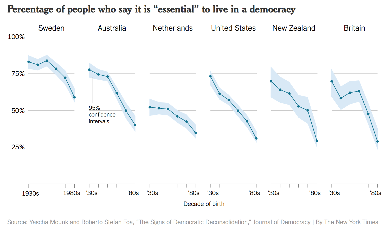
This plot is one that is well-produced, and that we could reproduce by calling sns.relplot like we learned above. The x-axis shows the decade of birth for people all surveyed in the research study.
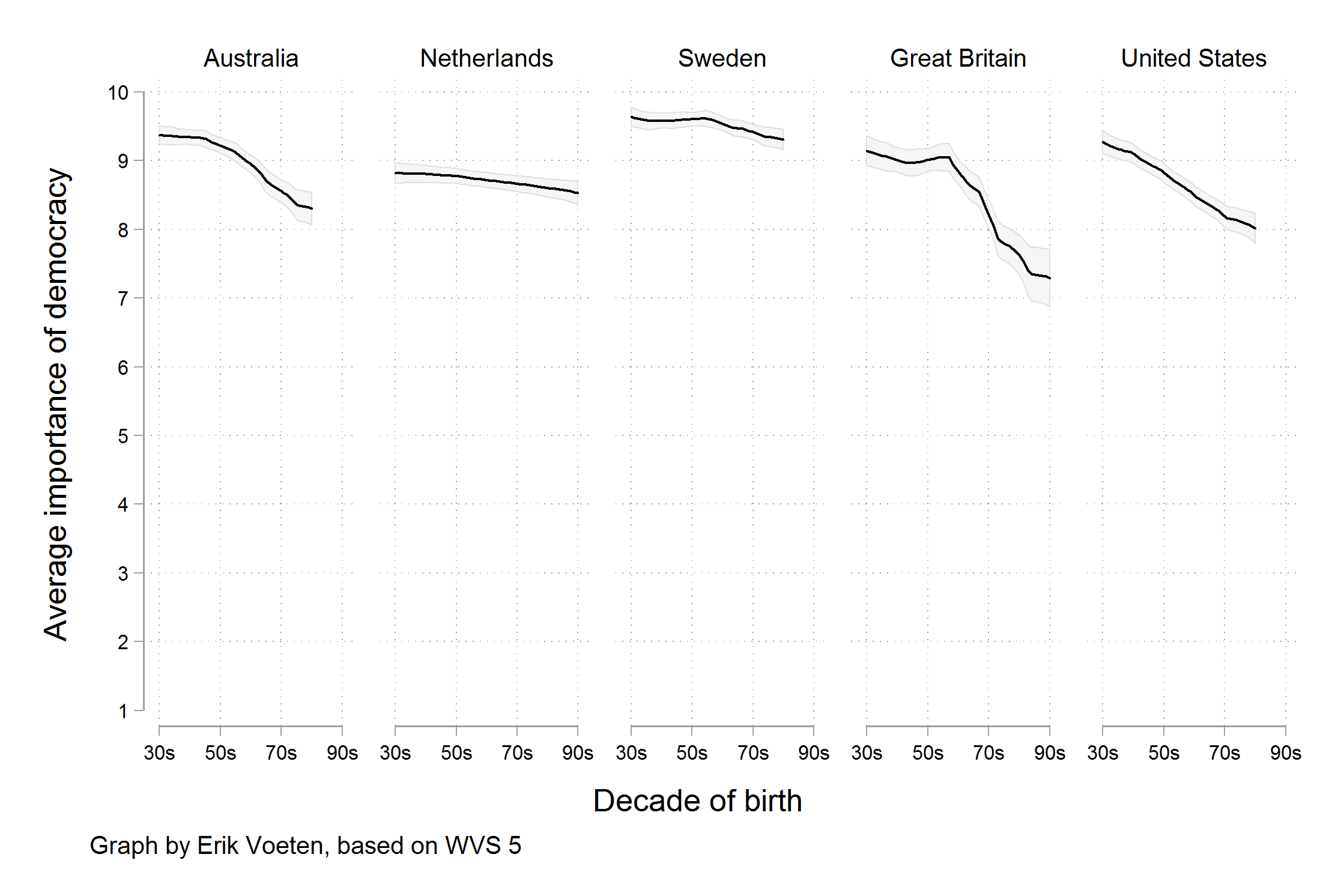
[But] scholars who knew the World Values Survey data underlying the graph noticed something else. The graph reads as though people were asked to say whether they thought it was essential to live in a democracy, and the results plotted show the percentage of respondents who said "Yes", presumably in contrast to those who said "No". But in fact the survey question asked respondents to rate the importance of living in a democracy on a ten point scale, with 1 being "Not at all Important" and 10 being "Absolutely Important". The graph showed the difference across ages of people who had given a score of "10" only, not changes in the average score on the question. As it turns out, while there is some variation by year of birth, most people in these countries tend to rate the importance of living in a democracy very highly, even if they do not all score it as "Absolutely Important". The political scientist Erik Voeten redrew the figure based using the average response.
Bad perception
The third problem is bad perception, which refers to how humans process the information contained in a visualization. Let's walk through section 1.3 on "Perception and data visualization".