Useful CSE 163 Resources
Learning objective: Apply Pandas, Seaborn, and Scikit-learn to process, visualize, and predict outcomes about data.
-
nces-ed-attainment.csvis a CSV file that contains the education dataset for this assessment. -
hw3.pyis the file for you to put your implementations. The Run button executes this program andcse163_imgd.py. -
hw3-writeup.mdis the file for your writeup. Instead of testing, this assessment emphasizes reflection on our data analysis. -
cse163_imgd.pyis a helper file that checks your plot outputs against expected output, and creates an image showing any pixel differences. The Run button executes this program and yourhw3.py. -
expectedis a folder containing the expected output forline_plot_bachelorsandbar_chart_high_school. Don’t modify the contents of this folder. -
ScikitLearnWordbank.ipynbis a Jupyter Notebook that reviews all of the scikit-learn features needed for this assessment. Feel free to edit this Jupyter Notebook to prototype ideas and explore the data.
Info
The Run button works differently in this assessment than previous ones. Once you’ve implemented plotting functions in hw3.py with calls to plt.savefig(), you’ll see that Run generates some images showing the pixel differences between your plot and the expected plot highlighted in red. If the image is blank, then all the pixels match. A summary of the percentage of pixels that match will appear in the console.
Context
The National Center for Education Statistics is a U.S. federal government agency for collecting and analyzing data related to education. We have downloaded and cleaned one of their datasets: Percentage of persons 25 to 29 years old with selected levels of educational attainment, by race/ethnicity and sex: Selected years, 1920 through 2018. The nces-ed-attainment.csv file has columns for Year, Sex, Min degree, and race/ethnicity categories. Note the missing data: not all columns have data starting from 1920!
| Year | Sex | Min degree | Total | White | Black | Hispanic | Asian | Pacific Islander | American Indian/Alaska Native | Two or more races |
|---|---|---|---|---|---|---|---|---|---|---|
| 1920 | A | high school | --- | 22.0 | 6.3 | --- | --- | --- | --- | --- |
| 1940 | A | high school | 38.1 | 41.2 | 12.3 | --- | --- | --- | --- | --- |
| ⋮ | ⋮ | ⋮ | ⋮ | ⋮ | ⋮ | ⋮ | ⋮ | ⋮ | ⋮ | ⋮ |
| 2018 | F | master's | 10.7 | 12.6 | 6.2 | 3.8 | 29.9 | --- | --- | --- |
-
Yearis the year for the row. There may be more than one row for the same year to show the breakdowns by sex. -
Sexis the sex of the people for the row:Ffor female,Mfor male, orAfor all students. -
Min degreeis the degree of educational attainment for the row:high school,associate's,bachelor's, ormaster's. -
Totalis the overall percentage of people of theSexin theYearwith at least theMin degreeof educational attainment. -
White,Black,Hispanic,Asian,Pacific Islander,American Indian/Alaska Native,Two or more racesis the percentage of students of the specified race (and of theSexin theYear) with at least theMin degreeof educational attainment.
Our main method provides a line of code to read nces-ed-attainment.csv and replaces all occurrences of the str --- with pandas NaN to help with later data processing steps.
Info
Remember to use the ScikitLearnWordbank.ipynb Jupyter Notebook to explore the data and work in a more interactive environment. You might even prefer writing all of your code in the notebook and periodically transferring functions over to hw3.py to run the automated checks.
Warning
Do not use any loops, list comprehensions, or dictionary comprehensions. The goal of this assessment is to apply data science libraries to answer questions.
Warning
Be sure to call all of the functions you write inside your main method!
Pandas: compare_bachelors_1980
What were the percentages for women vs. men having earned a Bachelor’s Degree in 1980?
Task: Write a function compare_bachelors_1980 and that takes the data and computes the percentages of men and women who achieved a minimum degree of a Bachelor’s degree in 1980. The result should be a 2-by-2 DataFrame with rows corresponding to men and women and columns corresponding to Sex and Total. The order of the rows doesn’t matter. For example, your result should look something like this:
| Sex | Total |
|---|---|
| M | ... |
| F | ... |
Pandas: top_2_2000s
What were the 2 most commonly-awarded levels of educational attainment awarded between 2000–2010 (inclusive) for a given sex?
Task: Write a function top_2_2000s(data, sex) that takes two arguments, the data and a sex parameter, and computes the two most commonly earned degrees for that given sex between the years 2000 and 2010 (inclusive). sex should have a default value of 'A' if it is not specified. The function should return a 2-element Series. Compare educational attainment levels by using the mean. The index of the returned Series should be the Min degree and the values should be its mean. The sex parameter should default to 'A' if no sex parameter is specified.
For example, top_2_2000s(data, 'A') will return the following Series with index on the left and value on the right. Your values don’t have to exactly match so long as they’re within a 0.001 tolerance due to how Python represents float numbers. Because sex is set to default to 'A', this means a call to top_2_2000s(data) should also return the same Series.
high school 87.557143
associate's 38.757143
Hint
Series.nlargest works like DataFrame.nlargest but does not take a column parameter (Series objects don’t have columns).
Seaborn: line_plot_bachelors
Warning
For line_plot_bachelors and bar_chart_high_school, be sure to use the respective generic seaborn functions. Instead of barplot(), you should use catplot(), and instead of lineplot(), you should use relplot().
Task: Write a function line_plot_bachelors that takes the data and plots a line chart of the total percentages of all people Sex A with bachelor's Min degree over time. Label the x-axis Year, the y-axis Percentage, and title the plot Percentage Earning Bachelor’s over Time.
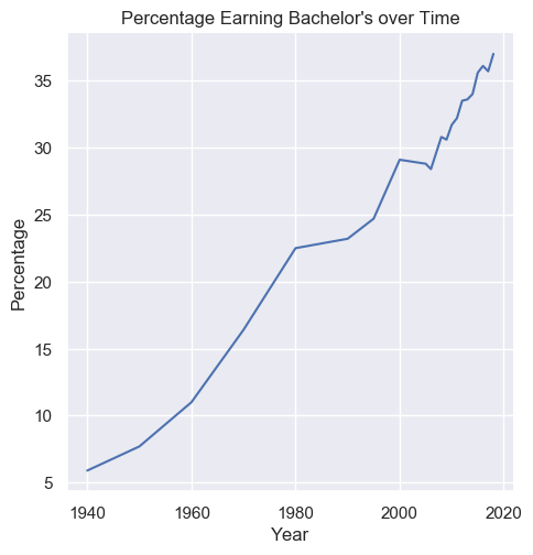
Save the plot as line_plot_bachelors.png with parameter bbox_inches='tight'.
plt.savefig('line_plot_bachelors.png', bbox_inches='tight')
Tip
For this assignment, you do not need to save the files with the /home/ prefix. We give you the line of code you should use to save the output above.
Seaborn: bar_chart_high_school
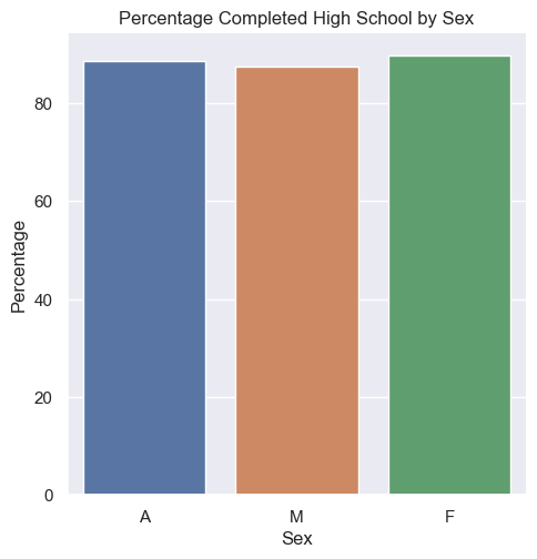
Task: Write a function bar_chart_high_school that takes the data and plots a bar chart comparing the total percentages of Sex F, M, and A with high school Min degree in the Year 2009. Label the x-axis Sex, the y-axis Percentage, and title the plot Percentage Completed High School by Sex.
Tip
Is this visualization an effective one? You will consider this in last section of the assignment asking you to reflect on the work we did for this assignment.
Save the plot as bar_chart_high_school.png with parameter bbox_inches='tight'.
plt.savefig('bar_chart_high_school.png', bbox_inches='tight')
Seaborn: plot_hispanic_min_degree
Task: Write a function plot_hispanic_min_degree that takes the data and plots how the percentage of Hispanic people with degrees have changed between 1990–2010 (inclusive) for high school and bachelor's Min degree. Choose a plot type for this problem and prepare to explain your decision-making process in the writeup. Label the axes and title the plot appropriately.
Save the plot as plot_hispanic_min_degree.png with parameter bbox_inches='tight'.
plt.savefig('plot_hispanic_min_degree.png', bbox_inches='tight')
Hint
Remember that your plot should be readable. You might find the function plt.xticks() helpful!
Scikit-learn: fit_and_predict_degrees
Task: Train a DecisionTreeRegressor to predict the percentage of degrees attained for a given Sex, Min degree, and Year. Write a function fit_and_predict_degrees that takes the data and returns the test mean squared error as a float. Follow these specific data preprocessing and model training steps.
Preprocessing: Filter the DataFrame to only include the columns for Year, Min degree, Sex, and Total. Drop rows that have missing data in these columns—do not drop any additional rows. One-hot encode str values. Split the columns as needed into input features and labels.
Model training: Once the data has been preprocessed, randomly split the remaining data into 80% training and 20% testing. Fit the model to the training set. Finally, calculate the mean squared error of the model’s test set predictions.
The automated tests only check that the function runs without causing an error. Try comparing the ground truth values and the model’s predictions manually to check for similarity. (It would be bad if the ground truth values were [2, 755, ...] but the predicted values were [1022, 5, ...].) Also, try calculating the mean squared error on the training dataset as well as the testing dataset—the error should be lower on the training dataset than on the testing dataset.
Info
This education dataset is a time series. When working with time series, it is common to use the last rows as the test set rather than random sampling since the goal is to design a model that predicts the future. But by randomly sampling to generate the test set, we are assessing the model on its ability to predict the past! Even though random sampling is not necessarily appropriate here, we ask you to do it anyways because it’s the most common sampling method.
main
Write a main method in hw3.py that loads in the dataset provided and calls all of the functions you wrote. For all of the method calls, you should rely on any default parameters we specified.
Writeup
Task: In hw3-writeup.md, apply critical thinking to address the following questions about data visualization, data ethics and justice, and our data analysis methods. You could spend an entire course talking about any of these topics, but we’re just looking for 2 to 4 sentences on each question.
Info
md is the file extension for Markdown, the text formatting language used in Jupyter Notebooks. Markdown offers a natural-looking way to define headings, lists, and links using special characters like #. But you don’t actually need to learn anything to start writing Markdown—you can just write plaintext under each heading in hw3-writeup.md.
- Do you think the bar chart for
bar_chart_high_schoolis an effective data visualization? - How and why did you choose the plot for
plot_hispanic_min_degree? - Datasets can biased. Bias in data means it might be skewed away from or portray a wrong picture of reality. For example, the data might contain inaccuracies or the methods used to collect the data may have been flawed. Describe a possible bias present in this dataset and why it might have occurred.
-
Intentions don’t equate outcomes—many people intending to good have caused very real harm in the world. We’ll discuss specific examples of well-intentioned algorithms perpetuating more harm later in the quarter. In computing, that harm is magnified, automated, and reproduced by computers.
Describe an application, analysis, or decision motivated by this dataset with the intended goal of improving educational equity but that ultimately exacerbates social injustice. How can this data analysis lead to further injustice even when designing with equity in mind? In other words, we are trying to think of a way that we could use this data with good intentions, but actually would end up causing more harm.
Info
In addition to writing your response in hw3-writeup.md, please feel free to continue the conversation in the Education Discussion thread. We wanted to open a space so the class can discuss their thoughts about the biases present here.
For more on data justice, see Anna Lauren Hoffman’s Data Ethics course introduction and Data Feminism.
Quality
Assessment submissions should pass these checks: flake8 and code quality guidelines. The code quality guidelines are very thorough. For this assessment, the most relevant rules can be found in these sections (new sections bolded):
-
-
Boolean Zen
-
Loop Zen
-
Factoring
-
Unnecessary Cases
-
Avoid Looping with Pandas
-
Submission
Submit your work by pressing the Mark button. Submit as often as you want until the deadline for the initial submission. Note that we will only grade your most recent submission. You can view your past submissions using the “Submissions” button.
Please make sure you are familiar with the resources and policies outlined in the syllabus and the take-home assessments page.
A3 - Education
Initial Submission by Thursday 04/28 at 11:59 pm.
Submit on Ed