CSE 154
Lecture 4: CSS and CSS Flex
Today's Agenda
Reminders
On the format for the quizzes
Questions?
More CSS and intro CSS Flex
Reminders
CP1 due on Tuesday, locks on Thursday
- No submissions accepted past lock date.
Supplemental video about Friday lecture is up here
Section is where you go to get practice -- important to attend!
Keep asking questions in lecture
On the quizzes
Administered through Gradescope
Will release after lecture on Wednesday and you'll have 24 hours to complete.
These are open-note, but not open internet.
- As in, we expect you to use resources from this class (slides, recordings, your notes, section exercises, etc), but you cannot copy answers from the internet.
- Lots of "right" answers out there. The only ones that will be accepted are what we discuss in this course.
5 points, 1 per question.
Covers the previous 1.5 week's worth of content (HTML and CSS). May reference that day's lecture content, but not in-depth.
Short answers, which will be capped at ~ 2 sentences.
Remember we will drop one of the five quizzes at the end of the quarter.
Example Quiz Question
What is one reason it might be useful to associate multiple selectors with one rule in your CSS? What is one reason it might be a bad idea?
Associating multiple selectors with one style cuts down on code redundancy. If the style for those individual selectors diverges later, then a new rule will have to be created anyway.
How to Link Google Fonts
A demo
Questions?
CSS Selectors Review
| Classification | Description | Example |
|---|---|---|
| Type Selector | Selects an element type | p |
| Class Selector | Selects all elements with the given class attribute value | .koala-face |
| ID Selector | Selects the element with the unique id attribute value | #scientific-name |
We can also combine selectors:
.borderedselects all elements with the bordered class.h2.borderedselects only h2 elements with the bordered class.
The Document Object Model
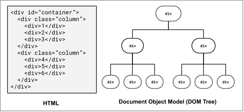
How the browser represents the hierarchy of a page - very useful when thinking about selectors!
We'll return to this when we introduce JavaScript, where we can dynamically access/modify element "nodes" in the DOM tree.
For those of you interested in accessibility on the web, there is also a related concept known as Accessibility Tree
DOM and Selectors: Q1
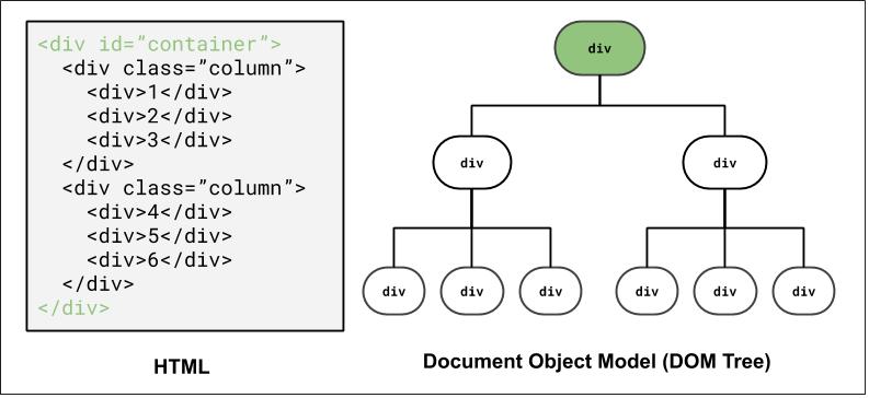
How to select the highlighted elements?
Using ID selector: #container
DOM and Selectors: Q2
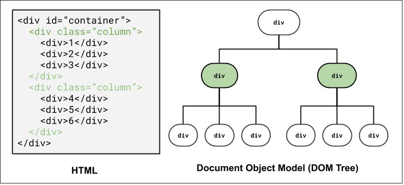
How to select the highlighted elements?
Using a class selector: .column
Using a combinator selector: #container > div
DOM and Selectors: Q3
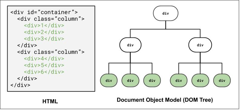
How to select the highlighted elements?
Using a class and descender combinator selector: .column div
Using a class and child combinator selector: #container > div > div
DOM and Selectors: Q4
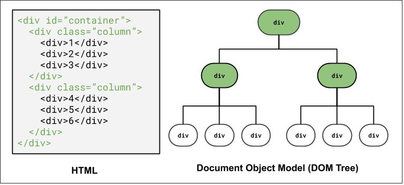
How to select the highlighted elements?
Grouping elements: #container, .column
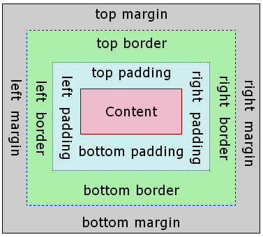
The Box Model?
- margin
- (outside) space between different elements
- border
- (optionally visible) line that separates elements
- padding
- (inside) space between element content and border
Why Page Layout is Important
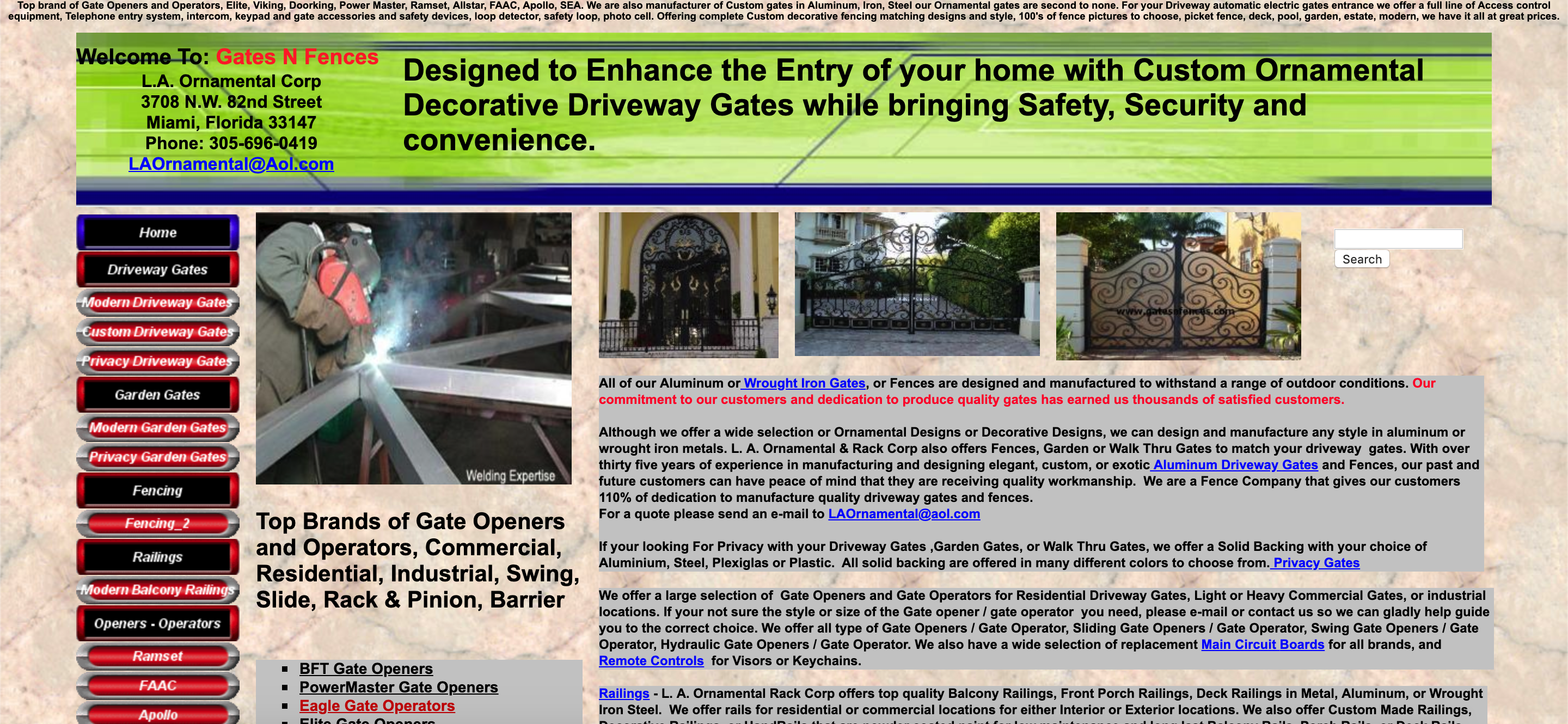
An example of poor HTML tags, layout, and accessibility (try resizing the page). The "old days" of layout.
Inspect?: table,table,table,table, ....
More Motivating?
This is the official HealthCare.gov webpage in 2018, where all kinds of users rely on for health care information.
Some visually-impaired users need larger font sizes on the screen.
What happens to the search bar when you increase the font size?
As a user, have you ever left a website (that may be useful) because of the layout or accessibility?
There's a lot of very cool research on verifying page layout!
The Goal: Clean Layout, Responsive Design.
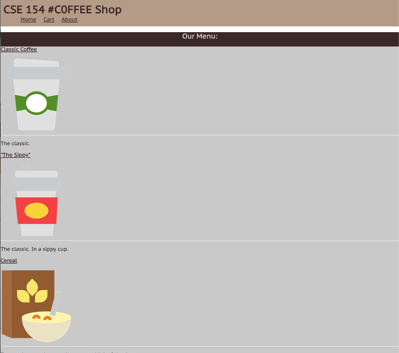
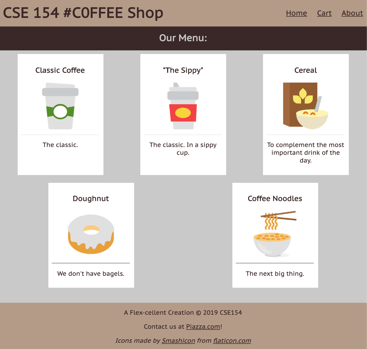
Today, we'll learn the fundamentals of various layout techniques to go from...
Overview of Layout Techniques in CSS
- Appropriate use of Block vs. Inline elements and nesting in HTML
- Box Model (margin/padding/border)
- Flex
- Positioning
- Float (less common, but still good to know)
These are what we expect you to focus on, roughly in order of prioritization
Starting with Building Blocks
Question: What does this look like on a webpage by default?
<div id="container">
  <div>1</div>
  <div>2</div>
  <div>3</div>
  <div>4</div>
  <div>5</div>
  <div>6</div>
</div>
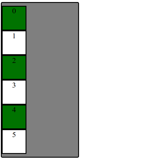
Uh... Why are we playing with boxes?
When learning CSS layout, you'll find there are many ways to layout your pages.
"Boxes" are great to practice with for comparing different layout strategies and better understanding the box model.
We are also working with text inside of each div to demonstrate block vs. inline layout.
In practice, it's useful to:
- Treat page elements as boxed regions to figure out the page layout
- Then focus on more specific CSS styling
(Older) Layout Method: Floating Elements
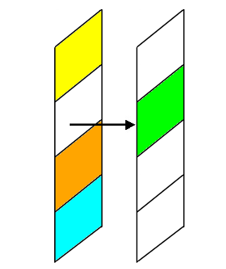
A way to remove elements from the normal document element flow, usually to get other elements to "wrap" around them.
Can float left, right (no center)
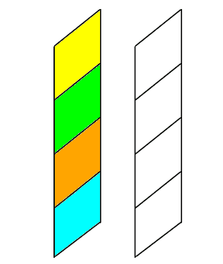
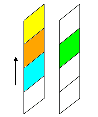
An Analogy: Page Layers as Sheets of Paper
Exercise: Breaking the Block Layout

Question: How would we make the boxes into a row instead of a column?
One possible solution: "Float" the boxes left or right. Another solution: Set display: inline;
What happened when we just add float: left?
Hint: Use overflow: auto to ensure container adjusts height if contents "overflow"
outside of the borders.
Back to Boxes...
Extra Practice: Center the box container on the page and change width to 75%.

Can we float? Unfortunately, can't center float element cleanly.
Idea: Use block property that the container spans width of the page. But if the container is 75% of the page width... where does that extra spacing come from?
For block elements that have a specified width, you can center
them by setting left and right margins to auto.
Distributing Boxes Evenly in a Container
How could we distribute boxes across box container evenly (equal space between each box)?.

... what should we do about the margins of the boxes?
... what value do we put?
... how many screen sizes will we try on?
display Property
The display property specifies the display behavior (the type of rendering box) of an element. The four values you most often will see are:
inline: Displays an element as an inline element, spanning the width/height of its content. Any height and width properties will have no effect.block: Displays an element as a block element. It starts on a new line, and takes up the width of the parent container.none: The element is completely removed.flex: Displays an element as a block-level flex container.grid: Displays elements in a 2-dimensional grid.
Flexbox
Flexbox is a set of CSS properties for aligning block level content.
Flexbox defines two types of content - "containers" and "items".
Anything directly nested inside of a flex container becomes a flex item.
Various properties on the container can be set to determine how its items are laid out.

Basic properties for the flex container
display: flex;- makes an element a "flex container", items inside automatically become "items" - by default, starts as a row
flex-direction: row; (column)- indicates whether the container flows horizontally or vertically (default row)
justify-content: flex-end; (flex-start, space-around,...)- indicates how to space the items inside the container along the main axis
align-items: flex-end; (flex-start, center, baseline,...)- indicates how to space the items inside the container along the cross axis
flex-wrap: wrap; (no-wrap, ...)- indicates whether the container's children should wrap on new lines
Basic properties for the flex items
It is less common to add flex properties to flex items, but on occasion you will need to.
flex-grow: <number>- Defines a proportional value to determine whether a flex items can grow (what amount of the available space inside the container it should take up).
flex-basis: 20%; (3em, 50px,...)- indicates the default size of an element before the extra space is distributed among the items
align-self: flex-end; (flex-start, center, stretch,...)- indicates where to place this specific item along the cross axis
Back to our Boxes
Exercise: Distribute boxes across box container evenly (equal space between each box).

Use justify-content to control flex item spacing on the main axis
Exercise: Responsive Page Layout - Wrapping
Set boxes to wrap when box container gets too small in the browser so that they keep their square widths (what happens when you shrink the browser width in the previous exercise?).
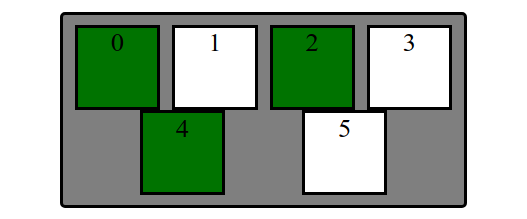
Use flex-wrap to control whether items should move to a new row or not
Extra Practice: A bunch more fancy flex stuff
Layout boxes into two 3-box columns using flex (use screenshot with given details). Note: don't rely too much on previous CSS solutions - you'll need to change the HTML slightly as well to get the columns grouped)

- In the HTML, make boxes grouped in two 3-box columns (hint: add a class to both groupings called "column").
- Change height of
#containerto 500px and center the columns vertically - Distribute the two columns on both left/ends of the
#container.
The Goal: Clean Layout, Responsive Design.
Now you know enough about flex to go from...
From Boxes to a "Real" Example
How can we use these different layout methods in pages with components like header, main, footer? What about side-by-side sections? Inline navigation with lists?
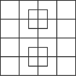
How many squares do you see?
What columns and rows do you see on the cafe page outline?
What are the parent "containers" distributing items in a row/column?
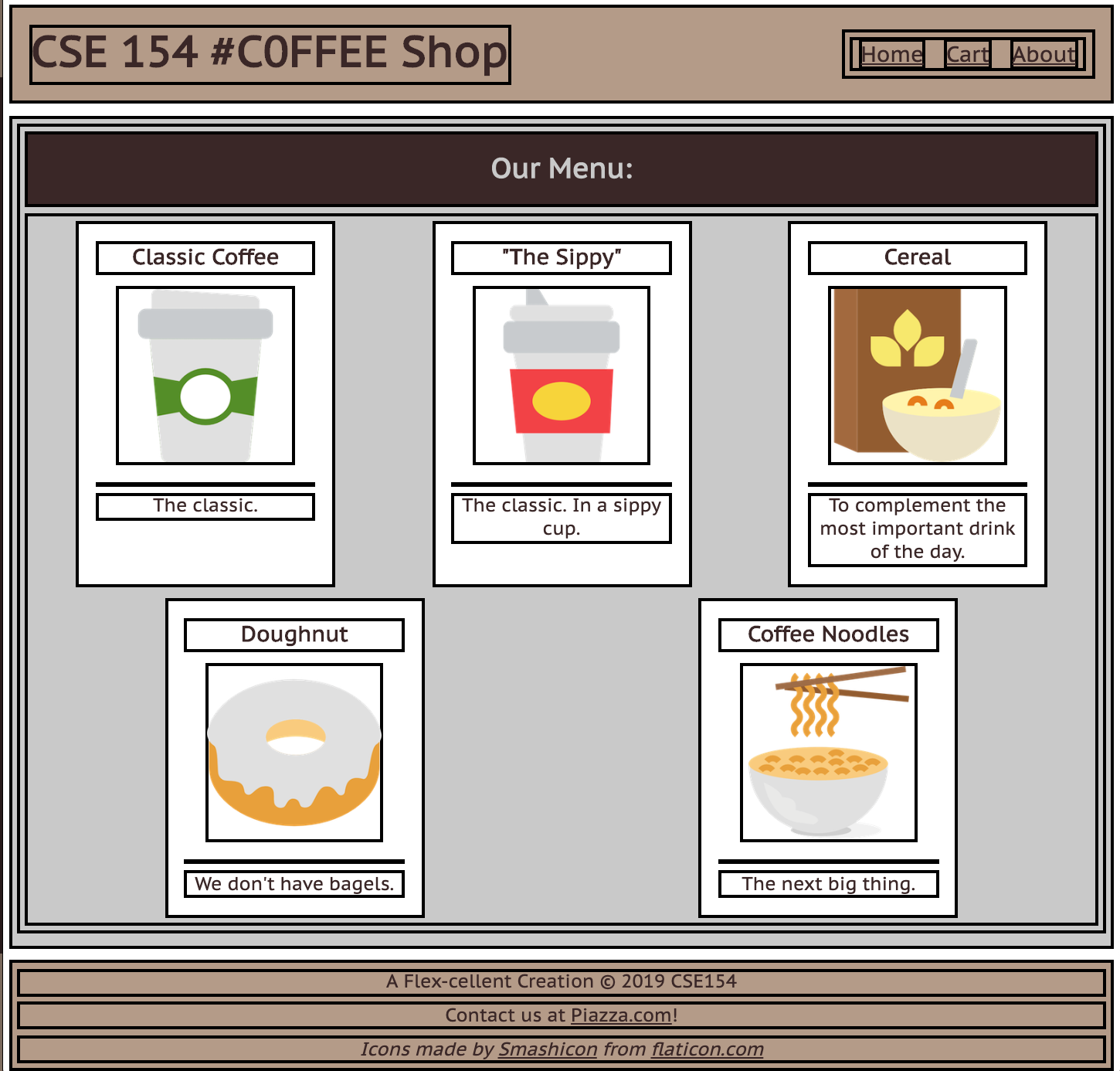
body(column with 3 children)#top-barheader (row with 2 children)#item-container(row with 5 children)footer(column with 3 children)
We'll take an "outside-in" approach, starting with the body
The Body Layout: A Column
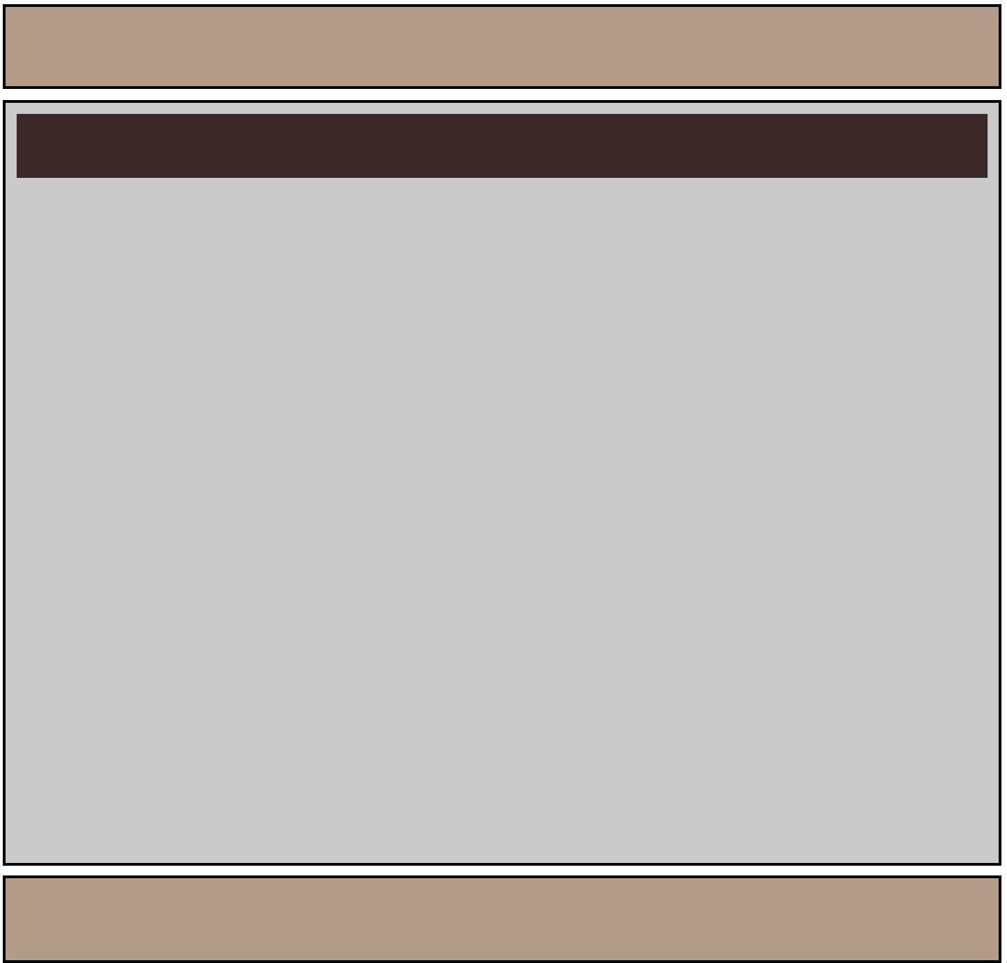
Demo
Figuring out the Flex Layout
For the body, we know we want a column.
We already get a column layout from the default block display
for header, main, footer.
But by default, these elements will have a height defined by their contents. This will result in whitespace at the bottom of the page.
We can use flex to control the distribution of the body's children to fill the entire page!
Making the Body a Flex Column
Many page layouts desire a full viewport height (vh) with a footer at the bottom.
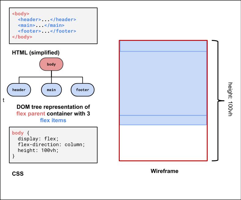
To set the body to be 100% of the view port height, use the vh size unit.
Using flex-grow with column page layout
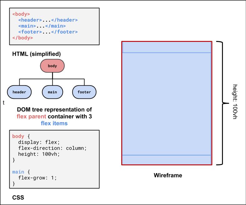
Next, we can use flex-grow: 1 on the child element of the body flex container to have that child fill any remaining whitespace
(the default for flex-grow for all items is 0). Let's make the main child fill the rest of the whitespace of the parent.
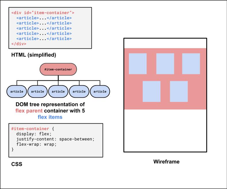
Second Flex Container: #item-container
This is the div that holds all of the product article "cards".
It would be nice to have some control over their distribution, and wrap them when the screen gets smaller.
<div id="item-container">
  <article>...</article>
  <article>...</article>
  <article>...</article>
  <article>...</article>
  <article>...</article>
</div>
HTML
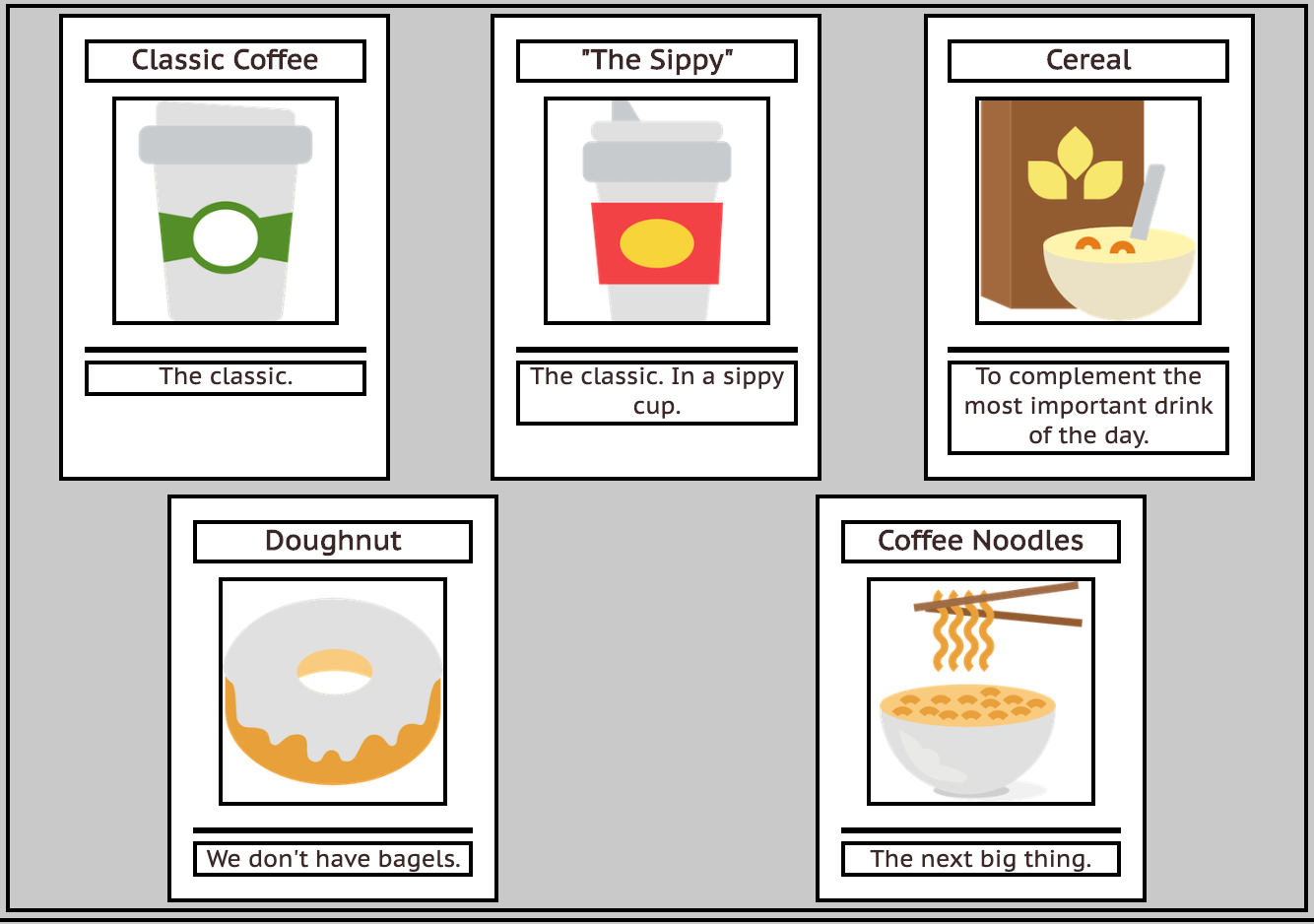
What's type of flex container is #item-container? (Demo)
#item-container Solution
Third Flex Container: The #top-bar
<header id="top-bar">
  <h1>...</h1>
  <nav>...</nav>
</header>
HTML
This is a bit of a trickier one, so it's good to do it last. We want to make it a flex row
so we can get a nice distribution of space between the h1 adn the nav.
We'll also make the #top-bar a sticky nav bar, so it sticks to the top when you scroll down!
With careful planning, we can combine different layout techniques like display: flex; and postion: sticky.
Let's take a look more closely at the CSS position property.
positioning Elements
position: static- Default value. Elements render in order, as they appear in the document flow
position: fixed- Puts an element at an exact position within the browser window
position: absolute- Puts an element at an absolute position based on the location of the element's parent container
position: relative- Makes children positioned relative to the parent container
- Handy for sticking a footer to the bottom of a page, for example
position: sticky- A "hybrid" - toggles between relative and fixed depending on scroll position
Another good explanation is here
Using position: sticky for a header/footer
A sticky element toggles between relative and fixed depending on the scroll position - is fixed when a given offset position (e.g. top of 0) is met in the viewport
See the Pen Sticky Examples by Melissa Hovik (@mehovik) on CodePen.
More questions from this lecture?
Especially if you're watching a recording, write your question on PollEverywhere and I'll answer them at the start of next lecture.
Either on your phone or computer, go to PollEv.com/robcse

