CSE 154
Lab 2: Page Layout Techniques with CSS
Today's Lab Exercises
Today you'll get practice with styling pages specifically for layout.
- Width, Height, and the Box Model (margin/padding/border)
- Flexbox
Reminder: Practice using your browser's page inspection resources!
Part 1: Width, Height, and the Box Model
Width and Height so Far (Defaults)
Height:
Block and inline elements normally have the height of their content
Width:
Inline elements have the width of their content
Block elements have a width that stretches across the whole page
Setting width and height in CSS
<div class="block"></div>
HTML
.block {
  height: 200px;
  width: 200px;
  background-color: greenyellow;
}
CSS
output
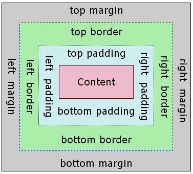
The Box Model
- margin
- (outside) space between different elements
- border
- (optionally visible) line that separates elements
- padding
- (inside) space between element content and border
More details about units/etc. in next slides - otherwise, move to the this slide for the first exercise!
CSS Properties for Margins
Specified in px, pt, em, rem,
% (or ex, or even in in, cm,
mm, pc...but don't :)
| Property | Description |
|---|---|
margin
|
margin on all 4 sides |
margin-bottom
|
margin on bottom side only |
margin-left
|
margin on left side only |
margin-right
|
margin on right side only |
margin-top
|
margin on top side only |
Using Margin to Center a Block Element
When a block element has a width set, one way you can center it relative to its parent element is by setting its left/right margin to auto
<div class="block"></div>
HTML
.block {
  height: 200px;
  width: 200px;
  background-color: greenyellow;
  margin-left: auto;
  margin-right: auto;
}
CSS
output
CSS Properties for Borders
h4 { border: 5px solid red; }
CSS
This is a heading.
output
| Property | Description |
|---|---|
border
|
thickness/style/color of border on all 4 sides |
Thickness (specified in px, pt, em, or
thin, medium,
thick)
Style
(none,
,
dotted,
dashed,
double,
groove,
inset,
outset,
ridge,
solid)
Color (specified as seen previously for text and background colors)
More Border Properties
| Property | Description |
|---|---|
border-color,
border-width,
border-style
|
specific properties of border on all 4 sides |
border-bottom,
border-left,
border-right,
border-top
|
all properties of border on a particular side |
border-bottom-color,
border-bottom-style, border-bottom-width,
border-left-color, border-left-style,
border-left-width, border-right-color,
border-right-style, border-right-width,
border-top-color, border-top-style,
border-top-width
|
properties of border on a particular side |
CSS Properties for Padding
Again, prefer px, pt, em,
or % for units
| Property | Description |
|---|---|
padding
|
padding on all 4 sides |
padding-bottom
|
padding on bottom side only |
padding-left
|
padding on left side only |
padding-right
|
padding on right side only |
padding-top
|
padding on top side only |
Layout Exercise 1: Boxes
Given boxes.html, write
boxes.css to make the appearance below.
output
More details for this exercise are on the slide below.
Exercise 1: Expected Output Details
The outer border of the box is red, the inner border of the box is black, and the inner background color of the box is yellow. Both the outer and inner borders have a width of 50 pixels. The yellow portion of the box has a width and height of 200 pixels. The overall box has a width and height of 400 pixels.
Solution: (result page) (CSS)
Part 2: Flexbox Layout
Flexbox is a set of CSS properties useful for aligning block level content into various layouts.
Flexbox can help manage how the elements should be sized relative to each other.
Like the position property, you have to think about your content in terms of the elements themselves, and the containers they are in.
The most complicated thing about flexbox is that the content can "flex" in either direction: horizontally into rows, or vertically into columns.
Basic properties for the flex container
display: flex;- makes an element a "flex container", items directly inside automatically become "flex items"
justify-content: flex-end; (flex-start, space-around,...)- indicates how to space the items inside the container along the main axis
align-items: flex-end; (flex-start, center, baseline,...)- indicates how to space the items inside the container along the cross axis
flex-direction: row; (column)- indicates whether the container flows horizontally or vertically
Basic properties for the flex items
Remember, flex items are elements directly nested
inside of flex containers. This means that their parents are set to display: flex
but the display property should not be changed for the flex items.
flex-basis: 20%; (3em, 50px,...)- indicates the default size of an element before the extra space is distributed among the other items
align-self: flex-end; (flex-start, center, stretch,...)- indicates where to place this specific item along the cross axis
Exercise 2: Flexbox Froggy (30 minutes)
There are great tutorials out in the world to help learn flexbox. This CSS-Tricks one goes into a deeper explanation of the flex properties and has some great examples to compare each - it's a great bookmark resource to reference for this class!
For the remainder of the lab, you are to work on Flexbox Froggy, which is CSS game for learning the basics of Flexbox. It's fairly self-contained, but feel free to talk to your neighbor with any questions or let your TA know if you run into anything you're not sure about along the way!
Extra Practice
Extra Layout Practice: Layout a skeleton
-
Download this skeleton HTML file with
this support image and open the
webpage in your text editor (e.g. Atom). You can
download the files by right-clicking the links and selecting "Save As..."
to save in a local folder of your choice. As you'll see in
example.html, the path to the support image assumes it is in the same directory as the HTML file). - To start out, you'll need to create and link in a CSS file.
- Follow the instructions in the HTML page to add page sections, and change the layout.
- See the slide below for a sample output.
Sample output (click to view in full size):
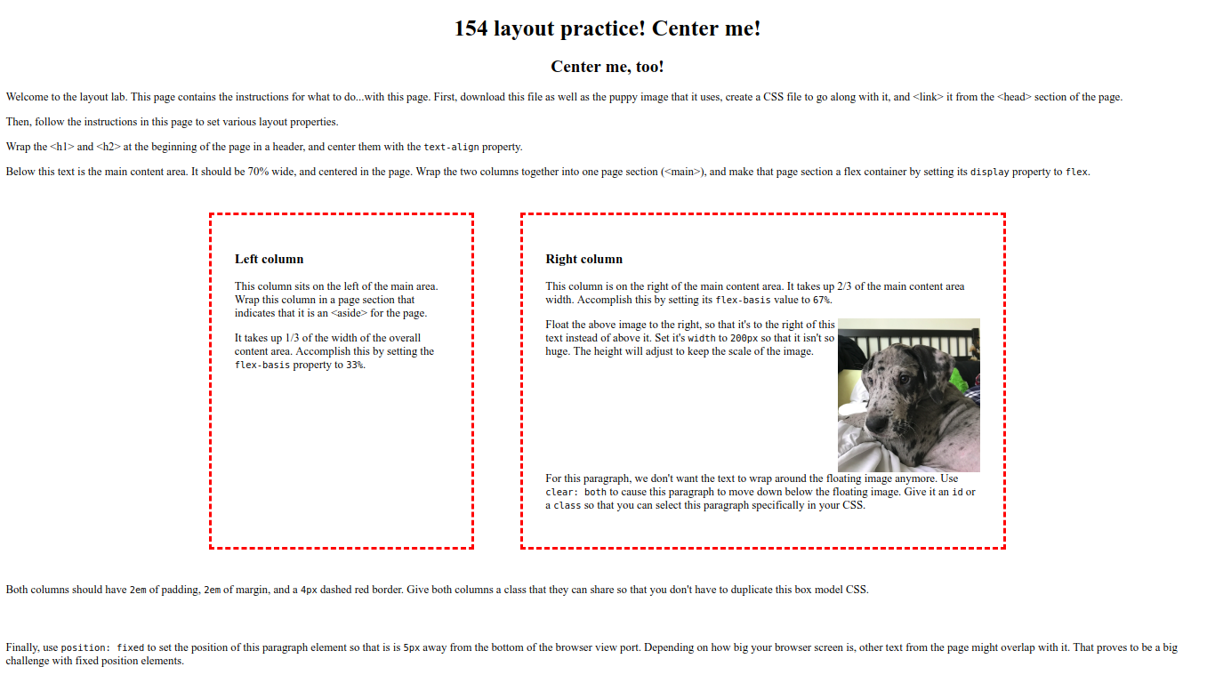
Note that your browser window size will definitely affect how the page is rendered. The sample image was generated on a wide screen, so it is possible that your page will flow differently.
Solution
Sample solution: (result page) (CSS).