CSE 154 Extra Sessions
Lecture 1: Typography; Transitions; Responsive Web Design
Reading: - Web Design is 95% Typography
- The Smashing Book: Typography Rules, Guidelines & Common Mistakes
Part 1, Part 2, Part 3, Part 4 - CSS Transitions, Transforms, and Animation Tutorial
- Responsive Web Design: What It Is and How To Use It
Part 1, Part 2, Part 3, Part 4
Except where otherwise noted, the contents of this document are Copyright 2012–2013 Morgan Doocy. All rights reserved. Any redistribution, reproduction, transmission, or storage of part or all of the contents in any form is prohibited without the author's expressed written permission.


1. Web typography
- 1. Web typography
- 2. CSS3 Transitions & Transforms
- 3. Responsive Web Design (RWD)
Line spacing (“leading”): line-height
p {
font-size: 18px;
line-height: 3em;
}
Lorem ipsum dolor sit amet, consectetur adipiscing elit. Proin ut leo enim. Curabitur eleifend interdum enim, mattis dignissim lacus placerat gravida. Donec et eros et leo gravida condimentum et non lorem. Morbi velit quam, imperdiet a sodales in, laoreet in lectus. Vestibulum auctor massa sit amet metus ultricies nec vestibulum lacus adipiscing. Duis hendrerit malesuada diam ac porta.
- Leading is measured from baseline to baseline.
- The longer lines are, the more leading is required for readable text.
- Rules of thumb:
line-height≈ length of line (in ems) × 5% ≈ size of body font (in ems) × 1.5
- Rules of thumb:
- Control line length (“measure”) by setting a width on the containing element
- Good line length: ~28em (25–33 times the base font size)
More CSS properties for text (3.1.6)
| property | description |
|---|---|
vertical-align
|
vertical offset from the line of text |
line-height
|
distance between lines of text |
word-spacing
|
distance between words |
letter-spacing
|
distance between letters |
text-indent
|
indents the first line only of a paragraph |
text-transform
|
alters the capitalization of text |
font-variant
|
switches to (or simulates) small caps variant |
white-space
|
controls how whitespace is handled within an element |
| Complete list of text properties | |
Anatomy of type
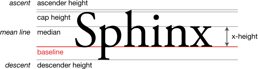
- Typefaces can be serifed (with flourished “feet”) or sans-serif (without)
- Serifed fonts are more legible at smaller sizes
- Sans-serif is better for display (=header) fonts
- A taller x-height often leads to greater readability
The vertical-align property
Sphinx  þ
þ
| property | description |
|---|---|
vertical-align
|
specifies inline element’s vertical position on the line of text;
can be top, middle, bottom, baseline (default), sub, super, text-top, text-bottom, or a length value or %
|
Letter & word spacing
h1 { font-size: 5em; word-spacing: -.05em; letter-spacing: -.05em; }
h2 { letter-spacing: .03em; word-spacing: -.075em; }
abbr { font-size: 80%; letter-spacing: .075em; }
Avant Garde
wharves and warfingers
The W3C standards HTML, for content, and CSS for presentation.
- Larger and smaller type sometimes benefits from letter- and word-spacing adjustments.
- Very slight! Usually ≤ .1 em. (Use Firebug to toggle these and see the improvement!)
Hanging indentation: The text-indent property
p {
text-indent: 2em;
margin: 0;
}
p:first-child {
text-indent: 0;
}
Lorem ipsum dolor sit amet, consectetur adipiscing elit. Proin ut leo enim. Curabitur eleifend interdum enim, mattis dignissim lacus placerat gravida. Donec et eros et leo gravida condimentum et non lorem.
Morbi velit quam, imperdiet a sodales in, laoreet in lectus. Vestibulum auctor massa sit amet metus ultricies nec vestibulum lacus adipiscing. Duis hendrerit malesuada diam ac porta.
- Indents only the first line of text in a block-level element
- Use either
text-indentormargin-top/margin-bottom(never both!)- If you use
text-indent, don’t indent the first paragraph in each section. - If you use vertical margin spacing, default is 1em; ideal is line height × 75%.
- If you use
Capitalization: The text-transform property
dt.charactername {
text-transform: uppercase;
font-size: .8em;
letter-spacing: .075em;
}
- Thomasina:
- Septimus, what is carnal embrace?
- Septimus:
- Carnal embrace is the practice of throwing one’s arms around a side of beef.
- Possible values:
uppercase,lowercase,capitalize(Title Caps) - Set to
uppercaseand reduce font size for mini-caps - Also, the
font-variantproperty switches to (or poorly simulates) Small Caps - Good idea to letterspace all caps/faux small caps slightly
- Increase at small sizes, decrease at large sizes
“Core” web fonts
Font “stacks”: similar, consistent, cross-platform
Stack: A list of similar, cross-platform, fallback typefaces in order of preference
body {
font-family: Garamond, "Hoefler Text", "Times New Roman", Times, serif;
}
h2 {
font-family: Garamond, "Hoefler Text", Palatino, "Palatino Linotype", serif;
}
- Fonts can be wider/narrower, or appear taller/shorter than others at the same size.
- Different fonts look better as body (paragraph) or display (header) text.
- Stacks are carefully chosen to maximize readability and consistency across platforms.
- More info and common stacks
CSS3 web fonts
@font-face {
font-family: 'Josefin Sans'; font-style: italic; font-weight: 100;
src: local('Josefin Sans Thin Italic'), local('JosefinSans-ThinItalic'),
    url('http://themes.googleusercontent.com/static/fonts/josefinsans/v1/s7-P1gqRNRNn-YWdOYnAOUU4uDXlcIT8_0bdRGwoYww.woff')
    format('woff');
}
h2 {
font-family: 'Josefin Sans', sans-serif;
font-weight: 100;
font-style: italic;
}
Sphinx Letterpress
- Browser compatibility varies; doing this safely is somewhat complicated. (Hint: use FontSquirrel)
- Several web font linking services: Typekit, Kernest, Google Web Fonts, Typotheque
- Services offer easy importing:
@import url(http://fonts.googleapis.com/css?family=Josefin+Sans:100italic,700);
CSS3 type effects
h1 { color: #484848; /* embossed look */
  text-shadow: 0 1px 0 rgba(255, 255, 255, 0.75); }
h2 { text-shadow: rgba(0, 0, 0, .5) .25em .25em .25em; /* drop shadow */
  -webkit-text-stroke: 1px red; /* outline */
  opacity: .5; /* transparency */ }
Built for the Web
Sphinx Letterpress
text-shadow: creates a drop shadow effect-webkit-text-stroke(Safari/Chrome only): creates a text outlineopacity: transparency (0.0–1.0); can be applied to more than just type
More precise font-weights
strong {
font-family: 'Open Sans';
font-weight: 100;
}
- Some fonts come in a wider range of weights than just
normalandbold. - Can specify range from 100–900 (in increments of 100).
- Browser will round to nearest available weight.
- Algorithm for doing this varies a little across browsers.
(*) Not available; rounded to nearest available weight
Font sizes: How ems work (or, “Em Is For Math”)
.before, .after {
margin: 0;
background-color: lightblue;
}
p {
font-size: 1em;      /* default */
margin-top: 1em;     /* default */
margin-bottom: 1em;  /* default */
}
p, h2 {
line-height: 1em;
background-color: fuchsia;
}
h2 {
font-size: 1.5em;       /* default */
margin-top: 1em;
margin-bottom: 1em;
}
Sphinx
Letterpress
margin,width,border, etc. specified in ems are relative to thefont-sizeof that element.
How ems work (cont’d)
.before, .after {
margin: 0;
background-color: lightblue;
}
p {
font-size: 1em;      /* default */
margin-top: 1em;     /* default */
margin-bottom: 1em;  /* default */
}
p, h2 {
line-height: 1em;
background-color: fuchsia;
}
h2 {
font-size: 1.5em;       /* default */
margin-top: 0.333em;    /* = .5em/1.5em */
margin-bottom: 0.666em; /* = 1em/1.5em */
}
Sphinx
Letterpress
margin: 1ematfont-size: 1emis equal tomargin: .6667ematfont-size: 1.5em
Base font sizes & scales
body {
font-size: 62.5%;
}
h2 {
font-size: 2em;
}
- Best practice: specify base font size in %, then specify other sizes in ems or %.
-
Pixels (e.g.,
16px) are still common but cause problems in mobile browsers- Points (
pt) rarely used
- Points (
Decide on a sequence (“scale”) of sizes:
- traditional: 0.667 0.75 0.833 0.917 1.0 1.167 1.333 1.5 1.75 2.0 3.0
- 1:1.618 (golden ratio): 0.382 0.618 1.000 1.618 2.618 4.236
- Scale calculator; scale designer
Web typography articles
- “Web Design is 95% Typography” — iA
- “Technical Web Typography: Guidelines and Techniques” — Smashing Magazine
- “Typographic Design Patterns and Best Practices” — Smashing Magazine
- Typography articles at A List Apart
- “The Smashing Book – Typography: Rules, Guidelines and Common Mistakes” — Smashing Magazine
2. Transitions & Transforms
- 1. Web typography
- 2. CSS3 Transitions & Transforms
- 3. Responsive Web Design (RWD)
CSS3 Special Effects
Upcoming CSS3 standard includes features for affine transformations and animation.
- Transforms
- Complete affine transformations: rotate, scale, reflect, skew
- 2– and 3–dimensional transformations
- Transitions
- Animation (“tweening”) between an initial and final state, triggered when state changes
- Animations
- More complex animations with more states, without needing to be triggered
- Sometimes needed to do something transitions can’t
- (We won’t cover animations here)
CSS3 Transforms: The transform property
selector {
-webkit-transform: function1, function2, ...;
-moz-transform: function1, function2, ...;
-ms-transform: function1, function2, ...;
-o-transform: function1, function2, ...;
transform: function1, function2, ...;
}
- functions cover most of the affine 2-D or 3-D transformations:
translate,rotate,scale,skew- (covers reflection via a 3D rotation effect)
- due to unfinished standard, basic
transformproperty does not work in most browsers- must specify custom properties with prefixes for each browser instead:
-webkit,-moz,-o,-ie - Nifty time-saving tool
- must specify custom properties with prefixes for each browser instead:
Translation: The translate function
selector {
-prefix-transform: translate(x-dimension, y-dimension);
}
#original, #transformed { position: absolute; left: 0; }
#transformed {
/* (browser-prefixed properties omitted) */
transform: translate(50px, 25%);
}
- shifts the object by x-dimension and y-dimension
- usual CSS dimension units:
pt,px,%,em,in, etc. - can be positive or negative
- roughly equivalent to
position: absolute;
left: x-dimension; top: y-dimension; - MUST include all browser-prefixed properties to work
Scaling: The scale function
selector {
-prefix-transform: scale(x-factor, y-factor);
}
#transformed {
/* (browser-prefixed properties omitted) */
transform: scale(.5, 1.25);
}
- scales the object by x-factor along x-axis and y-factor along y-axis
- factor is decimal scalar,
1.0= 100%,0.5= 50%, etc. - scales borders and inner contents too!
- content still selectable!
Rotation: The rotate function
selector {
-prefix-transform: rotate(angle);
}
#transformed {
/* (browser-prefixed properties omitted) */
transform: rotate(30deg);
}
- rotates the object by angle (can be negative)
- must include units of
deg,grad,rad, orturn - content still selectable!
Skew/shear: The skew function
selector {
-prefix-transform: skew(x-angle, y-angle);
}
#transformed {
/* (browser-prefixed properties omitted) */
transform: skew(-45deg, 10deg);
}
- skews the object by x-angle along the x-axis, and by y-angle along the y-axis
- must include units of
deg,grad,rad, orturn - skews borders and contents too!
- content still selectable!
Moving the origin: transform-origin
selector {
-prefix-transform-origin: x-dimension y-dimension;
}
#transformed {
/* (browser-prefixed properties omitted) */
transform-origin: left bottom;
transform: rotate(-75deg);
}
origin: left bottom
origin: default
(center center)
- moves the origin (0,0) to a different location
- affects the way all
transformfunctions are applied - dimensions can be usual dimensions (
pt,px,%, etc.) or a keyword:left/center/right,top/center/bottom - default:
50% 50%(=center center)
3D Transforms
In recent & upcoming browsers, can specify 3-dimensional transforms:
- rotation around X and Y axes (in addition to the usual 2D rotation, which is around the Z axis)
- translation and scale along Z-axis as well
- perspective distortion
Interactive examples:
- WestCiv 3D Transforms
- How to Use Transforms (see sections “3D Examples” and “A cube made with 3d transforms”)
3D Rotation: X and Y axes
selector {
-prefix-transform: rotateX(angle);
-prefix-transform: rotateY(angle);
}
#transformedX {
/* (browser-prefixed properties omitted) */
transform: rotateX(30deg);
}
#transformedY {
/* (browser-prefixed properties omitted) */
transform: rotateY(-45deg);
}
(X-axis)
(Y-axis)
- rotates the object by angle (can be negative); include units of
deg,grad,rad, orturn - notice the planes intersecting!
3D Translation & Scale
selector {
-prefix-transform: translateZ(dimension);
-prefix-transform: scaleZ(factor);
}
#translatedZ {
/* (browser-prefixed properties omitted) */
transform: translateZ(-5em);
}
#scaledZ {
/* (browser-prefixed properties omitted) */
transform: rotateY(-45deg)
          scaleZ(.1) translateZ(100em);
}
translateZalters “depth” or distance from viewer (distance from origin if rotated)scaleZprimarily affects scale oftranslateZdimensions (.1 × 100em = 10em)
3D Perspective Distortion
selector {
-prefix-perspective: pixels;
}
/* (browser-prefixed properties omitted) */
#container {
border: solid 2px blue;
background-color: gray;
perspective: ;
}
#transformed {
transform: rotateY(-45deg) translateZ(-5em);
}
- alters “camera distance” from object, which affects perception of depth
- affects the perspective of child elements only, so set this property on a parent
CSS3 Transitions: the transition property
selector {
-prefix-transition: property duration timing function delay;
}
/* (browser-prefixed properties omitted) */
#transformed {
transform: rotate(-45deg);
transition: transform 2s ease-in-out,
           background-color .5s ease 2s;
}
#transformed:hover {
font-size: 200%;
background-color: blue;
transform: rotate(10deg) scale(1.5);
}
(hover over me!)
- Whenever the specified properties change, they’ll be animated.
- Can specify multiple properties, separated by comma.
- ONLY specified properties will be animated (e.g.,
font-sizeis not animated above)
- ONLY specified properties will be animated (e.g.,
Transition Timing Functions
The timing function specifies how the transition will speed up and slow down across its lifecycle.
| timing function | description |
|---|---|
ease (default) |
quick start, gradual finish |
ease-in |
slow start, steady build to max speed |
ease-out |
start at max speed, steady slow to finish |
ease-in-out |
slow start, increase to max speed, slow to finish |
linear |
constant speed for entire duration |
cubic-bezier(n, n, n, n) |
specify your own custom Bézier curve function |
Where to specify transitions?
#foo {
width: 5em; height: 5em;
transition: width 1s ease, height 1s ease,
            font-size 1s ease;
}
.enlarged {
width: 7.5em; height: 7.5em;
font-size: 1.5em;
}
$(document).ready(function() {
$('#foo').click(function() {
$(this).addClass('enlarged');
});
});
-
Specify transitions on the element whose properties will eventually change.
- Says, “When these properties of mine change, animate the transition.”
- In this example, adding the class changes the specified properties, so the transition is animated.
Other transition options
transform-style
#foo, #bar {
transition: transform 1s ease;
transform-style: ;
}
#foo:hover, #bar:hover {
transform: rotateY(-135deg);
}
#bar {
backface-visibility: hidden;
}
transform-stylechanges whether children are rendered in 2D or 3D- Another demo of this (Safari/Chrome only, due to next-generation “slider” control)
backface-visibilitychanges whether an element is visible from behind- Both of these must also be browser-prefixed
- BUG: Prefixr doesn’t browser-prefix
backface-visibility, but it needs to be.
- BUG: Prefixr doesn’t browser-prefix
Proper browser-prefixing
#foo {
-webkit-transition: -webkit-transform 1s ease;
-moz-transition: -moz-transform 1s ease;
-ms-transition: -ms-transform 1s ease;
-o-transition: -o-transform 1s ease;
transition: transform 1s ease;
}

#foo.altered {
-webkit-transform: rotate(-45deg);
-moz-transform: rotate(-45deg);
-ms-transform: rotate(-45deg);
-o-transform: rotate(-45deg);
transform: rotate(-45deg);
}
$('#foo').parent().css({
'-webkit-perspective': '600px',
'-moz-perspective': '600px',
'-ms-perspective': '600px',
'-o-perspective': '600px',
'perspective': '600px'
});
- Browser-prefixing of
transforminsidetransitionmust match that oftransition. - When setting styles in JavaScript, don’t forget to set browser-prefixed properties!
3. Responsive Web Design (RWD)
- 1. Web typography
- 2. CSS3 Transitions & Transforms
- 3. Responsive Web Design (RWD)
Mobile device web traffic
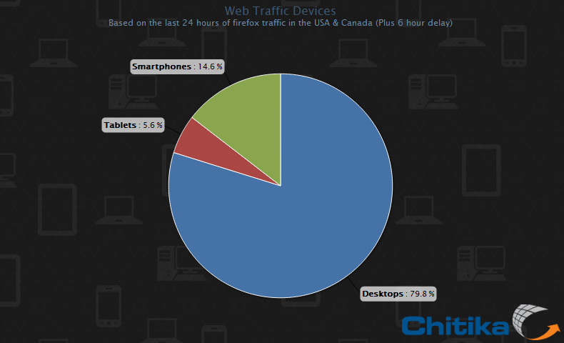
- Mobile devices now make up 20% of all web traffic
- Tablets: 5.6%
(95–98% iPad) - Phones: 14.6%
(72% iPhone, 26% Android)
- Tablets: 5.6%
- UI needs are different at smaller screen sizes:
- Larger tap area for links/buttons
- Hidden-away navigation leaves room for more content
- Only enough room for a single column of information
- How do we accommodate smaller screen sizes?
Mobifying layouts: “Responsive” web design
Layouts that adjust themselves (“respond”) to optimize for screen size

- Make your site always look good — no matter what screen size!
- Degrade gracefully in older or less-sophisticated browsers
- Use CSS3 Media Queries to apply different styles at different sizes
- Site design can change dramatically with size. Examples:
- mediaqueri.es
- 20 Best Responsive Web Design Examples of 2012 (SocialDriver)
- Replaces redundant “mobile site” approach, which adds another page to maintain
Fluid columns example
/* Three-column fluid layout with gutters */
/* 32% + 2% + 32% + 2% + 32% = 100% */
.col { float: left; width: 32%; margin-right: 2% }
/* remove extra 2% at right of every 3rd column */
.col:nth-child(3n) { margin-right: 0; }
- Small batch bushwick scenester, banksy salvia mlkshk williamsburg post-ironic.
- Freegan gentrify aesthetic jean shorts raw denim pour-over +1
- Wes anderson ethnic godard brooklyn mixtape carles cred.
- Retro twee fap, cardigan etsy pitchfork farm-to-table next level vice.
- Brunch pickled bespoke biodiesel, lomo swag street art four loko jean shorts forage.
- Umami fixie shoreditch, single-origin coffee cred quinoa ethnic brunch lomo aesthetic
- Notice the fencepost problem: Spacing goes between columns
- n − 1 spaces (“gutters”) for n columns
- Nice, but…
- At small sizes, gutters get too cramped; at larger sizes, too wide
- At small sizes, columns get too narrow (line lengths too short); at larger sizes, get too wide/long
Adapting with CSS3 Media Queries
<head>
...
<link rel="stylesheet" href="default.css" type="text/css" media="screen">
<link rel="stylesheet" href="mobile.css" type="text/css" media="screen and (max-width: 800px)">
<link rel="stylesheet" href="large.css" type="text/css" media="screen and (min-width: 1200px)">
...
</head>
/* default.css - 3-column */
.col { float: left; width: 32%; margin: 0 2% 1em 0; }
.col:nth-child(3n) { margin-right: 0 }
/* mobile.css - switch to 2-column */
.col { width: 48%; margin-right: 4%; } /* 48% + 4% + 48% = 100% */
.col:nth-child(3n) { margin-right: 4% } /* "undo" the 3n rule from default.css */
.col:nth-child(2n) { margin-right: 0 }
- Small batch bushwick scenester, banksy salvia mlkshk williamsburg post-ironic.
- Freegan gentrify aesthetic jean shorts raw denim pour-over +1
- Wes anderson ethnic godard brooklyn mixtape carles cred.
- Retro twee fap, cardigan etsy pitchfork farm-to-table next level vice.
- Brunch pickled bespoke biodiesel, lomo swag street art four loko jean shorts forage.
- Umami fixie shoreditch, single-origin coffee cred quinoa ethnic brunch lomo aesthetic
Responsive Techniques
- Reduce/add number of columns as size shrinks/grows
- Un-float elements to make them stack
- Calculate widths of columns and gutters based on some fixed size. Ex:
3 × 300px + 2 × 20px = 940px
Columns: 300px / 940px = 31.91489%
Gutters: 20px / 940px = 2.12766% - Common stop points:
240px 320px 480px 768px 1024px 1200px small phone iPhone portrait iPhone landscape
small tablet portaitiPad portrait iPad landscape
standard desktopwide desktop
Use case: Dropdown navigation
<nav>
<ul>
   <li><a href="/">Home</a></li>
   <li><a href="/blog/">Blog</a></li>
   <li><a href="/about/">About</a></li>
</ul>
<select>
   <option value="/">Home</option>
   <option value="/blog/">Blog</option>
   <option value="/about/">About</option>
</select>
</nav>
/* default.css */
nav ul     { display: block; }
nav select { display: none; }
/* mobile.css */
nav ul     { display: none; }
nav select { display: block; }
// scripts.js
// handle dropdown nav using JS
$('nav select').change(function() {
window.location = this.value;
});
- Use Media Queries to show/hide
selectdropdown at smaller sizes - Use JS to handle changes to the dropdown menu, and change the
window.locationto manually navigate