,
Lab :
Except where otherwise noted, the contents of this document are Copyright © Marty Stepp, Jessica Miller, and Victoria Kirst. All rights reserved. Any redistribution, reproduction, transmission, or storage of part or all of the contents in any form is prohibited without the author's expressed written permission.
thanks to former TAs Victoria Kirst, Jeff Prouty, Morgan Doocy, Brian Le for their work on these labs.
Basic lab instructions
- Make sure to click the Attendance Check-In link on the Labs page to get your participation points.
- You may want to bring your textbook to labs to look up syntax and examples.
- Have a question? Ask a TA for help, or look at the book or lecture slides.
- We encourage you to talk to your classmates; it's okay to share code and ideas during lab.
- You don't have to finish all of the exercises. Just do as much as you can in the allotted time. You don't need to finish the rest after you leave the lab; there is no homework from lab.
Today's lab exercises
Today you'll style a "Victoria's Journal" page. Before you leave, check in with a TA.
- Arrange Your Page into Sections
- Spacing With Padding and Margins, Backgrounds
- Float, Alignment and Clear
- Cosmetic Finishing Touches
- Upload Your Page to the Web
- Resources: Firebug, lecture slides
Exercise : Arrange Page into Sections (~20-25 min)
(The next 3 slides describe this exercise. Please read them all, then start.)
First download the following HTML file. Then open it in your text editor, and also open the HTML page on your hard drive in Firefox. Then move on to the next slide.
Exercise , details
(See example screenshot on next slide.)
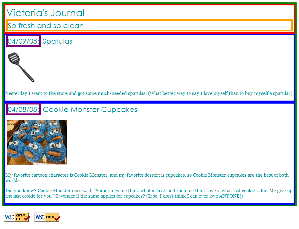
Organize journal.html by adding ids, classes, spans and divs. Then, add borders around these sections by editing your layout.css.
-
The borders are all
5pxthick andsolid. -
The colors are the intuitive HTML color names, e.g. the red border is the HTML color
red. -
Hint: To reduce the needed
idandclassattributes, consider using CSS context selectors.
The only major changes to make to the HTML are adding ids, classes, divs, and spans.
Exercise , output
Your page should look like this when you are done:
Exercise : Padding, Margins, Backgrounds (~15 min)
(See example screenshot on next slide.)
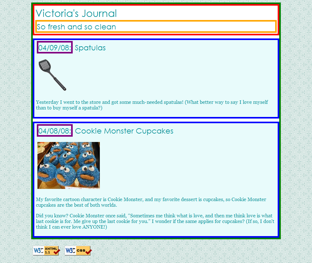
Add padding, margins, and backgrounds to the page. Change only your layout.css file.
-
The box with the green border should have a background color of
white.
-
The boxes with the blue borders should have a background color of
#E8FBFB.-
It should have a padding of
5px(on all sides) and margin of10pxonly on the top of the box.
-
It should have a padding of
-
The overall page content area should become centered on the page, should have left and right margins of
10%, and the following background image:-
 (right-click and choose "Inspect Element" to find out its URL!)
-
Exercise , example
This example is Victoria's page with padding/margins and backgrounds:
Exercise : Float, Align, Clear (~15 min)
(See example screenshot on next slide.)
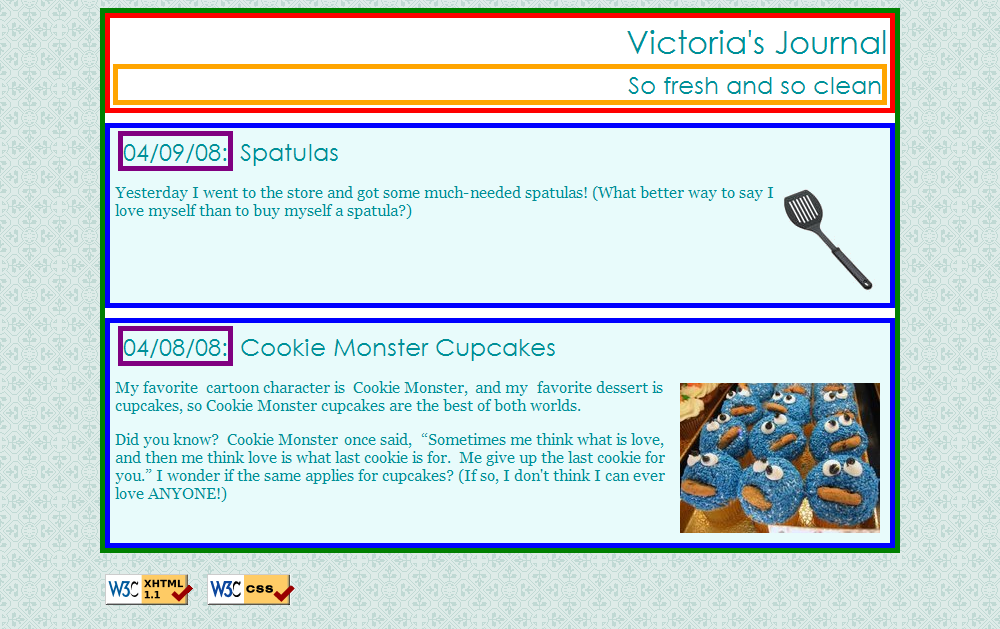
Now we'll practice float, clear, and alignment. You may have to edit journal.html code as well as layout.css.
- The heading text in the red box should appear on the right side of that section of the page.
- The text of each journal entry should be widened so that each line fills the entire width of the section ("fully justified").
-
The journal entry images should hover on the right side next to the surrounding text. The image should stay within the bounds of the blue box; that is, it should not
bleed
into the other content below it.- (Hint: If your boxes are not tall enough to fit the floating elements inside them, see the "Making Floating Elements Fit" in Chapter 4 of the textbook.)
Exercise , example
This example is Victoria's page with floating and alignment:
Exercise : Finishing Touches (~10 min)
(See example screenshot on next slide.)
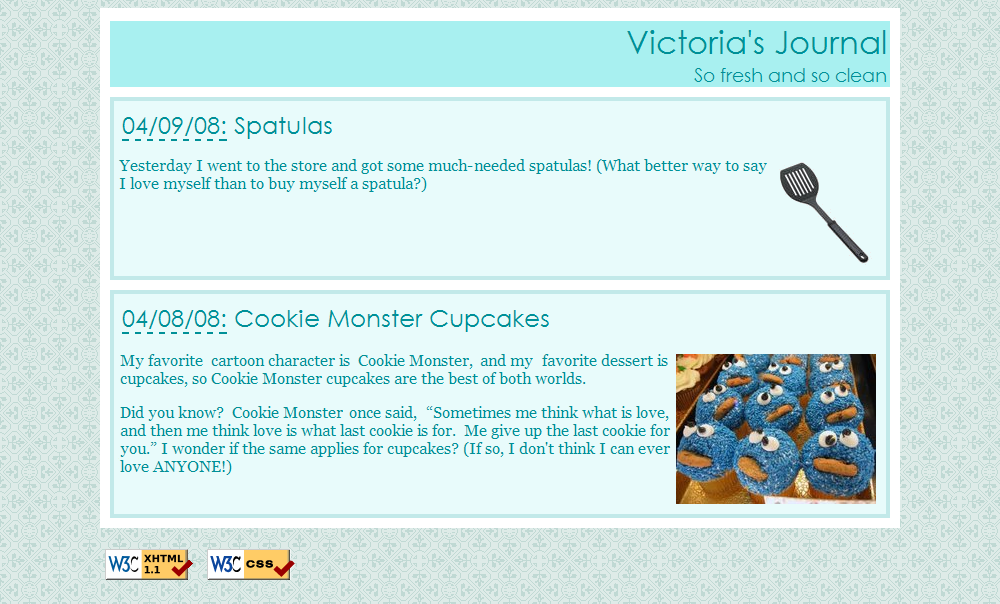
- Change the box with the green border to have a solid, white, 10px-thick border.
-
Change the boxes with the blue border to have a solid, 4px-thick border, in color
#C2E9E9, with a 15px rounded border radius. - Change the box with the purple border to have only a bottom border: blue, dashed, and 2px-thick.
-
Change the box with the red border to have a background color of
#A8F0F0, and get rid of its border. -
Change the font size of the
So fresh and so clean
area to 14pt, and get rid of its border.
Exercise , example
This example is Victoria's beautified page:
Exercise : Put Page on Web (~5 min)
-
Use our Uploading Files directions to upload your page to our Webster server.
-
Put your files in a folder named
lab2within yourpublic_htmlarea.
-
Put your files in a folder named
-
Check the page by viewing it in the web browser. Its URL should be:
- http://webster.cs.washington.edu/YOUR-UWNETID/lab2/journal.html
Ask a TA if you have any problems logging in to Webster or uploading your files!
Exercise : 2nd Column, Friends List
(See example screenshot on next slide.)
Add a second column to the layout. Copy and paste the following code into journal.html:
<h1>Friends</h1>
<ul>
    <li><a href="http://www.cs.washington.edu/154/">154 Buddies</a></li>
    <li><a href="http://www.willsmith.net/">Big Will</a></li>
    <li><a href="http://youtube.com/watch?v=mZHoHaAYHq8" title="Conan the Librarian">Conan the Librarian</a></li>
</ul>- Use the appropriate layout-related tags/attributes and CSS to make this list into a second, left-aligned column as shown below. The colors, borders, etc. of the list are not important; the focus is on the layout.
-
The layout with a second column must still be a
liquid
layout -- that is, all parts of it should adjust in size accordingly when the browser size changes. - Hint: When multiple elements float in the same direction, they arrange themselves into columns. Also see textbook Chapter 4's section on "The clear Property" for more information.
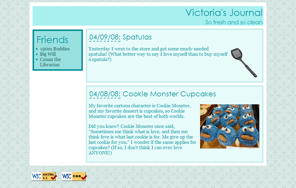
Exercise , example
This example is Victoria's page with the friends list:
Exercise : (h4x0rz only): Yellow highlight
Write your page so that if you hover over any element (i.e. any header, paragraph, image, etc), the element is highlighted in yellow.
This must be a one-selector, one-property addition to your stylesheet -- no commas allowed! How can one rule apply to all elements? Google away! (Tricky.)
Exercise : (h4x0rz only): Rounded borders
The new CSS version 3 introduces borders with rounded corners.
- If they don't have them already, place rounded corners on your journal borders.
- Try making each of the four corners have a different amount of roundedness.
- Google to find out how to make the roundedness be elliptical, that is, have different horizontal vs vertical size.
- If you finish that, consider exploring some other properties from CSS 3, such as text shadows or multiple text columns.
If you finish them all...
If you finish all the exercises, you can add any other content or styles you like to your page.
If the lab is over or almost over, check with a TA and you may be able to be dismissed.
Great work!

